|
Published on Archi.ru (https://archi.ru) |
|
| 13.09.2013 | |
|
Tobacco Office |
|
|
Anna Martovitskaya |
|
| Studio: | |
| Sergey Estrin Architects | |
|
Sergey Estrin architectural studio finished working on the interior design of Philip Morris International headquarters.
The new Russian office of Philip Morris is located in
Designing the office for a tobacco company proved a
non-trivial challenge for the architect - first of all, from the standpoint of
the ideology of the future interior. Traditionally, the artistic concept of the
headquarters design is based on the company profile or the company's product
but in this particular case of cigarettes and cigarette packs you cannot just
go and use their images as the basic decoration element - simply because this
may be regarded as smoking propaganda. On the other hand, Sergey Estrin did not
want to abandon this idea altogether, and this is why he and his colleagues
were searching for "semitones" - they thought of and searched for
details that would tell about the activity of Philip Morris in an oblique way.
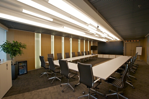
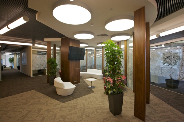
Probably, the most eloquent elements in these terms
are the lights that are installed in the entrance area, in the main corridors,
in the recreation areas, and in the meeting rooms. They are executed from
opaque white glass and have not only elongated cylinder shape but also side
covers of a darker color that remind one of compressed shredded tobacco. For
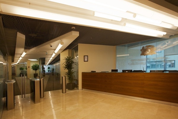
lighting the main meeting room, as well as the transient areas (the entrance
lobby, the reception, and the main corridor) the architects use a few rows of
such lamps at once, positioning them in a staggered order and thus accentuating
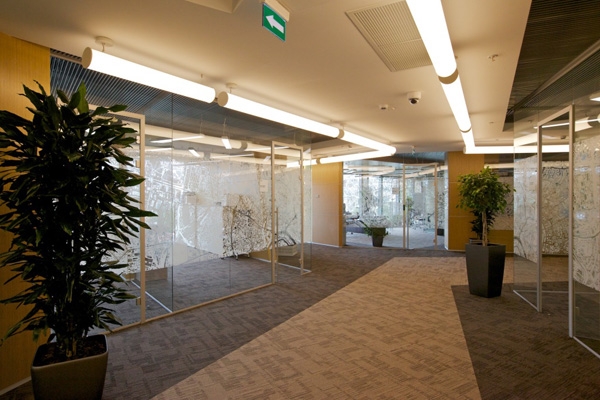
the constant movement in this part of the office. The inside corridors that are
mainly only walked by the employees of these or those particular departments
are lit by the same "torpedoes" but aligned here into one chain -
according to Sergey Estrin, this helps employees to easier find their bearings
and at the same time does not put too much accent on the passages against the
overall structure of the office.
The color palette of the office also unobtrusively hints at the main "hero" of Philip Morris business - i.e., tobacco. Combinations of light- and dark-brown shades are there in the wall finish, as well as in the decoration of the floors and the ceilings – by creating "blends" of different "flavor" the architects are getting a space that is as stylish as it is “rich in taste”. "One of the sources that we drew our inspiration from was, of course, the legendary Marlboro Cowboy and everything that has to do with him - but in the contemporary interior design we limited ourselves to but a hint at this sturdy stylistic" - Sergey Estrin shares.
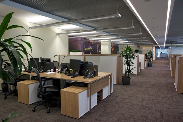
One of the architects' primary tasks, as was
already said, was breaking away from the corridor system with its set linear
properties. Avoiding the monotonous passages became possible not only thanks to
opting out of building numerous offices in favor of open space that contains
the islets of meeting rooms, recreation areas and small smoking rooms with air
conditioning of their own, but also thanks to a whole number of decorative
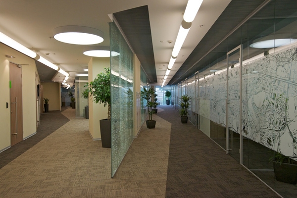
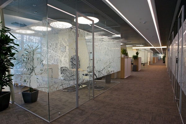
techniques. First of all, it was the use of transparent partitions that the
architects place at different angles, thus breaking the corridor perspective.
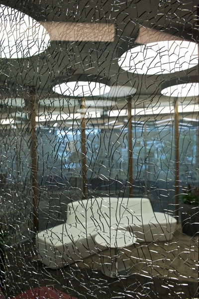
In order to make them yet more "palpable" the architects decorate the
glass with an opaque design in the shape of the map of Moscow, while part of
the transparent walls are executed with an effect of broken glass which makes
the light break and play in the countless cracks.
The corridors become even more expressive at the
expense of the floor covering that is pieced together from carpet fragments of
different colors. It looks as though some passages are pierced by a lightning,
while the floor of others consists of pieces of ice shattered into a multitude
of little fragments. All this put together creates a feeling of a dynamic
territory, the logic and structure of which are hard to read at first sight.
"In our design solution, we looked to combine areas that initiate movement
and are conductive to quick decision making, with areas that make the reality
"slow down" and that are suggestive of making a break - Sergey Estrin
explains - The way I see it, this is what smoking is all about: having, during
your busy day, a few legitimate excuses to make a well-deserved break. And,
even though I myself quit ages ago, I wanted to convey this mood in the design
of Philip Morris Headquarters - work and life that allow for a smoking
break".
 None None None None None None None None |
|
