|
Published on Archi.ru (https://archi.ru) |
|
| 22.01.2008 | |
|
Facade-Museum |
|
|
Natalia Koriakovskaia, Julia Tarabarina |
|
| Studio: | |
| iCube Architectura | |
|
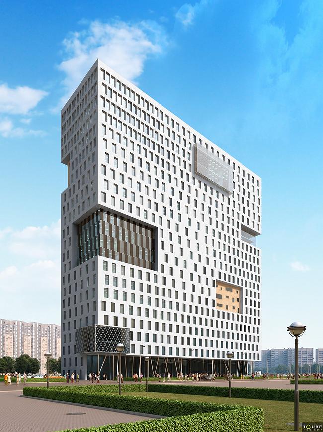
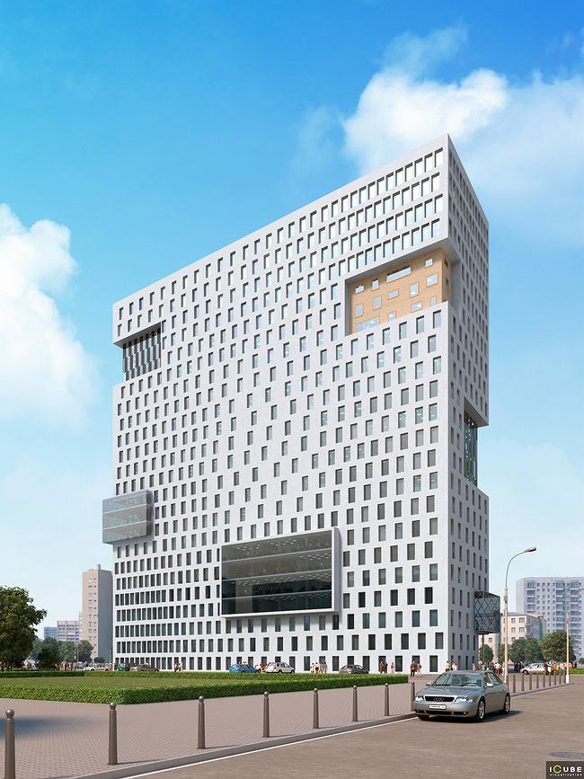
The office-building project on Nametkin street combines a plain rectangular volume with the remarkable idea of “collection” of different office facades fragments, gathered in the architecture of a single building like in a “museum”. The building’s volume is primitive – it is a 23storeys white parallelepiped. One of the facades rests upon thin metal “legs” placed at different angles creating a kind of closed gallery that can be a shelter for people walking along the street. In modern Moscow architecture such galleries are gradually becoming a common method – fascinated with beauties of Rivoli street in Paris, Moscow citizens do like them, and for developers this is another chance to enlarge space of a building, “hanging” it over a street. As for the rest, facades of the office building unite the two ideas. Most of the area is white. Rhythm and density of openings within horizontal rows smoothly a change, concentrates by corners, becomes rare in the middle. The authors compare this motif with fabric, tense in some parts, and somewhere dapple with pleats, or compare with a punched card – and the both variants can be true. But this is just a context for the key idea. The key idea can be defined this way: we have a collection of various textures nowadays applied to office buildings. Chaotic huge ledges each like an element taken from another office building facade and put onto the iCube’s building thruogh an architectural-surgical operation, cut white punched-fabric of main areas. There are glass consoles-oriel windows, shiny and smooth, and lined by metal carcass into rhombs. Due to alternate of transparent and dark glass some insertions resemble giant plasma screens and evoke media connotations. There are also brick insertions, which remind of numerous Moscow constructions that more often now are faced with plastic panels – as if there used to be a brick building and then it was dressed missing a few parts. Facade insertions have practical value – pieces of “peculiar” facades mark the inner public zone – they all appear to be of 3storey height. As all, it looks like an archeological museum, where behind glass of different shapes and sizes are exhibited fragments of true layings, graffiti and rest. But only here is the “museum” of modern office facades, fragments of various architectural concepts, in soft white frame. Eventually, in the iCube’s project an ordinary office-building facade have turned into a cheerful post-modern cocktail of elements of rationalism, dynamic architecture and the authors imagination. But some pieces of usual glassing were left as a reminder, or more likely as a part of the game. NoneNone |
|

