|
Published on Archi.ru (https://archi.ru) |
|
| 17.07.2013 | |
|
Window of Power |
|
|
Anna Martovitskaya |
|
|
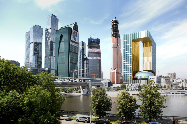
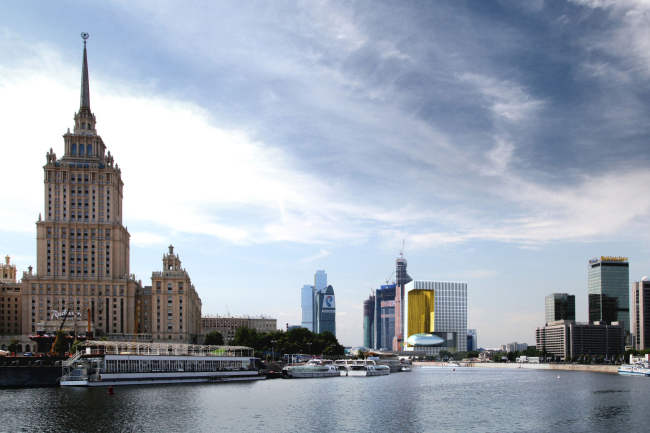
Meditating on the subject of how the new Parliamentary Center of the Russian Federation might look like, the team of architects headed by Alexander Asadov and Karen Saprichyan proposed to build, within the framework of Moscow City, a building with a golden niche on the main facade and a giant sphere of the congress hall suspended inside of it. For the record, we will say straight away that this
project will not be implemented - it relates to the list of experimental
developments that our authors are so fond of. Their portfolio has in it quite a
few of such proposals and concepts - the kilometer-tall TV-tower or the
recreational complex "Mirax-Garden", so much remembered by many
people. The architects themselves call these projects "Alternative
Moscow", appreciating the opportunity to let their imagination go free in
terms of how the Russian capital might have looked like, had it not been for
the ball and chain of the construction restrictions and other limitations. As
for the customers, they, in turn, fully appreciate Alexander Asadov's readiness
to think out of the box and look into the future (of this particular city and
of architecture in general) with optimism, and this is why the architects get such
proposals on a regular basis. This time the "alternative reality"
theme came in the form of placing the As the architects themselves explain, this idea came
up last fall, at the point when it became clear that the territories of the
"New Moscow" are not ready, in terms of their infrastructure, to
accommodate for the large numbers of federal agencies. As is known, the
Deputies of the State Duma were also against moving beyond the confines of the
Moscow Ring Road, and thus the capital started searching for an alternative
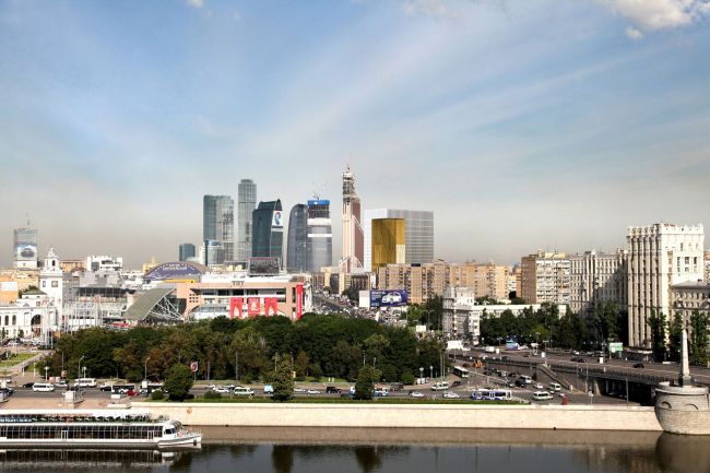
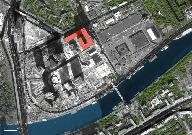
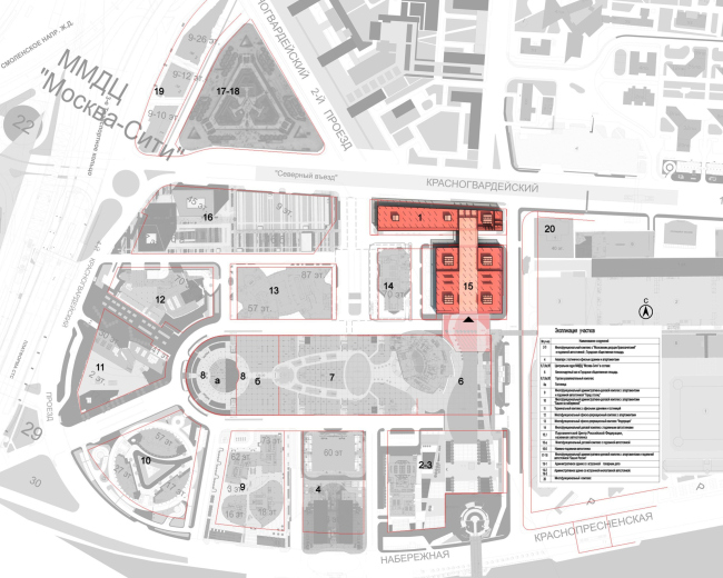
site for the
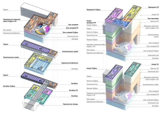
The construction site of What the authors do is assemble the
As for the structure that the architects place on top
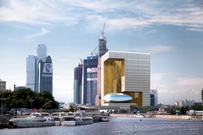
of the library, it looks nothing like the classic skyscraper. Rather, it looks
like a window or a window frame: off a square-section tower, the authors take
away most of the corner that faces the Moskva River, as well as from the
opposite corner, and then they embellish this niche with a deep horizontal slit
in such a way that the building "looks" at the Bagration Bridge not
with a massive dull facade but with a graceful niche. The unusual form of the
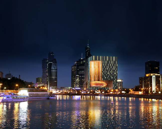
opening is also enhanced with its coating - the niche is finished with metallic
panels of copper hue and glass of a similar shade. The main adornment of the
niche, though, is not even its golden lining but the egg-like volume inserted
inside of it - these are the the convention halls, one for each of the houses,
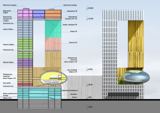
and a common one. If we look at the
The height of the upper link that in fact makes the
building look like a giant window and connects the two towers into a single
whole, is three floors. Here the authors were planning to place the offices of
the support staff of the chairmen of the State Duma and the Federation council,
as well as the representatives of the Chief of State. This is also symbolic:
the ruling power structure is placed at the very top having, just in case, a
few helicopter landings handy. Oh, by the way, about the fire prevention
measures: the laconic finish of the facades and the windows that are arrayed
into thin vertical lines (at some places in pairs and in some places as
"stocks" 5-6 floors high) completely conceal the three technical
floors that allow, if necessary, for complete isolation of the library, the
premises meant for the joint work of the Deputies and the members of the
Federation Council, the fractions of the State Duma, and the committees of the
Federation Council, as well as the top echelons of power. In front of the
building, the architects make a small square that is accessed from the
Krasnopresnenskaya Embankment by a wide staircase. All this put together - the
plaza that is elevated above the river, the glittering zeppelin hovering above
it, and the frame of the high-rise golden on the inside, endow the Russian
Parliament with an image that is bright, and, possibly, even too
"progressive".
NoneNoneNoneNoneNoneNoneNoneNoneNone |
|


