|
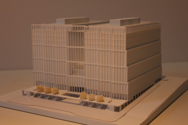
Taking part in the contest for the project of the second stage of construction of "Empire Tower" Complex, the architectural group DNK treated the last unfinished building on the Krasnopresnenskaya Embankment as a laconic-shape volume with dramatic and expresive facades.
The contest for the construction on the land site "Moscow City"
next to the 60-floor "Empire
Tower" on the
Krasnopresnenskaya Embankment was already covered by our website. This area has
quite a long story behind it: projects of a most diverse nature have been
designed for it at various times. This circumstance is to be seen not only on
paper - for example, the underground and some of the above-ground levels of a
once-approved aqua park have long since been actually built in concrete. Due to
the fact that now the investor has made a decision to place here the public
multifunctional premises, as well as a car park, the above-ground part will be
dismantled, while the existing underground part will remain unchanged, and, in the
capacity of the parking garage, will be put into operation in the nearest
future. This is why one of the contest specifications was the task of
integrating the underground part with its surface exits into the new building.

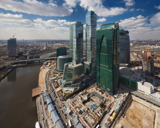
Panorama of the construction site in "Moscow City" 
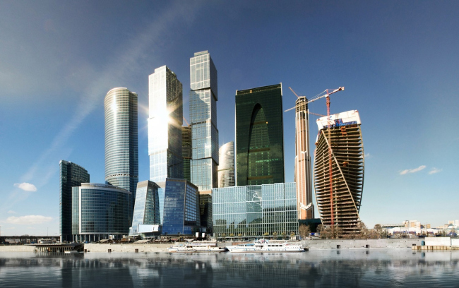
Panorama of "Moscow City" with the insert of the contest proposal
The architects of DNK group opted out of building their solution around
the "catchy" curved shape, and chose a fundamentally different and
austere geometry. "We proceeded from the fact that Moscow City is full of
unusual shapes as it is, so we thought that yet another strangely shaped
building would be too much, all the more so because this building is smaller
than its neighbors, and its reserved character will help it to be in proportion
with its surroundings, will add some importance to it, - explains their choice
one of the founders of DNK Natalie Sidorova - Plus, the implementation budget
was very-very tight, so it is just not meant to cover any large-scale
experiments with the shapes".
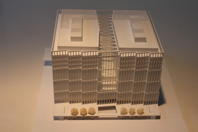
The dimensions of the construction footprint of an almost square shape
of 90 x 75 meters,
and the reasons having to do with finding the optimum depth of the building
necessitated dividing the conditional parallelepiped into two blocks with a lit
space between them. The latter was positioned perpendicular to the embankment -
it is this particular position that lets all the interior spaces of the
building get a river-commanding view. Both blocks were encased in a single
casing in order to conform to the dimensions of the surrounding skyscrapers.
Thus, between the two buildings, a spacious atrium appeared, a "visual
corridor" of sorts that connects the embankment and the "Empire Tower"
standing on the second construction line. The architects deliberately centered
the complex strictly along the axis with the 60-floor high-rise, connecting in
this way the two parts of the "Empire
Tower" and enhancing
their connection. The new volume is similar to propylaea, a sort of the
proverbial Acropolis Propulsion before the high-rise. On the other side, the
plan of the atrium that narrows in towards the center and widens out towards
the exits - like a concave lens - conceptually echoes the "trademark"
oval niche on the main facade of "Empire Tower"
skyscraper and provides for a better river view from most of its premises.

Miniature
One of the main tasks of the competition was creating the new public
territory integrated into the single pedestrian structure of "Moscow City"
and leveling out almost a 5-meter height difference between the embankment and
the entrance to "Empire
Tower" high-rise. In
the architectural discussions it was repeatedly noted that the Moskva River
is under-engaged into forming the public territories and a fully-fledged
riverside promenade is all but a rare sight in Moscow. Moscow City
complex had every opportunity to repair the omission but one cannot really say
that the already-built buildings succeeded in that. This is why the DNK
architects laid particular stress on turning the embankment into the project
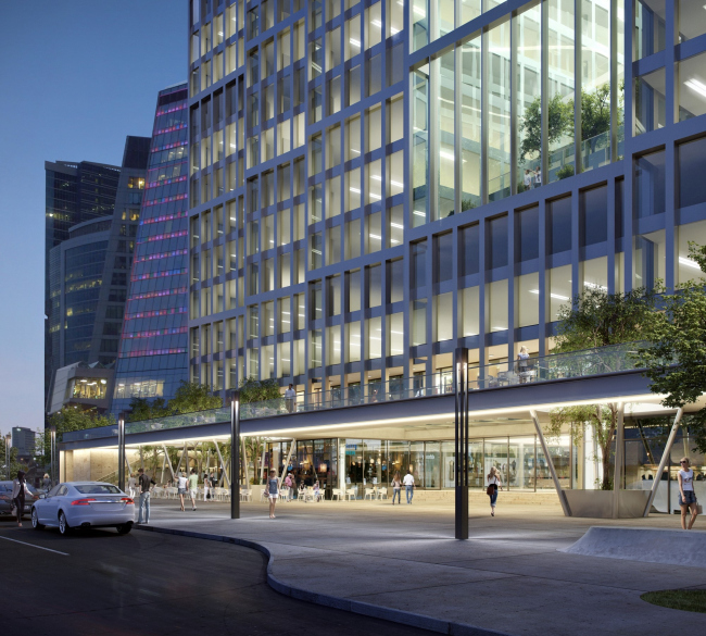
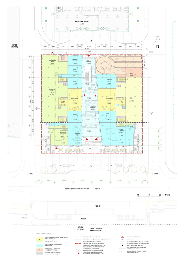
priority, setting the goal of breathing life into it. In their project, the
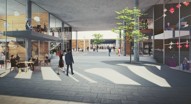
inner passage is not confined inside the building - it spills out onto the
embankment in large two-level terraces with cafes and restaurants. As for the
passage, DNK made it inclined, thus providing a direct link between the
embankment and Moscow
City with no moving
staircase, in the shape of a natural landscape. The wide "terrace"
promenade is oriented along the axis of "Empire
Tower" skyscraper, and it leads
from the embankment up to the high-rise's entrance and further on into the
center of Moscow City. The inner "stairs",
interconnected with spiral ramps, have on them various planting and landscape
elements. Along the street, cafes and shops are situated; the
"high-profile" entrance lobbies of the upper tier of the
multifunctional "towers" also have their exits here, and one gets
easy access to Moscow
City system of pedestrian
underpasses.

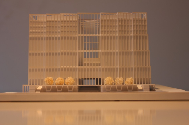
The view of the complex from the embankment

Inside covered passage 
Cross-sectional plan In spite of the fact that it is in fact the second construction stage of
"Empire Tower" high-rise, the
"dress" of the new volume is fundamentally different from it. The
least "exposed" northern and western facades are executed almost
flat, while the eastern one has a "stepping" structure which
accentuates the corner position of the complex: in the construction array of
the embankment and starting from "Bagration" bridge, the new building
will be in fact the first one in the row. As for the southern facade that faces
the river, its main theme is all about fracturing into vertical fragments that
are meant to introduce the "intermediate" scale between the streets
and the tower upon this, rather extended, surface. In fact, the architects
piece it together from grilled fragments the width of which is equal to the
width of the atrium - which allows for articulating the overall structure of
the building more clearly. What is important is the fact that each of such
fragments DNK places at a slight angle, and this seemingly simple technique
helps give the building a more "chamber", transitional-scale
character and adds extra dynamics to the embankment: when viewed from one side,
the asymmetric movement is more prominent, and when viewed from the other side
- less active.
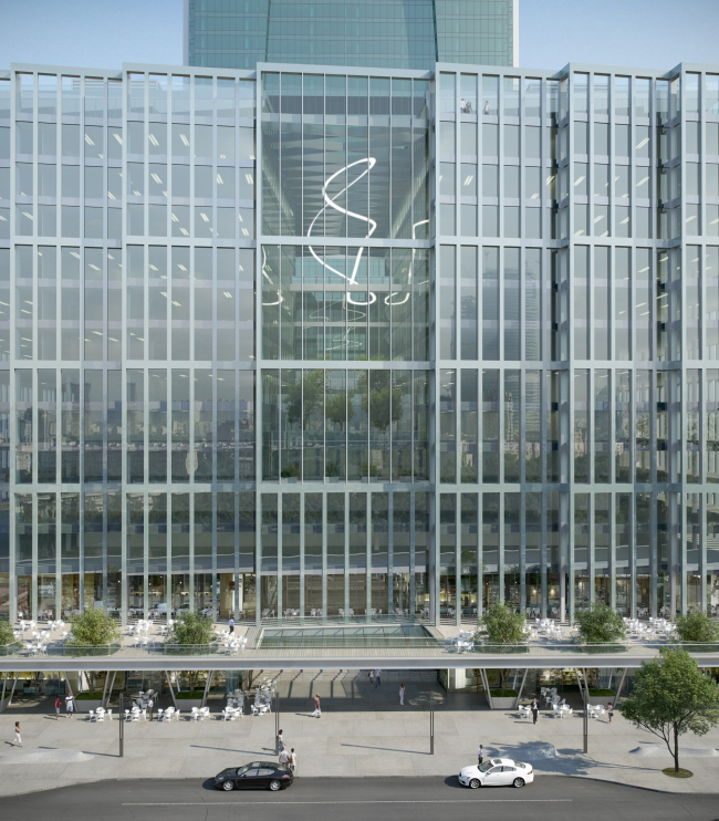
According to the authors of the project, they treated the facade rather
like a "windowed wall", reasoning that, for the embankment that
serves as a sort of buffer between the city and the island of skyscrapers, the
plastics of the pylons introduce the detailed design that is necessary for the
building to be adequately perceived from the pedestrian level, as opposed to
the predominantly flat surfaces of Moscow City high-rises. According to the
initial plan, DNK were to even dress this "wall" into stone but later
on they opted in favor of a more subtle solution - the opaque structured glass
in the framework of polished steel with "windows" made of glass of a
slightly greenish hue.


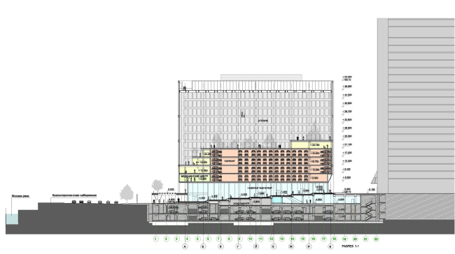
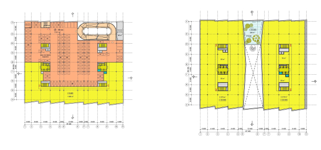
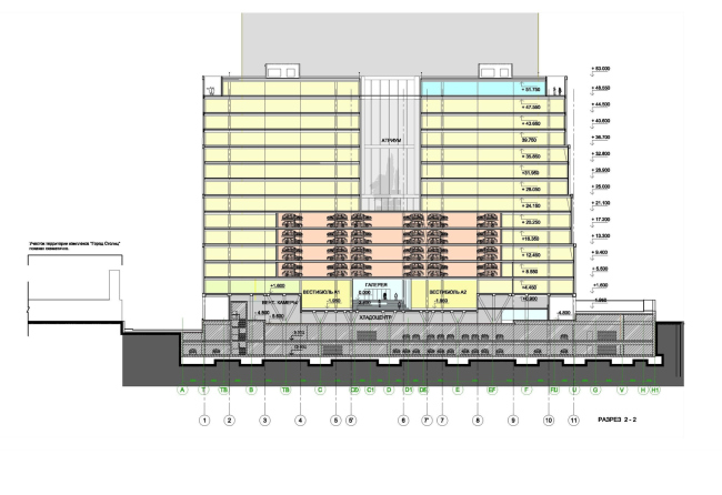
The authors paid a lot of attention to the development of the optimum
functional structure of the building: the car parks are compactly placed on the
four floors in the back part of the building, further away from the river, so
as to free the facades with river views or the offices; the ramp in the parking
garage at the corner of the building is made unheated which provides for
substantial savings on the energy consumption; the positioning of the vertical
communication nuclei allows people to easily move around the building - in
particular, the parking garage provides easy access to any of the floors; the
two blocks feature the optimum depth from the light front to the communication
nucleus, and the convenient for the commercial use area of 2000 square meters
with free planning; most of the maintenance premises are located in the central
"dark" part of the basement floor; the technological loads and
communications of the shops and restaurants are designed in such a way that
they do not cross with the main public areas.

Plan on the level of the inside street

Plan of the car parking floor (left). Plan of the typical floor (right). The project answers all the specifications of integrating the new
building into the existing underground levels. For instance, the architects
were able to keep intact all the numerous underground emergency staircases
leading to the embankment level. It should be mentioned here that not all of
the contestants were able to meet this condition. According to the construction
plan, for the transition from one column spacing to another, the project
provides a ribbed relieving platform that, due to its thinness, allows for
using the space beneath it to the fullest, while the spaced-out positioning of
the building nuclei and the columns kept the structure of the underground
parking with no losses of the parking stalls.

Longitudinal section
Landscaping of the territory between the building and the embankment and
creating a covered passage is not all what the theme of public spaces is about.
DNK decided that the new complex needs them just as much as the city, and this
is how an oasis of their very own was granted to the tenants of the second
stage of "Empire
Tower". The atrium
sports a stepping structure and is treated as a nice little courtyard that
opens up to the river panorama. "The quality of the environment seems to
us just as important as the quality of the space that arises in the city with
the advent of the new building - explains Natalia Sidorova. - Only by forming a
single environment within and without, we achieve the balance between the
interests of the investors and the interests of the city, which, in our
opinion, is the key to a successful project". 
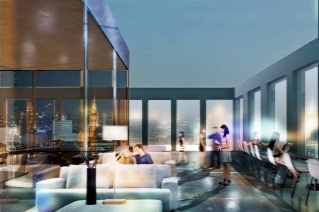
View of city from the rooftop restaurant
None
None
None
None
None
None
None
None
None
None
None
None
None
|
