|
Published on Archi.ru (https://archi.ru) |
|
| 28.12.2007 | |
|
Ice stalagmite |
|
|
Natalia Koriakovskaia, Julia Tarabarina |
|
| Studio: | |
| iCube Architectura | |
|
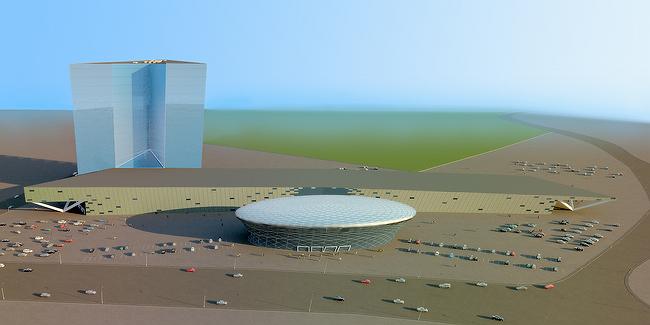
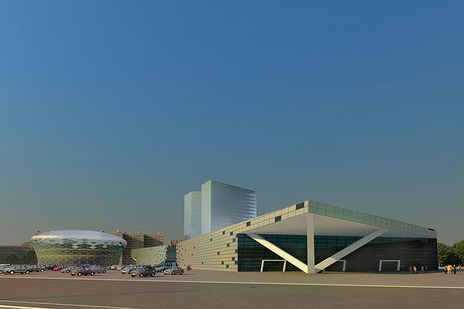
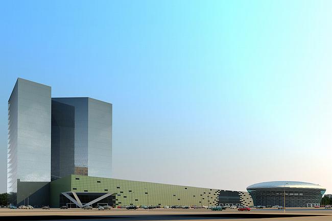
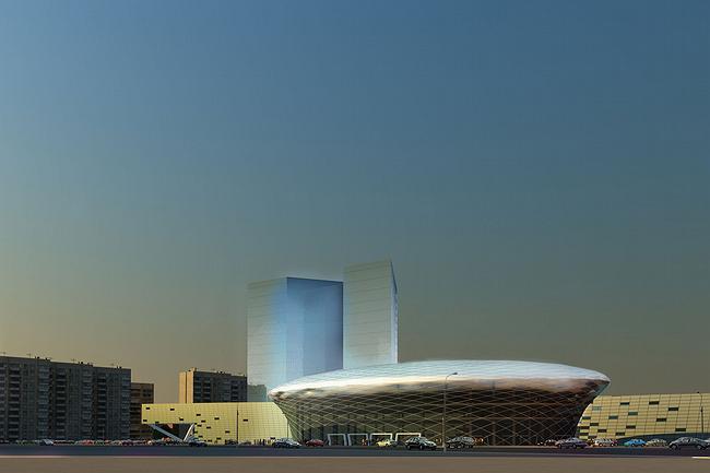
One of the peculiarities of the modern Russian architecture is the so-called investment construction. A client finances construction of a cultural object – a theatre, concert hall or school, and in return he is allowed to add to - as they say ‘practical for the city’ - something profitable, like shops or office centers. As a rule, spaces of the commercial part, growing around ‘cultural’ core, are larger and that is a challenge for the architects how to arrange appropriately the complex of such different, even conflicting, buildings. One of such projects is the architectural concept of Vyacheslav Tretyak’s sport school developed by iCube. There will be the two main sections – the hockey school and the commercial part: a megamall, supermarket and an office centre. The second, commercial part, is about nine times larger than the school’s part – an absolutely typical example of a Moscow investment construction. How does it look outside then? Quite Europe-like. The conceptual core of the complex – the hockey school is extended forward and looks like a glass “earth-ball”, lined with a net of diagonal sections. The “mushroom” is like an enlarged ice stalagmite, one of those kind-of-columns that grow at the time of early spring. This analogy is easy to explain – there will be the ice arena, so shape is ‘telling’ about it, with sculptural and architectural means reflecting the purpose of the construction. The rest buildings back it. The building of the megamall is as usual low and stretched along the site. The front façade is a like a display that is reflecting the glass sculpture of the hockey school. Its surface actively reacts to the neighbor – slightly bends, backing out, also creating a glass spot in the middle – windows, chaotically spread over the rest surface, resembling large pixels of a digital image. The three parts are matched and set against at same time – they talk, and during it there occur similarities and differences, key points are highlighted. This is the architectural studio’s fine approach to the Moscow idea of investment construction, with the commercial-dominated spaces. NoneNoneNone None |
|


