|
Published on Archi.ru (https://archi.ru) |
|
| 04.06.2013 | |
|
The Power of Proportion |
|
|
Julia Tarabarina |
|
| Architect: | |
| Andrey Romanov | |
| Ekaterina Kuznetsova | |
| Studio: | |
| ADM | |
|
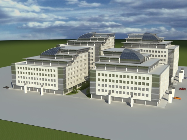
In the vicinity of "Sokol" metro station, the construction of a new business center has been completed - by ADM Bureau. The A-class business center "Alkon" is located on the "It was the project of the second stage that the story of our working with this territory began with - Andrew Romanov shares - Back in 2008 we were offered to develop a project of the buildings that face the avenue. A little later on we got down to transforming the buildings of the first stage of construction that had been up to that point done by Fitzroy Robinson architects. Our client asked us not to make any changes to the already-approved dimensions of the buildings and the layout of the complex (all the more so because the construction in fact had already started by that time) - if we had planned this part "from scratch", we would have done everything a different way. So ultimately the first thing that we did to the project of the first stage was change the facades, did a lot of improvement work, and also redid all the design development phase, prepared the engineering documentation and got all the necessary approvals. By the moment that we had to start our work, all that we actually had was the renders; we did not even have the plans of the buildings". Thus the planning of the four square buildings with an atrium in the middle and four elevator groups at the atrium's corners, the height and the stepping silhouettes of the buildings that rise up towards the middle of the block, the multitude of the air-vent pipes running along the perimeters of these buildings, and the technical floors that the architects had to mask with grilles - all of these were inherited from the preceding project by Fitzroy Robinson architects (read the Russian article here).
Project by Fitzroy Robinson architects, 2008 Andrew Romanov and Ekaterina Kuznetsova were able, however, to
drastically transform the overall image of the complex. First of all, the
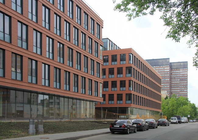
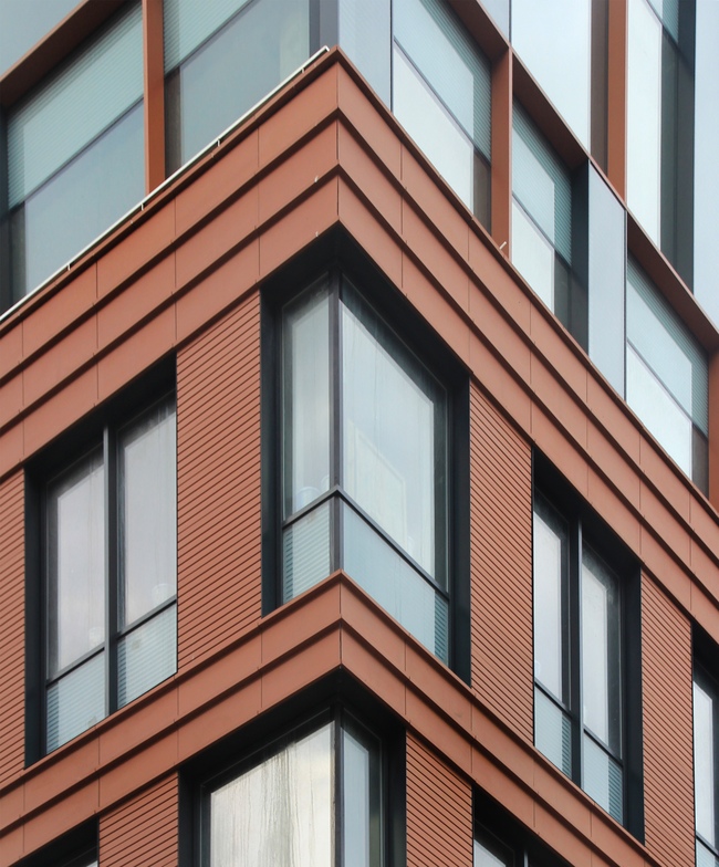
architects changed the white porcelain tiles with terra-cotta panels. Their
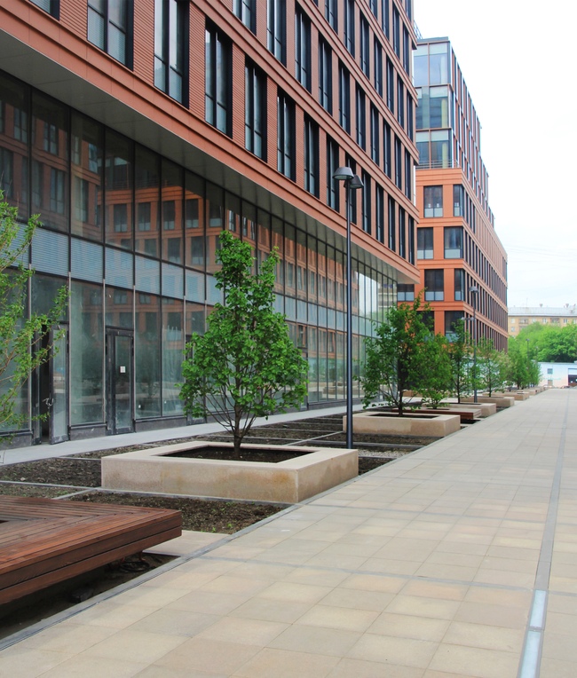
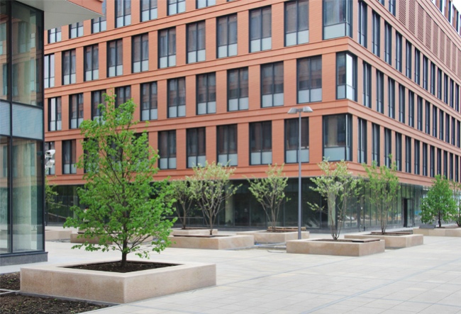
rich dark orange color stands out against the sandy gray background of the Besides, the terra-cotta color of the business center rhymes nicely with the rich brick-red color of the facades of the residential towers built by "Ostozhenka" Bureau next to Sokol metro station - so the modern buildings, placed in an array of Stalin and late Soviet era houses, form an association chain of their own.
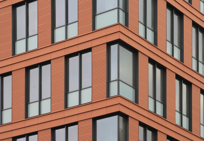
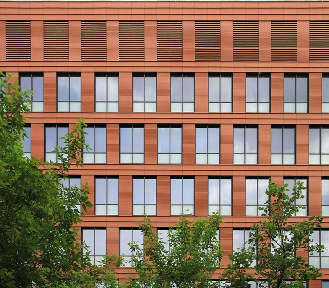
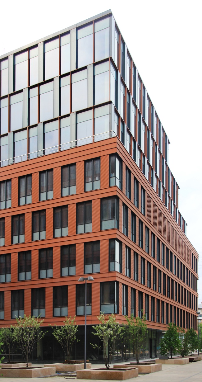
The northeast view, from the side of Aviakonstruktora Yakovleva Street. The residential buildings by "Ostozhenka" Bureau seen in the distance. Photo by Julia Tarabarina If we are to speak about the facade structure, then we should mention the fact that in this case ADM did what they have already done in other projects that were about reconstructing former Soviet buildings: they visually "stretched" the proportions of the windows, masking the window espacements and the window sills from the outside with glass duplex panels that bear the design of horizontal stripes imprinted by sandblasting technology. The stripes help hide the massive wall behind the glass and it looks like the windows are tall, almost "down to the floor", and they stand on the intermediate rods marked by the horizontal terra-cotta stripes looking like the double-T girders so much loved by ADM. The stripes on the glass echo the texture of the thin horizontals on the terra-cotta espacements together with the striped glass inserts on the upper floors - which results in several "levels of complexity" of the pattern, that the eye visually perceives as the sign of expensive design and allow avoiding the monotony.
Photo by Julia Tarabarina The
architects placed the window espacements in something like a staggered order,
only here it is not a "one-two" but a "one-two-three"
rhythm pattern. Two cells in this array are occupied by the halves of the
window, and the third one is occupied by the espacement. In the second line,
the espacement is shifted one third to the right and is placed above the left
half of the window. Higher up, though, in the third line, this movement
continues no more and forms no hint at an upward-bound spiral - it breaks off
only to pick up at the next floor and break off again. The motion pattern is
outlined but not fully developed, and thus the structure of the facade remains
regular, not overloaded with excessive "swirling". The described
"break-off" must have been necessary to avoid the inheritance of the
preceding project which is the theme of the step-like Ziggurat, the
The north facade of the northwest building. Photo by Julia Tarabarina
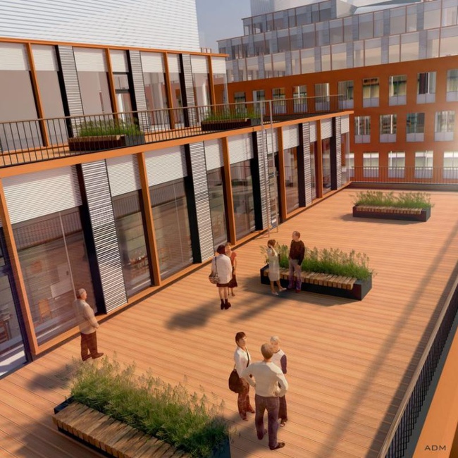
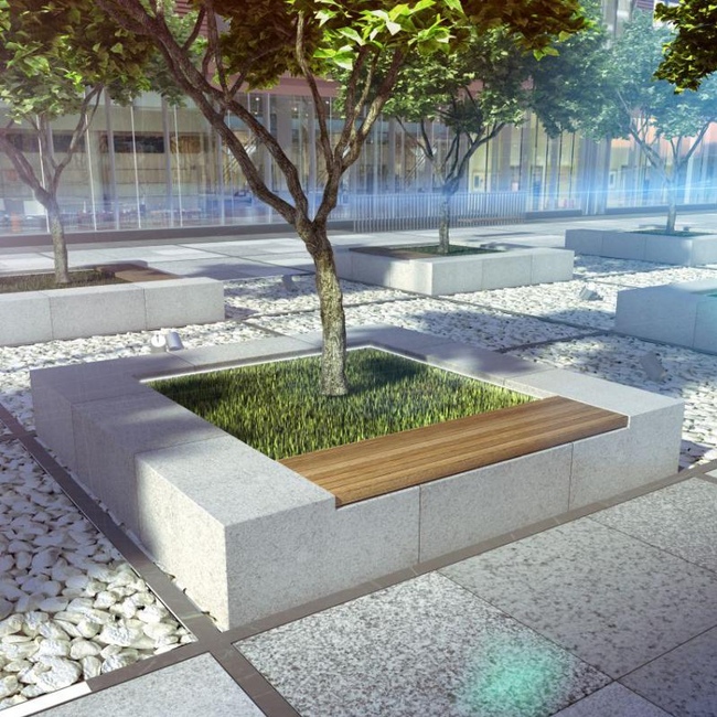
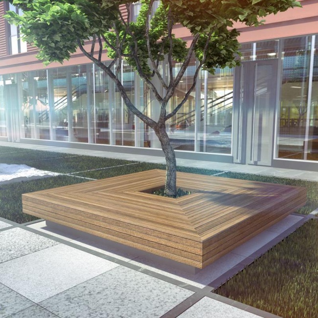
Photo by Julia Tarabarina Being devoid of opportunity to change the step-like silhouette of the upper floors, Andrew Romanov and Ekaterina Kuznetsova designed their facades in an entirely different way: light and made out of glass with slightly outstanding terra-cotta delimitation. Gradually stepping back from the edge, the upper floors form terraces in front of them, that the architects improved and turned into mini parks elevated above the city: the floors are covered with wood, the benches alternate with grass lawns. Incidentally, wood becomes yet another important, after the glass and the terra-cotta, material of this project. The walls before the building entrances are decorated with fumed spruce; wood is also used in the decoration of the benches on the territory of the "inner" boulevards.
Photo by Julia Tarabarina
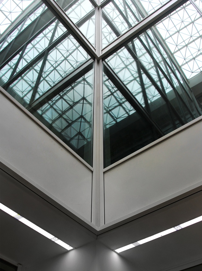
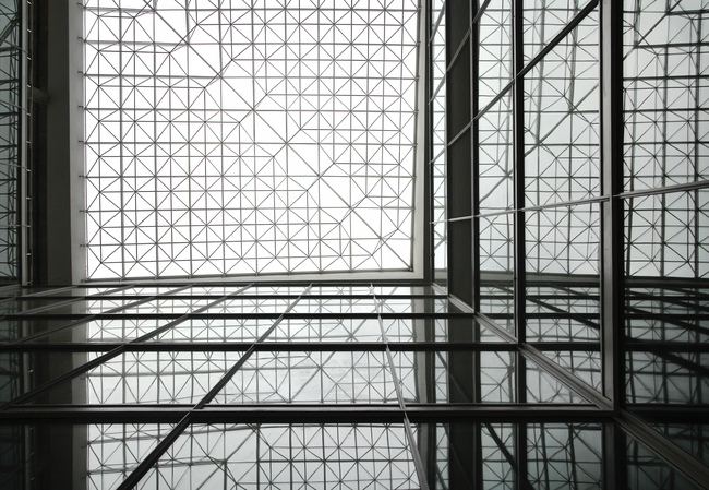
Improvement project, the terrace The atriums, one in the center of each of the
square buildings, are covered with MARCHI System (named after its developers,
the engineers of Moscow Institute of Architecture) that allows making the glass
roof virtually weightless. The interiors of the atriums are almost sterile,
while the pristine faceting of the glass surfaces, just as the narrow lines of
backlighting unobtrusively echo the main theme manifested on the facades.
Atrium. A fragment. Visible are the backlighting system installed into the breakjamb of the first tier and the reflection of the covering network in the glazing. Photo by Julia Tarabarina
Atrium. "MARCHI" covering system and its reflection. Photo by Julia Tarabarina.
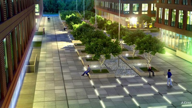
For the ADM architects, these boulevards are the favorite part of the project. The project of improving the adjacent land which is going to be open to the city public, is not yet fully completed. What is completed, however, is the granite paving that sports a pristine geometric pattern: narrow black strokes dissect the pavement and the surrounding green lawns into a network of large quadrants, picking up the unobtrusive theme of "speculative" structuring of the space, making it fit in with the general proportional order. Anyone who took drawing classes while still a child will remember the experience of building up a perspective by drawing a grid of lines helping to create an illusion of a 3D space on a 2D sheet of paper; some children even opted out of erasing this grid later on and keep its traces intact. Same thing here - the architects are so much into proportion work that even in the tiniest details they are trying to find an opportunity to implement this Cartesian grid and instill it in the careless Moscow territory.
Improvement project. A fragment.
Improvement project. A fragment.
Improvement project. A fragment. The improvements are not the first
thing that catches the eye - but they are to be seen everywhere. At some spots,
the quadrants are filled with granite, at some places - with grass, at some -
with snow-white pebble stones. Into the black lines of the pavement, the
strokes of footlights are neatly inscribed (that look very much like the lights
in the lower slants of the atrium walls). By day, unless you purposefully
search for them, are all but invisible. By night, however, they form a
large-scale ornament glittering under one's feet. Into these same black lines,
slotted outlets are inserted, the slanting to which is almost imperceptible.
Photo by Julia Tarabarina
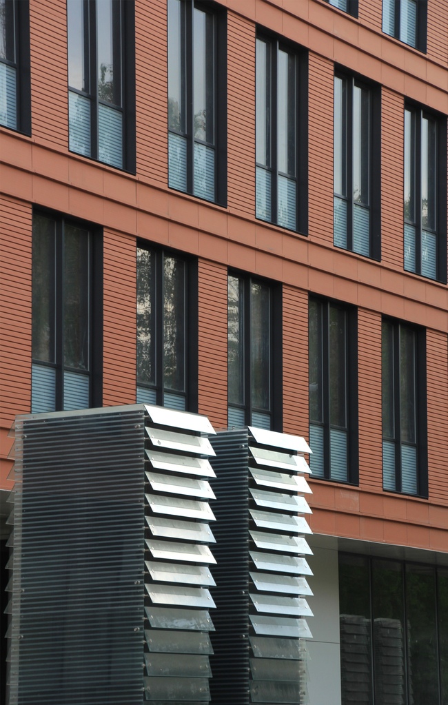
Photo by Julia Tarabarina The boulevards are skirted by trees planted on tall square pedestals, each third tree surrounded by a frame of wooden bench made of round plaques. The trees - some exotic sort of hybrid plum trees - are already in bloom. The picture is completed by the ventilation columns, decorated with slanting glass lamellae and looking like art objects or some eccentric artist's whim (although the architects keep saying: "If we could have done it otherwise, we surely would have").
The facades and the design of the air ducts of the underground car park echo with the design that uses the glass and the horizontal striped pattern. Photo by Julia Tarabarina. Even now, in spite of the fact that the improvements are still incomplete, the complex looks like a quality and expensive-decorated thing. This is not its only peculiarity, however. The main thing about this project is probably the exquisiteness of the lines of the regular and crystal-clear grid that is multiplied by the glass reflections and counterbalances the massiveness of the silhouettes by stretching the proportions and making all of the buildings of the complex look more austere, slender, and more "physically fit". This phenomenon of “weight reduction” through introducing order must be the main achievement of ADM architects who were able to change the initial project practically beyond recognition, endowing it with new stadial properties. In a nutshell: the architects were able to turn a decade-old project into a quite up-to-date building.  None None None None None None None None None None None None None None None None |
|