|
Published on Archi.ru (https://archi.ru) |
|
| 17.04.2013 | |
|
Wooden Mop of Hair |
|
|
Anna Martovitskaya |
|
| Studio: | |
| Totan | |
|
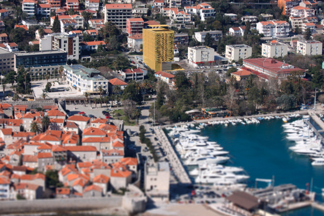
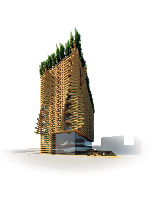
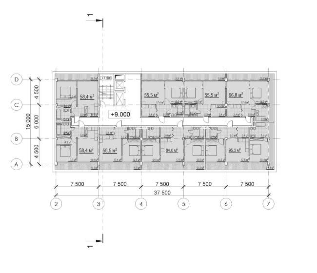
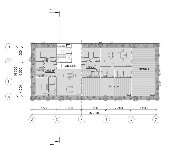
The contest project of an apart-hotel on the shore of the Adriatic Sea, developed by Totan Kuzembaev, has been awarded the Special Jury Prize The nine-story apart-hotel of fifty apartments will be built in the
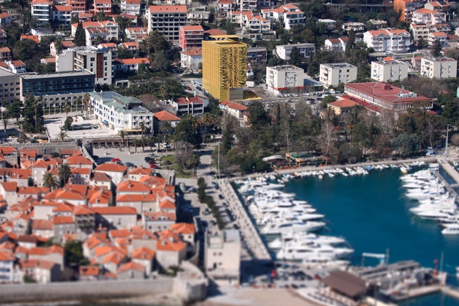
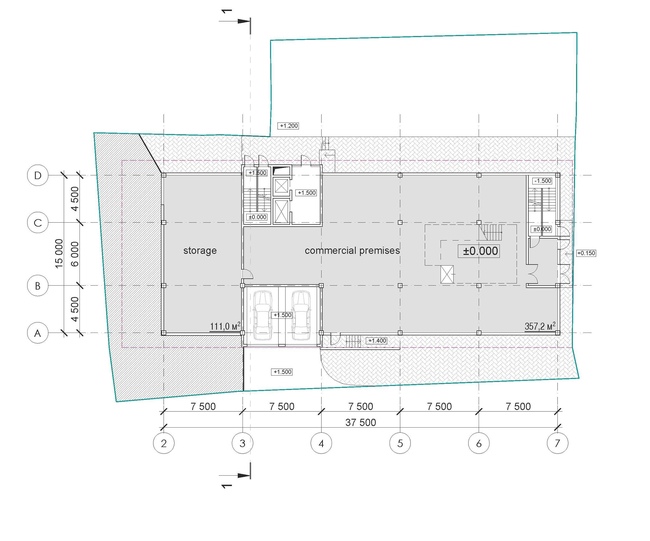
central area of one of As the architect himself shares, the contest specifications were put in
this nutshell: the contestants were to come up with proposals of a building
that would look impressive but not garish and that would precisely fit the
environment of this seaside town. The height of the future building was limited
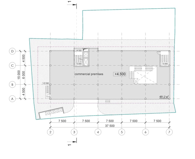
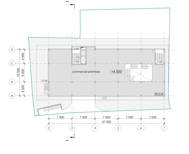
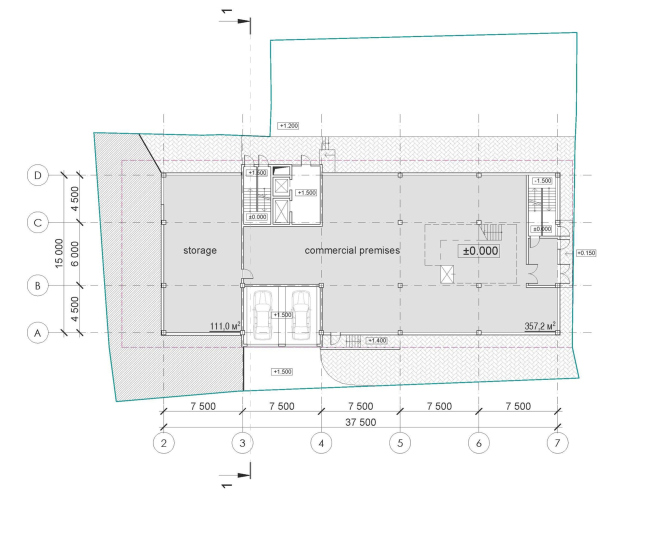
to nine floors, two of which were to perform the commercial functions. The fact
that the layout of the building would be of a rectangular shape, was clear to
the architects from the very start - standing in the beginning of the
Mediterranska Street, it would "head" a whole array of typical
"cubes", three floors of each overhanging above the shops and cafes
in a cantilever. Actually it was these "cubes" that not only defined
the width of the hotel facade that faces the sea, but also became the starting
point in the development of its architectural image.
His task here Totan Kuzembaev defined as the search for a reasonable
balance between the creation of a self-sufficient architectural theme and
paying homage to the building's surroundings. Proceeding from using a very
simple and laconic volume, he looked to make it "grow" in such a way
that the initial geometry would still be discernible even at the pedestrian
level, thus creating a feeling of continuity. This is why the two bottom floors
of the building that house the shops and stores get an expressly laconic
design, and are turned in a cantilever to their immediate neighbors. In other
words, in the case of this hotel, the residential premises also overhang above
the public functions, even though, due to its tallness, this cantilever is not
articulated so vividly - the architect but defines its presence. The latter is
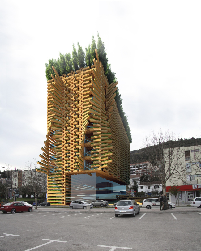
done with the construction materials as well: while the residential floors and
the facade that face the old town are dressed by Totan Kuzembaev into his
favorite wood, the "cubes" are looking at a fully-glazed
parallelepiped that looks as if it was "wedged" under the P-shaped
building at the last moment and is now supporting the terminal laconism of the
neighboring buildings with its facets.
And, even though Totan Kuzembaev's design presupposes the abundant use
of wood almost by definition, the architect prefers to give reasons for his
choice in this case. The thing is not so much that he likes this material and
not so much that he is a virtuoso expert in wood - for Budva wood was chosen,
in the fist place, in order to create, in the apart-hotel, a comfortable
microclimate in the hot summertime. Besides, the architect wanted to make the
"intrusion" into the
The seaside architecture, doomed to eternal search for the compromise
between the grand-scale glazings for the sake of beautiful views and protecting
this very glazing from the hot sunshine, inspired Totan Kuzembaev to make a
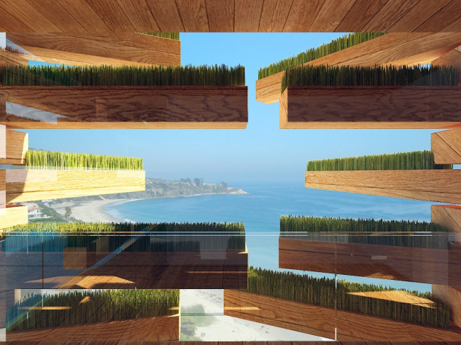
bold experiment. Choosing between the blinds and the shutters, the architect
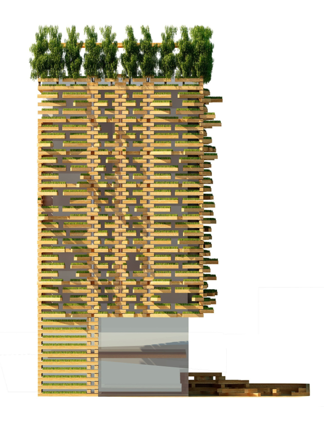
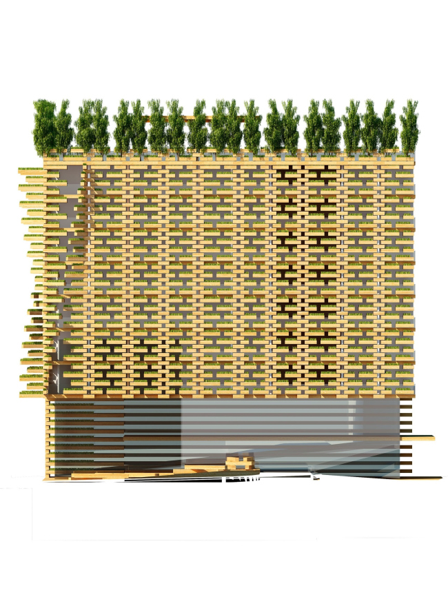
decided to try and cross these two elements: the function of the upper
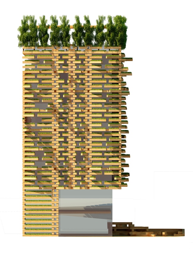
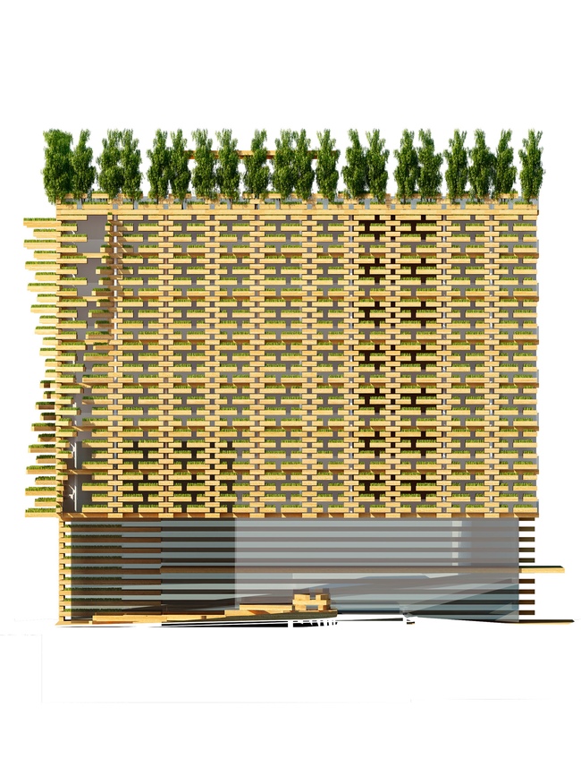
protective "casing" of the fully glazed facade is performed by a
sophisticated system of moving wooden troughs with soil and green planting.
They have a varying length and they are strung on a few pivoting axles in such
a way that each of the windows and each of the terraces gets the
"shutters" of their own. They all have opening amplitudes of their
own as well which can be controlled both from the master switch and from its
apartment. According to the authors of the project, the plants in the troughs
will not only add to the beauty of the seaside view but also will help keep the
cool air, and absorb CO2 together with the rainfall.
This cross between the blinds and the shutters also plays an important part
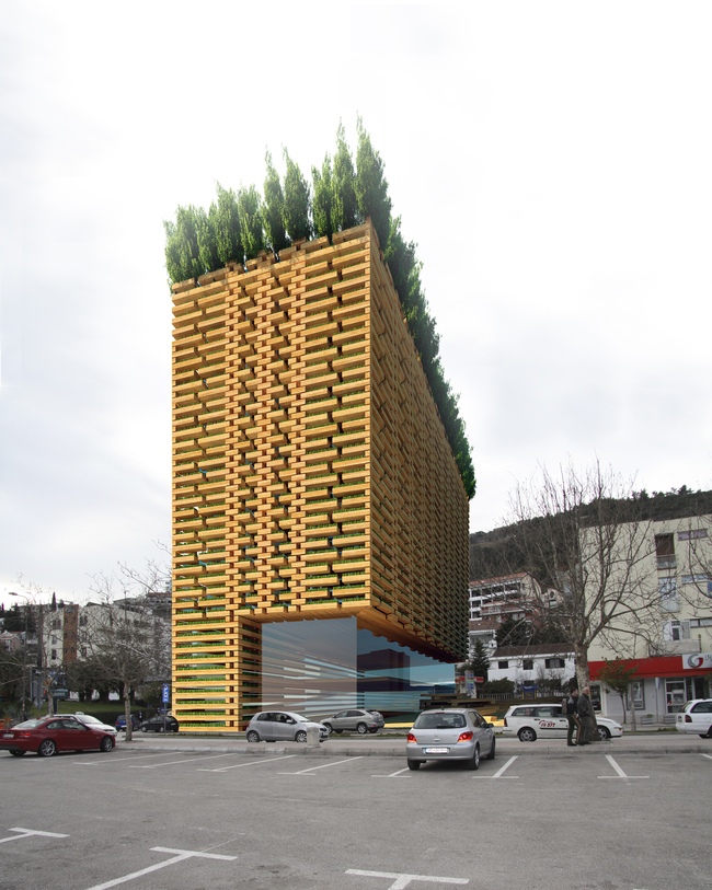
in creating the architectural image of the building. When they are shut the
hotel sports a rather minimalist look: the facades are only decorated with
these broad wooden stitches between which the greens are barely discernible.
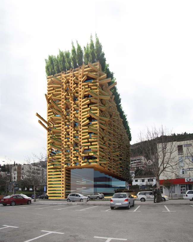
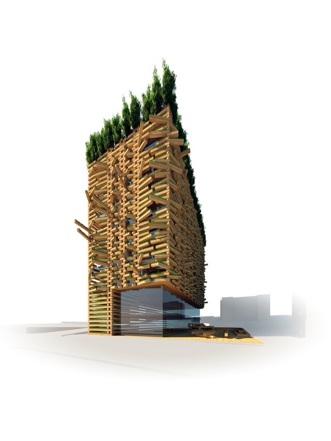
However, once at least one apartment opens its windows, the facade goes into an
immediate transformation bristling with wooden needles. The overall number of
possible combinations of open and close "lamellae" is even hard to
count - which endows this initially laconic volume with a lively and
unpredictable character. Actually, this is plainly seen from the visualizations
provided by the architectural studio: at times there is a wave running over the
surface of the facade, at times the facade looks like a mop of hair, and at times
from a distance it looks like a sophisticated anthill. The fact that this solution was not exactly the most inexpensive one
possible prevented Totan Kuzembaev from winning the international contest but
the jury unilaterally mentioned this project for its originality, recognizing
that the solution proposed by the Russian architects helps create a memorable
architectural image that also fully answers its intended functions.
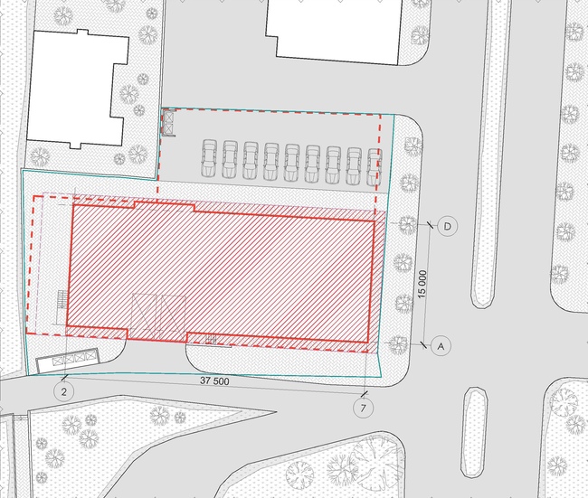
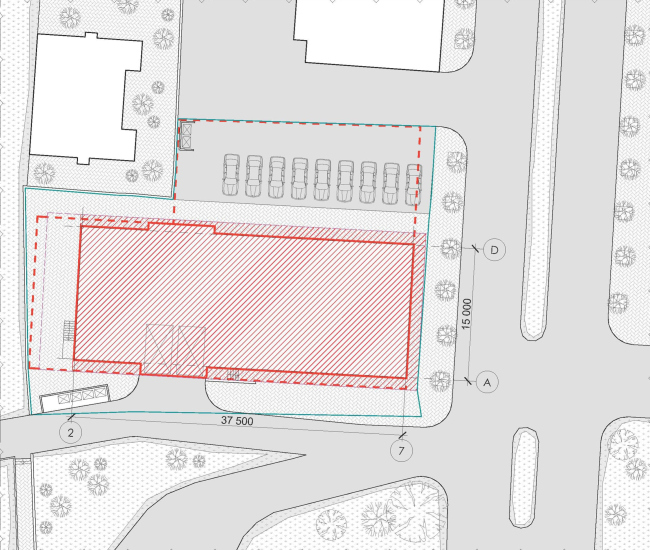
Location plan
NoneNoneNoneNoneNoneNoneNoneNoneNoneNoneNoneNoneNoneNoneNone |
|
