|
Published on Archi.ru (https://archi.ru) |
|
| 15.04.2013 | |
|
The Art of Rigid Boundaries |
|
|
Tatiana Pashintseva |
|
| Architect: | |
| Andrey Romanov | |
| Ekaterina Kuznetsova | |
| Studio: | |
| ADM | |
|
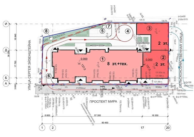
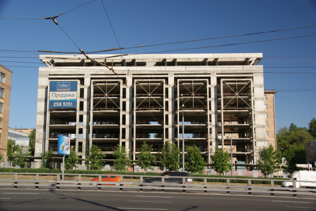
The Architectural Workshop ADM turned an obsolete protracted construction into a modern office center. For over five years, an unfinished concrete volume stood on the Mira Avenue in Moscow making a gloomy impression on the pedestrians with its hollow embrasures and the massive lattice constructions. Last year, the new owner of the building turned to the architectural studio ADM requesting to bring the “ruins” in order, turning the abandoned framework into a modern office complex. However, the customer wanted to preserve the projecting concrete pylons, so the architects literally couldn’t go beyond these pretty rigid limits.
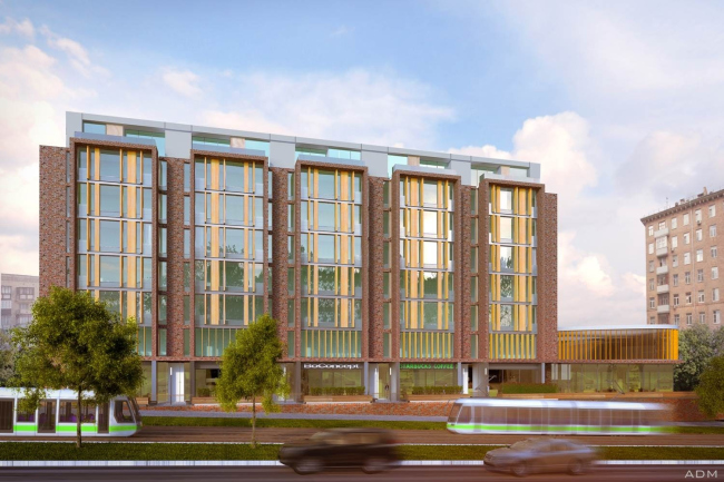
Moreover, these “limits” were not of completely ideal proportions: the already squatting volume seemed even stockier under a massive concrete canopy. And the brutal style, claimed by the former authors (unknown architects from abroad who made the original sketch-idea) goes off-key with the context of Stalinist architecture that prevails on the Mira Avenue. Of course, Andrew Romanov did not intend it to fully merge with the background but he still had to consider the surroundings. “We didn’t want the new building to become a featureless glass-faced building. We wanted it to fit in line of the Mira Avenue with its typical Stalinist architecture, that is, the skillfully traced facades, abundance of details and the indispensable ceramics” – the architect explains. Having thoroughly analyzed the present state of the unfinished building, the architects came to the conclusion that a cosmetic repair of the facade would not suffice. First of all, it was due to the fact that the schematic layout of the building did not quite correspond to its new functional program. For example, ADM had to do over the bank of lifts – add passenger and technical lifts; link them in an ergonomic way, organize comfortable elevator lobbies. But, of course, the main focus was set on the façade.
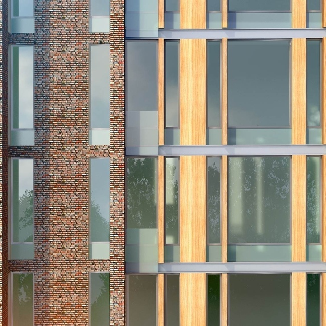
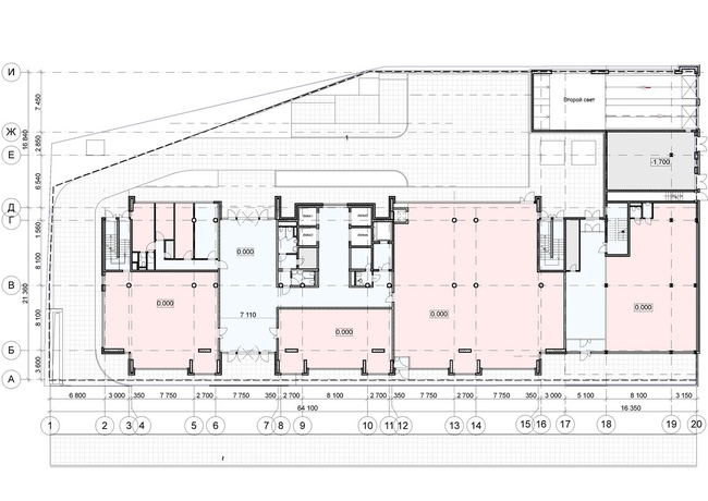
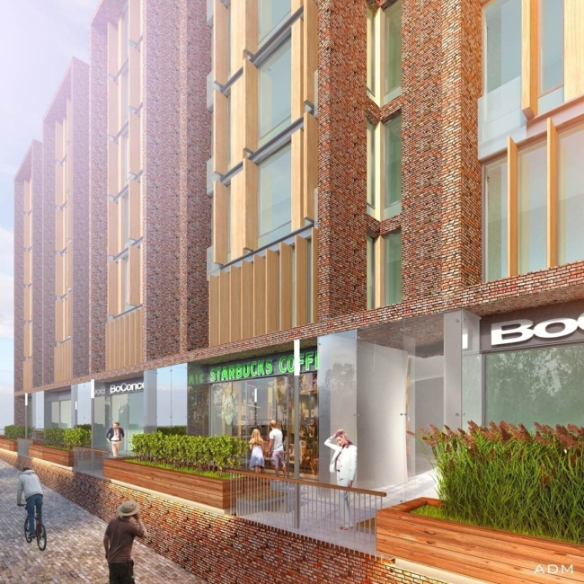
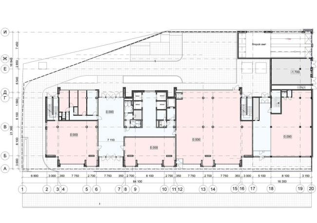
The first step was to fix the proportions. The building was “pulled up”, extending the five protruding bay windows, thus visually lightening its top and shifting the emphasis from the canopy. Another improvement had to do with the design of the facade – the architects wanted to give it an expressly modern but not minimalist look, and make the laconic surfaces look more sophisticated with the help of plastically regulated decorative elements. The detailing is achieved through graphical segmentation of the façade with protruding laths lined with composite Alpolic material of tree texture, that are set along to the glass. The solid parts of the facade (walls and pylons) are made according the Diat system of ventilated facades with “antique” ceramic tiles. Wood and variegated brickwork add warmth to the image and layout of multi-format slats and the thorough execution of the details (stemalite window-sill blocks, T-bars belted along the floors) set a human scale. The horizontal and vertical segmentation of the volume corresponds to the facades of nearby buildings and does not disturb the impression of the site development. The first floor, used for the shops and the service sector establishments, is covered with gray granite, which gives it solidity and visually emphasizes the typological zoning. The seven upper floors are designed for free layout office space. The top floor is provided with an exit to the open terraces. In addition, there is a two-story volume attached to the main framework: its first floor is also intended for public functions, and the second one – for the offices. And, while the “wooden” slats of the main building are delicately fused with the brick coating, in the extension they serve the only finishing element – the visual lightness and the natural color of these elements are designed to emphasize the small-scale look of the additional volume.
The construction of the office center is planned to be finished by the end of this year. And then one more “missing tooth” in Moscow will be made up for. “I felt sorry for this project. And, in spite of the fact that we were very strictly limited in its improvement and could not do all sorts of fronts, we have tried to do our best in the name of the city, so that we return the building, so that we could return the building to the city”.
NoneNoneNoneNoneNoneNone |
|

