|
Published on Archi.ru (https://archi.ru) |
|
| 05.03.2013 | |
|
Density as a Style |
|
|
Anna Martovitskaya |
|
| Studio: | |
| Arhitekturium | |
|
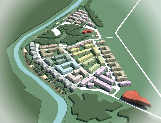
While he was designing a low-rise district named "Andersen" in "New Moscow" area, architect Vladimir Binderman tried to envisage how this small town would look like if it had been designed by, say, the great-grandson of the famous fairy tale writer. The land site with an area of almost
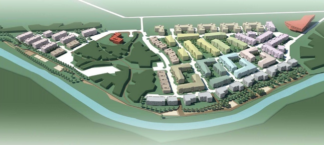
On the layout, the land site looks like an open hand fan, the outer
rounded side of it tracing the bend of the river, and the straight side
following the line of the highway. In spite of the closeness to the water,
there is no direct descent to it, this being the tall bank of the
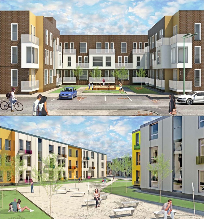
Towards the road, "Architecturium" turned the "П"-shaped sections that, while forming the outside housing front of
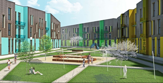
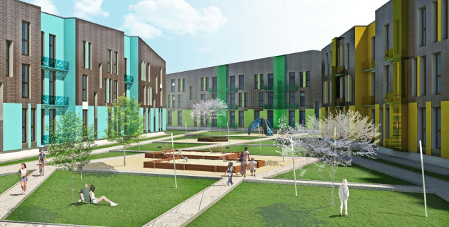
the district, will provide its residents with cozy little courtyards. In the
blocks of triangular shape, the architects only build the lamellar houses along
two sides, marking the third side with a single-entrance tower house that also
gives the courtyard more of a private feel. Most of the settlement is
predictably cut into rectangles, though - "Architecturium" came up
with as many as six options of their configuration which is meant to help avoid
the monotony of the environment and make the panoramas of the future town more
interesting.
In the closest vicinity to the woodland, the architects placed the
kindergarten; on the bank of the river - the sports fields and the playgrounds.
There are, of course, parking lots here as well - they are situated along the
outside perimeter of the blocks but casting even a casual glance at the master
plan one can understand that the number of parking stalls is barely sufficient.
"The increased housing density led to us providing but one parking stall
per one apartment - Vladimir Binderman explains - But we really did not want to
sacrifice the inner courtyards to make parking lots, simply because courtyards
crowded with cars do not make any sense for man". At the end of the day,
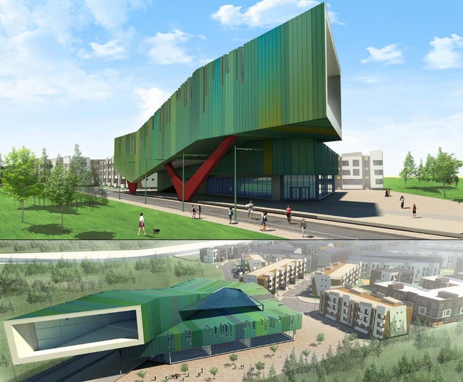
an out-of-the-box solution was found - while designing the traditional
community center located at the entrance to the settlement, the architects gave
up three out of its five floors to the parking garage.
Due to the fact that the road that runs from the settlement to the
highway touches the "fan" but at one of its angles, it is there that
the main entrance to the settlement is made. Accordingly, for the construction
of the community center, a triangular land plot was allotted, and the
architects decided to build a complex of this same shape. Had they acted
straightforwardly, though, the "signature" building of the settlement
would have stood welcoming its residents and guests with a sharp pointed nose.
This seemed trivial to Binderman's team, and not really sensible in terms of
providing the maximum useable space of the future building, so the architects
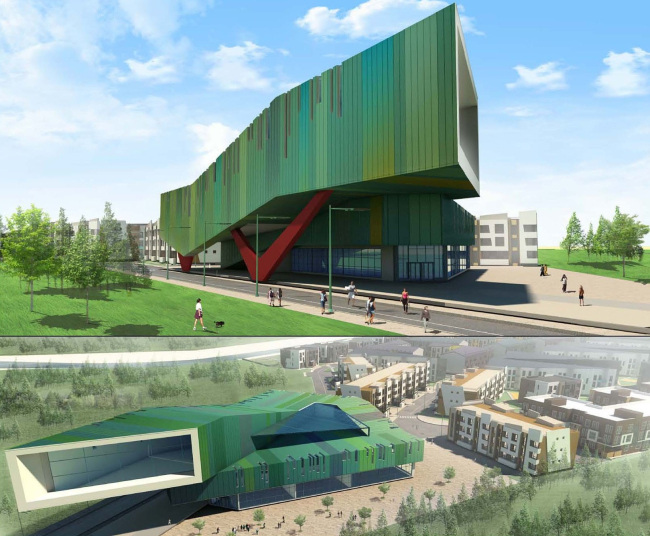
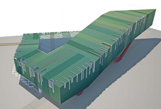
made is shape more complex. The triangle that was initially determined by the
master plan is formed by a square-section tube that is folded in an ascending
spiral in such a way that the main volume gets a fully fledged cantilever above
it that faces the entrance. The building can be compared to a coiled snake that
is tentatively and cautiously raising its head, but then again, this shape was
prompted to the architects not so much by the vicinity of the nature, as by the
very function of the building: in fact, it is a ramp that the authors make a
skillful spin of. On the first floor of the building, there are stores and
services, the next three floors house the parking garage, and in the
"hood" of the cantilever there will be a cafe. The facades of the
complex are designed in a similar fashion: the first floor has wall-to-ceiling
glass windows, the side wall of the cantilever is made transparent, and the
main volume, meant for the cars, is assembled from blind metallic panels that
are only at some places cut through with the narrow slits of the windows.
As far as the architectural solutions of the other houses are concerned,
"Architecturium" had to put in a lot of effort to persuade the
commissioner to shift his preferences to the side of the contemporary style.
Giving the settlement the poetic name of "Andersen", the commissioner
saw the appropriate architecture in his mind's eye: picturesque fairy tale
little houses referring you to your favorite pictures from your childhood
books. Vladimir Binderman proposed an alternative concept: contemporary Danish
houses are arguably the best in the world, so why not imagine that the
settlement on the Desna bank was designed by Andersen's great-grandson? All the
more so because the very housing density has nothing to do with the aura of the
good old fairy tales, while it has a lot do do with how the analogous
residential blocks are designed in
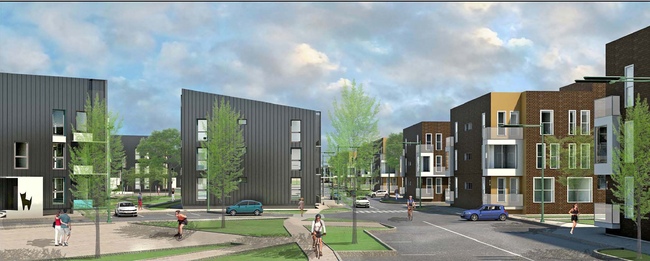
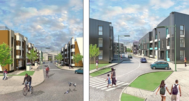
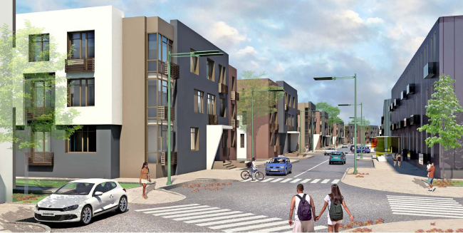
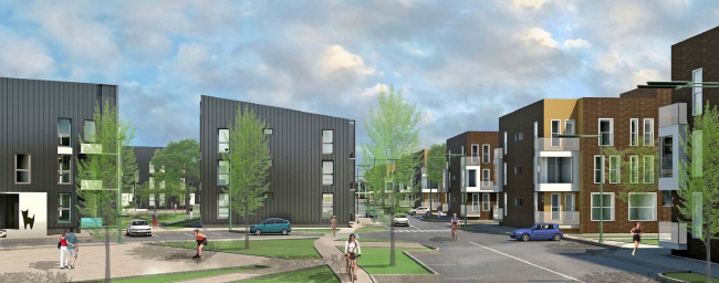
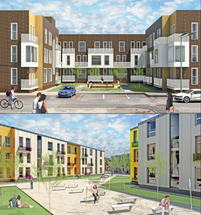
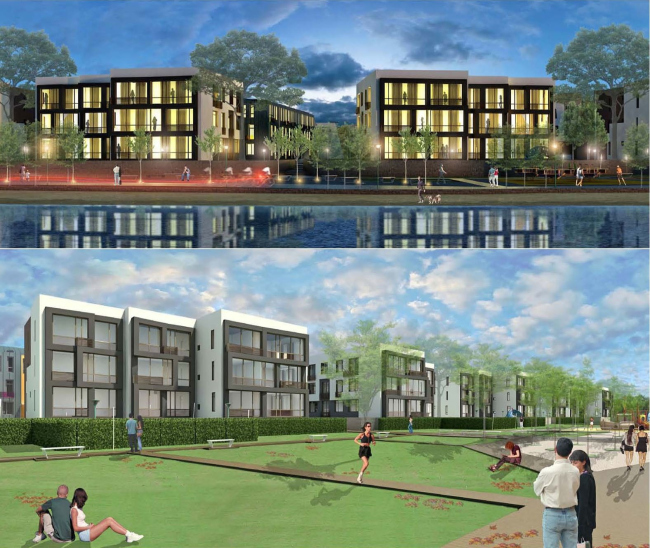
Thus, the sections of typical layout got the characteristic "Scandinavian" design of the facades: combination of dark-colored and light-colored surfaces, window jambs marked in a contrast fashion, inserts of multicolored metal, and the terminally laconic bay windows and balconies. Totally, the architects came up with twelve facade design options which help give individual image to every block. Having persuaded the commissioner to forego the idea of a too-obvious stylization, Vladimir Binderman's team suggested a tactful solution that puts one in the mind of the up-to-date samples of the Danish and Dutch architecture.
NoneNoneNoneNoneNone"Andersen" residential complex. Project of the community center © ArkhitekturiumNoneNoneNoneNone |
|
