|
Published on Archi.ru (https://archi.ru) |
|
| 25.03.2013 | |
|
Caspian Sea Oasis |
|
|
Alla Pavlikova |
|
| Architect: | |
| Andrey Romanov | |
| Ekaterina Kuznetsova | |
| Studio: | |
| ADM | |
|
The simple and functional volume of the hotel building is not only surrounded by a garden - it grows together with it, or rather, almost literally, grows OUT of it. The hotel will be built on the Caspian Sea shore in Makachkala's
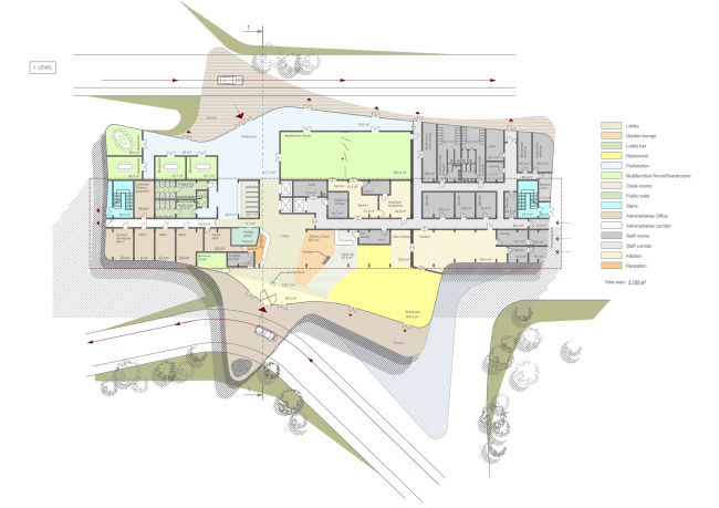
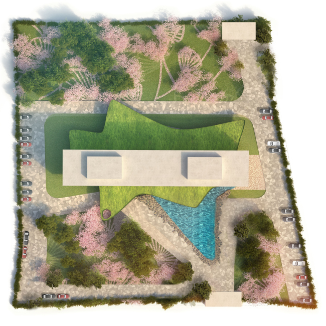
satellite town of Here, under the auspices of the Foundation of Social Assistance in the management of town planning "Novy Gorod" ("New City") (at a private investor's expense and without the involvement of public funds), it was decided to build a four-star hotel managed by an international network operator in strict accordance with international standards in order to create comfortable conditions for the representatives of the world business community staying in the republic of Dagestan. The hotel is also meant to serve sporting events, including the world-class ones: it is planned that during the football matches the hotel will accommodate the teams and the football fans. To develop a draft of such a hotel the commissioner invited ADM Bureau shortly before the New Year; now the project is ready to be submitted for the approvals. The first thing that the architects gave their thought to was the vicinity of the sea, that, paradoxical as it sounds, is almost invisible behind the dense housing of the neighboring blocks. Due to the seismic hazards (earthquakes up to a 9-point magnitude are possible here), the height of buildings in Makhachkala is restricted to five floors - this is why the idea of making a tall building that would rise high above its surroundings, was no option from the very start. As a result, there was only a small strip of the see left to be viewed against a rather bleak city panorama. Besides, the international operator's requirements to the efficiency of space usage were quite rigorous: what was demanded was the standard delimitation of rooms accessed from the corridor - and nothing more. "The most effective shape for a hotel building is a rectangle. This was not the case when we could afford any experiments with shape-making", - the author of the project Andrew Romanov shares. It looked as though the hotel building was going to end up as another rank-and-file dull parallelepiped. The architects, however, did not want to put up with this, and, as if to offset the mundane surroundings and the strict limits of the specifications, they lightened up the project by combining the simple orthogonal shape with the smooth "natural" curves. 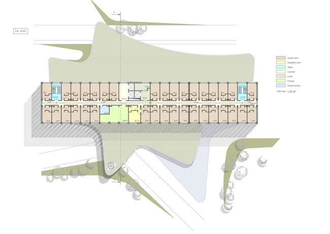 According to the specifications, the area of the first tier of the building that included the lobby, the restaurant, the meeting rooms, and the administration office, was to be almost twice as large as any of the other four floors of the hotel. Instead of following the example of "classic" modernists and turning this extra volume into yet another parallelepiped, the architects made its outlines sophisticated and curvilinear. A few triangular protrusions look like fins, and generally the entire plan of the first floor looks like a giant fish. The protrusions include the entrances to the reception, the lobby of the meeting rooms and the restaurant - their homogeneous intertwining spaces of free layouts seem to be spilling over to the outside area, leaving the inside rectangle for the maintenance premises behind the walls.
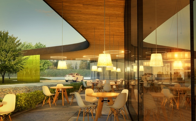
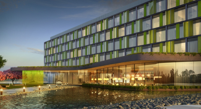
The roof of the first floor protrudes still further, forming a few large
marquees that inherit the rounded triangular shape from the outlines of the
lobbies of the first floor. The marquees overhang above the open-air terrace
along the glass windows of the restaurant and the spacious lobby, mark the
central entrance in a acute angle, and then fly out in a whirlwind wave in the
direction of the garden above the conference hall. "This is a purely
emotional choice, - Andrew Romanov explains - it comes from our wish to fill
the intimidating environment with a softness that is always comforting to a
man". For all its softness, the building is not at all devoid of its inner
energy: the marquees throw themselves over the driveways, reaching out to the
outside space as pseudopods of a science fiction creature that strives to
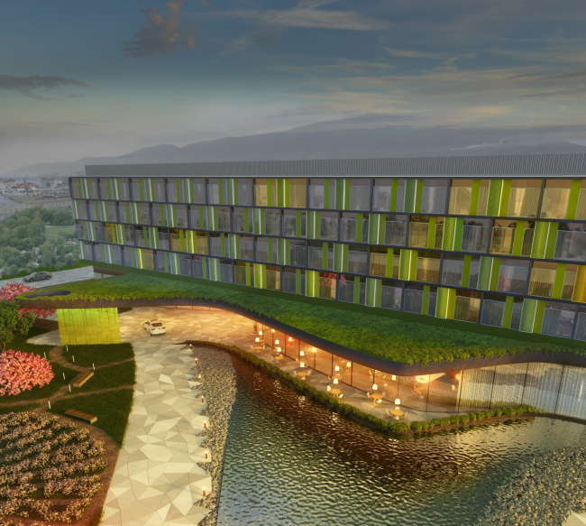
spread itself as far around as possible from its nucleus. The result is not only spectacular but also functional: in the rain, the
cars and busses will be able to set their passengers down directly under the
roof. On top of it, the whole roof of the first floor awning, according to the
architects' idea, will be completely covered with grass - when viewed from
above it looks not so much as the above-mentioned "fish" but rather
like a fancy lawn or, rather, an exotic water plant upon which, like Thumbelina
upon a leave of water lily, the architects put the slab of the hotel. (This
solution definitely reminds us of the green awning above the promenade in an
office complex in
This very slab itself, though, can also be likened to an offshoot of the
fantasy water lily of the first floor, all due to the fact that the facades of
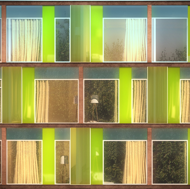
the hotel itself are designed in the multicolored green key. The characteristic
for ADM 3D metallic framework forms a regular grid whose equal horizontal cells
alternate in a staggered order. Inside, each "cell" (in actuality,
each "cell" correlates to a couple of rooms) is filled with verticals
in a jigsaw puzzle way - the bright transparent glass of salad color, covered
with thin stripes, falls into a diverse, but not chaotic, obeying certain rules
surface, charged with green-grass-of-spring optimism. The ethereal geometric
design all but conceals the horizontal intermediate floors that duly recede
into background and do not weigh down the overall impression by taking part in
the play of lines and color.
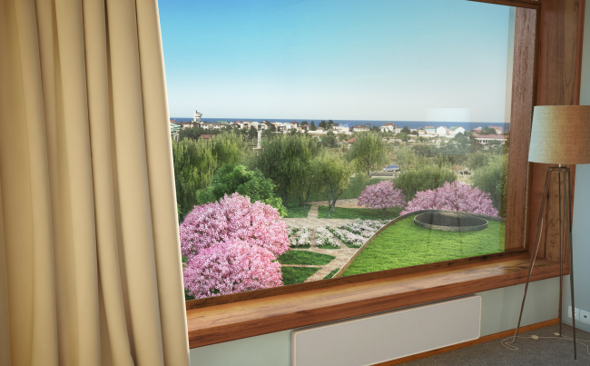
In all respects, the "green", nature-based image is skillfully enriched by a garden that, according to the architects' plan, is to fill in virtually all of the hotel's surrounding space (the parking space is also provided along the perimeter, though). The rectangle of the building is positioned in the middle of an almost-square site in such a way that on either side of it there was enough room left for lush vegetation: the fruit trees and blossoming bushes separated by paved footpaths and enriched by a small reflection basin whose triangular petal embraces the glass "nose" of the restaurant. The footpaths form sophisticated designs; the laconic wooden benches and small pillars of the streetlights are freely scattered around the grass - the landscape design got as much attention as the architecture of the building itself. The building and the garden are inseparable, just like a French castle and its inevitable park - they are the continuation of each other, and they play one and the same tune: the garden "walks in" through the glass walls, and, even when viewed from above, it remains the main context of the hotel - the characteristic sea cottages receded into the background and become of little significance.  Such careful treatment of the landscape and many other things that can all be described by the almost-outdated term "improvement", has over the recent years become the trademark quality of ADM projects. On the territory on
So, if the commissioner, as Andrew Romanov shared with us, wanted to get
a modern European-standard building, free of any historical or national
allusions, then the task is fulfilled. The building got quite a European
"face" that looks over the NoneNoneNoneNoneNoneNoneNoneNone |
|


