|
Published on Archi.ru (https://archi.ru) |
|
| 01.02.2013 | |
|
Yards behind a Wall |
|
|
Anna Martovitskaya |
|
| Architect: | |
| Nikita Yavein | |
| Studio: | |
| Company: | |
|
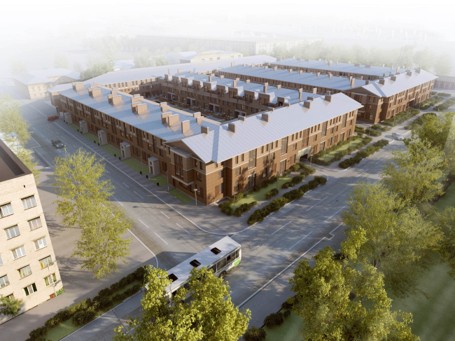
In the center of Kronstadt, architectural office "Studio 44" is designing a new residential complex. Bordering on the architecture monuments protection zone, the new project develops the principles of historical town-planning of this fortress town. The land site allotted for the construction of the residential complex
is located in the central area of Kronstadt, between Surgina, Zosimova, and
Martynova streets. Up until 2005, this place was owned by the automobile
operating company GATP-24, and then this area patiently waited for an investor.
In 2011 it was bought by "KVS" company that invited "Studio
44" to take part in the project. The developer explained his choice in the
first place by the fact that the team of Nikita Yavein has a tremendous
experience of doing residential projects in the historical centers of various
cities. For Kronstadt, this criterion was more than vital: right next to the
future residential district, heritage buildings are situated, and the complex
itself is to occupy the protected area, so, long before the new residential
complex ever came into being, various restrictions were put upon it. In
particular, the height of the buildings was not to exceed
Among the nearest surroundings, the
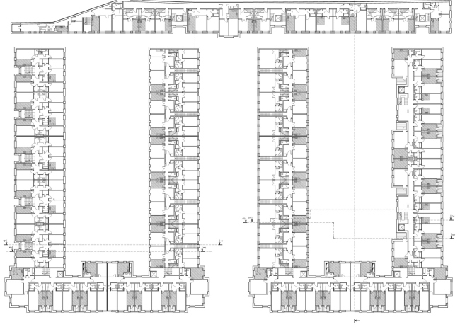
By doing so, the authors fenced off most of the land site - the
appearance of this "partition" of sorts let them make the most of the
remaining area. To the "splinter" building, they draw two "П"-shaped buildings, thus getting two closed yards and one yard open
to "Such a layout seemed to us to be the simplest and the most
efficient thing to do to provide the necessary differentiation of spaces -
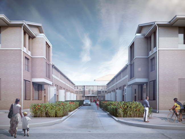
Nikita Yavein explains. - Through the middle yard, we put a passage to the more
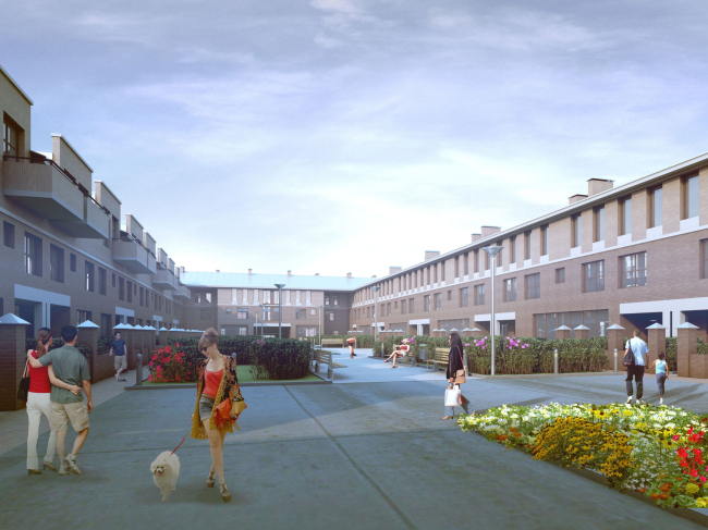
comfortable large-area apartments. Inside the courtyards
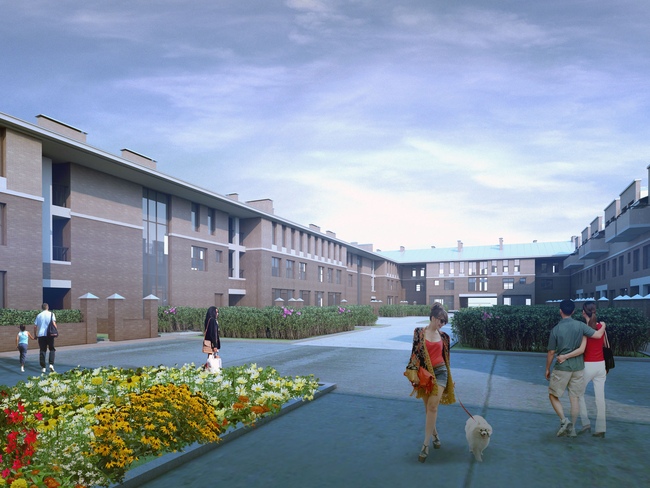
Designed in such a manner, the residential complex presents a rather
saturated and rigorously organized structure with a barely sensible resemblance
to a fortress or a military barrack. For any other residential complex built
for any other city, this comparison would have hardly been flattering but for
Kronstadt, founded by Peter the Great with strictly military purposes in mind,
it is not only appropriate but also it testifies to the maximum harmony between
the new complex and the environment that it enters. The architectural solution
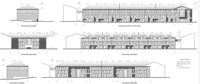
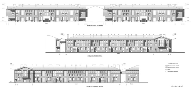
serves the same purpose: all the residential houses are facing the red lines of
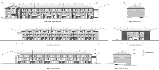
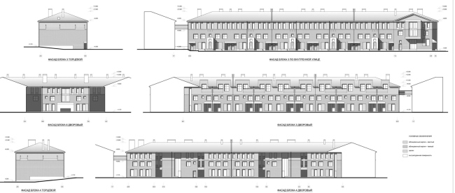
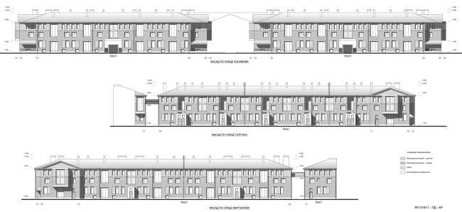
the block; the main facade is executed as a symmetrical three-part one. The
street facades as well as the yard facades are finished with bricks of two
shades of red, thus getting the color scale that makes them even more akin to
their immediate surroundings. The earth-table is coated with slabs of
"Putilovsky" stone, and the pitched roofs are made of metal.
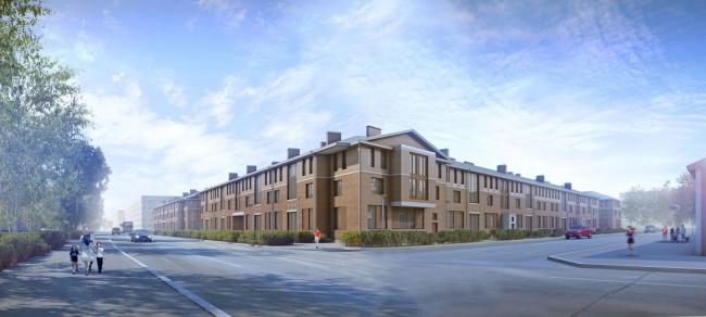
What is interesting is the fact that in both of the two "П"-shaped buildings the upper "stroke" is a little longer
than it should be, and the authors finish these "protrusions" with
rather massive rectangular bay windows and triangular gable ends. Such
"houses within a house" fix the outside corners of the complex, that
are turned in the direction of the crossroads. Just as the solemn portals of
the entrance group, painted white, these elements enrich the plastics of the
stretched facades, making them more dramatic and stressing their modern, or
rather "postmodernist" origin. The inside "yard" facades
look lighter at the expense of wide "niche" recessed balconies and
wall-to-wall glassing of the stairways - by doing this, the architects tried to
visually expand the stretched courtyards. And, while in the architecture of
this complex, as was already said, some "militarist" flavor is quite
appropriate, the last thing the authors wanted to do was to make the courtyards
look like drill grounds - by using green planting, paving, and other
improvement techniques they gave the inner space a friendly and memorable image
of its very own.
"Amazon" residential complex. Project 2011-2013 © Studio 44None"Amazon" residential complex. Project 2011-2013 © Studio 44"Amazon" residential complex. Project 2011-2013 © Studio 44"Amazon" residential complex. Project 2011-2013 © Studio 44None"Amazon" residential complex. Facades © Studio 44NoneNoneNone |
|


