|
Published on Archi.ru (https://archi.ru) |
|
| 10.01.2013 | |
|
Creation of Environment |
|
|
Anna Martovitskaya |
|
| Studio: | |
| Architectural bureau of Yuri Vissarionov | |
|
Two new projects by "Vissarionov Studio" developed for the cities of Archangel and Sochi... Different in climatic conditions, typology, and square footage, they have one thing in common: they create new public spaces. In both cases the work started from the task of designing a purely
utilitarian building - Archangel center of the city needed a new underground
parking garage, and in
In
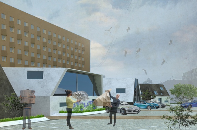
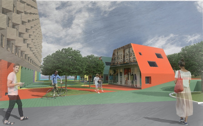
Besides the wooden mansions and the concrete vertical, in the vicinity
of the construction site there is yet another building that is hard to
overlook. This is a large multi-hallway condominium located on the other side
of the avenue and almost as long as the rectangular construction site. The
eight residential floors are raised on 1970's-style triangular pillars, behind
which there are the retail and repair shops occupying the ground floor. Further
on up, the only decoration of the stretched facade is the line of triangular bay
windows. Thus, the land site that is to be turned into an improved public space
neighbors with a roofed pedestrian gallery on the street level. The obvious
choice would have been to build up the extension of the pedestrian street with
little "vaudeville" mansions and limit oneself with the traditional
improvement coming down to benches and street lights - but the architects of
Vissarionov Studio reasoned that such a solution would be dissonant with the
huge silicate-brick wall as if bristling with the triangular
"thorns". This is why designing the volumes of sizes comparable to those
of the historical housing the authors of the projects strived to find for them
the shape that would simultaneously resonate with it and with the modernist
legacy as well...
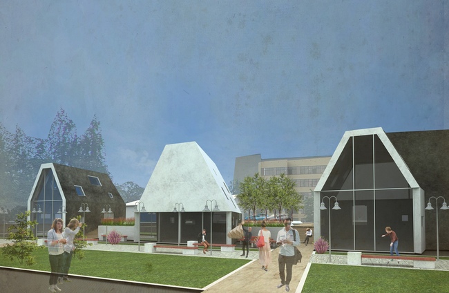
Such a compromise was found in building a few compact low-rise houses
(two floors max) with pitched roofs. On the one hand, the inclinations of the
roofs make these volumes akin with their "grandfathers" in the
extension of the street; on the other hand, the architects replace the
traditional apex with a flat fragment, and extend the inclinations down to the
ground, thanks to which the houses get the characteristic
"technocratic" silhouette that is closer in spirit and geometry to
the towering high-rise condo. The authors even go as far as to marry the new
space with the already-existing pedestrian gallery by means of the color
solution as well: one of the project options presupposes the massive rests
painted in bright colors "overflowing" down the asphalt and onto the
roofs. A less radical option proposes a monochrome, almost black-and-white
solution for the cottages - at the first glance it does not look too garish but
it still looks quite prominent against the background of the silicate bricks.
The contemporary "origin" of the volumes will be also stressed by the
fully glassed main facades turned to the pedestrian area under construction.
And, because these houses perform the function of expo and retail pavilions, in
the design offers the transparent facades are treated as showcases that in the
nighttime will provide the city space with extra light and comfort.
The former parking lot is going to be planted with trees, and the former
carriage way will be removed altogether, so the pedestrian area that used to occupy
the modest space under the protruding ledge of the condominium now becomes the
rightful and the only "owner" of the territory. The entrance to the
three-level underground parking garage that was in fact the starting point of
this project is located on the opposite side - between the complex and the bank
territory, and it is designed to be as inconspicuous as possible.
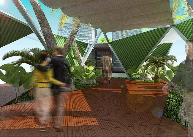
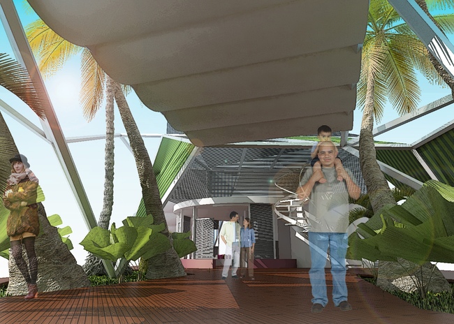
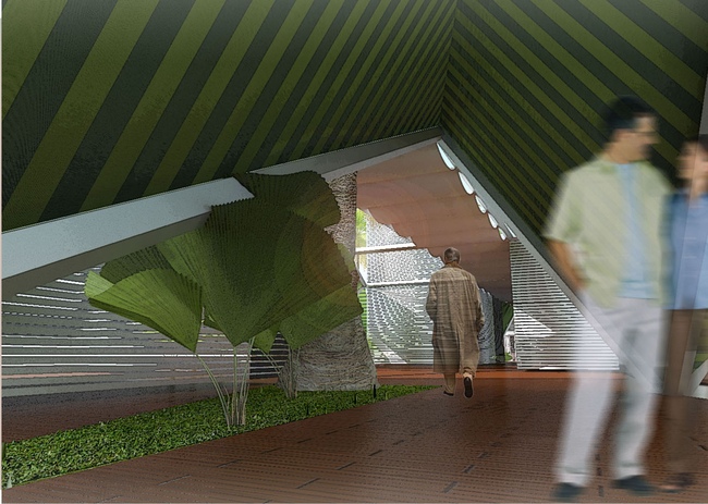
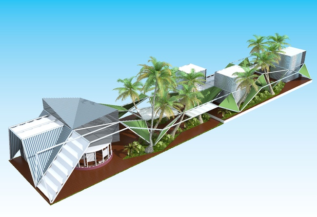
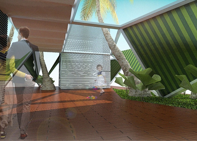
In
At the same time, the only area that allows expanding is the cafe's
green yard, so the architects were confronted with a difficult choice - new
construction or preserving the green planting. The designers were able to find
a compromise even here, though: as the main building material they chose
various sun-screening structures - tents, awnings, and even Venetian blinds.
"We ourselves define the typology of this comparatively small but
functionally saturated object as "café-shop with gazebo pavilions" -
the authors explain. Reconstructing the existing building of the cafe (the
architects are replacing its top floor and cover it with a compound roof, as if
borrowed from the masters of origami), the authors add to it a whole number of
light glass pavilions, filling in the spaces between them with plants, benches,
and dining tables.
The new structures are laconic cubes whose walls are made of Venetian
blinds, so, depending on the position of the lamellae they can become anything
from dead-blind to see-through. They are connected to the main building with a
band of awnings. And in order to keep these volumes from looking like the train
cars, the architects give different geometry to the tents - they continue the
theme of the roof of the reconstructed building, others are designed as
marquees. Together they form a chamber but at the same time sophisticated space
resonating with the vibes of the seaside resort city.
 None None None None None None None None None None None None |
|