|
Published on Archi.ru (https://archi.ru) |
|
| 24.12.2012 | |
|
A Block on Three Shores |
|
|
Anna Martovitskaya |
|
| Studio: | |
| Arhitekturium | |
|
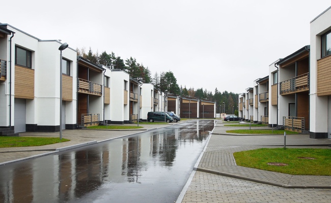
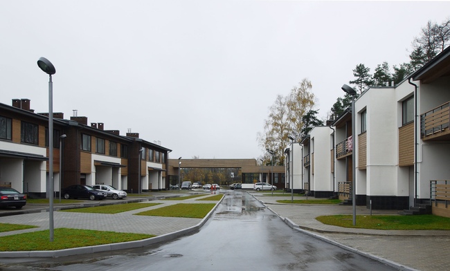
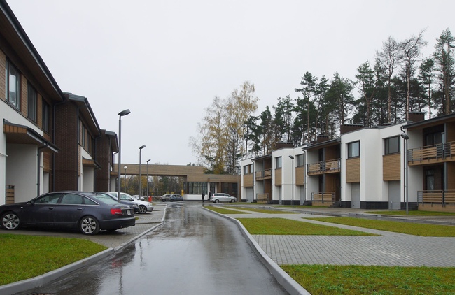
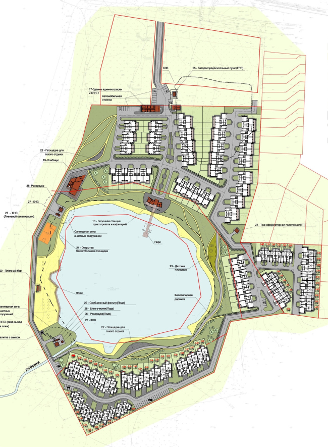
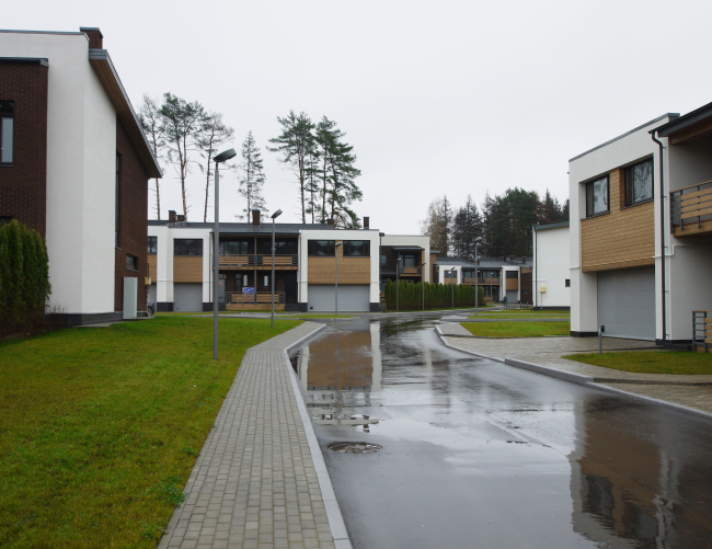
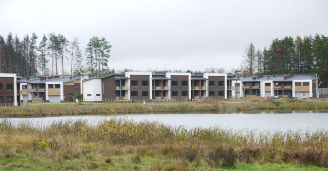
In the vicinity of Moscow area's Kransnogorsk, "Architecturium" studio is building a townhouse community named "Rizhsky Kvartal" (Riga Block). The classy low-rise houses are positioned around a large forest lake, and for Moscow area this is an example of the rare case when the name actually answers its content. This
settlement is sure some stereotype breaker. It starts surprising you once you
take the first look at its master plan. For one, in the spot where usually the
neat central square is designed (pseudo "European" style), or some
equally neat little creek is there, "Rizhsky Kvartal" sports a huge
body of water. Its area is quite comparable to the area occupied by the houses,
and, because the architects tried to evenly "spread" the townhouses
along the shorelines, the lake's unconditional leadership in the space
hierarchy of the settlement is all but obvious. It is the lake that sets the
general layout structure, as well as the style of the housing created by the
architects.
It
should be noted here that the "Rizhsky Kvartal" land site itself
looks quite matching on the land map, and has a fish-like shape: its triangular
nose is turned south, its wide tail is turned north, and its fin is turned
eastwards. The lake of an almost perfectly circular shape is inscribed
precisely in the middle of this figure, and, because the developers caught a
big and rather slender "fish" this time, only two shores out of four
turned to be wide and spacious enough for building houses upon. And while on
the east side, the issue is solved by the elongated rectangle of the
"fin" that the architects fill up with houses sparingly, the narrow
strip of land next to the water on the west side remains virtually vacant.
"There has always been a beach here, and we decided to keep its function -
all the more so because, according to the planning permission, the developer
was to create here the conditions for public water-based recreation - explains
the leader of "Architecturium" Vladimir Binderman - Besides, the land
here is rather swampy, and you cannot build anything close to the water - not
only houses, even a decent quay is impossible here. So what we did was make a
choice in favor of light structures - duck-boards, and almost weightless
footbridges. So, ultimately what we did was something Scandinavian or Baltic -
and this is how we made up our minds about the overall style; it had to be
described with the following three words: natural, sturdy, simple".
And,
while around the lake there appears the developed pedestrian area, along the
border of the land site, the architects run a road that circles the lake in a
wide loop and connects the separate housing segments. These are clearly visible
on the master plan: one group of houses is situated at the settlement's driving
entrance, between the highway and the lake, the second group consists of rows
of townhouses that fill in the already-mentioned "fin", and the third
one is the residential area on the other side of the lake. Incidentally, this
"forced" disunity of the blocks played only into the hands of the
developers - it was now really simple to determine the construction priorities:
presently, the "North Bank" is already put into operation, the
"East Bank" is under construction, and the "South Bank" is
expected to be put into operation by the end of 2013.
This
settlement has no traditional Main Street as such, the one that is usually
pierced with the capillary of the inner driveways and private property -
perhaps the already-mentioned promenade around the lake can count as such - no
matter what block you exit, you find yourself in the developed shoreline area.
At the same time, the layout of each particular segment directly depends on
where exactly in the settlement it is situated in relation to the lake. At the "South
Bank", for example, the houses are made as open to the water as possible,
in fact, they face the water in a single frontline, while at the "North
Bank" the houses stand with their side walls turned to the water, and with
a little shift in respect to one another. The architects, however, did not want
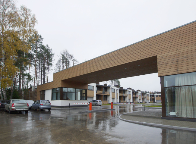
to "cut" the trivial "view corridors" from the entrance
area to the lake, and this is why the central promenade near the water is
flanked with two houses consisting of six sections each; in the future its
perspective will be completed by an elegant fully-wooden volume of the marina.
"This solution helps us to let the settlement keep the lake all to itself
- it's virtually invisible from the highway - and at the same time the housing
that's on the side of the highway takes on a certain depth and
multidimensionality" - Vladimir Binderman explains.
The
square footage of the houses gradually increases as one gets closer to the
water's edge: while the "North Bank" is mainly overbuilt with 200-
Vladimir
Binderman reminisces that over the several years of working on this project his
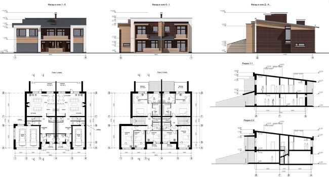
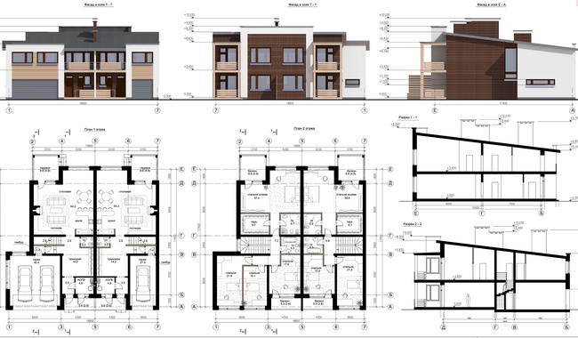
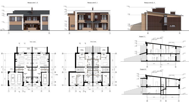
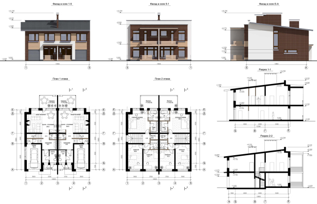
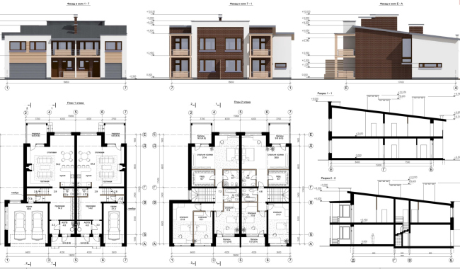
studio has come up with dozens of planning solutions for the townhouses. The
architects drew fully-wooden houses, houses that were coated with natural
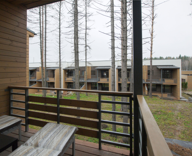
stone, and even lofts - but ultimately the "reserved" Scandinavian
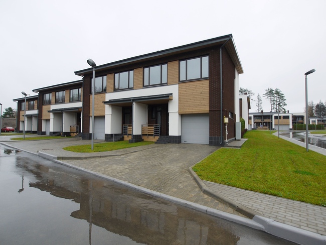
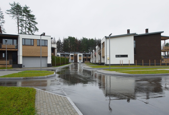
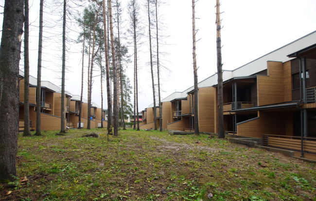
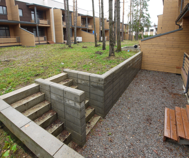
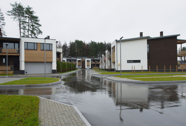
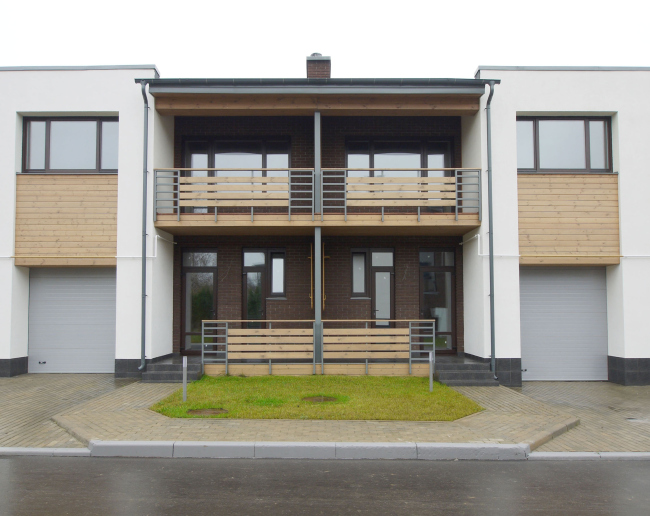
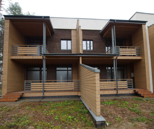
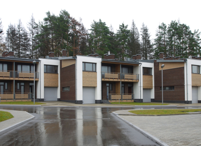
style prevailed. The rhythmic shifts of the houses in respect to one another,
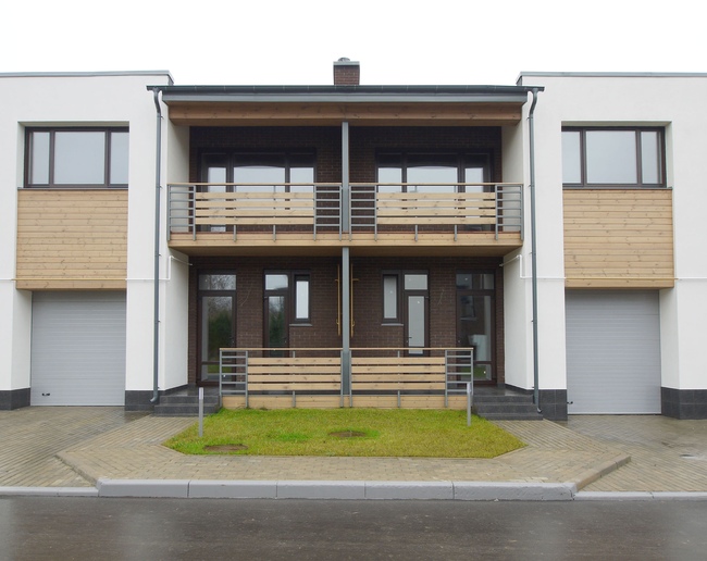
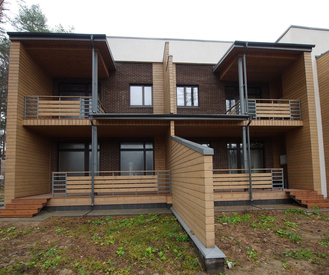
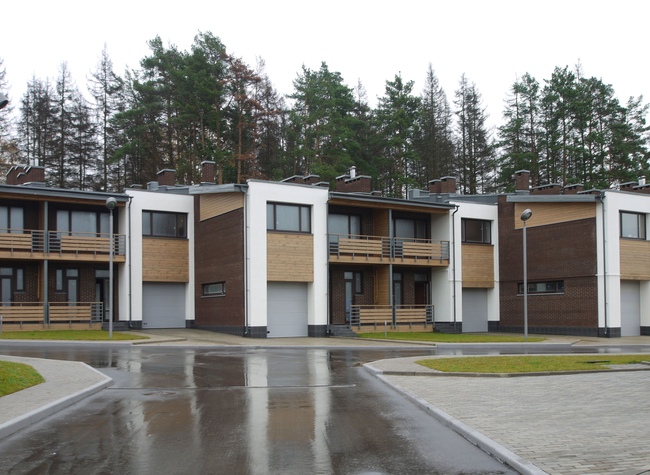
the alternating of the advanced and recessed planes, balconies, and terraces,
the lean-to roofs that look like flat rectangular portals and the flatly cut
awnings - all this immediately strikes you as something "Finnish" or
"Baltic". But it is not the architecture alone that makes this
settlement look like a piece of Northern Europe - the strictly measured
combination of materials and stylistic devices that the authors of the project
never break away from seems to work to its fullest particularly in conjunction
with the pine trees, the waters of the lake, and the generous amount of the
public spaces.
NoneNoneNoneNoneNoneNoneNoneNoneNoneNoneNoneNoneNoneNoneNoneNoneNoneNone |
|

