|
Published on Archi.ru (https://archi.ru) |
|
| 18.02.2013 | |
|
The Art of Being Different |
|
|
Alla Pavlikova, Julia Tarabarina |
|
| Studio: | |
| ABV Group | |
|
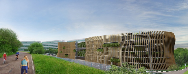
АВV Group architects have designed a parking building in “Krylatsky Hills” Business Park. The parking building considerably differs from the office buildings yet harmoniously blends with the adjoining park. An open six-level parking structure is to be built on the territory of
Krylatsky Hills Business Park. Designed by Boris Levyant’s ABD architects in
2002-2003 and constructed in 2006, this office complex became famous in Moscow
at that time as an entirely new kind of business park, a cleverly designed
project and a fine example of minimalistic business architecture.
However, the business park had an initial disadvantage: its four
six-storey office buildings with the total area of 10000 square meters
apparently lacked open parkings on its territory. Adjacent streets got packed
with cars and as soon as the offices were rented out heavy traffic and lack of
parking space made the area nearly disastrous. So a multi-level parking
building was to be constructed on the territory of Krylatsky Hills Business
Park. The architects of Nikita Biryukov's АВV Group were to design the parking area
destroying neither urban nor natural surroundings and so that the construction
process should not interfere with the office life.
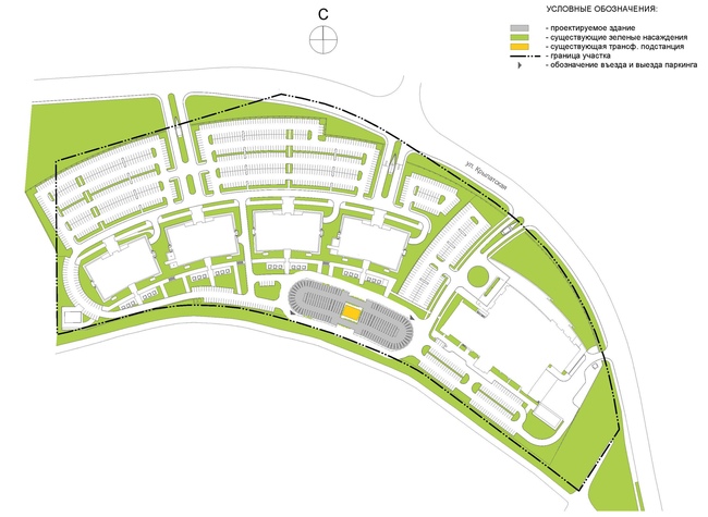
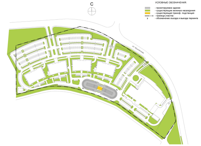
The new parking is to be built on a site in the south-eastern part of
the business complex separated from Krylatskaya street by a circular arc of the
business park office buildings which stretches from the Medical Centre in the
east to the panel apartment blocks in the west. The multilevel parking will
stretch along Moskvoretsky Park, one of the Moscow’s largest parks, much loved
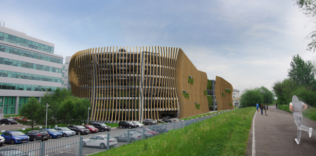
by skiers. The building is supposed to harmonize with the park. The parking
will have no external walls so that the floors are aired. Instead of walls
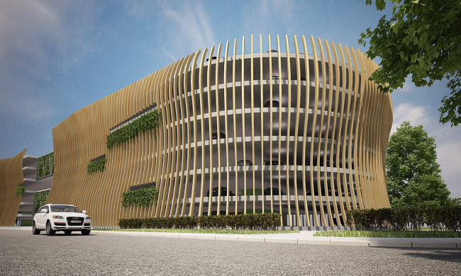
there will be a secondary structure consisting of vertical wooden lamellae. These
lamellae are bent in smooth, slightly irregular waves giving the impression of a
transparent moving mass or soft long grass stirred by the light wind or slender
tree trunks or even a giant skeleton of some prehistoric animal suddenly
discovered in a Moscow park. Strictly speaking, these lamellae are an
independent though a bionic-associated structure. Yet the facade is transparent
like a sunny pine forest and the roof outline like the tops of the trees is
stretching high above in the sky.
Bits of greenery in the construction also contribute to the effect of the
freshness of nature. The architects have adequately coped with all the design
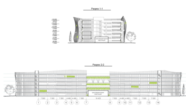
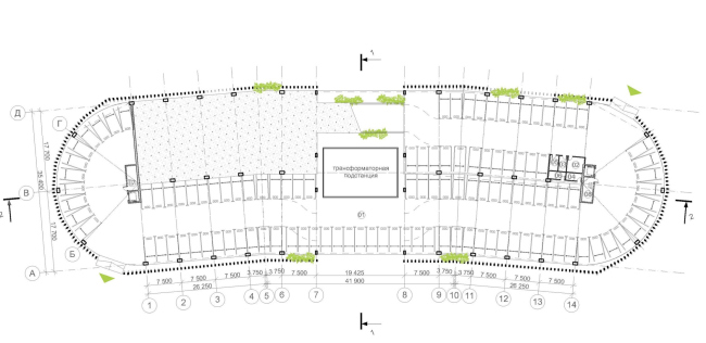
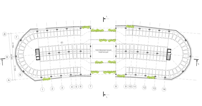
tasks. Right in the middle of the site there is a transformer box which cannot
be moved about as the construction process should not interfere with the office
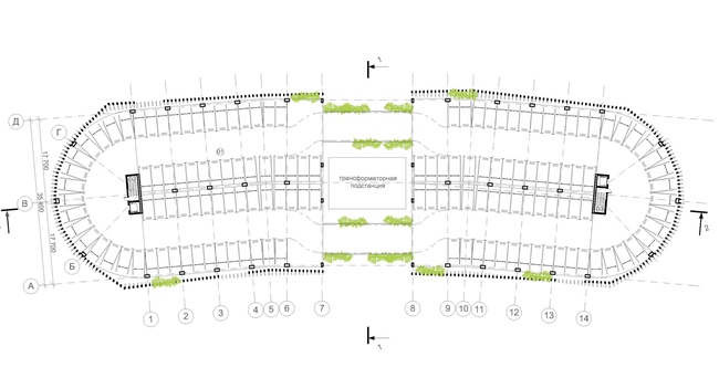
activity. So the architects have divided the building into the two parts
connected by metal girder bridges for cars to move from one part of the parking
to the other.
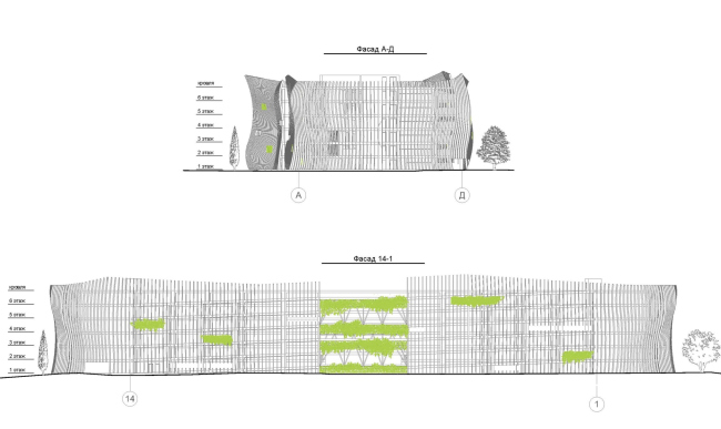
Facades
Division of the building into the two parts has made it look bigger, its
image lighter and its structure more diverse. Besides, the opening lets the
staff in the business park enjoy the lovely views of Moskvoretsky Park. The
design of the building is greatly influenced by its natural surroundings as the
design concept is to create a blend between strict regular city architecture
and irregular, alive and transparent park nature.
And the building looks like a natural part of the green area rather than
that of the adjacent business park buildings which are regular and simple due
to a combination of angles, wide stripes and smooth facades while the parking
is a curvilinear structure with undulating lines and a transparent framework.
Glass and aluminum are contrasted with wood and green, horizontals - with
verticals, and regular office life – with the park freedom.
The office buildings stand in a circular arc while the parking building
bends just slightly as it stretches along the nearly straight-line park
boundary. The new building is bending in its own way: visually “rotating” it loses
all of its angles. As architect Ivan Loginov explains, “All the buildings of
the business park office complex have straight-line shapes so another similar
building would not harmonize with its architectural and natural surroundings.
On the contrary, soft lines look quite harmonious. Besides, round gable façades
provide more car parking space which is crucial for this project.”
Location plan The main task of the architects was to efficiently use the allotted
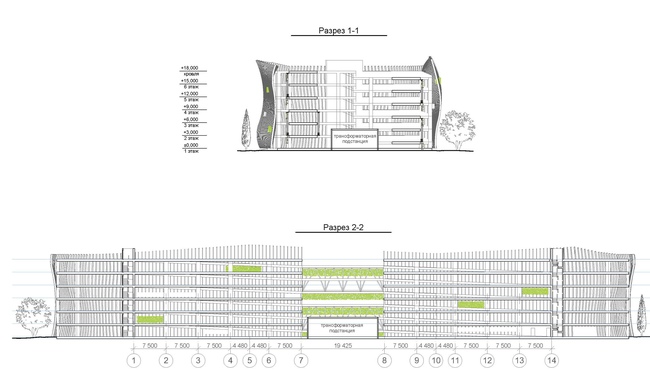
space to provide the maximum amount of car parking places. Wooden façade ribs
rising above the roof slab form the upper, namely the seventh, level of the
parking building. In fact it is not just a decorative architectural technique
but the wall of this upper level as you can park your car on the “roof” since
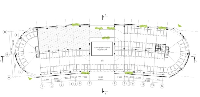
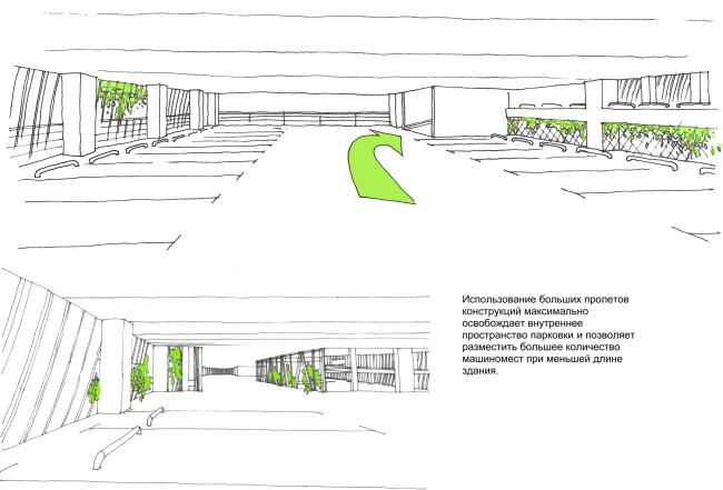
the parking gets an extra level. The concrete piers are separated by a
considerable span of 17 meters, with one row of piers forming the perimeter of
the building, the other standing along the central longitudinal axis and large
spans between the piers providing ample parking space within so elegant a
structure. “To make the construction solid the floor slabs will be thicker but
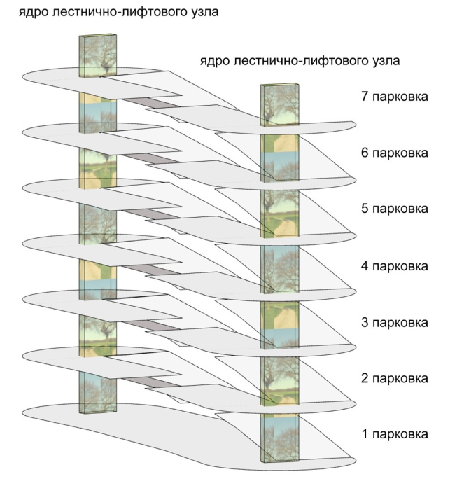
considerably lighter than usual”, Ivan Loginov explains. The interior space of
the building is designed according to a famous but rarely used in Russia
pattern of a car parking ramp: the floors in one half of the level are sloping
so the cars stand on a sloped surface. The architect underlines that “this
system provides plus 20 percent of parking space.”
Structure
Sketches So the parking building is entirely practical as its essential function
is implemented here together with careful space saving. However, this designing
project goes far beyond a simple engineering task: the architects manage to create
an impressive unique structure which markedly differs from the adjacent
buildings yet looks quite harmonious on the border between the city and the
park.
As for the historical aspect, one cannot but remember that garage
buildings were much favored by the Russian avant-garde architects who mastered
their skills in designing large structures. A lot has changed since then: car parking
which used to be an almost futuristic task connected with creating a new world
has come to be a daily necessity. And we can see that this sphere still offers
lots of opportunities.
Sectional views
Layout of the ground floor
Layout of the typical floor NoneNoneNoneNoneNoneNoneNoneNoneNoneNone |
|

