|
Published on Archi.ru (https://archi.ru) |
|
| 25.10.2007 | |
|
Accord and fight |
|
|
Julia Tarabarina |
|
| Architect: | |
| Sergey Kisselev | |
| Studio: | |
| Sergey Kisselev & Partners | |
|
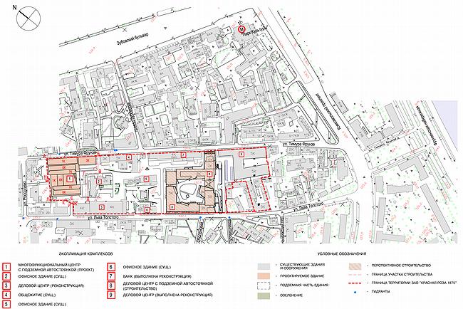
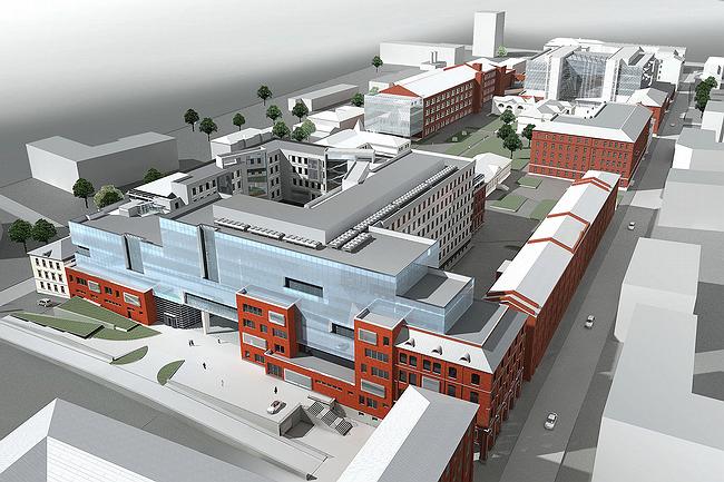
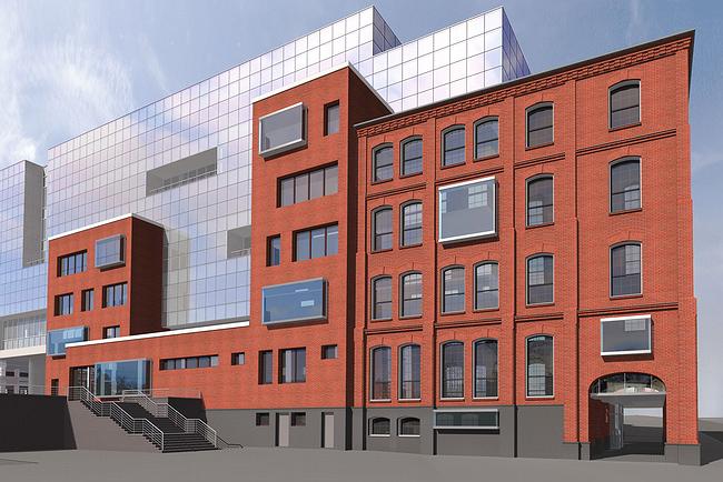
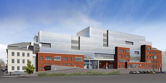
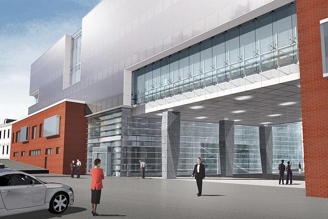
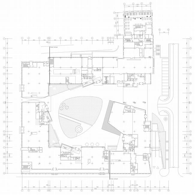
Architecture of the largest of Red Rose’s new buildings is a sculptural etude on interplay of the old and the new. They live in peace, but in some parts the façade turns into a battle scene Reconstruction of the ‘Red Rose’ factory’s territory is the newest and most famous project in Moscow of such kind. We might as well say that this project, started in the beginning of 1990’s, is one of those that have given a start to the tendency of turning industry zones into modern business (rarely residential) areas. In 2003-2004 ‘Sergey Kiselev and partners’ company designed the town-planning concept of ‘Red Rose’ territory reconstruction and then made projects of the two most grand office buildings of A class. About one of them, the ‘shed’ building №1, we have recently told. The second one, №8, is on the opposite, southeastern part of the territory. Building №8, started in 2007 (spring), is a huge square with the inner yard. The largest in the block (total area is over 61.000 m2) this building will unite a few facades, restored according to the layouts, an old building and modern glass of the chief volume. The saved building joins the main one from side and its front views Timur Frunze street. The architects said this was the most expensive one - a small and extravagant diamond surrounded with ‘useful area’. Very probably, it will be sold at higher cost to some huge representative office. Only, there will be the three façade walls left, but they won’t be concrete, but made of old brick. It cost even more to firm foundation so that walls wouldn’t fell down. Along the opposite, Lva Tolstogo street, there are three facades that are to be dismantled and further reconstructed according to survey (they get into the ‘influence area’ of the monument – museum-cottage of the writer). These are the stretched brick building and the two small houses, faced with yellow stucco. For the reconstruction it is planned to use German hand-formed brick that imitate materials of 19th century. In the lower part of the red façade there will be gallery instead of windows that is widened due to pavement. By the third façade there will be the narrow street that have never been here before. From the north building façade begins with the saved brick part, on the south it ends with the reconstructed and stucco part. Between them – a well-seen implementation of the interpaly of the two origins of modern architecture: manufacturable, structural glass and contextual searches that is alright here and inevitable due to historical ‘frames’ from the both sides. Architectural forms make a kind of sculpture here – it’s really a battle-scene describing ‘modernism’ and ‘history’ fighting with each other. The ‘old’ buildings, that flank the composition, send their emissaries to the middle part – red-brick plates that go fighting with the huge glass volume, which grows higher extending a little from the line of the narrow street. The fighting line breaks up, curves and is covered with wide arch of the passage in the middle, in some parts brick planes are covered with glass oriels – opponent’s agents; but they ‘keep ground’ – and it seems that in answer, there appear asymmetrical ‘impulsions’ in modern surface– deepened loggias. Everything’s dynamic, graded and will be made of expensive structural glass that allows creating huge and solid stained-glass panels. ‘Dynamic potential’, perceptible from the narrow street side, effects differently the inner yard. It’s square space looks like a leaguer of modernism surrounded with reconstructions and restorations, placed along the perimeter. Here, in the yard, there is much glass in giant concrete frames, interlacing different shapes, asymmetrical insertions. Volumes of staircases, that are closer to the three facades of the yard square, are unfolded in 20 Co toward walls, on the 4th level motion is seized by alike ledge of the large hall, so the space of the yard is not that square but goes spiral. If you look at the building layout you will see that the outline of the inner yard consists of the two squares, turned towards angle-wise and overlapped – main volumes and the walls follow into line with the first one, and staircases to the other one. NoneNoneNone NoneNoneNoneNoneNone |
|
