|
Published on Archi.ru (https://archi.ru) |
|
| 27.12.2012 | |
|
House of Multicolored Fairs |
|
|
Alla Pavlikova |
|
| Architect: | |
| Igor Shvartsman | |
| Studio: | |
| Sergey Kisselev & Partners | |
|
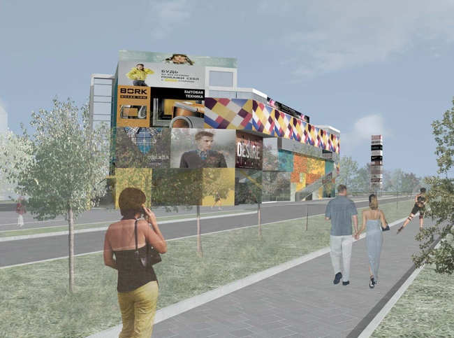
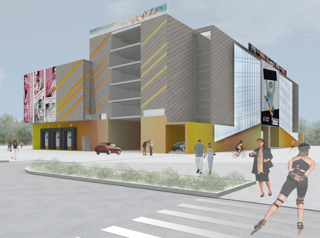
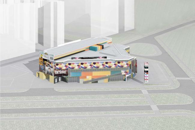
A colorful collage, as if glued together out of newspaper and magazine clippings, against the background of monotonous housing of the small town of Moskovsky situated in Moscow area... this is how the competitive project of shopping mall by "Sergey Kselev and Partners" looks like. The architects got
an invitation to take part in a small closed tender for the project of a
shopping mall. The commissioner put the contestants into rather narrow bounds:
on a comparatively small strip of land, they were to design a large multi-layer
shopping mall and a spacious above-ground parking garage (because the
commissioner reasonably wanted to avoid the necessity to burden himself with
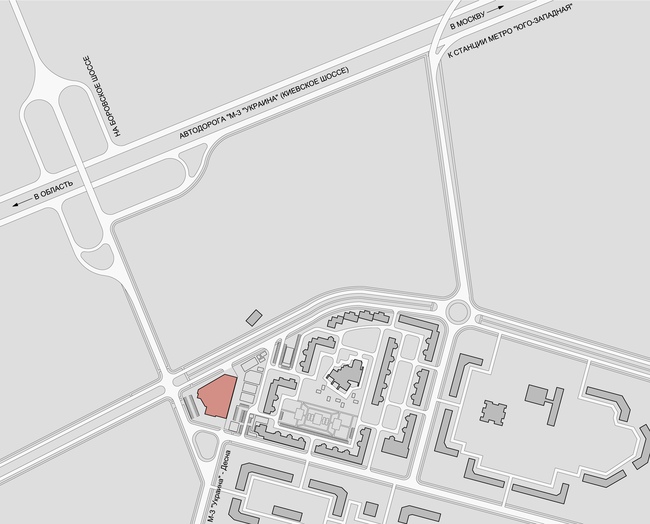
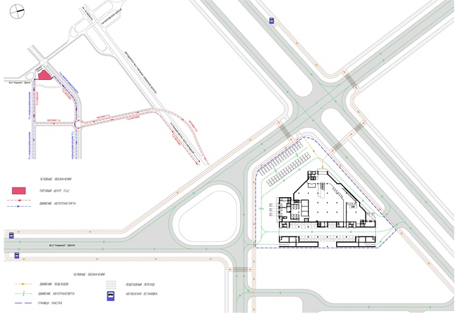
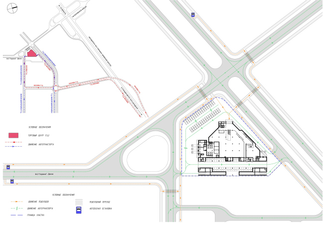
the expensive earthwork). The land site is
located seven kilometers away from Moscow Beltway at the edge of the settlement
of Moskovsky, near the flyover that leads from
Location plan
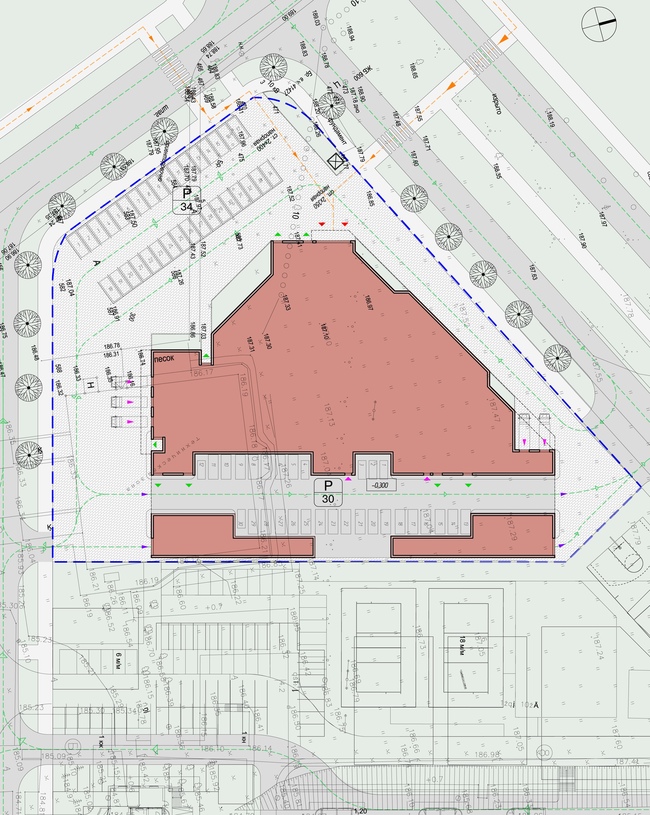
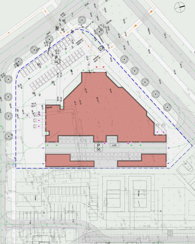
The site has a
polygon shape, the edges of the construction spot are rather intricate and
remind a sketchy little house with a chimney or even a profile of a human face
with a long nose turned in the direction of Kievskoye highway. Because there
was a need for a lot of useable space, and the land site was comparatively
small, it was planned to make the most of it and use every square meter
available.
In the contest
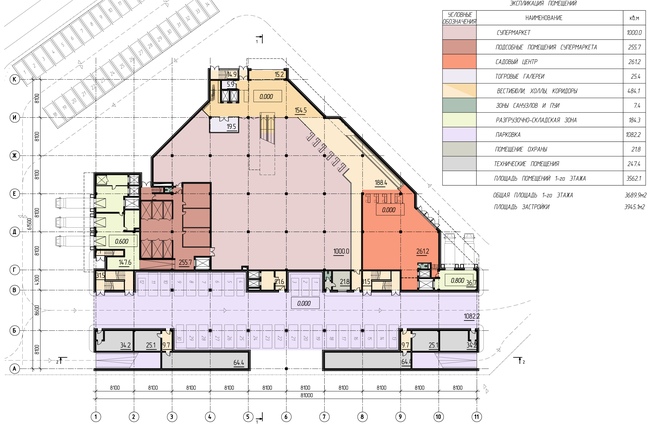
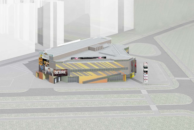
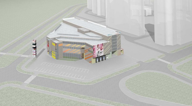
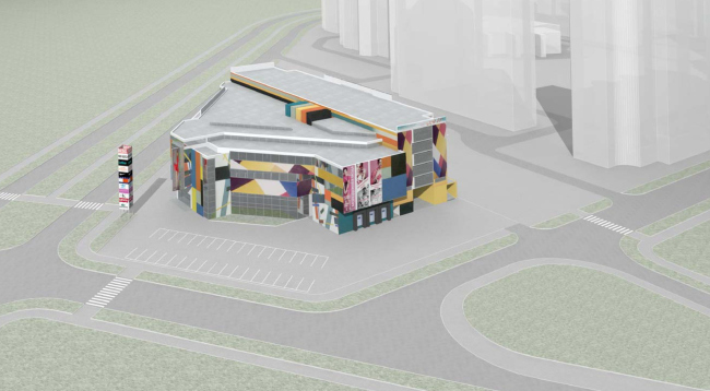
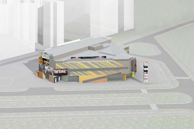
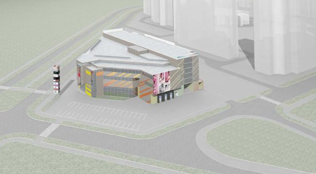
project, a five-level parking garage occupies the rectangle in the south-east
part, and the shopping mall occupies the triangle turned to the highway and the
boulevard. Thus the shopping part of the building takes on all the intricacies
of the plan with all of its facets, angles, and protrusions, while the recessed
and more balanced volume of the parking garage serves as the background. "A task like
this - combining the above-ground parking garage and a shopping mall - we have
already come across, in particular, when designing a shopping mall in the South
Butovo, even though we had a lot more room there, - Vladimir Labutin explains -
In this case squeezing all the necessary shopping areas and the parking garage
into the allotted territory was rather challenging because, according to the
contest specifications, we could not use the underground space". In the options of
the shopping mall structure, that were submitted for the contest, different
facades are superimposed; what they have in common is the brightness of the
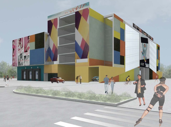
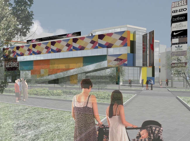
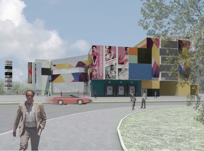
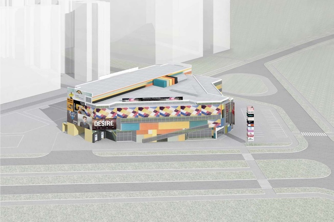
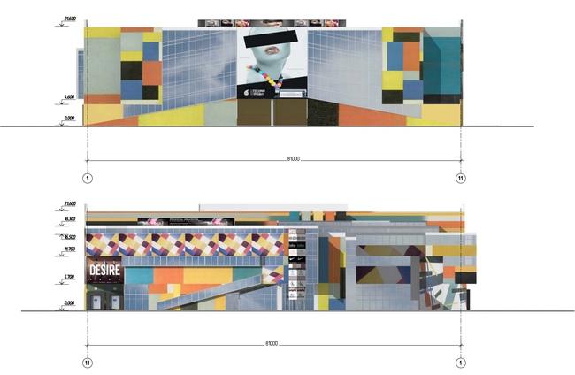
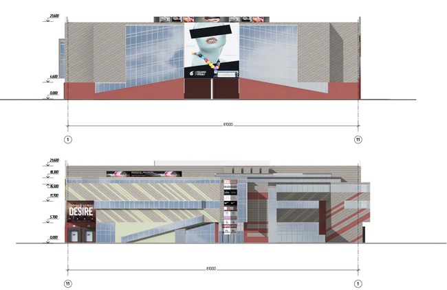
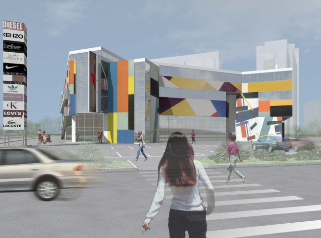
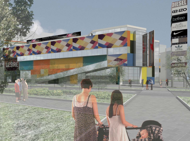
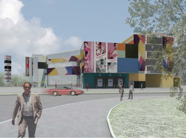
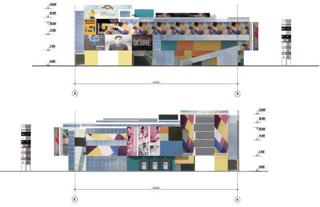
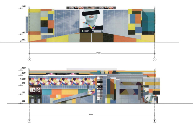
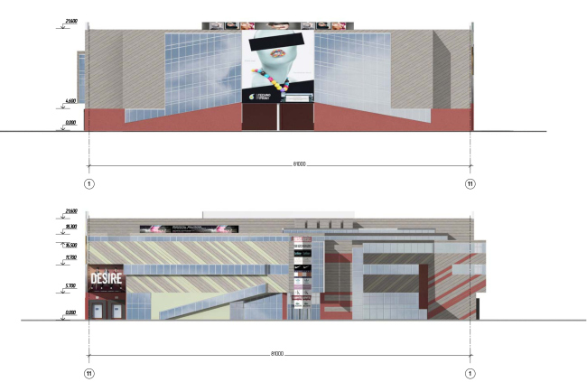
color solution and the diagonal theme. The first option of
the project gives the main role to the color as such. The facades are covered
with glass and billboards; the "blind" unfilled planes get a
large-pixel ornament. It is bright blue, yellow, and red, and as opposed to the
traditional "pixels", rather irregular: at some spots, the ornament
is turned at a 45-degree angle, at some spots the edges of the colorful spots
change their direction to form triangles and trapezes... in a word, the whole
thing looks not so much as the traditional pixel design but rather like Russian
abstractionist painting of the 1910's. To enhance this analogy, the architects
filled in a few advertising spots with enlarged replicas of Malevich's
paintings. What they ultimately got was a kaleidoscope in which, like inside
some mirror environment, different pictures that look like large-figure
ornament and billboards replace one another in a certain order. All this is
superimposed on the complex and super-sculptured structure of the facade
(which, as we remember, sparing the square meters, follows exactly the outline
of the construction spot), is pierced by the diagonal protrusion of the travolator,
and is augmented by a few overhanging ledges (which also, yes, add a few extra
square meters). The order of the floors is thus completely erased, and the
building turns into a three-dimensional version of an avant-guard painting, a
3D collage of sorts.
Option 1
Option 1
Option 1
Option 1 It must be noted at
this point the the architects of "Sergey Kiselev and Partners have been
working with bright colors for years: if anything, one should remember the
"Avant-guard" house (which also sported the classical multi-pixel
design), a shopping mall in the South Butovo (colorful strokes on the gray
canvas) or the project of a residential complex in Moscow area's Mytischi (that
was based on the 3D optical effect of playing with the colors of the rainbow).
The Moskovsky project adds yet another position to this list: a building that
grows out of a classical avant-guard painting. (One also cannot help but
mention in passing that this is a whole world of its own, and it used to be
explored by first-rate foreign "star" architects: David Adjaye and
his building of business school in Skolkovo or Erick Egeraat and his housing
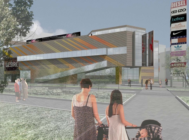
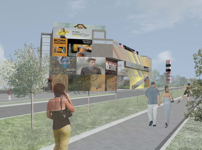
project that was still left unbuilt on Moscow's Yakimanka street). The second option
proposed by "Sergey Kiselev and Partners" for the Moskovsky shopping
mall is more on the balanced side and is not so much charged with the
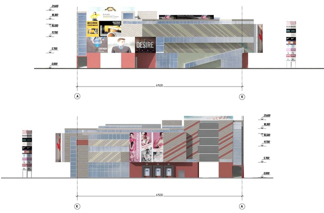
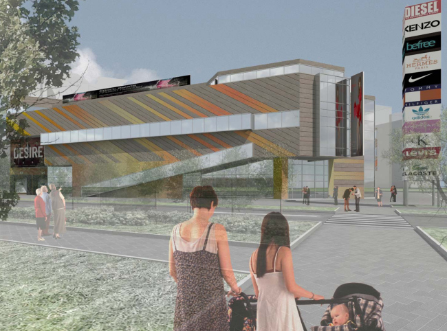
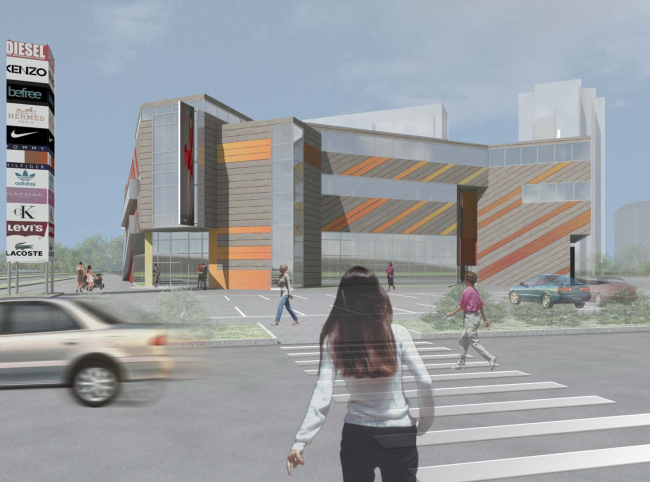
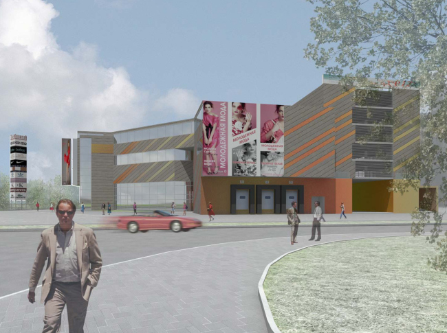
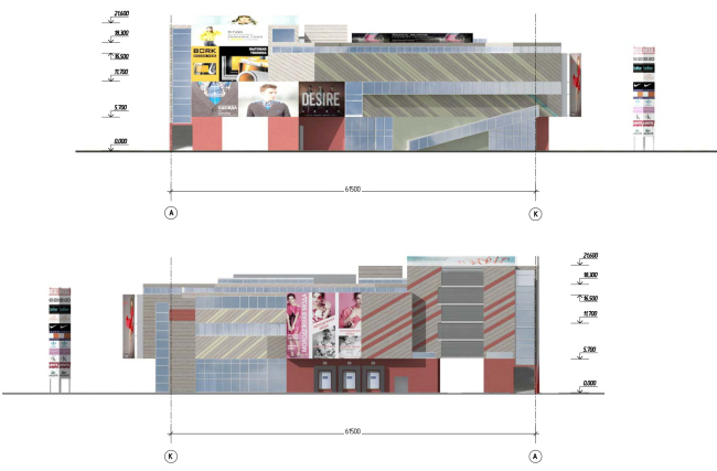
"metaphorical field". The facades are dissected with thin strokes of
peat-brown diagonals with hummingbird-like fragments of glistening orange and
yellow. These "beams" were to be executed from ROCKPANEL Chameleon
panels that change their shades of color depending on the ambient light and the
observer's angle of vision. The design of the facades also sports advertising
fragments, even though they are a lot more scarce than in the first option.
Option 2
Option 2 The deliberate use
of advertising and artistic treatment of it is also the thing that the two
"Sergey Kiselev and Partners" projects have in common. This solution
looks sensible and logic: billboards are something that a shopping mall is
definitely going to get, and it is better to foresee their presence in advance
rather than let them intrude into the architect's original idea. In both of the
two versions they become an organic part of the overall idea, an important part
of the image, and proudly announce the function of the building. The picturesqueness
that the architects ultimately got is resonant with the once-popular song by
Maryla Rodowicz "Kolorowe Jarmarki" ("Multicolored Fairs" -
translated from Polish, translator's note), the warm nostalgia transferred to
the walls of the mall looks more than appropriate. The
greenhouse-bearing-wall-housing environment definitely lacked this bright
accent; it would also be clearly viewable from the
Construction spot
Transportation map
Option 1
Option 1
Option 1
Option 1
Option 2
Option 2
Option 2
Option 2
Option 2
Option 2
Option 2 NoneNoneNoneNoneNoneNoneNoneNoneNoneNoneNoneNoneNoneNoneNoneNoneNoneNoneNoneNoneNoneNone |
|
