|
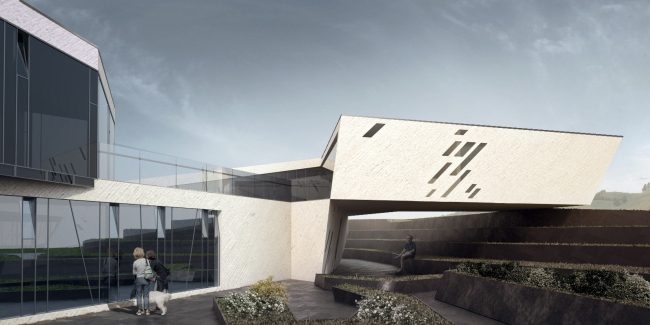
On the second version of TOTEMENT / PAPER project for Sakhalin
In the
second version, the building is restricted neither by the unity of the
geometric module nor by the rectangular frame that cuts the spongy “cell” out
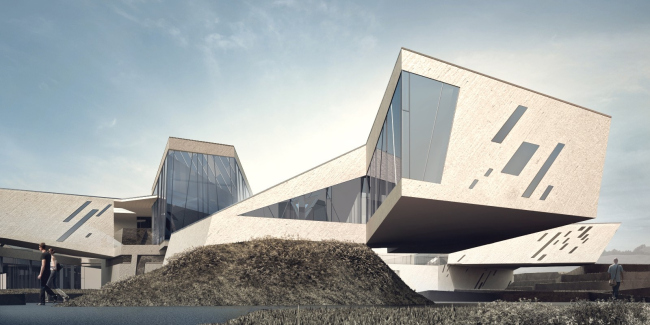
of the space. At a first glance, one gets the impression that the building
“shoots up” perfectly free and in a very energetic way, too - transforming and
enhancing the irregular contours of the landscape. Here what we see, however,
is rather a phenomenon of a geologic type: this is how the result of rock decay
in some ancient mountain might look like. If the rock material had initially
come in a stream pattern, then got broken, leaving bridges, caves, and consoles
of quaint shapes and forms, and then was neatly sliced with broad planes...
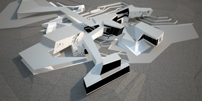
Approximately this kind of a process could have created the “branching”
environment that in some places follows the curves of the landscape but more
often than not even enhances them in a grotesque way, making them sharper, and
stretches the long “necks” in the direction of the seaside.
In spite of the first “geologic” impression, however, the idea of shape-making
here is not about mimicking the nature (we do not like it when our architecture
is defined as “bionic” - Levon Airapetov says). Its meaning lies in the
interaction between the architect and the landscape. This interaction, however,
is of a special kind: man adopts the language of geological formations, learns
it and builds his forms in accordance with its laws but - and this is
especially important here - exerting his own will in this dialogue quite
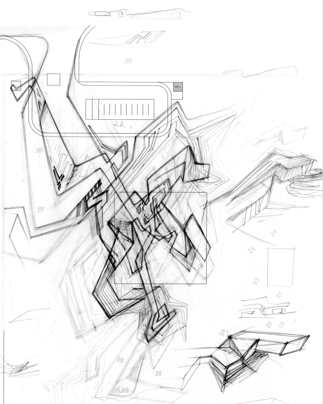
unambiguously. The exquisite graphic lines are the result of the author’s
reconsideration of many various things: from the random contours of the
seashore to the beauty of the drawing as such, charged with kinetic energy. The
energy is supplied by the author himself who charges the lines and the volumes
with motion, based on sheer landscape: the slope and the mountain. “On a flat
field, you've got nothing to hook on to - the architect shares - and here it is
a whole lot easier with the depression, the hill, and the creek”. The key word
here is “hook on” - once you have that nailed down, things will pretty much
take care of themselves, you will only have to spin and bend the lines, not
letting them run away too far off the center.
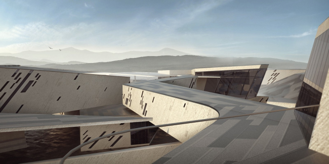
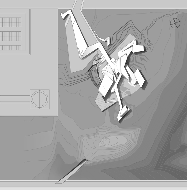
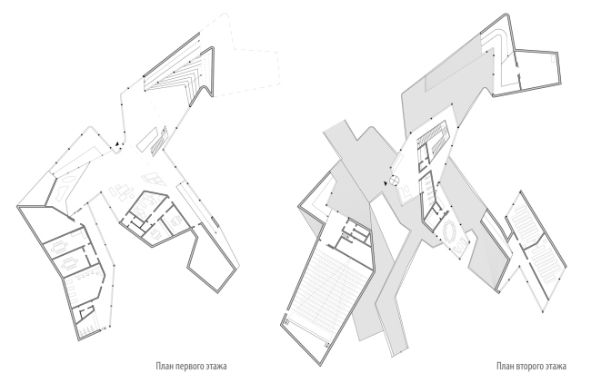
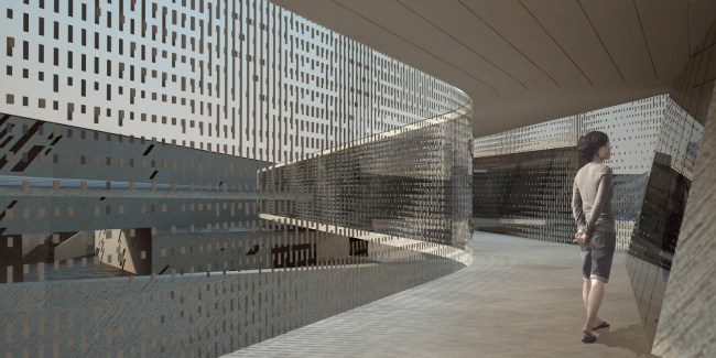
The lines are spreading far and wide indeed: the architects made an accent on
the roofed passage to the plant area - this is the farthest of the “runaway”
lines that pierces the center of the building, dashes past the atrium in the
center and, making a number of sharp turns, opens up to the sea with a
two-level sightseeing platform with a panoramic window below and a summer
terrace on the second floor. It was planned that from here and down to the
shoreline a tunnel would be dug - thus, the exquisite axis would have run the
complex through from north to south, from the plant to the sea. What is
peculiar here is the fact that initially this motion runs on the ground, then
above the ground, and finally underground, inside the hill. It should be said
that the first version of the project also had in it the passage and even the
tunnel as part of the specification, but in the first version they were
peripheral and looked like mere supplements to the comparatively austere
rectangular building, while here they have turned into the major form-building
elements.
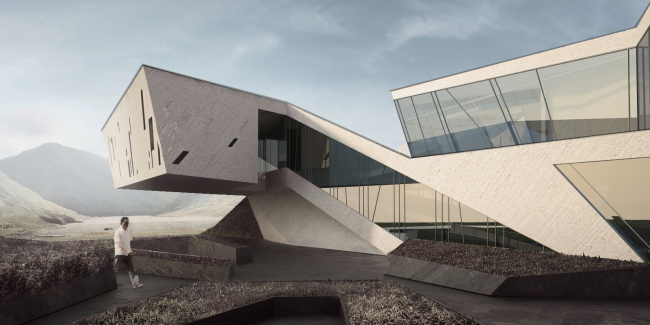
The volumes of the auditoriums, offices, and meeting rooms scattered over the
slope in a three-fingered “paw” pattern, they also look like three brisk “noses”
or even “heads”: one looks eastward, another one looks south-east, and the
third one looks south-west. In this version f the project, the authors treat
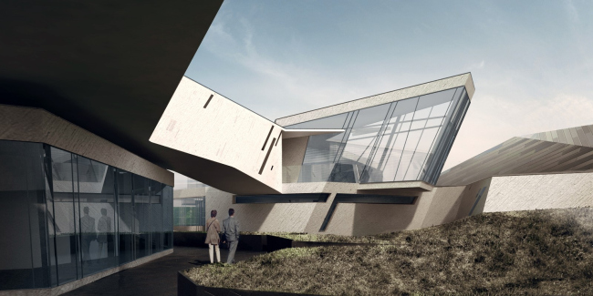
the terrain and the landscape just as actively: the buildings spring up from
underground and shoot off deep consoles, leaving open pedestrian pathways
below. The building “sticks” to the surrounding environment, and penetrates it
without making any obstacles but opening numerous air corridors.
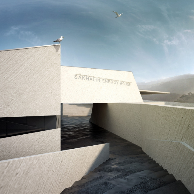
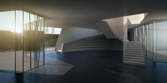
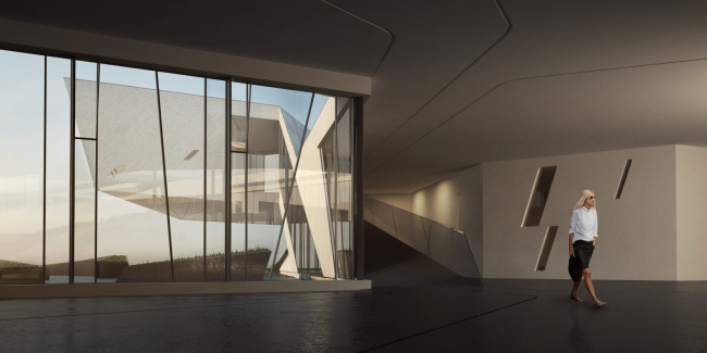
The labyrinth- like spaces outside and inside look a lot like one another, and,
thanks to he glass walls, the difference becomes almost imperceptible: this
building is a single organism that consists of a multitude of various open,
semi-open, and closed spaces. The fact that the main facade here is simply
non-existent goes without saying - it is purely inconceivable here because this
building, as the architects aptly put it, is a collection of stop-frames taken
off a moving organism with a life of its own. None
None
None
None
None
None
None
None
None
None
None
None
None
|
