|
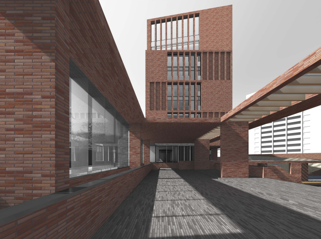
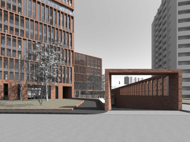
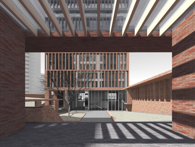
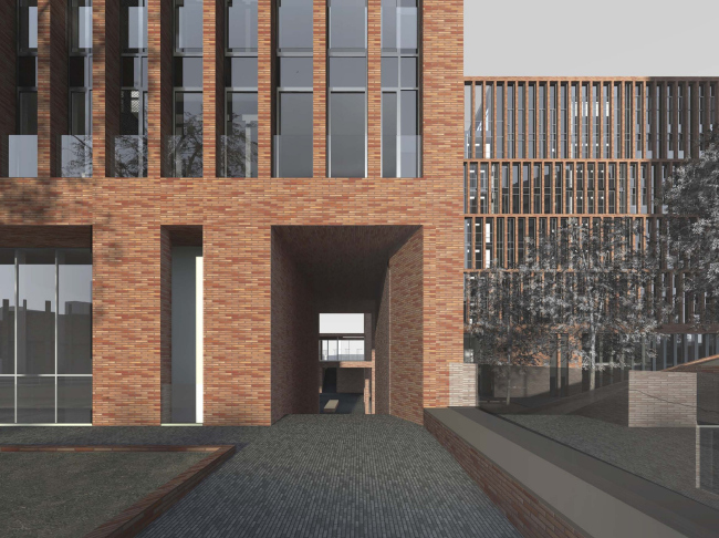
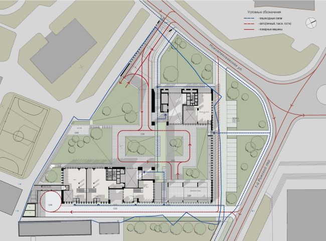
On Moscow's Novoalekseevskaya Street, by Sergey Skuratov's project there will be built a residential complex consisting of two brick houses and a sunk courtyard
The complex
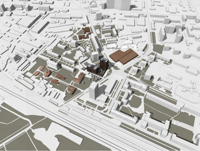
will be built between two red-brick buildings of historical value - the
Bakhrushiny Brothers Orphanage and Alekseevskaya Pump Station - so the idea of
creating some sort of material and meaningful link suggested itself early on.
Besides, there is hardly any architect other than Skuratov that could handle
this task better, what with his consuming passion for red bricks.
Having settled on the red bricks, the architect made two crucial decisions
still before the development of the execution plan. First of all, he
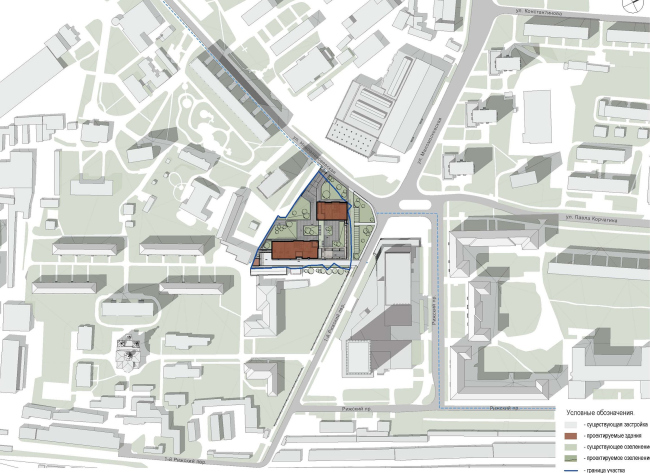
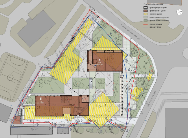
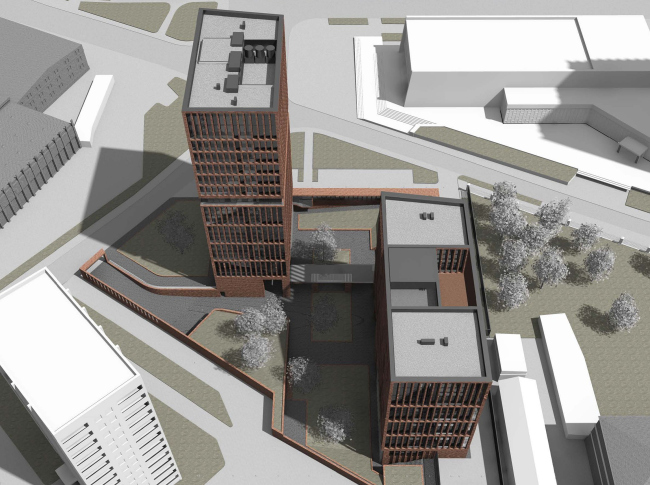
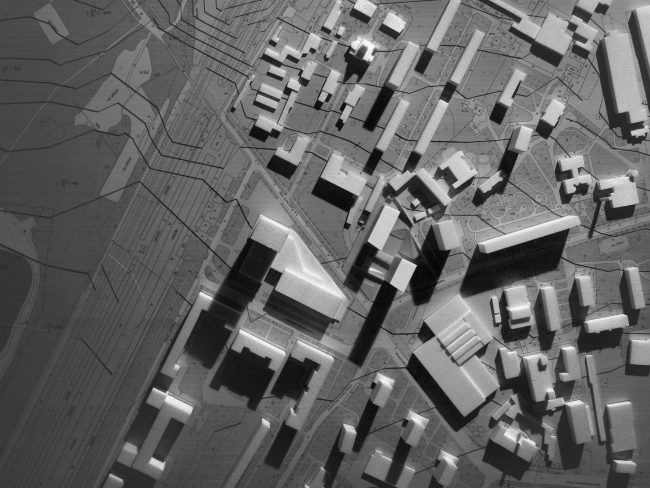
straightened out the southeast boundary of the land site where it borders on
the historically formed industrial area - which turned the site into a
triangle, more convenient for house planning in this particular case. Second of
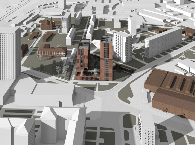
all, Skuratov placed his stake on designing a high-rise centerpiece which is
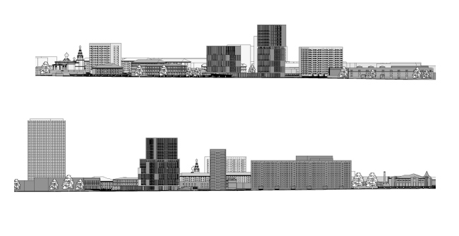
really vital for his place. The thing is that the opposite side of the street
sports the tall modernistic building of Glavtransproject with yet another
standard residential high-rise only a block away, which makes the alley
"give under" visually. What the architect wanted to do was to support
the "pulse" of the cityscape and at the same time not to cram too
many verticals in one place, this is why he found
the infallible combination - Skuratov positions the new buildings on those
sides of the triangle that are farther away from the residential tower.
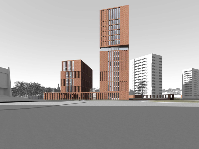
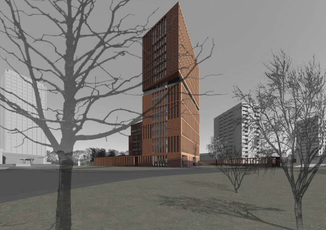
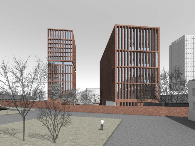
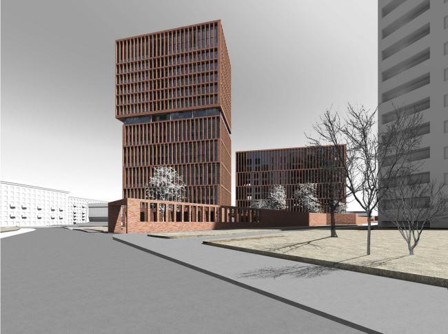
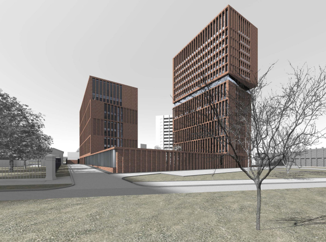
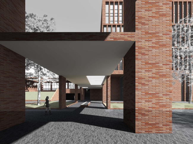
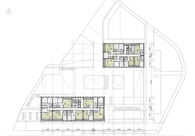
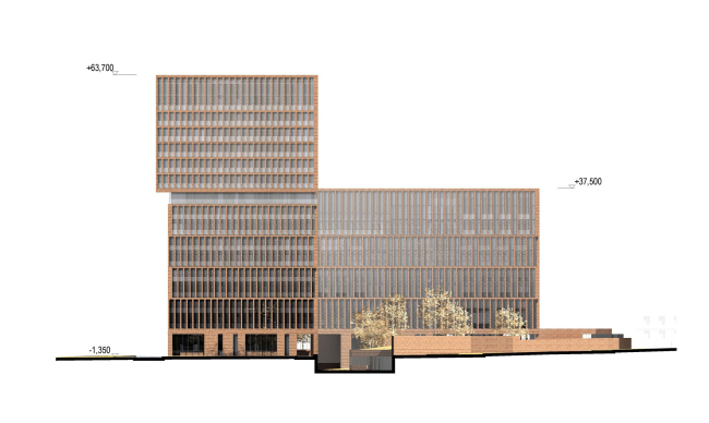
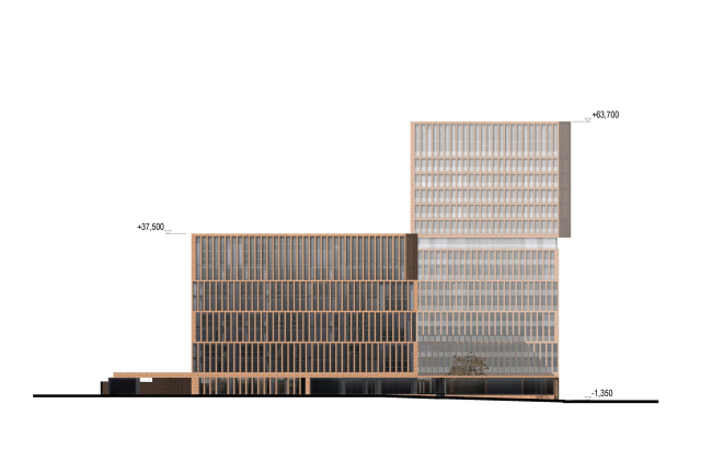
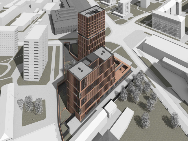
From the compositional standpoint, the complex consists of two buildings placed
on a single two-level stlylobate. The two volumes are of equal width but
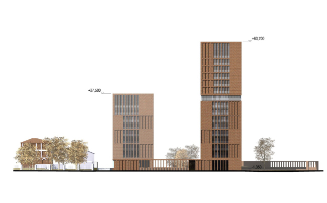
very different in their length and height. Building "A" has 15
residential floors in it, and two floors of public premises, while Building
"B" is almost twice as low: it has 8 residential floors, two publics
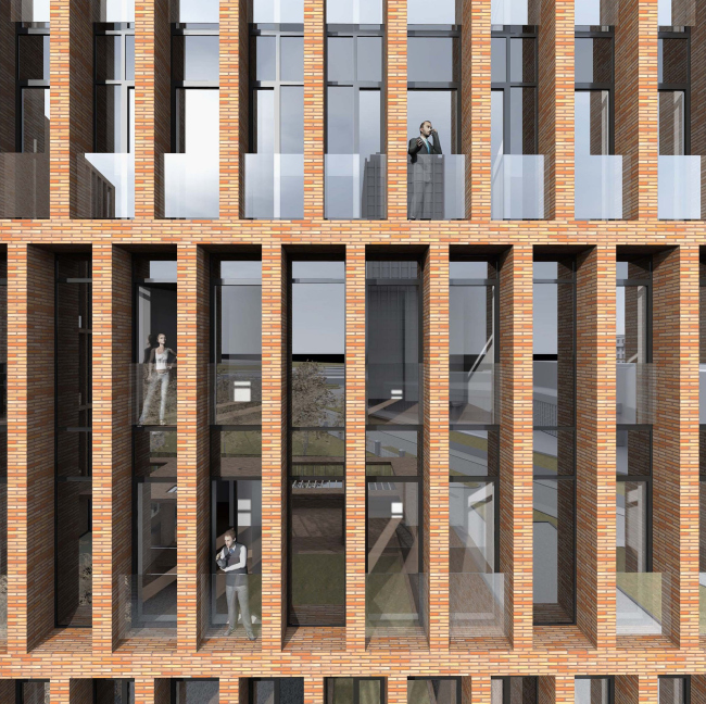
ones, and it is twice as long at the same time. From the side of the crossroads,
the complex looks like two narrow towers placed on a single base and having
almost identical facades whose pattern is formed by the alternating tall and
high windows and recessed cells "embossed" into the building. And,
while the place of several streets crossing used to be dominated, even if from
a side, by the high-rise building of Glavtransproject, pierced from top to
bottom by look-alike stitches of windows, now the two new volumes with facades
that are as modernist but a lot more diverse and sophisticated, make the former
centerpiece "step back" a little.
What is interesting is the fact that at the same time the towers are NOT
standing on the same straight line: Skuratov moves the taller volume closer to
the crossroads, thus making it actively react to the traffic situation.
Vertically, this tower is split into two halves of almost equal size - the
upper floors are separated from the lower ones with a translucent belt - and it
is turning its "head" to the right, with its layout following the
routing of 1st Rizhsky Side-street. The other volume is not left unattached
either but its plastic is not as active: the facade facing the crossroads
sports a characteristic "dent" but because of the smooth brick
surface it does not meet the eye at once.
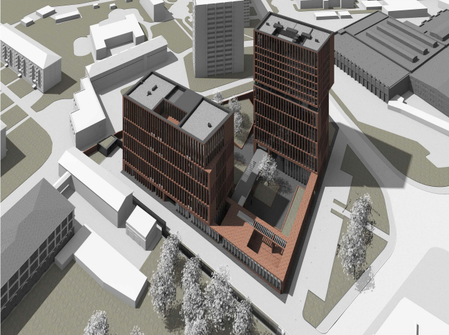
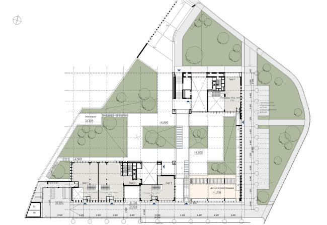
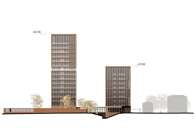
The stylobate that takes up almost all of the land site area is predictably
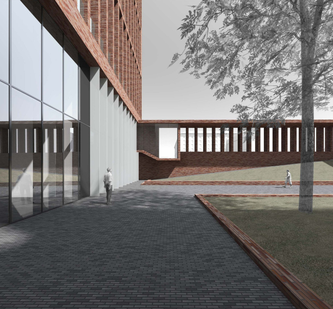
used by Sergey Skuratov for the purpose of making the inner courtyard. The
architect, however, is consciously refrains from the stereotypic solution of
landscaped functional roof, reasoning that under the megalopolis conditions it
will not be capable of providing the appropriate level of comfort and security,
and thus he sinks the yard more than three meters down into the ground,
building a brick wall along its perimeter. Thanks to the height
difference and the wall-to-wall openings, the wall does not look like a
fortress wall at the same time clearly dissecting the courtyard space,
separating it from the city public square, as well as from the driveway leading
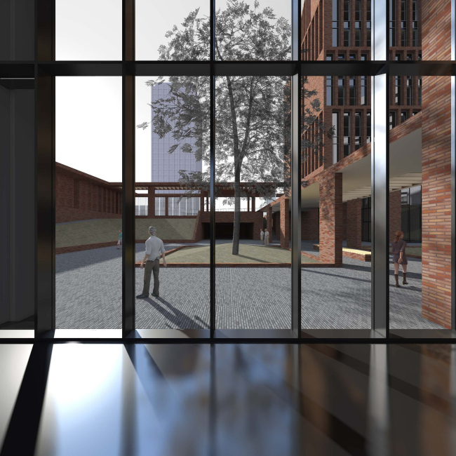
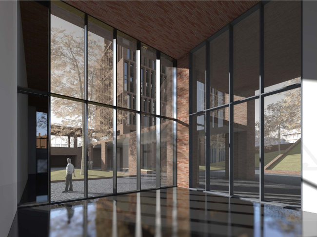
to the underground parking garage. Sinking the courtyard down into the ground,
the architect was also able to design double-height entrance areas that are
nothing more nor less than 8,4
meters high. The colossal lobbies sport 100% glass
walls, thanks to which the border between the outer and the inner space is
practically erased, while the impression of a skillfully designed environment
where the modern architecture is at peace with nature, is particularly strong. None
None
None
None
None
None
None
None
None
None
None
None
None
None
None
None
None
None
None
None
None
None
None
None
None
None
None
None
None
None
|
