|
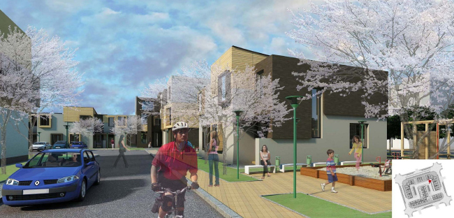
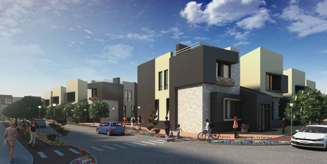
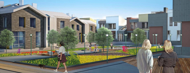
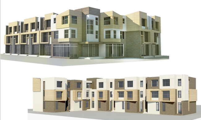
For one of Saint Petersburg’s most popular resorts – Sestroretsk – “Architecturium” Bureau has developed a concept of a low-rise residential complex. The compound that is going to include townhouses and villas is designed as an integrated development with a comfortable and memorable environment.
The new residential
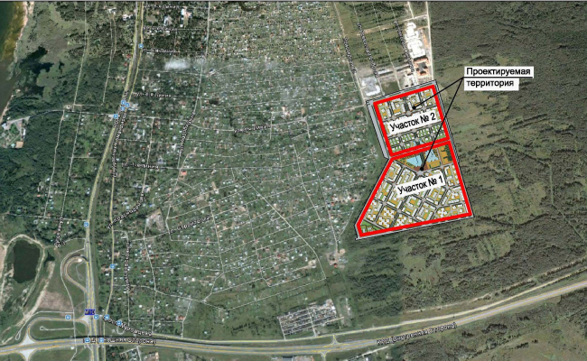
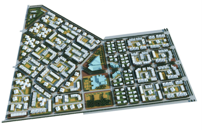
compound will be built on a land site with a total area of 39 hectares. Having the
shape of a quadrant and a trapeze adjoining to one another, it is limited by
Matrosskaya Street, Levashovskoe and Primorskoe Highways, and on one side it
borders on the new residential area of five-story houses, while on the other
side – on a nursery garden and woodland. “Our impressions of the place luckily coincided
with the requirements of the commissioner who did not want to build anything
high-rise here but, quite the opposite, asked us to design a comfortable area
with low-rise residential buildings and developed infrastructure – Vladimir
Bindeman shares – and the motto of this project sort of suggested itself: ‘A
cozy megalopolis suburb’, so we took this as a starting point in our work. At the
same time, it was important for us that our megalopolis in this particular case
was Saint Petersburg,
a city with a unique history and a recognizable regular planning pattern”.
The architects opted not soften the inherent “geometrism” of the layout but,
conversely, used it as the main composition and planning device enhancing the
new compound’s continuance with the planning of Saint Petersburg downtown area.
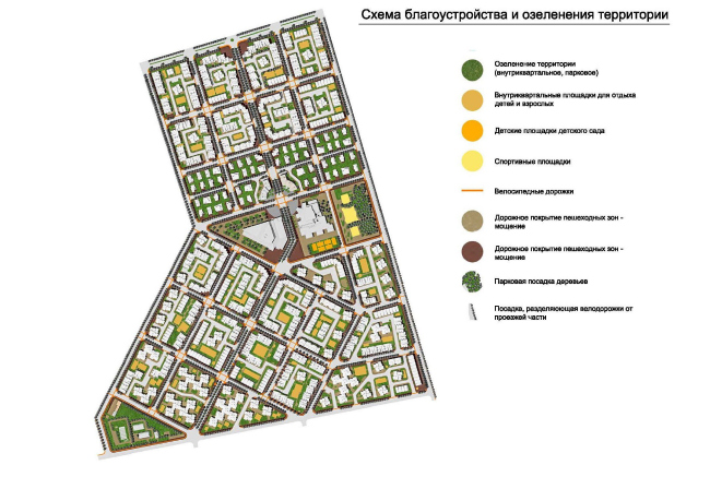
Into the trapeze, the architects inscribed a square, the size of the
neighboring plot, but positioned it at an angle to the latter, and, dissected
with the square cells of blocks, these two quadrants became the two main
residential areas of the future complex. The “tip” of the site is landscaped and
it hides the engineering infrastructure facilities, while in between the two
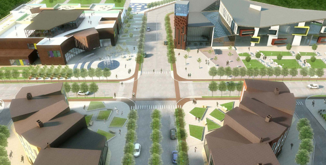
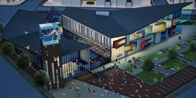
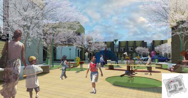
quadrants the architects make the central square with a park – the main
landscaped area of the compound, surrounded by public buildings. Incidentally,
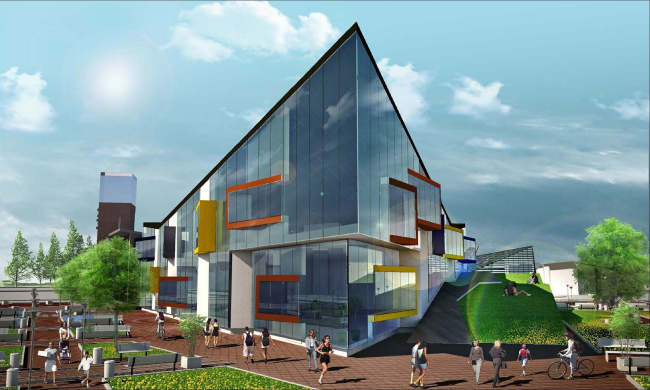
the layout of one of those buildings is also fully conditioned by the master
plan – this is a triangular volume facing the square and suck into the trees at
the back. From the opposite side, the theme of landscaped area is supported by
a park, while yet another boulevard runs perpendicular to the already-mentioned
street.
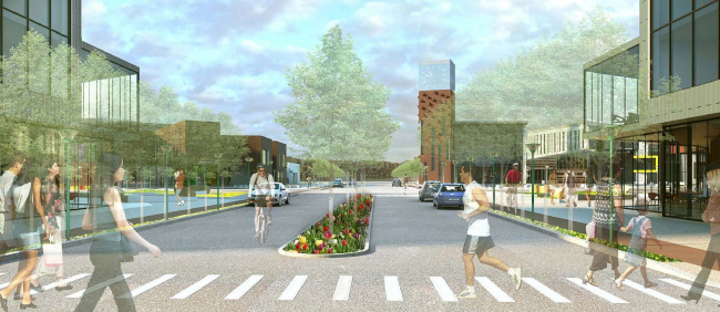
Each block, according to the authors, is going to get paved with paving slabs
of different shades (shades of color fairly close to one another but at the
same time clearly indicating to the pedestrian which part of the area he is
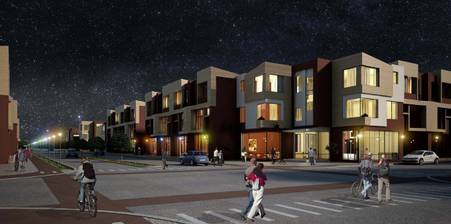
in), the streets are going to be aligned with trees, and each of the crossroads
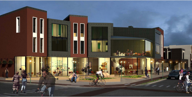
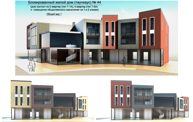
will be designed as a little cozy square with corners – shopping and restaurant
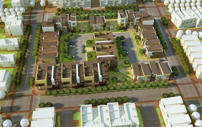
facilities situated on the ground floors of the corner buildings. The
environment will also be diversified by the various options of positioning the
townhouses. “Because the future area neighbors on the nursery garden, i.e., with
“dacha” land plots, the first thing that occurred to us was o organize our
planning in such a way that the dachas would neighbor on the villa belt , and
closer to the center it would be a circle of townhouses – Bindeman explains –
but we realized early on that it was a very predictable and, hence, rather dull
idea. So we decided: since we are breaking away from the typical Russian idea
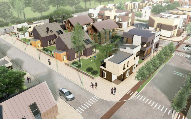
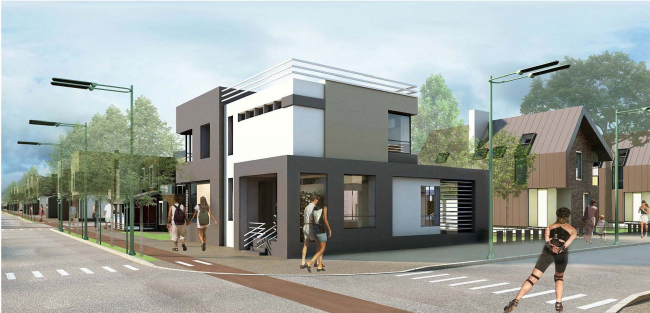
of the townhouse, then why not change the image of a villa?” According to “Architecturium”,
a villa is not some kind of fortress behind a wonderwall, but a friendly city
house with a land site of its own but no fence of any kind, thanks to which it
becomes a fully-fledged player of the city planning and contributes to its
image.
The residential volumes will be finished with light multicolored panels (yet another
point in favor of diversifying the environment visually), while the public
buildings, by contrast, are designed in serious-looking bricks. The only exception
is the triangular “nose” of the shopping and sports volume – the pointed façade
turned to the little green square gets a 100% glass finish with its surface
decorated with multicolored triangular bay windows. According to estimates, this
complex is going to become the main “magnet” of the social life of the
neighborhood, and the architects introduce into it such an indispensable
element of the town square as the clock tower. The clock tower is also
up-to-date here, though, the clock being an electronic one – the top section of
the vertical centerpiece is designed as 360-degree revolving cube that will be
backlit at night and serve as the recognizable orienting point. None
None
None
Concept of the low-rise residential complex in Sestroretsk. Project, 2012 © Arkhitekturium
None
None
None
None
None
None
None
None
None
None
None
None
None
None
|
