|
Published on Archi.ru (https://archi.ru) |
|
| 28.08.2012 | |
|
QR-Code Style |
|
|
Julia Tarabarina |
|
|
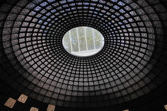
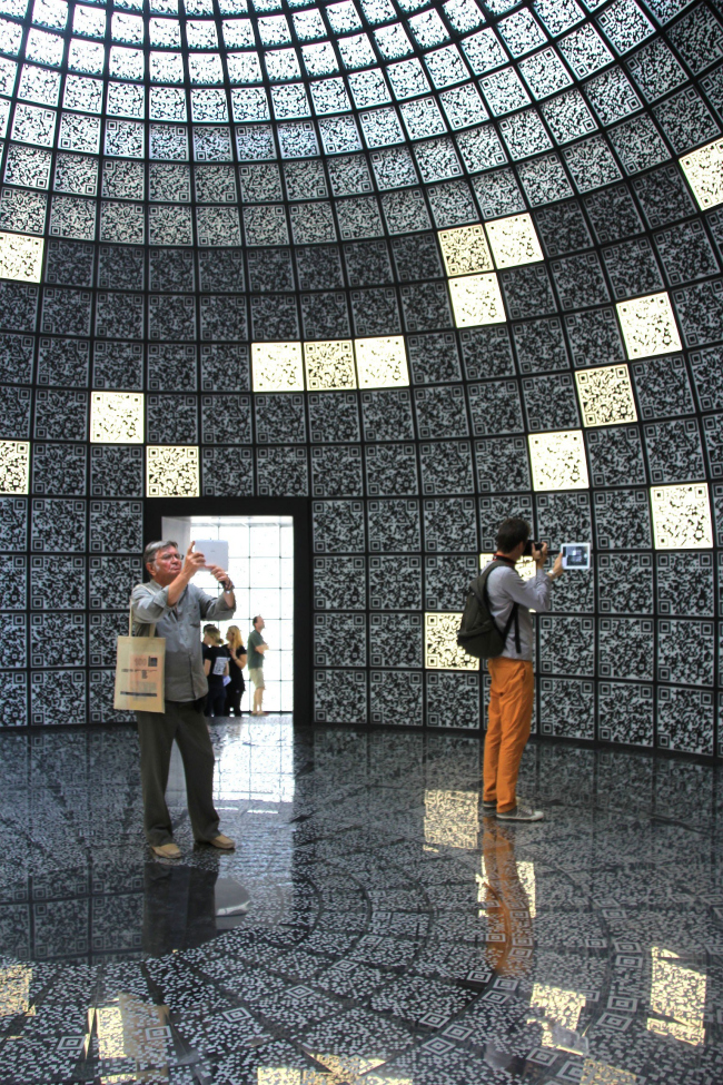
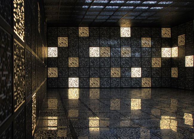
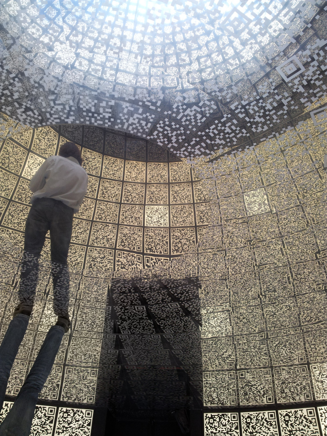
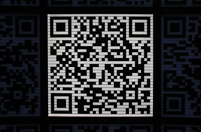
At Venice Arch Biennale, the “I-City” exposition of Russian pavilion has opened its doors. The design of Russian pavilion's exposition was kept secret up until its opening day. In early August, the curators of the pavilion Sergey Kuznetsov and Sergey Choban, together with the commissioner of the pavilion Gregory Rezin shared with the journalists that, at the biennale, they were planning to demonstrate the designs of Skolkovo innovation city, but, at the same time, they opted not to unveil just how exactly they were planning to do that, limiting themselves to the phrase that "the exposition will be quite a surprise for everybody". Now the secret is uncovered and made available for the visitors' inspection. The main exposition of the pavilion is based on the QR-Codes
(two-dimensional quick-response codes) - square patterns on white backgrounds
that are now widely used everywhere for encoding all types of information -
from train ticket numbers to guided tours of Moscow historical streets. In the
pavilion's exposition, however, these QR-codes are used in a manner that is far
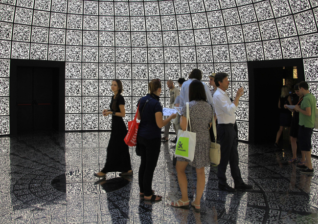
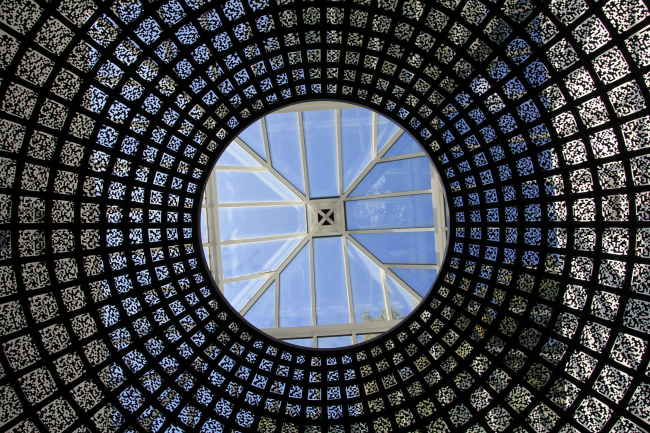
from traditional: they make up the walls and the ceilings of the side halls,
and in the central hall they even make up the dome with an oculus. The mirror
floor also sports patterns that look very much like QR-codes. Behind the wall panels, there are lamps that
turn on and off smoothly, at time backlighting separate squares and at times lightening
up all together - at these moments the walls start to emanate soft light, and
that code pattern looks particularly elegant.
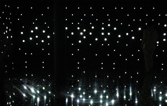
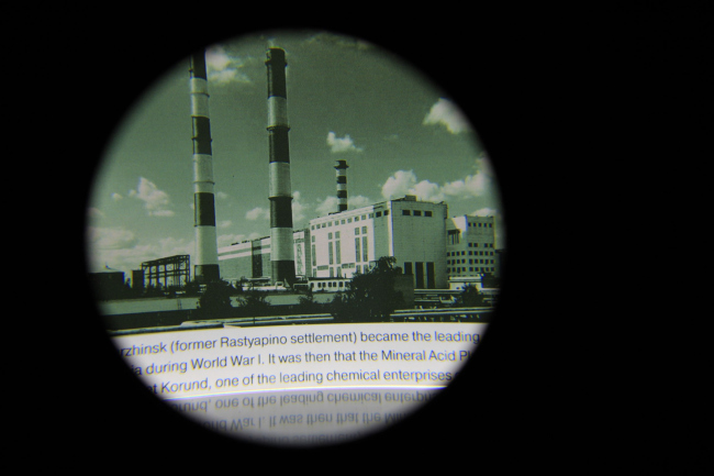
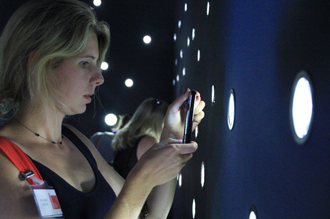
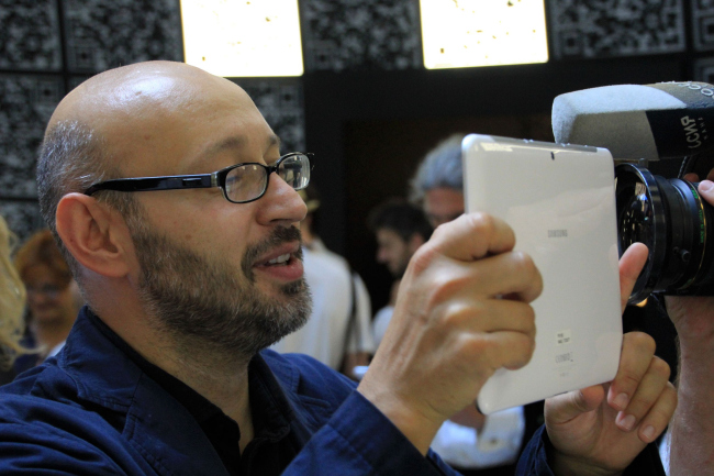
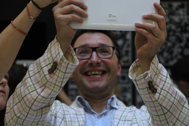
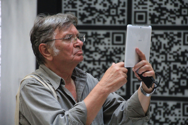
Otherwise, the halls are completely empty but every visitor gets an electronic pad: one needs to aim it at any quadrant on the wall, press the button, and see on the pad screen the information of the appropriate exhibit. This information includes: information about the contest for the master plan of the science city, master plans of its districts made by their "star" curators, and the results of the recent contest for the residential housing of the Technology Park area. The pads infallibly “tell” one square from another and each of them gives away the information about "its own" project. The human eye, however, is incapable of seeing the difference between the patterns, and this is why the tour takes on a slightly haphazard character (you can only examine the projects that you’ve chanced to point your pad at) - or requires a fair bit of perseverance from the visitor who, falling in with the "machine" logic, can consistently watch one quadrant after another. At the same time, one can also put a positive spin on it: the information search turns into an exciting quest "find a project" (at the opening ceremony, architect Yuri Gregoryan looked for a project of his own for quite a while, and, reportedly, to no avail). The purpose of the exposition does not come down, of course, to showcasing the Skolkovo projects - they are known to everybody, and, besides, every visitor of the pavilion gets a badge with a QR-Code leading to the website made especially for the exhibition. At the website, all the products are showcased in a more conventional manner. The point of the exhibition consists in the fact that it shows Skolkovo architecture in an innovative/digital manner, at the same time submerging the visitor into a technogenious shell and making interact with it by means of technological gadgets. Behind the scenes, "Lawnmower Man" movie was recalled more than once. The indoor image (authors of the exposition: curator - Sergey Choban, co-curators - Sergey Kuznetsov and Valeria Kashirina (nps tchoban voss)) turns to be quite impressive - if anything, the pavilion is worth visiting to feel the effect of the openwork dome space. It feels like being inside some sci-fi movie about a spaceship but not the modern kind (where spaceships often look a lot like Zaha Hadid projects) but some fantasy movie from the 1970's or rather 1930's even. The solution should be viewed as a typical one for SPEECH bureau, not alien to ornaments and classical motifs. The architects turned quite a practical shape of the QR-code into the statement of the geometric ornament and into openwork modules, out of which they have built a very rigid grid of the symmetric interior with a dome in the center. Thus, on the one hand, being inside of it, a person gets surrounded by an interactive network of codes, an “info-environment” of sorts. On the other hand, the constituent parts of this environment are treated as parts of the decorative carpet that could have easily existed outside the information context as a sheer decoration. If in his manifest, the curator of the biennale David Chipperfield calls on to search for roots and connections, and one can safely say that SPEECH pavilion presents the perfect marriage between the modern technologies and the classic shape. And if we are to speak about filling architecture with meaning, here we can find, just like in Chipperfield's manifests, a few layers besides the main and already-mentioned one (innovation shell used to showcase the science city). Namely, it is common knowledge that in the ancient times, the ornament was part of magic rituals and a magic meaning was attached to it, this is why sometimes it was a decoration, and sometimes a crime. Now one of its kinds has become the graphic code, i.e. people have attached a definite digital meaning to it - beautiful though it still is. To be fair, one must say here that the idea of using the beauty of the meaning-carrying information dots of the QR-codes is not entirely groundbreaking - it has been used in architectural project ever since this technology started spreading worldwide. The QR-codes were already used on the facades (N Building in Tokyo from TERADADESIGN or the Teletech call center in Dijon from MVDRV), as well as indoors. So, in this particular case, SPEECH was able to hit the trend that is rising and current thanks to its being digital and innovative. But SPEECH went still further: not only did they decorate the walls with code patterns but also turned the code itself into a shell that is molded in accordance with archetypical architectural laws, which cannot be "read" by the electronic pad but can be felt by a person that stands under the grid of the pantheon-like dome because human mind is capable of "reading" the cultural patterns of the historical tradition (one that curator David Chipperfield also refers to quite often as an important kind of common ground). The first floor of the Russian pavilion shows the symbolic background history of Skolkovo: the Soviet science towns, 37 out of the total of 62 declassified in the post-Soviet 1990's. The two halls are built as a black (on the inside) box, pierced with circular luminous openings that shine very much like stars and get reflected by the mirror floor. Through the openings of a larger size, situated at eye level, one can examine the pictures of old science cities, magnified by the lenses, and read the annotations. As the commissioner of the pavilion Gregory Revzin put it, the visitors of these halls are not very much unlike spies of the post-war era, that are peeking into the secrets of the Soviet ballistic missiles and submarines - as we very well remember, the Soviet science towns were primarily military-oriented establishments. The "rocket" monuments on the greenish pictures behind the magnifying glasses do not look very fearsome, though - rather like old newspapers or something. And you don't seem to feel like a spy, really - rather you feel a pang of sympathy for the Soviet scientists armed with magnified glasses, drawing-boards and other fossil tools, having to create their innovations literally from scratch. It is expected that Skolkovo will make a positive difference in the order of things. Well, let's wait and see. NB: The Russian pavilion got a special mention of Venice
Arch Biennale that was put in this nutshell: “The ‘i-city’ takes a dialectic
approach to Russia’s past, present and future and in the process turns us all
into digital spies. The jury was drawn into this magical mystery tour and
beguiled by its visual presentation”. NoneNoneNoneNoneNoneNoneNoneNoneNoneNoneNoneNoneNoneNoneNoneNone |
|
