|
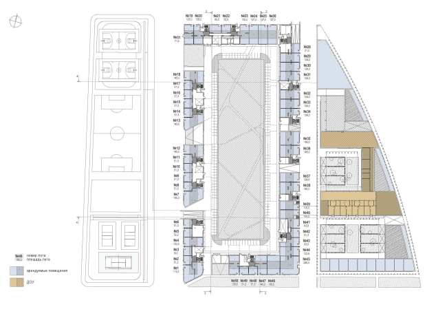
While designing a residential compound in Moscow’s Preobrazhensky district, architect Sergey Skuratov introduces a new spin of two favorite themes of his – the brick fortress and the garden quarters.
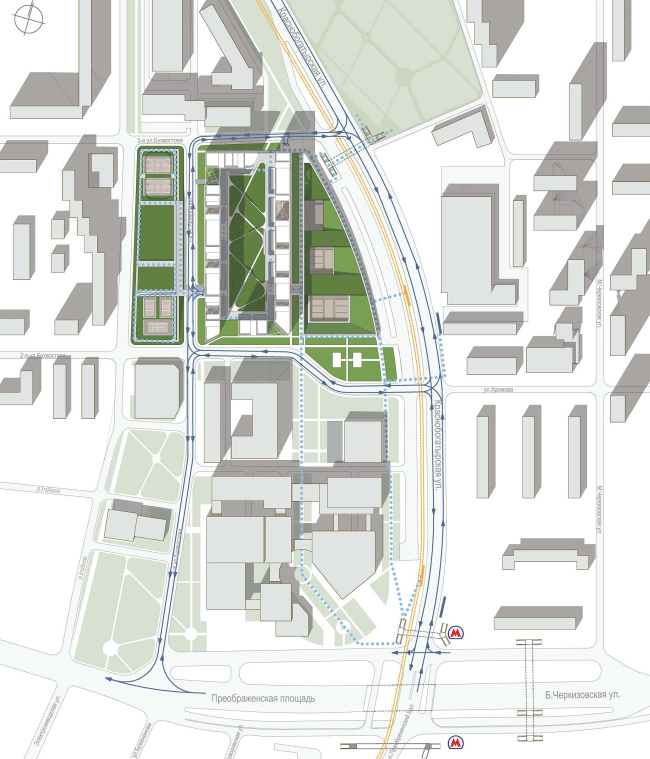
The land site, on which
the new residential compound will be built, is situated in the vicinity of
Preobrazhenskaya square and is bordered by Krasnobogatyrskaya Street, 1st
and 2nd Bukhvostova Streets, and an inner driveway. It would have
had the shape of an elongated rectangle, had it not been for Krasnobogatyrskaya
street – it is at this point that this street makes a sharp turn, thanks to
which the North-Eastern border of the plot takes on an arched shape. Today,
this entire area is occupied by warehouses and semi-abandoned factories hidden
behind a blind concrete fence. Being of little or no value to the city, these
facilities will be taken down in the nearest future. Actually, the contractor decided
to launch a competitive bid particularly because he found himself an owner of a
fairly large territory that needed to be given a lot of competent town-planning
thought.
It was there, right on the future construction site that Skuratov made a firm decision
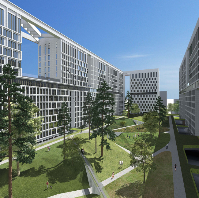
that one of the main “magnets” of the future complex should be the inner
automobile-free courtyard, saturated with light and protected from the noise of
the surrounding streets, equipped with children’s playgrounds, green lawns,
pedestrian bridges, and bikeways. Now he was to figure out how to make this
idyllic dream become a reality.
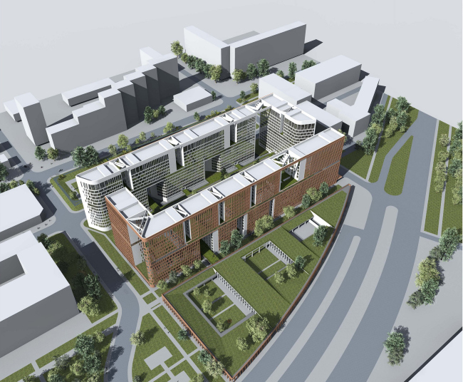
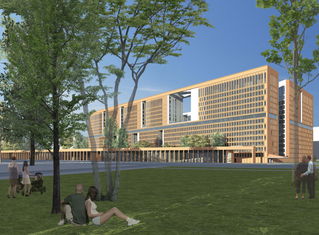
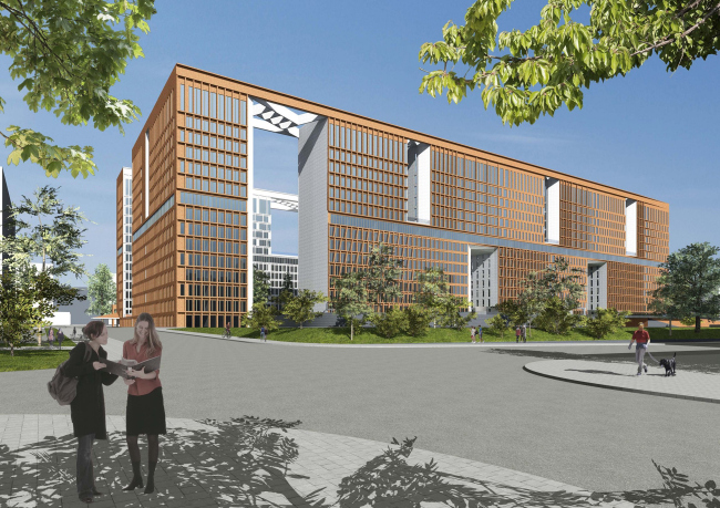
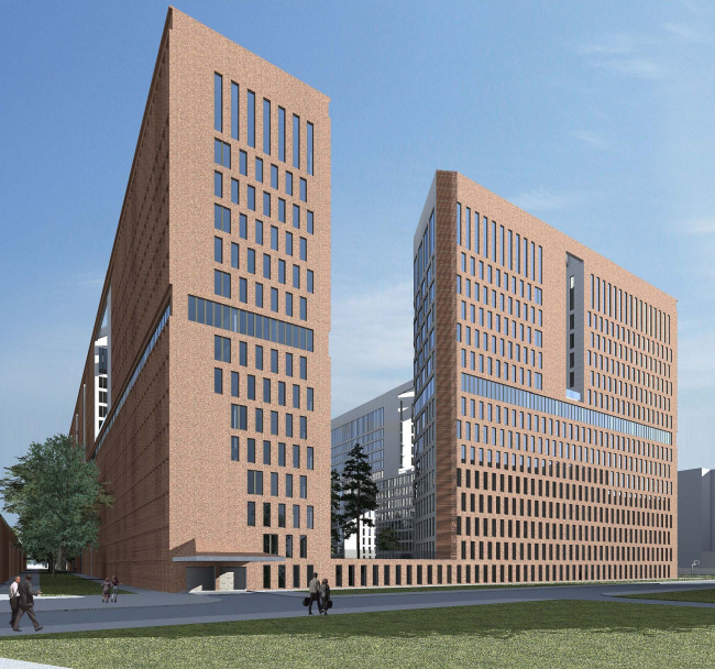
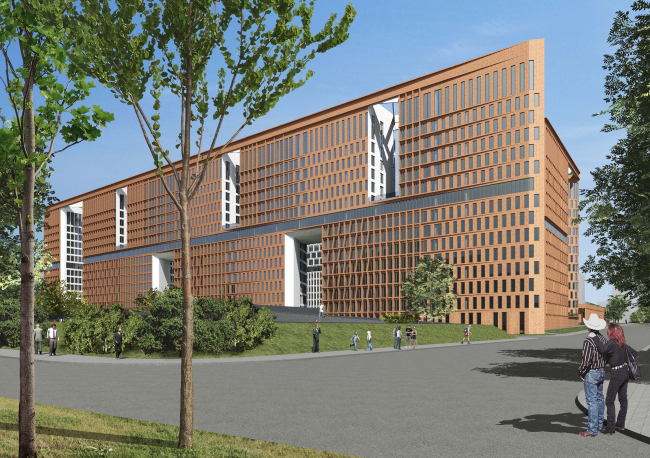
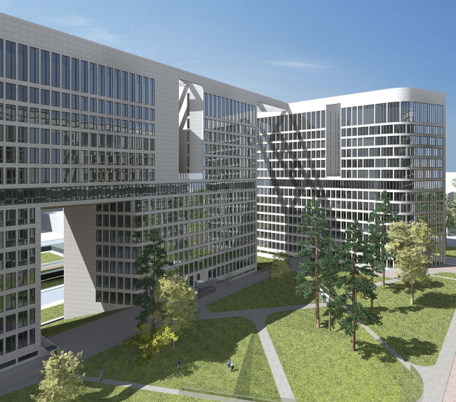
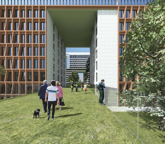
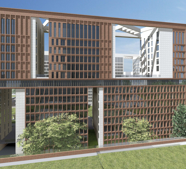
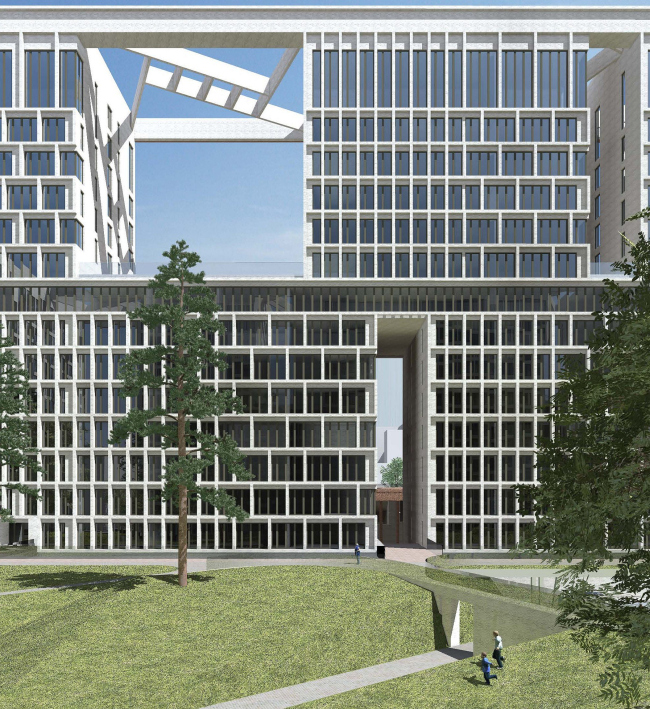
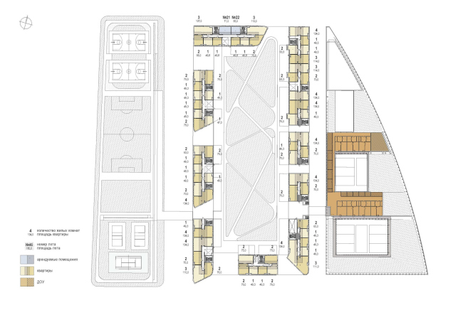
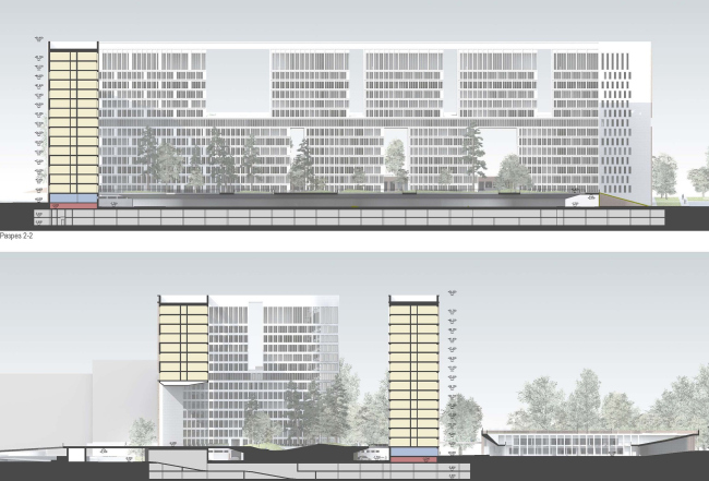
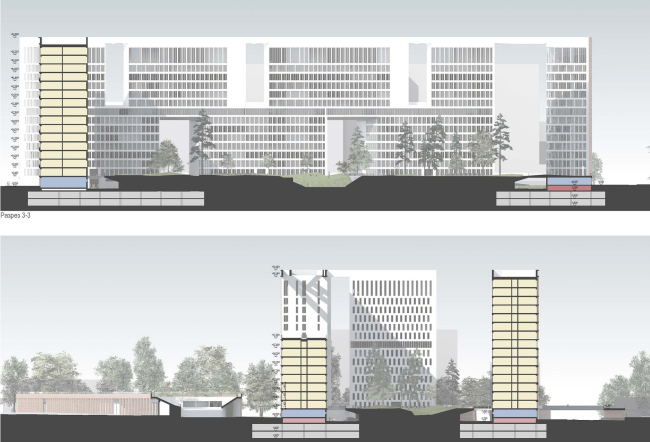
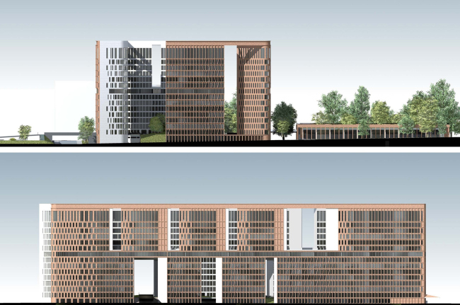
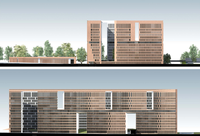
The inner courtyard is formed by two r-shaped planes, pierced with vertical
openings of various width and heights. The horizontal shifts of these openings
create an effect of two elongated buildings standing on top of one another. This
impression is also enhanced with the help of the connecting glass belt – as a
matter of fact, this fully glassed storey includes the flats that are just the
same as the ones in the other parts of the house, but, when viewed from a side,
one gets the impression that the complex is divided into two independent parts
vertically. The extra function of the openings that look like loopholes of
sorts - only meant not for defense purposes but for softening the image of the
structure – consists in providing the courtyard with extra light and air and
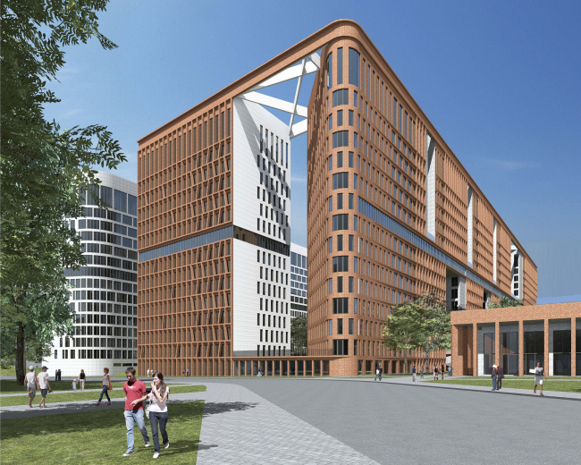
improve the insolation of the flats. With this same purpose, some of the corners
of the r-shaped planes get distinctly rounded; framing the entrance areas, the
rounded facades are perceived as the obvious hint at castle towers flanking the
entrance to the fortress.
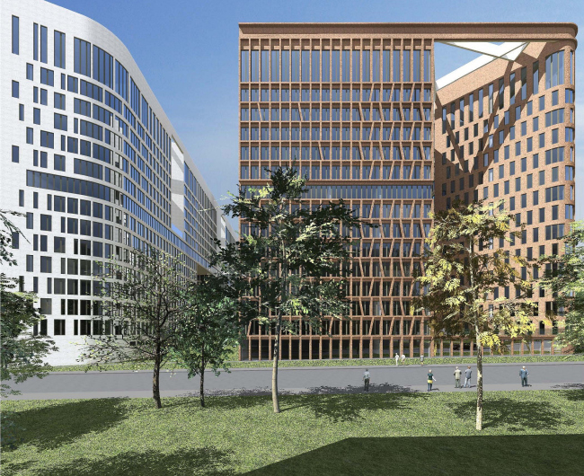
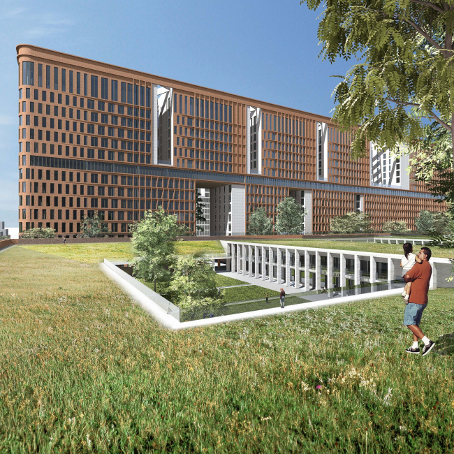
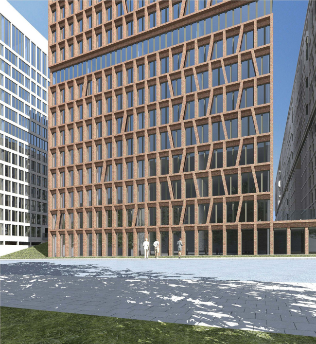
The façade solutions are based on the so-very-much-like-Skuratov principle of
“monomateriality”. On the outside, the building is dressed in a “shell” of red
bricks of several shades – it has a unified modular grid but it changes its pattern
depending on its current cardinal direction, its size and location in the
overall composition of the complex. At some places, the window openings alternate
with partition walls of the same size, at some places they are coupled, and at
some places they form a rigorous grille pattern at the expense of their elegant
intertwining.
The inner facades of the courtyard, in their turn, are faced with white bricks.
This choice is pretty much self-explanatory because even though the courtyard
has a substantial size, it is still a closed space, the kind that by definition
needs a light finish in order to avoid turning into a mediaeval dungeon.
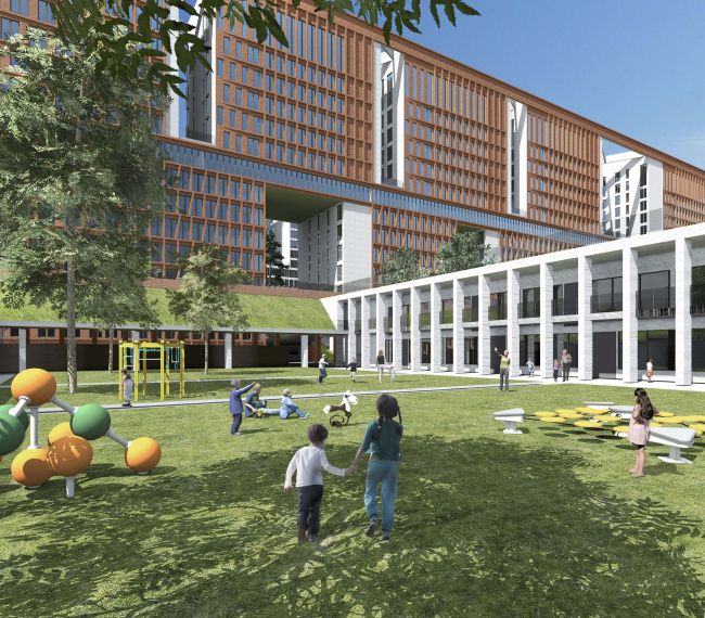
The same principle holds true for the kindergarten: its outer facades are
coated with red bricks, while its three courtyards shine pure white. Skuratov
places this facility between the residential complex and Krasnobogatyrskaya Street – following the
latter’s laying logic, its layout takes on the predictable sector shape. The
proximity of the noisy street made the architect rethink the traditional
kindergarten layout: its outer perimeter sports the cafes and shops that serve
the city, the next “layer” is given to the maintenance premises of the
kindergarten, and the bedrooms and playing rooms are grouped around the center
of the layout, next to the three playgrounds. The roof of the building is
completely covered with green planting, thanks to which, when viewed from the
windows of the upper floors of the neighboring buildings, the house looks like
a landscape object with three playgrounds in the middle. None
None
None
None
None
None
None
None
None
None
None
None
None
None
None
None
None
None
None
None
None
None
|
