|
Published on Archi.ru (https://archi.ru) |
|
| 10.12.2007 | |
|
Metamorphosis of the tower |
|
|
Julia Tarabarina |
|
| Architect: | |
| Pavel Andreev | |
| Studio: | |
| Paul Andreev | |
|
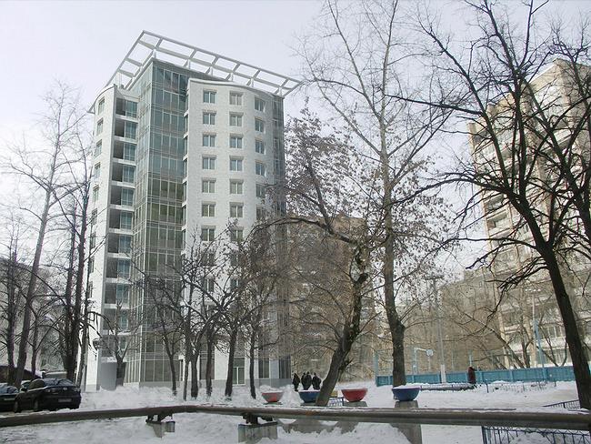
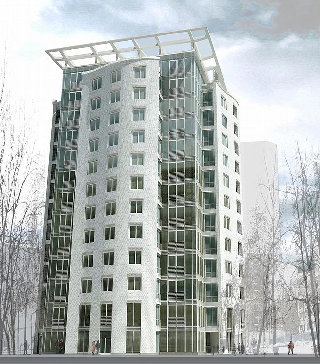
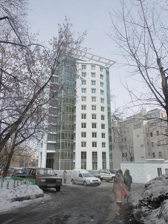
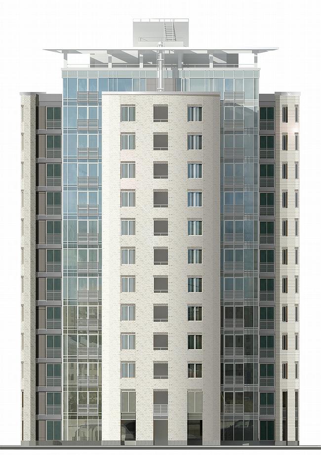
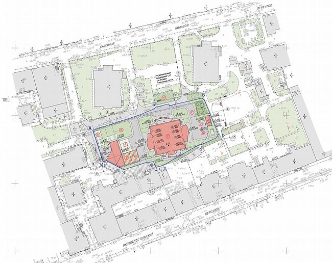
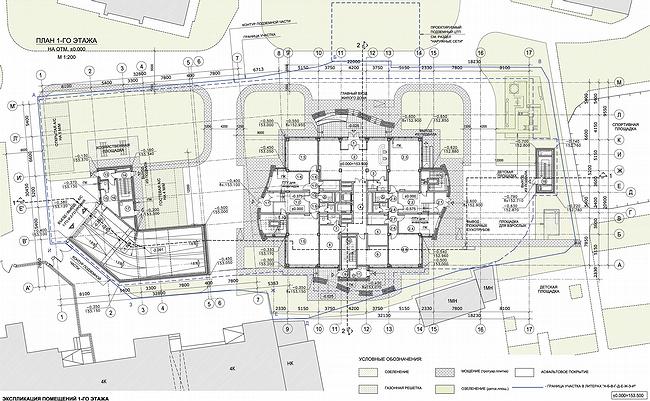
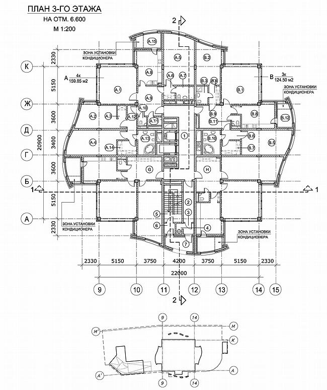
Residential house-tower by Pavel Andreev’s studio is carefully fitted into its architectural surrounding – however, it appears to be an impressive picture about ‘context and modernity’, showing to anyone interested a theatrical scene of turning ‘strict’ modernism into ‘contextual’ The building is being constructed among Jakovoapostolski and Bolshoi Kazenni pereulok. In 1970 the two elite rosy-brick towers were built here, roughly wedging in the texture of historical area built along old streets – twin-towers playfully stand diagonally, having scorn for the lay-out: they used to be called somewhat ‘false teeth’. As this soviet towers were built, urban space around lost all the features of a historical environment – for that period that was one of the short steps expansion of new housing into the center, a kind of mini-new-arbat, a piece - there are many of such left within and outside Sadovoe Kolco. So, we can agree with the authors of thee project on the opinion that ‘the historic morphotype of the building area has been wasted'. So, despite the location of the site in historic center, not far away from Pokrovka street, the general context for the new building is not 19th century but those residential towers of Brezhnev period. The new one copies them in height (13 levels) and squarness of the volume. However, the changes occur to it, that are developing in two ways. First, and most clear is that the tower is strange to aggressive modernism, it’s a ‘child’ of contextualism and this sharpens contradictions. The building takes seriously the nearby surrounding of ‘brezhnev period’ and also remoter and older one. It seems to repeat the neighboring towers in outlines, but doesn’t copy their tough and rude arrangement that ignores everything around, slightly turning parallel to the line of B.Kazenogo pereulok – the only place it can be entirely seen from, like saying: I’m a tower too, but I’m polite, I’m not a sign of future redevelopment, on the contrary, I’m after conciliation and harmony. The other peculiarity is more obvious, 40 years have passed and the new tower is aiming to combine the modern techniques and materials with thorough ‘contextuallity’ of the entire image. It’s not surprising and brand-new, everything that is being built in the centre has this aim, and no other. But here the common process of combining the new with the old is even more evident. Outside the building seems to consist of a square glass core – the spine covered with the four boards, looking very ‘brick’ and slightly curved. These ‘boards’ are extended forward on projections, which flank walls are also glassed and so seem to belong to the material of basics. If think further on this way, the story goes like this – we have, figuratively saying, square brick tower, which resembles ‘bezhnevskaya’. Somehow it starts regenerating: ‘skin’, wall-facing texture, is changing, becomes smother and look richer. Then the volume is pulling apart from within and this makes brick boards split and curve as if under some inner pressure – wavily, like facade in ‘The Matrix’. Moving apart the house reveals its ‘core’ – glass boards, on which it is actually ‘placed’. Certainly this story is just a fancy – houses never grow or transform, but there remain elements of truth. The truth is that the architectural image of the tower – new, but in harmony with the context – holds that story, so truthful that the house looks like a sculptural sketch on ‘modern building in half-wasted historic centre’. Especially truly is shown the contradictory wish to hide behind the brick screen texture, but at the same time to break the shell from within.  NoneNoneNoneNoneNoneNoneNoneNone |
|
