|
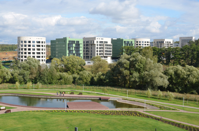
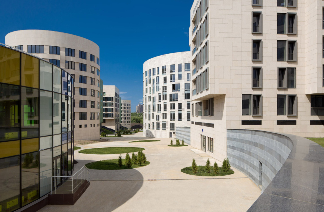
In the settlement of Zarechye of Moscow Region, the construction of the new residential compound “Grünwald” has been completed, the general designer of which has become the architectural bureau “SPEECH Choban&Kuznetsov”. This project has united four designer visions of up-to-date high-standard residential architecture.
This
project was launched back in the pre-crisis 2004, when the company “Group LSR”
set off to build a residential complex, one of the most notable features of which
would be the high-quality architectural environment. The advantages of living
outside the metropolis were to be combined here with the comfort and cozy
atmosphere of a European city. The commissioner placed his bets on Russia’s
leading architects, Sergey Choban and Alexander Skokan, while they, in turn, while
developing the masterplan, suggested that the author team should be expanded by
inviting other authors to work on separate volumes within the project. These
people were Anton Mossin who at the moment worked for “Meganom”, and the German
bureau “AssmannSolomon”. The land site, allotted for the construction of “Grünwald”,
is situated on the river bank and is notable for a prominent height difference
– about 5 meters.
The residential compound borders on a wide field that separates it from the
technology city of Skolkovo.
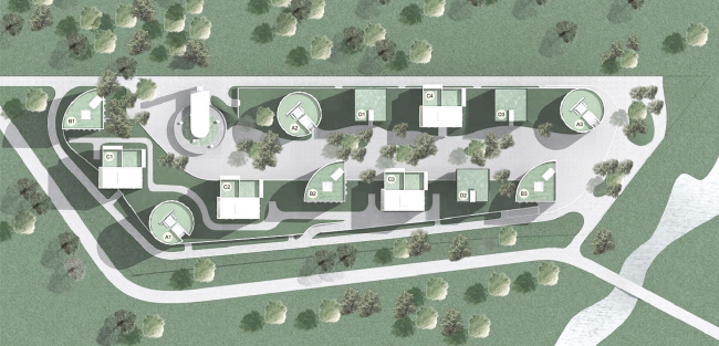
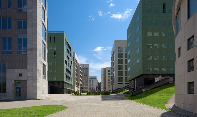
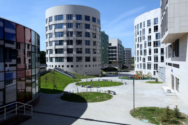
In order to visually single out the territory and give it a cozy feel, the
architects surrounded the “Grünwald” with an earth mound, into which they hid
the parking garage. The mound forms two layers of public space: the main one, the
boulevard surrounded by the buildings and protected by a green hill, and the
secondary one – an array of terraces set upon this hill, i.e. on top of the
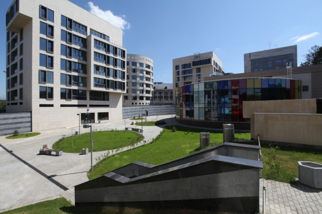
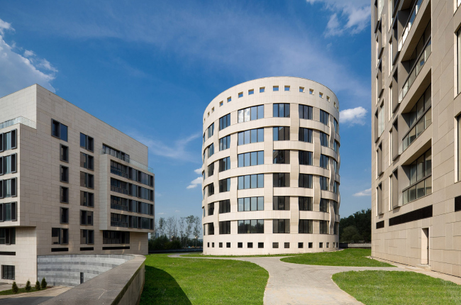
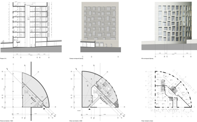
parking garage, commanding a fine view of the surroundings. No two houses here
are exactly alike. The round volumes mark the corners, while the sector
building creates the dynamic entrance area. The height of the buildings is also
carefully chosen – they tower just a little bit over the surrounding treetops,
not domineering over the nature but just making their presence visible. The house
designed by “Ostozhenka” studio, was aptly named “Sector” because it looks like
a quarter circle on the layout. This shape, stylish by definition, did not require
any extra volume elements – that’s why the facades here are dominated by the
so-much-like-Ostozhenka pattern of window openings and the combination of
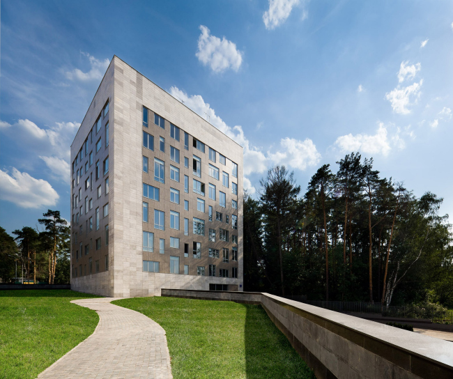
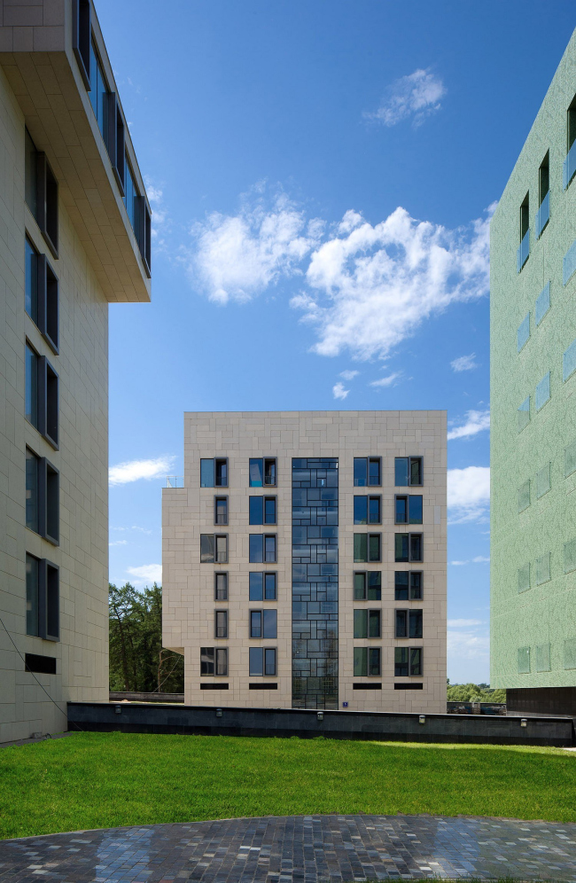
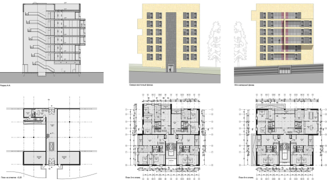
finishing materials, natural stone and wood. The “Cubuses”, houses by the German
bureau AssmannSolomon, originally the largest ones of all, got the facades with
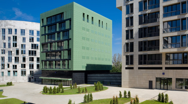
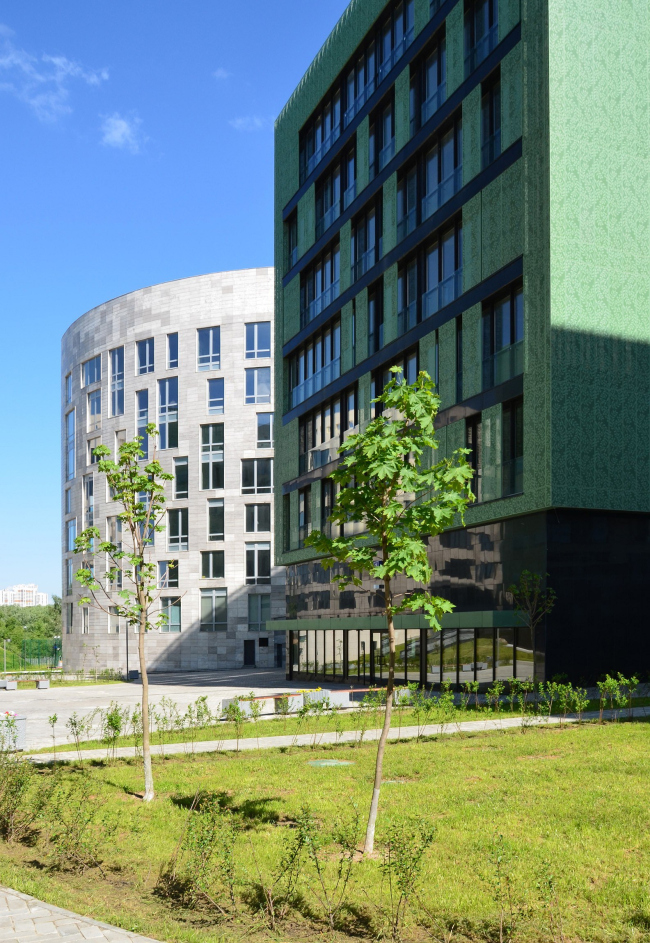
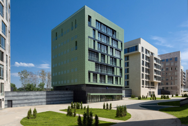
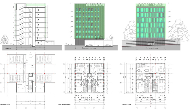
prominently protruding elements. Arguably, the most unusual facades are sported
by the “Veil” house designed by Anton Mossin. They look as if they were covered
with a green openwork shell that forms various floral ornaments. This shell
serves the function of an extra façade and provides not only visual and
acoustic protection but also creates the air buffer protecting from the heat in
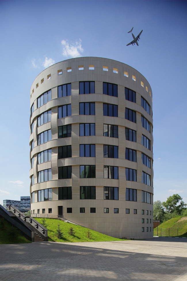
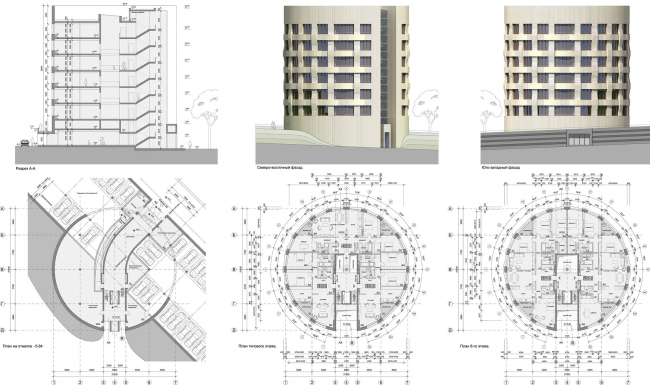
the summertime, which helps cut the air conditioning expenses. The round house,
designed by SPEECH Choban&Kuznetsov and nps tchoban voss, according to the
masterplan, was to become the outpost of the settlement, and the architects
treat it accordingly as a tower, enhancing this metaphor with the rhythmical
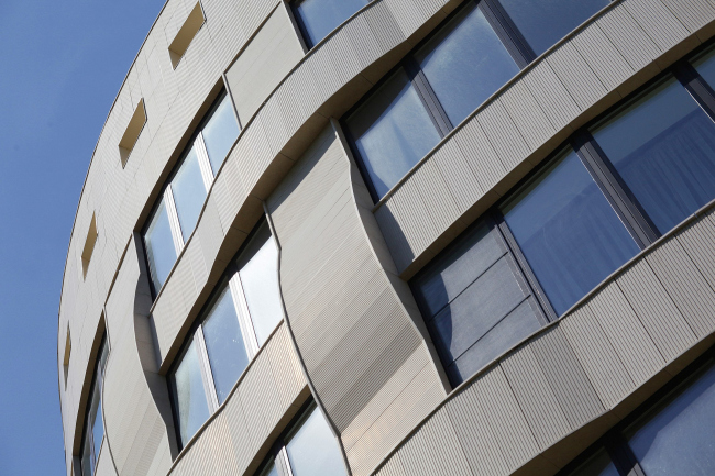
window belts. The facades of this house, with a poetic name of “Waltz”, are
finished with rusticated stone blocks that the architects run between the
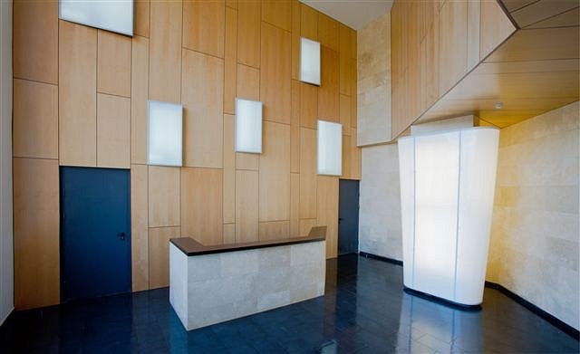
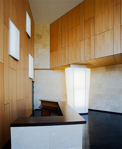
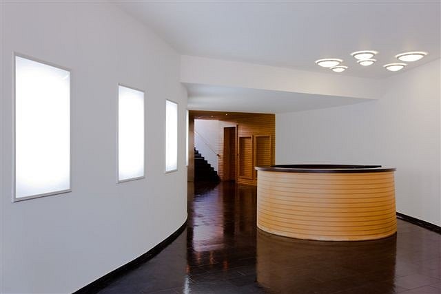
window openings in crisscross bands. The interior of the well-like elevator
lobby also takes the tower association to a new level: the light from the
high-rise lights permeates it from top to bottom, and the elevators are
accessed by hanging bridges. None
None
None
None
None
None
None
None
None
None
None
None
None
None
None
None
None
None
None
None
None
None
None
None
None
None
None
None
|
