|
The new building of Arbitration Court in Selesnevskaya street presents a number of experiments with ‘pure’ form. But the most important experiment here is a new plastic image of justice – pure, transparent and rational.
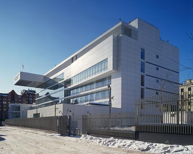
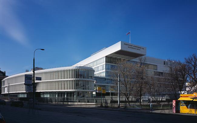
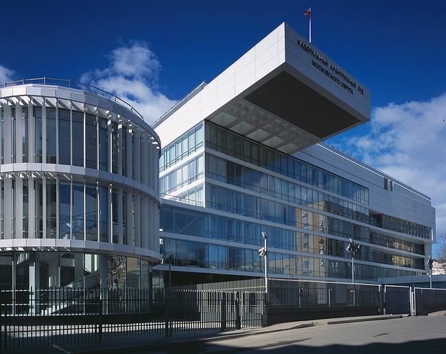
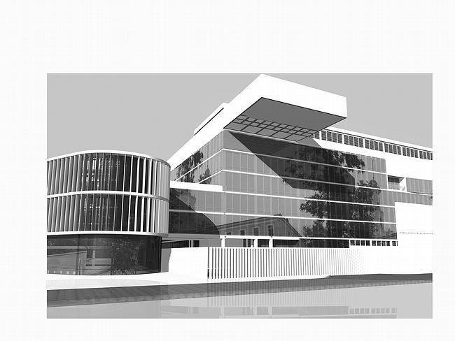
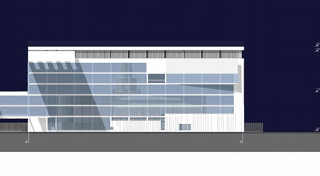
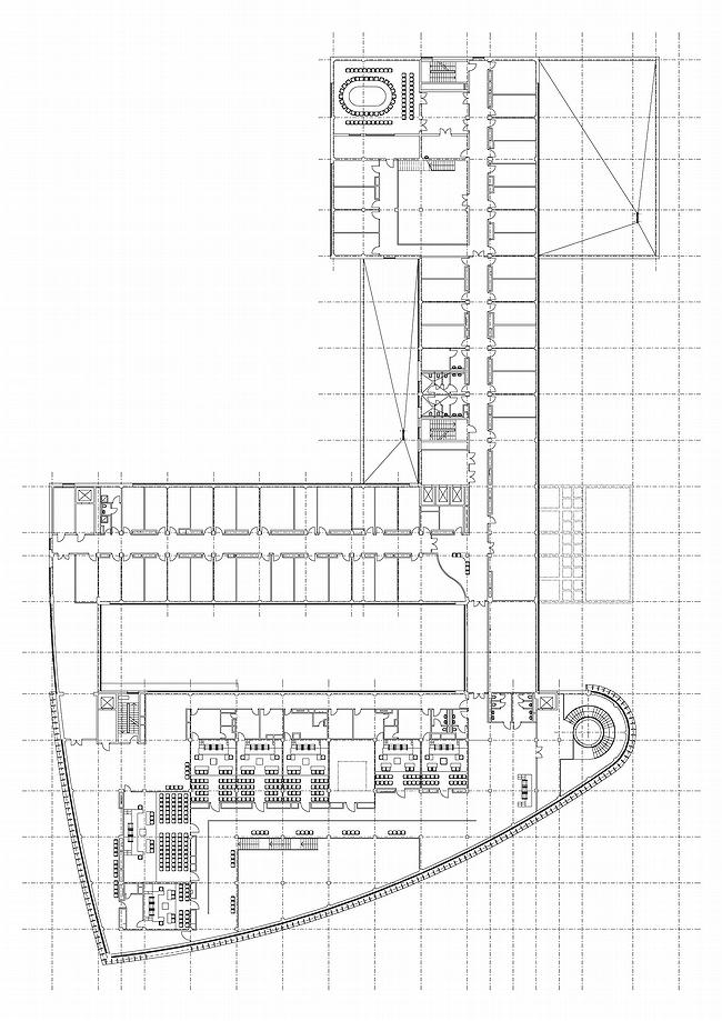
The Arbitration Court consists of two buildings, one intended for the everyday work of the judges, the other is open to public, it is closer to the street and it is where Court rooms are situated. There is an open space between the two buildings that are connected by two passages; everything is set in such a way so that judges would not meet members of the public accidentally.
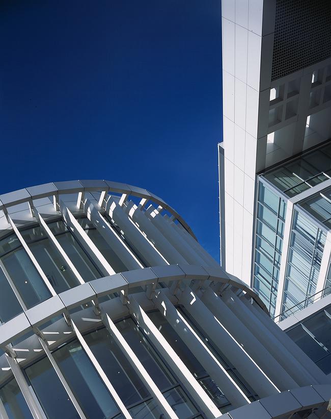
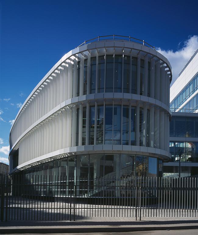
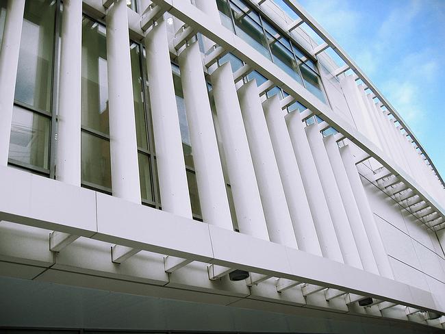
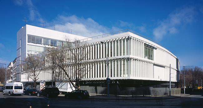
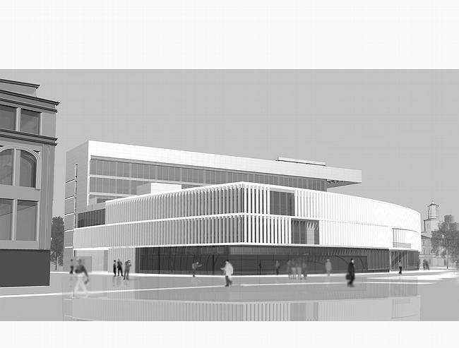
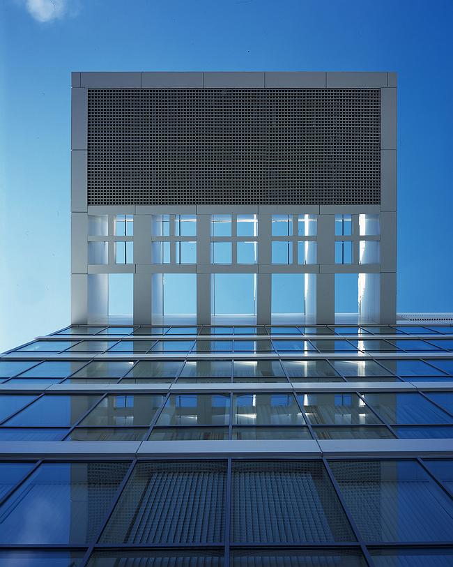
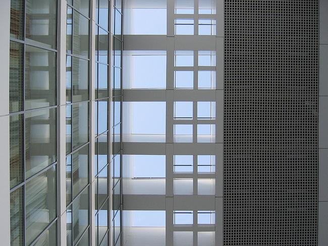
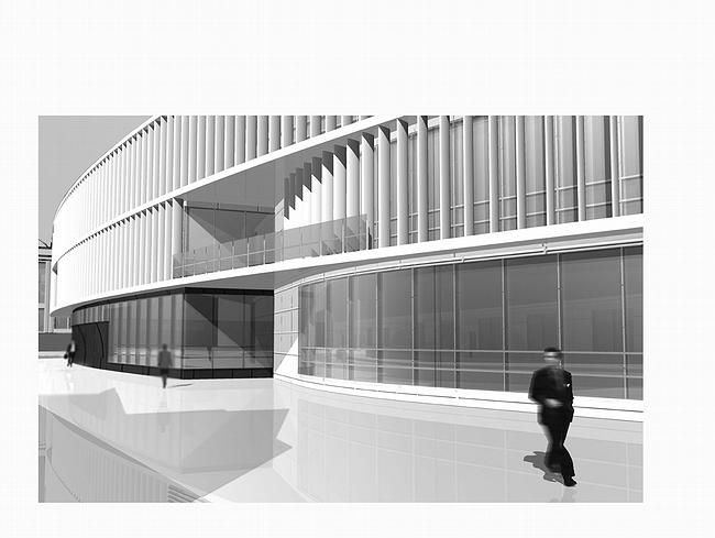
The composition is based on the juxtaposition of the two building: one is large, rectangular and shines with the surfaces of its large windows. The other building is smaller, its lines are curvaceous, and its facade is decorated with thin white lamellas that are supposed to protect public courtrooms from direct sunshine. But there is craftiness in this practical explanation. First, it’s much cheaper to protect the rooms with blinds. Secondly, lamellas on the facade are motionless. Thus they less like technical and more like artistic device – and here they work perfectly by creating an image of ephemeral purity.
The lamellas turn their thin sides towards an onlooker so if one looks frontally they do not cover anything. But in perspective they create an even and at the same time vague surface. It looks like grate; it makes a second shell for the facade – solid yet vague, metal yet open. Thus main facade consists of three layers: first sharp ribs of lamellas, then transparent glass, and finally white strips of blinds. All three layers looks thins and permeable although they all enable one to lock out the outside world. But the building itself lost its mass and matter. It seems to be made of paper, since it looks to be so light.
Lamellas exist only on the curvaceous surfaces. Thus an architect demonstrates different textures: straight lines shine with glass while curves are decorated with grates. Vladimir Plotkin rarely uses curves. It is not a coincidence he works with them here. He had to work with strict limitations posed by the surrounding landscape – by the Church of St Pimen and by the Fire tower, - and solved the problem by the combination of uncompromising modernism and attentive attitude to the environment. The curves open views and create perspectives that had not existed before, while glass windows are used as mirrors to reflect the monuments.
Thus the lesser building was placed in the historical zone and had to become curvaceous; it overlooks the Krasnoproletarskaya street with a ‘nose’ typical for Russian constructivism. Plotkin is sceptical about open biologism so there are few curves in his projects. Thus oval ‘nose’ at Selesnevka has to be somewhat special.
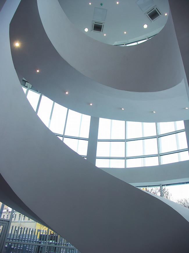
First, it has been designed rationally – the landscape was taken into consideration but geometry was not neglected. Its form is a combination of three arcs and one line. Inside there is a spiral staircase. The other building matches it with rectangular entrance block.
All these formal and abstract juxtapositions of pure artistic value are combined wuth modern technologies and create a clear and pure image. The impressions made by the building are that of purity, transparency, permeability, lightness and rationalism, as well as of respect towards historical monuments and towards the public. They all construct the image of an ideal court of justice – human, rational, transparent. We tend to connect these qualities with an open society and the European way of development. Thus the building either looks as a reflection of the changes taking places in the country, or rather shows the desire to spped the process up by artistic means.
None
None
None
None
None
None
None
None
None
None
None
None
None
None
None
|
