|
The project of the landscape solution for the courtyards of the residential compound “Italian Quarter”, offered by “Sergey Kiselev and Partners” studio, turns a new page in the “playing the classics” game that Mikhail Filipov started.
For the chief architect of the project Vladimir Labutin and his team, finding the landscape solution for the yards of "Italian Quarter" became their second experience in the field of landscape development: before that he mostly dealt in 3-D architecture. Besides, Labutin considers himself an advocate of the modernist shapes, while "Italian Quarter" by Mikhail Filippov sets the typical for this architect example of Neo-Palladianism. Labutin found the clue to solving this contradiction in the works of Italian architect Carlo Scarpa who used to integrate modernistic shape into Venice's historical environment with incredible grace.
None
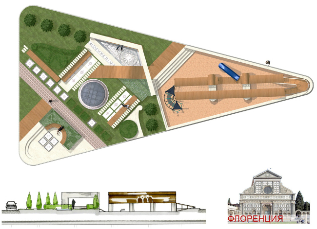
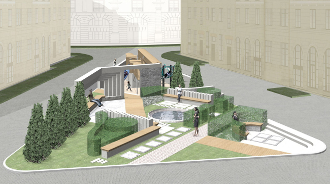
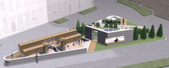
All the buildings and yards of "Italian Quarter" are named after the names of Italian cities. Hence, the central yard is named "Florence", and the two side ones are named "Rome" and "Milan". The basis for the layout of each of the yards was chosen to be… the famous monuments of the Renaissance epoch but – and this is important – refraining from making direct replicas of them. For example, the sub-basis of the layout of the central yard came up from a fragment of the façade of Florence's church Santa Maria Novella: the "rose-window" turned into a round swimming pool with a mosaic plaiting on the bottom, the volute turned into a smooth-shaped supporting wall, the gable became a pergola, etc. Looking down into the yard from their windows, the people will see the image of the façade fragment in all living glory and harmony of its proportions drawn by Leon Battista Alberti.
None
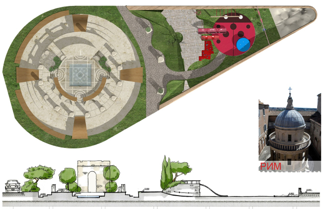
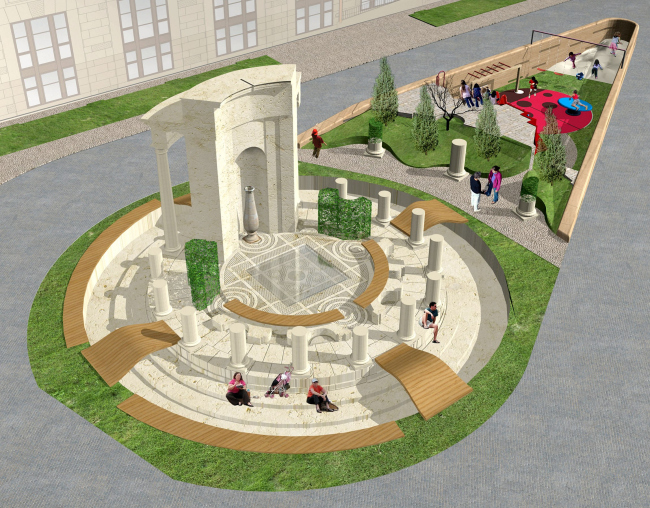
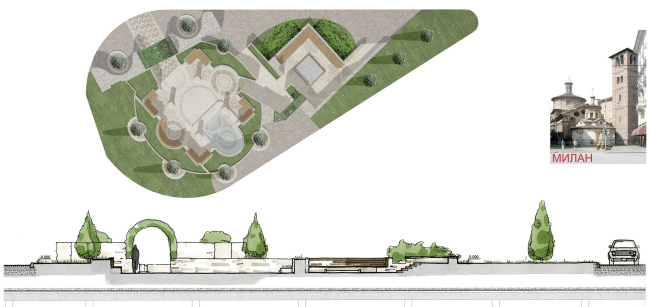
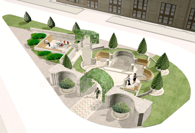
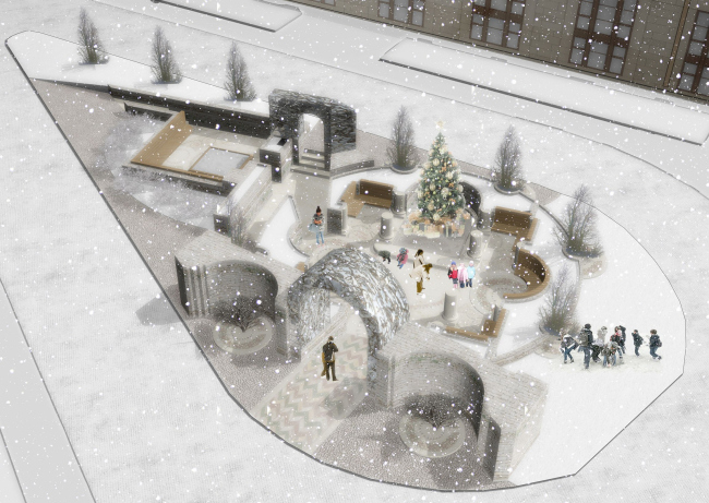
For the other two yards the architects chose the works by Donato Bramante who worked both in Milan and Rome, thematically uniting the two sections. "Milan" is represented by Bramante's first architectural work, the church Santa-Maria Presso San Satiro, and "Rome" – by his most famous work, Tempietto. Here the architects proceed from the popular in XVIII century genre of "ruin park" and "destroy" Tempietto, leaving only the bases of the columns and a fragment of the wall with a niche, giving the viewers an opportunity to see, as if in a visual aid exposition, the layout of the famous building real-size.
None
It was decided that all the volumes would be executed in stone that is hard enough and has the right colour. For "Florence" cold shades were chosen, for "Rome" – warmer shades. Because the specifications also included playgrounds, each of the three yards is split in two parts one of which becomes a playground, each of the yards serving a different age bracket of children. The central yard features the most sophisticated construction of all – this an allusion to Ponte Vecchio, and the special safety rubber coating underneath it is meant to simulate the muddy waters of the Arno River.
None
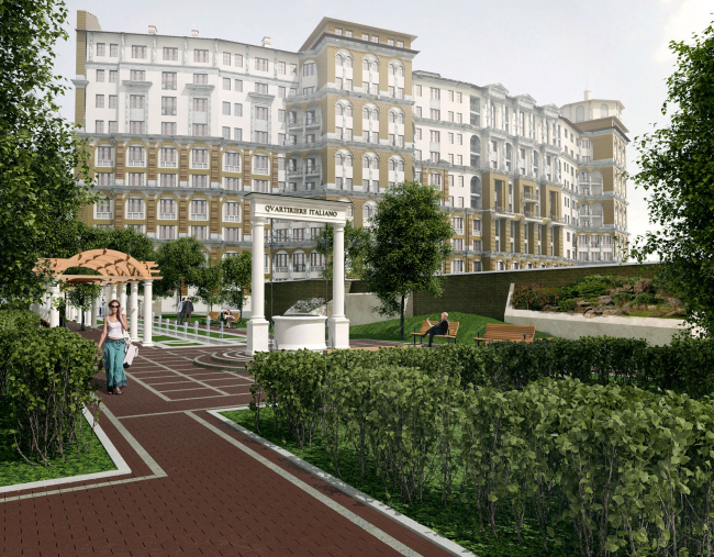
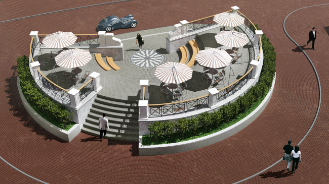
While the three inner yards will serve only the people living in "Italian Quarter", the green area before the main entrance will be open to the general public. The architects turn this small park into a conditional amphitheatre with one stairway. Its upper part will become the platform for the summer cafe, and the two semi-circular steps will serve as benches. The adjacent birch-tree alley will also be revised in the spirit of Italian Renaissance: two lines of low-rise fountains, an elongated pergola, and a decorative well. These areas will connect the new residential compound to the city and will prepare the city people for entering the environment rich in quotations and allusions.
None
None
None
None
None
None
|
