|
Published on Archi.ru (https://archi.ru) |
|
| 26.03.2012 | |
|
Around the Brick Square |
|
|
Anna Martovitskaya |
|
| Architect: | |
| Sergey Skuratov | |
| Studio: | |
| Sergey Skuratov architects | |
|
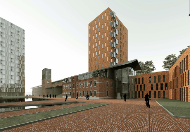
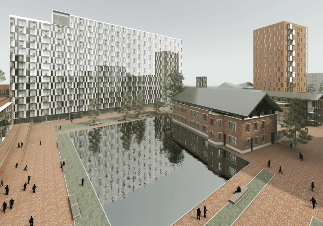
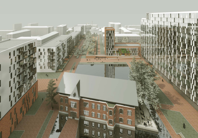
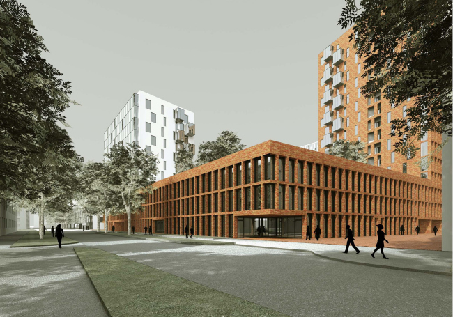
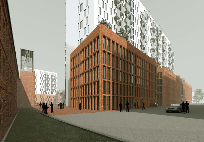
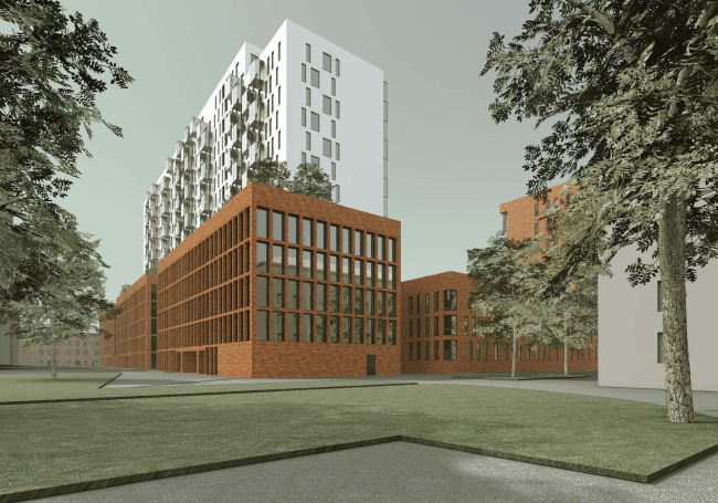
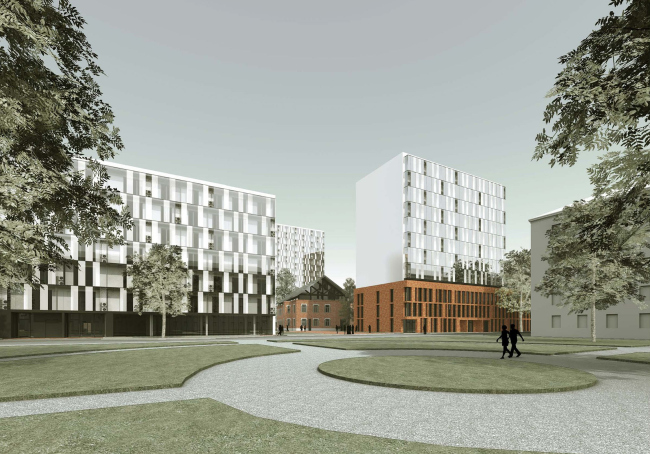
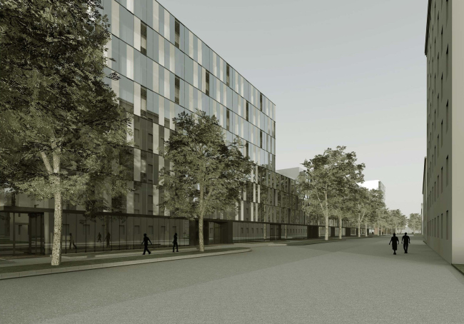
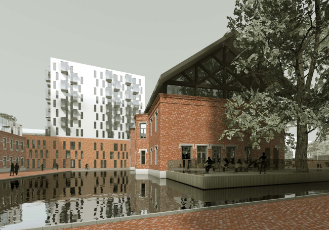
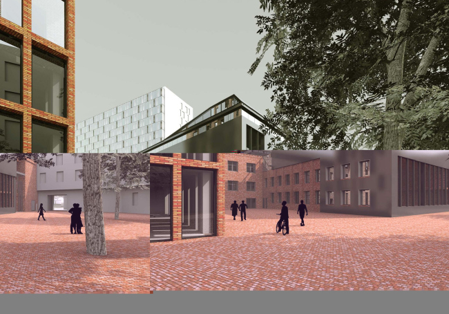
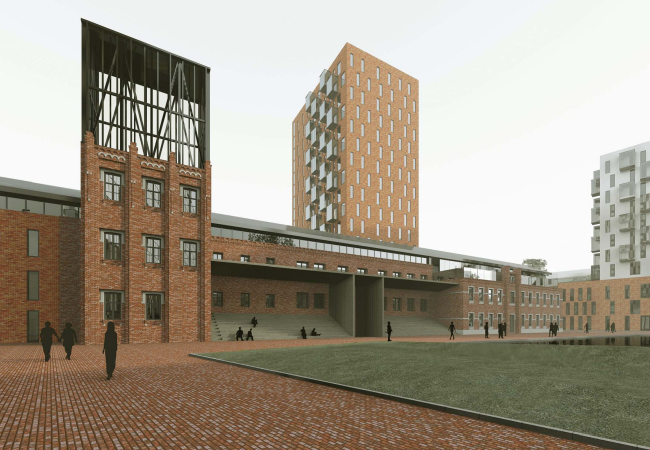
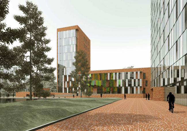
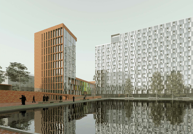
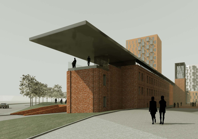
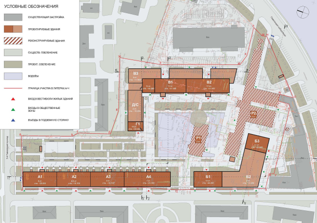
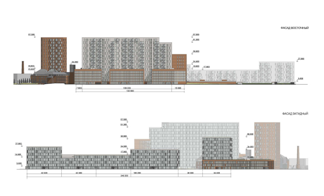
A year ago, “Sergey Skuratov Architects” studio won the international bid for the concept of the new residential compound that will be built of the territory of the former “Moscow’s printing and publishing integrated works”. Over the past year, the concept of the residential center has taken its final shape: the number of floors decreased, the housing density slightly increased, and all the indispensable accompanying functions were organically woven into the housing fabric – to accommodate them, the architects used the already-existing factory buildings. And, while the original housing version included only some of the industrial facilities, now the red-brick architecture “with a history” has become an integral part of the look of the district. According to the architects’ plan, the central factory building will be remodeled into a café combined with an exhibition hall – this two-storey volume that is topped off with a transparent cock-loft and covered by the brutal-looking gable roof of black metal, will be placed in the middle of the artificial pond. The pond, in turn, is surrounded by a brick-paved square and serves as some sort of a starting point of the axis of the central pedestrian boulevard. This “recreational area”, composed from several spacial elements (pond, square, and boulevard) is meant to be the nucleus of the entire composition, around which the basic volumes are placed. Yet another pedestrian pathway connects the square and the Paveletskaya embankment – there are several factory buildings standing alongside it; they will be remodeled into a community center. And, to make sure that the building does not visually fall apart into two stylistically mismatched parts, the architects support their unity with a few volumes made up of Flemish bricks. The building looks all the more stylish because the architects partially covered the brick volume with a metal hood. Yet another two volumes are designed as high-rise centerpieces – they help the authors to lift the industrial theme off the ground and make it enter into a dialogue with modern architecture. These centerpieces are the 10-floor tower, built on the border between the boulevard and the multicell apartment buildings executed in the modern style, and the 17-floor tower that ends the “North-South” axis and for the most part forms the silhouette of the embankment. Extending the factory buildings down to the very embankment, the architects logically placed inside of them the premises meant for renting and leasing. In the original version of the project, this volume got an all-too-laconic solution: it was annexed to a futuristic bridge connecting the center to the opposite bank of the Moskva River; no plastic excesses were needed against its background. In the long run, the architects had to forego the idea of building the bridge because it turned out to be prohibitively expensive – that’s why the problem of the façade was so acute now. The elongated brick volume that crosses the embankment at an angle was extended as far as possible with the help with the already-mentioned black metal marquee. The building itself, as it closes on the embankment, become one storey lower, so the marquee that is oriented towards the river forms a natural open-air sightseeing platform. It also successfully serves both as the “visiting card” of the entire center, and the reminder of the bridge which could have made the life of the tenants significantly easier but, regretfully, was to remain a just dream. NoneNoneNoneNoneNoneNoneNoneNoneNoneNoneNoneNoneNoneNoneNoneNone |
|
