|
Published on Archi.ru (https://archi.ru) |
|
| 27.03.2012 | |
|
Pedestrian Arc |
|
|
Anna Martovitskaya |
|
| Studio: | |
| Arhitekturium | |
|
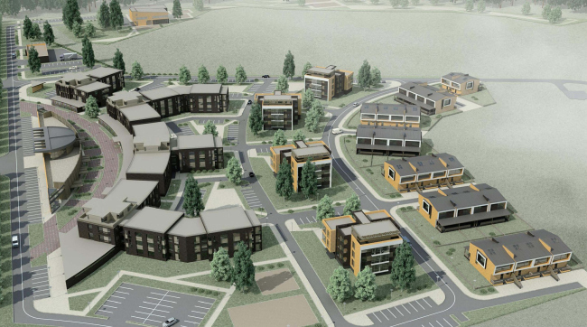
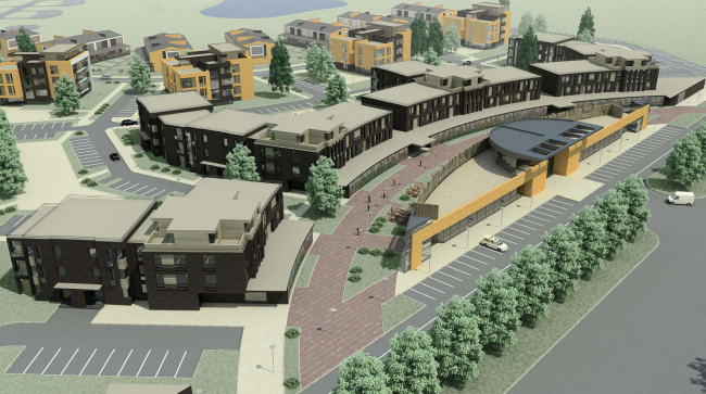
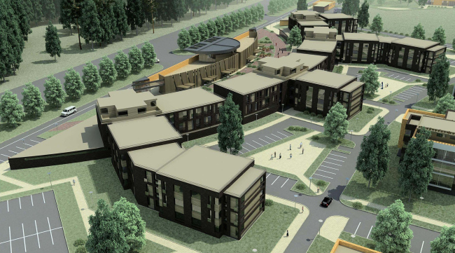
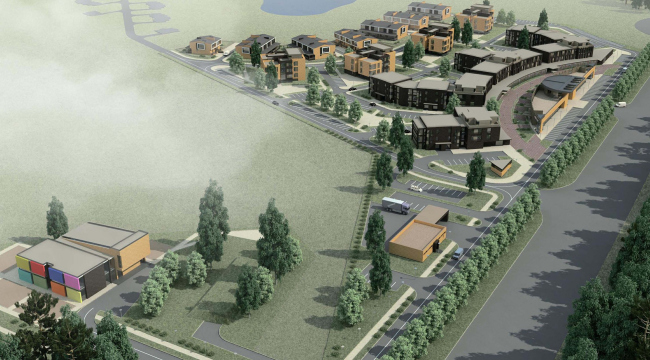
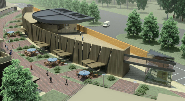
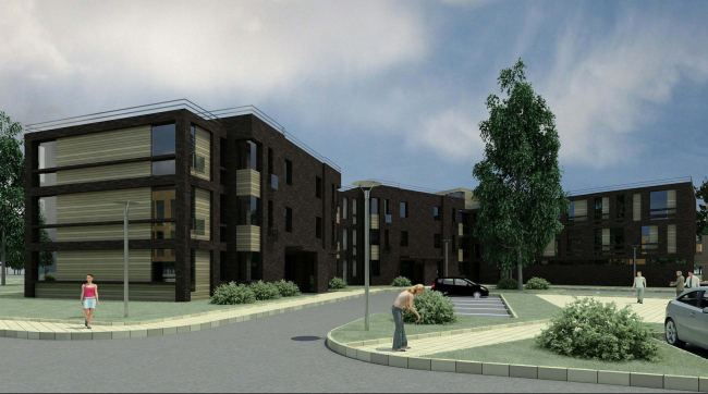
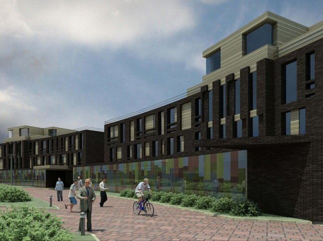
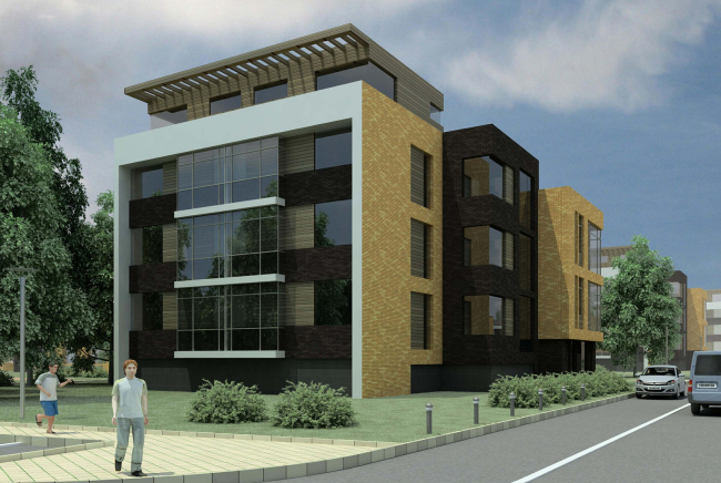
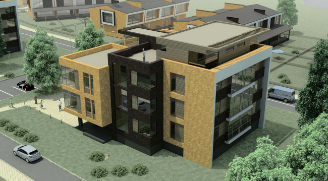
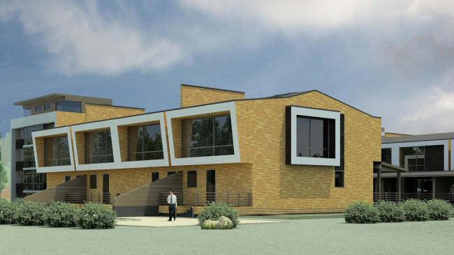
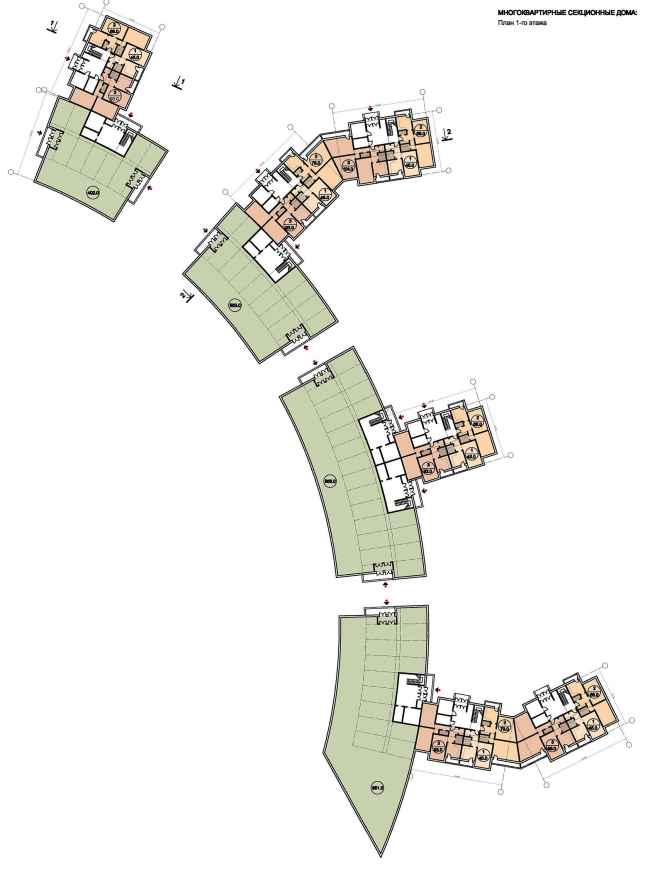
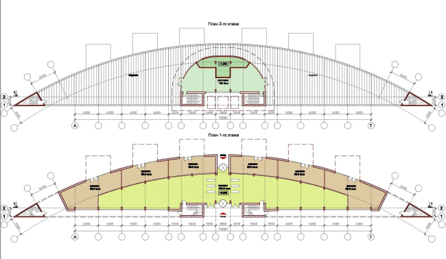
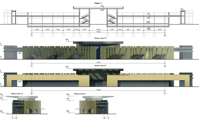
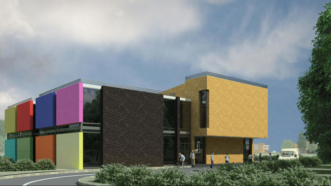
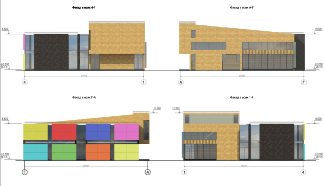
Not far away from the Moscow’s suburb of Istra, “Architecturium” studio has designed a low-rise mixed-use development. The new district with a cozy pedestrian street in the middle will become an integral part of “Svetlogorye” settlement. The designers had the task of creating some sort of an all-purpose buffer area saturated with infrastructure and capable of “beefing out” the settlement with housing of various type and class. Ultimately, the architects turned the “interfacial layer” that originally was supposed to play a solely utilitarian down-to-earth function, into a cozy and self-sufficient district with a heart and soul of its own. The land site that was allotted for the mixed housing has a very sophisticated layout shape and in fact falls apart into two virtually independent polygons. The smaller one, according to the architects’ plan, will accommodate the kindergarten and the sports and fitness center, separating these two from the traffic way with a wide green belt. The bigger rectangle is turned into a system of open-ended interflowing green courtyards between which the residential houses are placed. It is obvious, however, that, unlike with a kindergarten, you cannot protect a residential house from the noise of the traffic with threes alone - and this is why the south-west border of the land site, where the house “rests” on the highway, is flanked by a shopping mall. On the layout, this building has the shape of a circular segment and looks a bit like an angle protractor; behind it, there is an arc-shaped apartment house. Together these two volumes form the inner commercial-pedestrian street that not only helps to separate the new residential district from the road but also gives it the feel of a self-sufficient city medium. The lower floors of the multicell residential building accommodate various shops and services. This, however, is not the only way to “load” the pedestrian street with work. From the shopping mall side, the architects are placing a few cozy miniature cafes - the convex facade of the building is faced with wide wooden wedges, the ends of some of which are bent to make marquees. Wood also serves as the facing material for the upper terrace of the building, while the high skirting safely protects it from the noise and the dust of the traffic way. At the same time, the shopping mall is turned to the traffic way with its wide glass surfaces, the showcases that are inbuilt into the minimalist frames of light-colored Flemish brick. The same bricks, only of a darker color, are used to face the arc-shaped apartment building; the housing that starts behind it, combines both of the two shades of color.In order to keep the house from looking too much like a dark solid line, even if sophisticatedly curved, the authors break it up into four separate blocks (between them one can pass through into the territory of the district but these passageways are tenements-only); the facades are ornamented with vertical slits of varying length. NoneNoneNoneNoneNoneNoneNoneNoneNoneNoneNoneNoneNoneNoneNone |
|
