|
In the 1st Smolensky Side-Street, the architectural studio “Group ABV” is building an elite residential house.
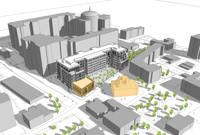
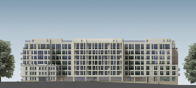
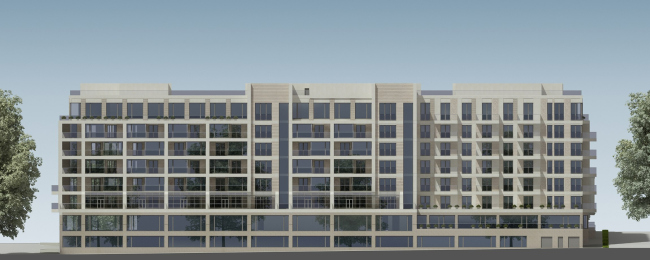
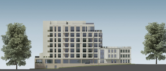
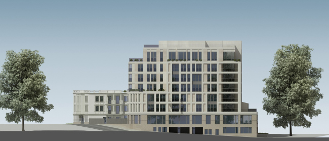
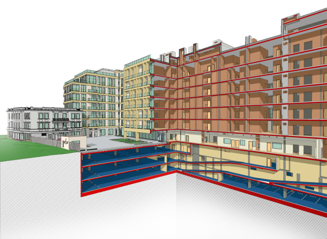
The 1st Smolensky Side-Street is located in the vicinity of Novinsky Boulevard and really close to Smolenskaya Embankment. One of its must-see buildings is the Church of the Wonderworker restored in the late 1990's and located right across from the construction site of the future residential house. This proximity clinched the matter: this land is part of the protected area of the church building, and the city granted the permission for construction work here only on condition that some certain restrictions are observed. First of all, this is, of course, the height restriction (the height of the seven-storey building is 29.8 meters) and the "overall modesty" of the architectural solution. To make things more difficult, the city administration put forward, however, a more exotic demand – that the residential building should include the so-called "house of the clergy", a three-storey volume that is going to house the educational and the conventional centre of the congregation. Historically, no house of the clergy ever was here, but, because the facility is going to be a church-related one, the church insistently recommended the architects to execute it "in the classical Moscow style".
 None
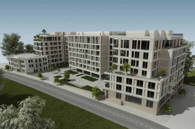
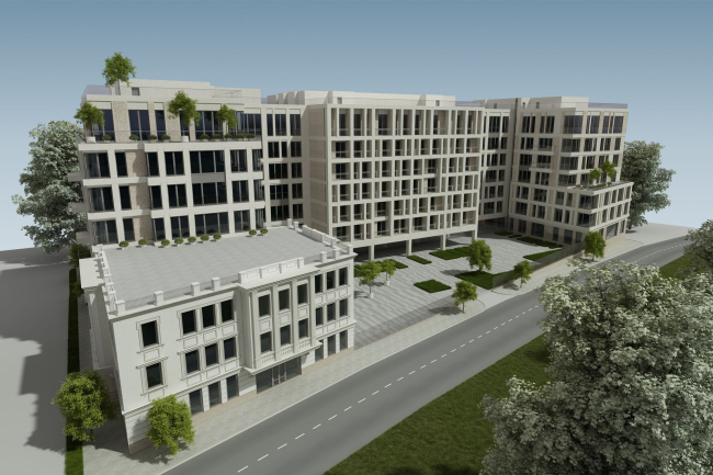
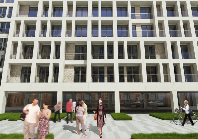
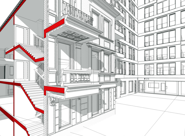
What is interesting here is that the solution that the architects came up with was not based on some average cross between the classical and the contemporary styles but the contrast between the two functions. This contrast is not garish or brazen, and it is not even the first thing that meets the eye – the volumes are executed from the same material and in the same colour – but apparent to the careful observer. Despite the fact that from the composition standpoint the house of the clergy is designed as a wing of the residential building, it looks like an already existing house (indeed as an old Moscow mansion of sorts), while the main volume looks like it definitely belongs in the present day.
None
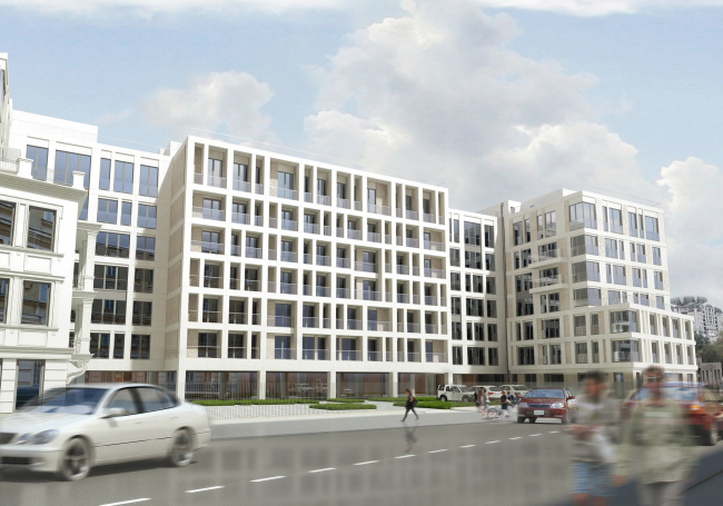
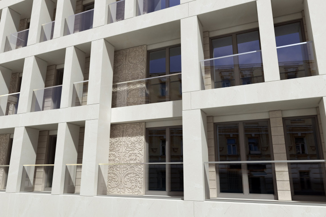
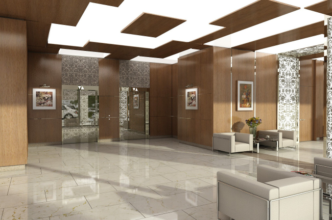
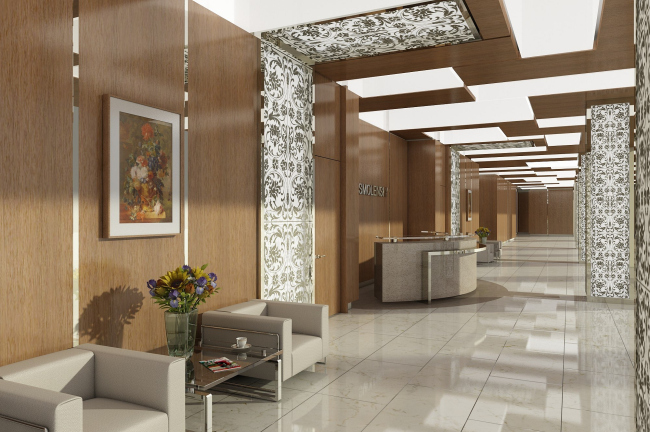
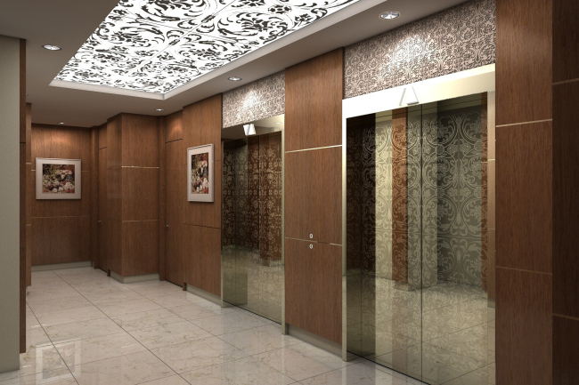
The silhouette of the house resembles a staircase, and this makes the house look like a town block: its parts look like one another but they keep varying all the time, and the careful observer will have a great time examining the house for these little differences. What's more, a really careful observer has all the chances to notice that these variations fall together into a very logical architectural "story". The façades of the house consist of framework-like white verticals and horizontals. This framework is geometrically correct: no slats or askew lines but its rhythm is really sophisticated – at times it is dense and at times it is sparse with some elements missing – both horizontally and vertically. Historically it is often the case that if the building had been built on one rigorous grid but then was several times remodeled and renovated with lintels taken down and added again, this rhythm may look like imitation of the traces of the natural history of the building. On the façade of the central projection that protrudes into the yard from the street side, the white grid changes from flat to convex and projects far beyond the house making room for the stanzas here. In the depth of the stanzas the careful observer is in for a surprise – the flat surfaces of the Jurassic stone are covered with branch-like ornament that in some places alternates with thin rustication. The architects are intending to maintain this theme inside the house as well: this same design is actively used in the interior public areas, only now it will glow and glitter: on the polished metal of the elevator doors and on the huge lights that run from the walls up to the ceiling.
None
None
None
None
None
None
None
None
None
None
None
None
None
None
None
|

