|
Published on Archi.ru (https://archi.ru) |
|
| 02.02.2012 | |
|
Town in the Woods |
|
|
Anna Martovitskaya |
|
| Studio: | |
| Architectural bureau of Yuri Vissarionov | |
|
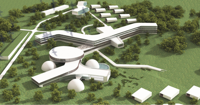
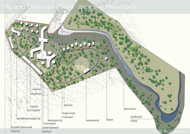
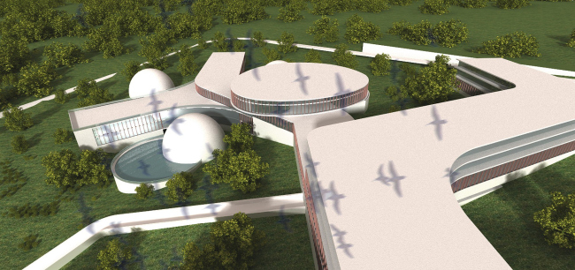
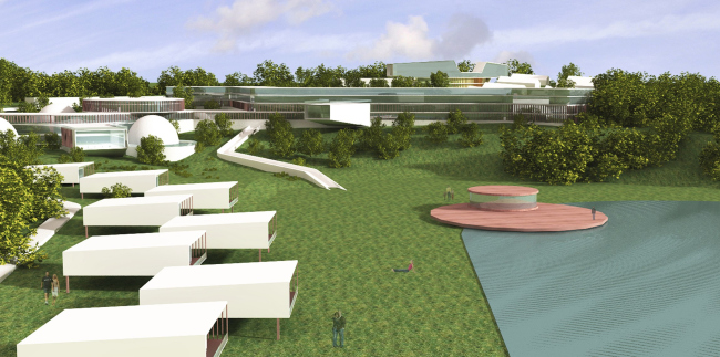
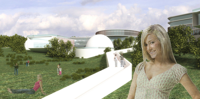
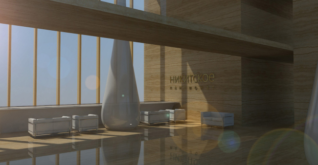
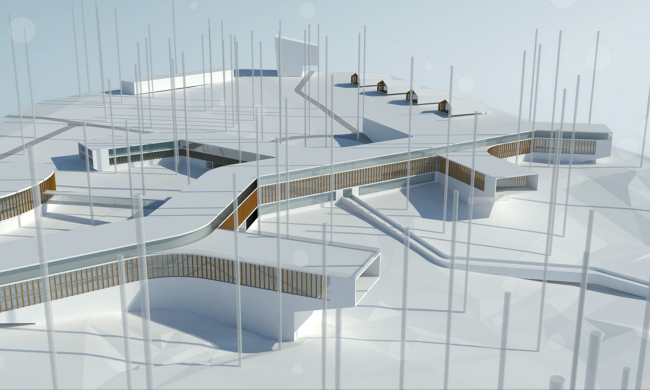
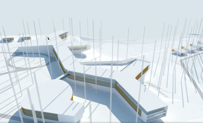
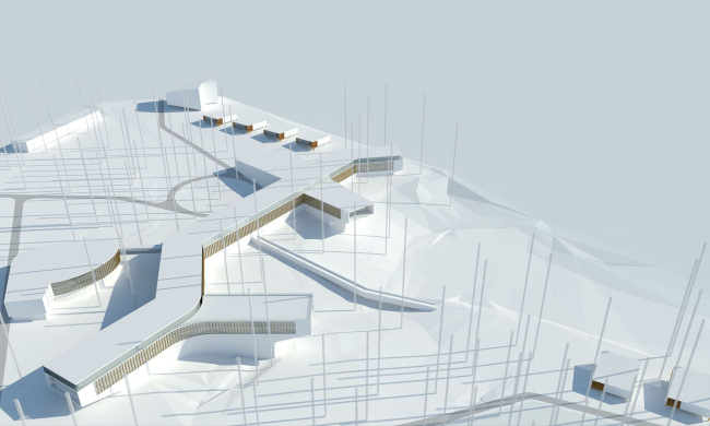
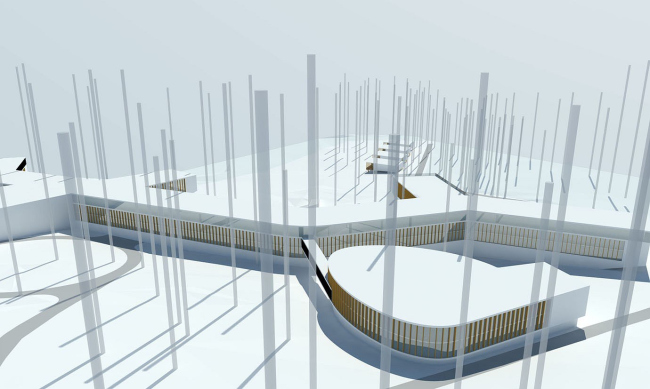
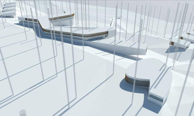
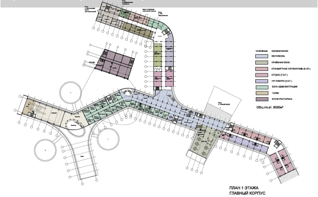
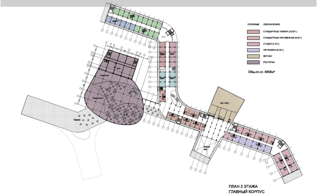
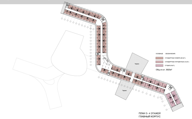
On the territory of the former children’s summer camp (aptly called “pioneer camp” back in Soviet Russia – translator’s note) not far from Moscow suburb of Domodedovo, Yuri Vissarionov’s Architectural Workshop is building a resort that is going to include a hotel, a few villas, an aqua park, a sports club, and a conference center. The authors placed the main volume deep inside the land site and at the crest of the slope, orienting the complex-shape building along the North-South axis. At the same time, this building has so many projections and annexes that one can only speak about the cardinal points orientation in respect to its central part: on the layout, one can plainly see the S-shaped structure of the medical block that branches away from the Southern wing of the main building. From this same side, the dormitory is annexed to the oval-shaped cafeteria and the aqua center that overhangs above the slope. Such “branchy” layout came around for several different reasons at once. First of all, the architects wanted to concentrate, within one space, all the major functions of the future resort: this is especially vital in view of notorious Moscow climate – during the really cold winter days or during the really wet and drizzling autumn days, the guests will be able to move from the cafeteria over to the spa without having to go outside. Second of all, the height restriction was 4 floors max – and this also determined the elongated shape of the buildings that “sprawl” over the ground. According to the architects’ idea, such buildings play in tune with the winding forest paths and allow the tall trees (that were, of course, also to be kept intact) keep their dominant position of the land site. It is also worth mentioning that, thanks to the low-rise of the buildings, the guests will not be able to see from their windows another construction that is in progress not far away from the resort. At the same time the villas that by definition are meant to provide their guests with as much privacy as possible, are placed at the far end of the site – behind the conference center and along the northern border of the site, closer to the river. The horizontal orientation of the main building is enhanced by its three-part structure that the architects came up with. The walls of the ground floor are faced with white slabs (sort of a tribute to this place where back in the old days limestone was mined), while the second and the third floors are decorated with wooden lamellae that set the fractured rhythm and go a long way to enhance the rotating figure of the oval of the restaurant. The top floor, conversely, is fully covered with glass that makes it look akin to the light ship deck of a gallery. Possibly, the elongated sprawled space would have visually “fallen apart” and looked at the same time a bit too monotonous, had it not been for the funnel of the main entrance lobby: it is a “developed” two-storey trapeze that cuts into the building exactly in the middle.It houses a whole number of premises: the reception area, the bar, the lounge, a few mini-shops, and an Internet café. The complex shapes of the public buildings offset the laconic volumes of the villas – one and two-storey houses with gabled roofs. NoneNoneNone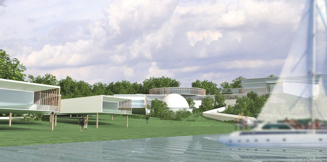 NoneNoneNoneNoneNoneNoneNoneNoneNoneNoneNoneNone |
|
