|
Published on Archi.ru (https://archi.ru) |
|
| 30.01.2012 | |
|
Tinted History |
|
|
Anna Martovitskaya |
|
| Studio: | |
| Tchoban Voss Architekten | |
| Evgeniy Gerasimov & partners | |
| SPEECH | |
|
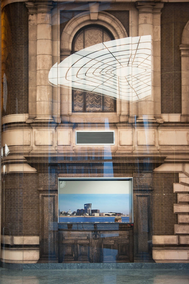
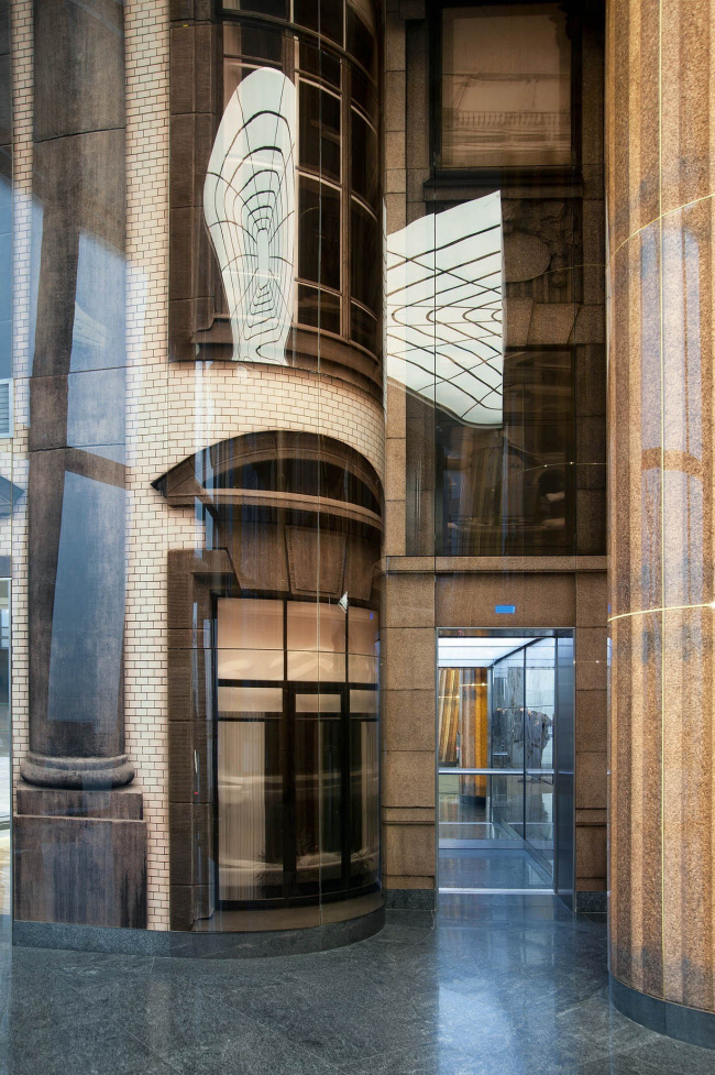
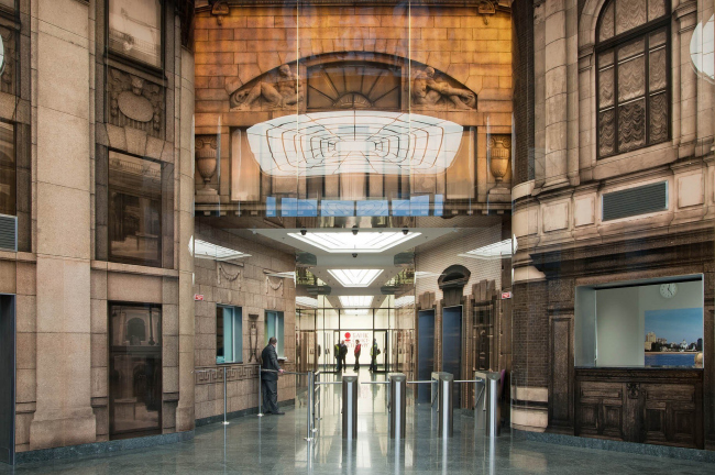
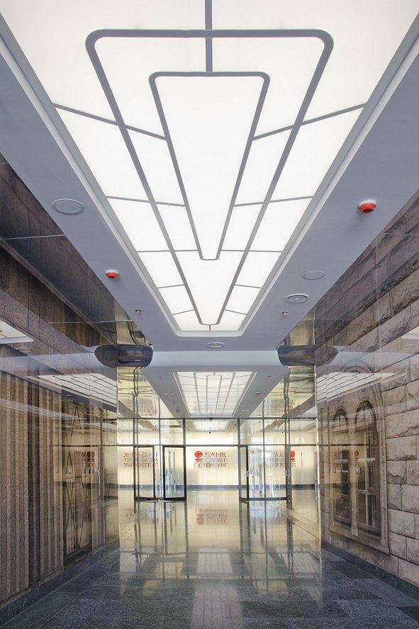
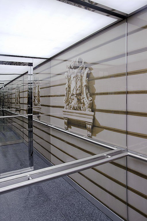
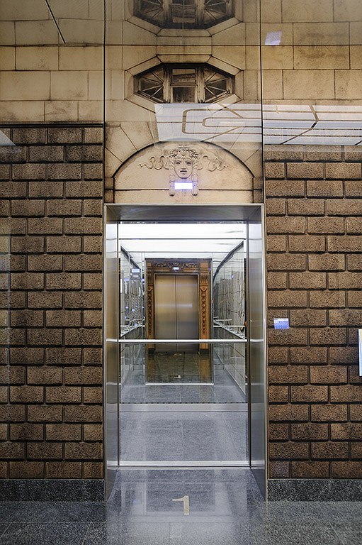
If there was a list of last year’s most notable architectural premiers, it would definitely include the building of the bank “Saint Petersburg” built by “Eugene Gerasimov and Partners” in cooperation with “nps tchoban voss” and “SPEECH Choban and Kuznetsov” on Saint Petersburg’s Malookhtinsky Avenue. Recently, the architects completed their work on the interiors of this project – the updated solutions are aptly added with the photos of Saint Petersburg’s major banks. The entrance and the elevator lobbies were designed by Berlin’s studio “nps tchoban voss”. As Valery Kashirin, the chief architect of the project, shares, the architectural solution was based on the idea of the link of times – by virtue of using the contemporary means of expression, the authors sought to highlight the continuity of generations and thus inscribe the first XXI century bank into the list of its top-rated predecessors of the previous centuries. To achieve this, the architects coated the walls of the entrance lobbies with glass panels that bear the images of the historical bank buildings of Saint Petersburg; the images were made by way of digital printing. And thus, while from the outside the building of “Saint Petersburg” bank looks like a completely transparent hyperboloid cylinder that enchants the beholder with its futurist plastic shape, on the inside it presents a completely different picture: the images printed on the translucent glass surfaces give it a distinctly corporeal look and take the observer into the past instead of the future. Cleared from the signs of our time (air conditioners, ventilation louvers, etc) and slightly enlarged, the fragments of the historical facades form the historical street, creating an illusion of dense urban housing in the entrance area. And this illusion is exactly true-to life, too – not only thanks to the retouched details but also to the absence of visible mounting clamps of the glass panels. This so-called technology of “concealed mounting” consists in hanging the glass panels with fastening elements on their backs upon the steel rack-mount substructure. The fragments of the building are also used in decorating the columns, elevators, and the elevator lobbies on each floor, while the controls and indicators are inbuilt into the panels as lit-up “windows”. In order to stress the venerable age of the photographed buildings as well as the very fact of the images being photographs, and not fragments of the buildings themselves, the architect chose sepia as the main color solution. The columns and the 8-meter high central part of the lobby are backlit, which gives the entire space its particular “amber” glow, while the “original” properties of the glass – its transparency and its ability to reflect things - allow to lay over the textural stone-like coating a multitude of multicolored flares, thanks to which the image of the entire area looks like it is always in motion. The main theme is also enhanced by the floor coating of natural stone and large-size granite plinth that runs along the walls and the columns. 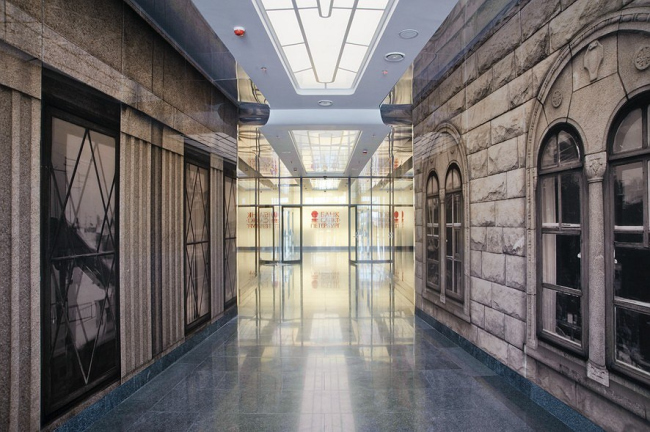 NoneNoneNoneNone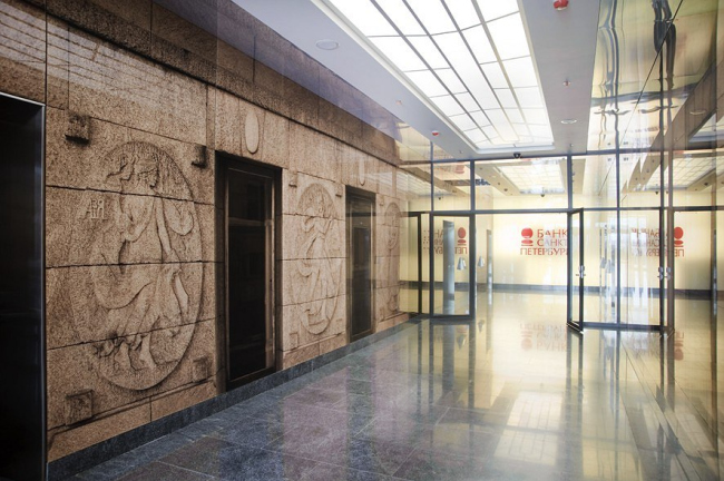 None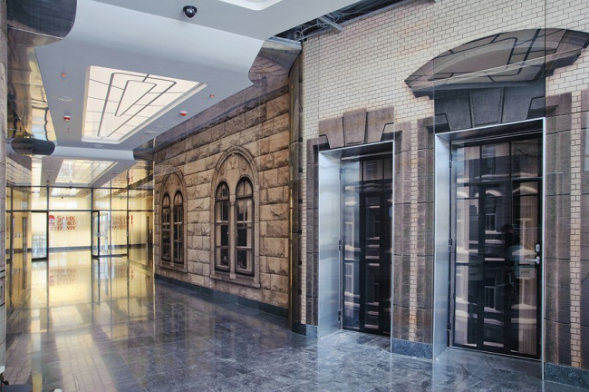 NoneNoneNoneNoneNoneNoneNone |
|
