|
Published on Archi.ru (https://archi.ru) |
|
| 16.01.2012 | |
|
Two Elements of Color |
|
|
Anna Martovitskaya |
|
| Architect: | |
| Levon Ayrapetov | |
| Valeria Preobrazhenskaya | |
| Studio: | |
| TOTEMENT/PAPER | |
|
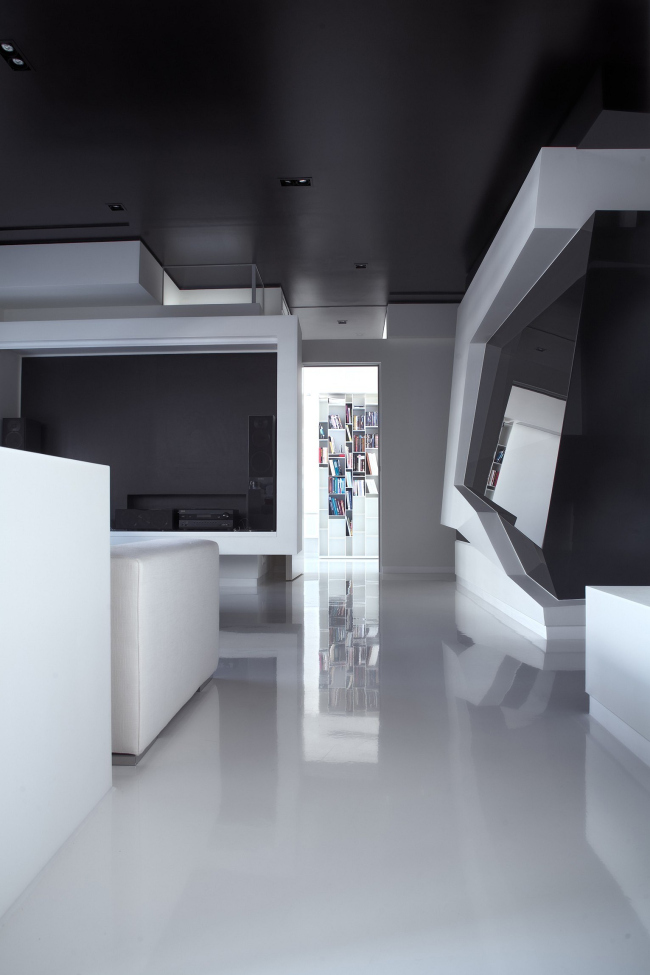
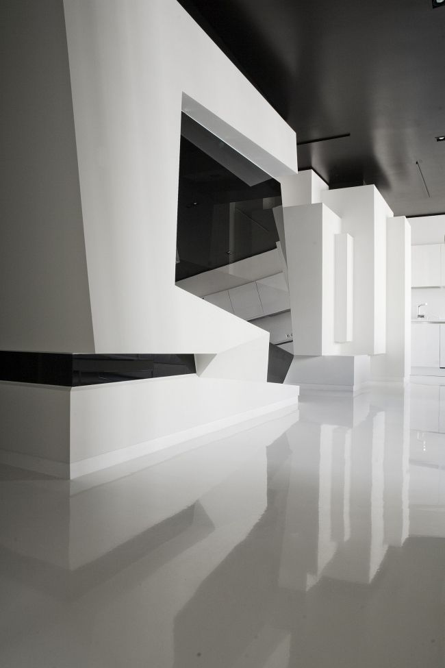
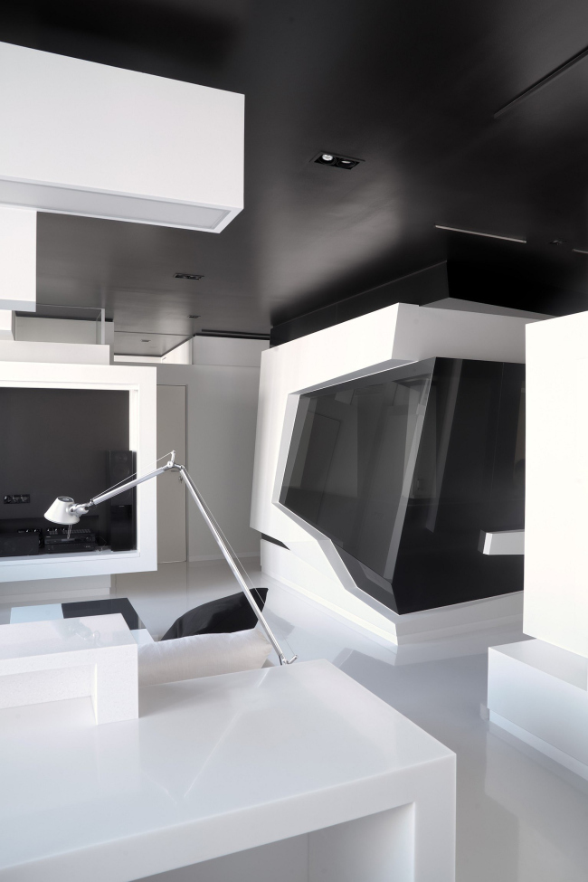
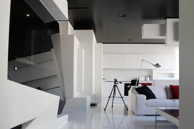
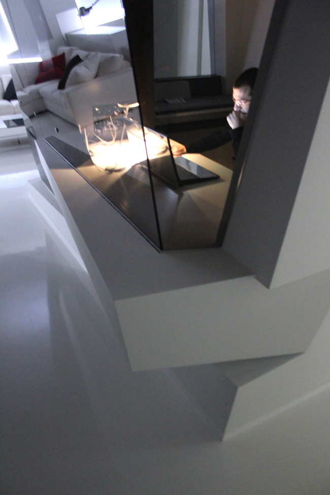
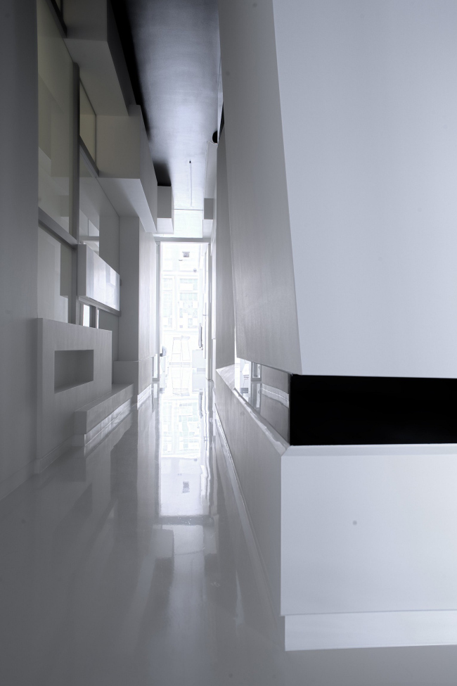
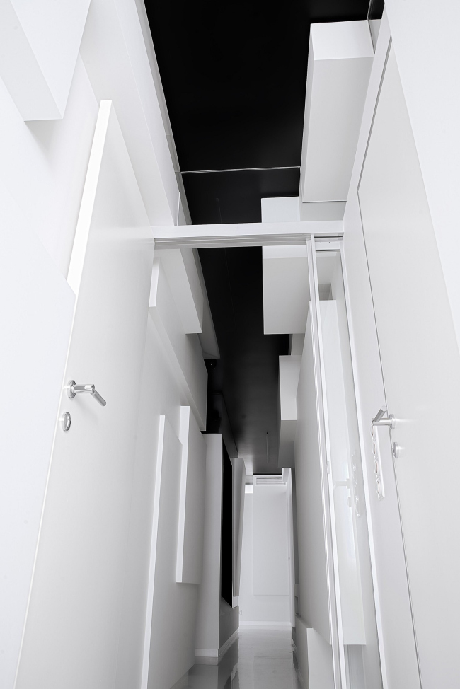
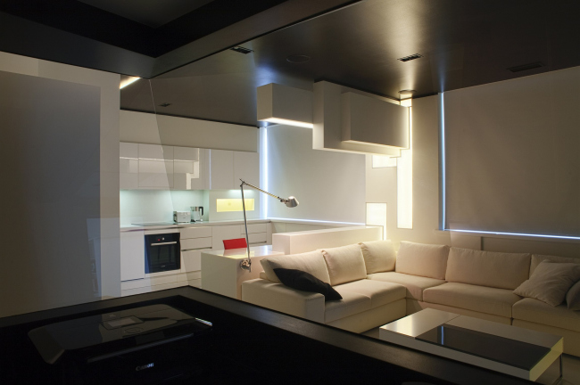
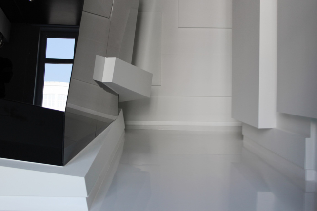
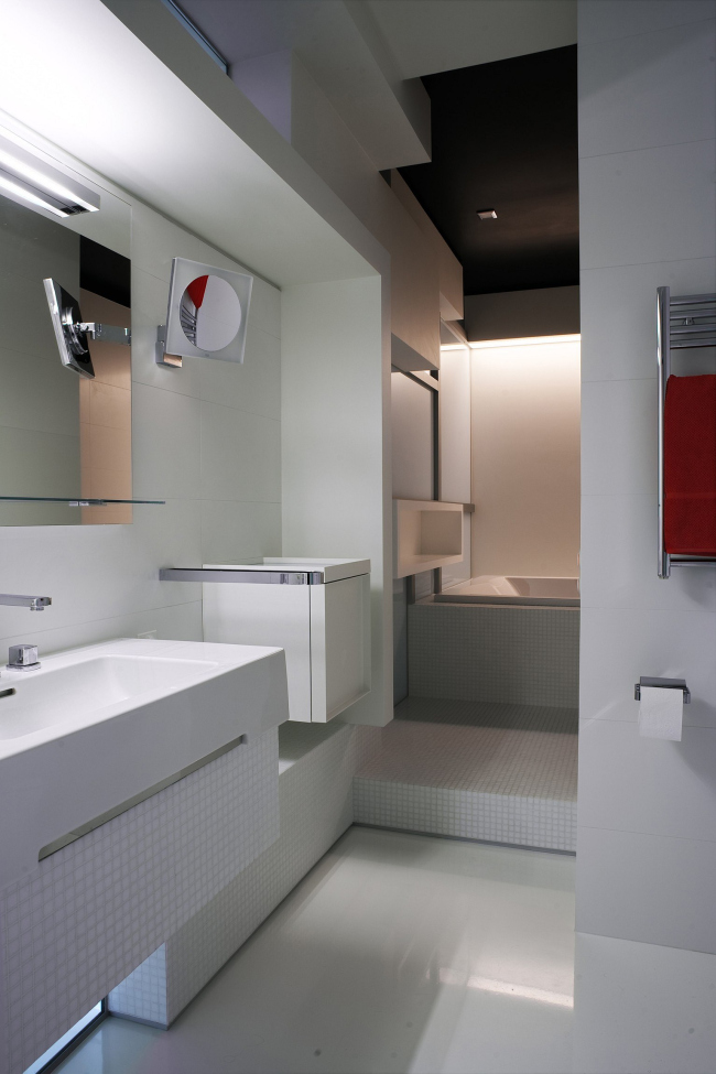
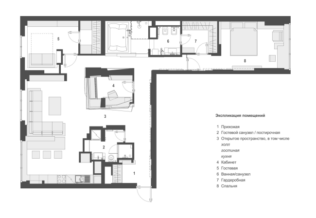
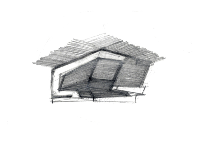
In the vicinity of Khodynsky Field, in a house situated on Aviakonstructora Mikhoyana Street, TOTEMENT/PAPER has implemented a residential interior design project. The apartment, the design project of which TOTEMENT/PAPER was to design, was of no particularly original layout. On the floor plan, it looked like the Cyrillic letter “Г”: the main rectangular space had three windows, while the long narrow appendix ended with the fourth one. The floor space of the apartment was 105 square meters (“almost a tiny flat by today’s standards” – the architects note), and all these meters were “sliced” with load-bearing concrete walls into inconvenient cage homes, which made a total re-planning completely impossible. The customer, meanwhile, wanted radical changes: stylish futuristic design, and a large open space with a study in its center. The long appendix was treated by the authors as the customer’s fully private “wing” separated with a door from the rest of the apartment. A small corridor leads to a bedroom that is situated in the end by the window; this same corridor is also the way to the spacious clothes room, as well as to a separate bath/WC, half of which is taken by a spa. On the same axis with the private section, the guest room with a clothes room of its own is placed. On the other hand, it borders immediately on the public section, thus “taking up” one of the three windows of the main rectangle. Inscribing the multi-functional space into the rectangle of rigid dimensions, the architects treated the geometry of the original shape in many different ways. Parallelepipeds are all around: they form the walls, as well as pieces of furniture and even the design of the lights. By using this stylistic device the architects created the impression of a new, smaller, scale that visually expanded the volume of the premises, substituting the hackneyed right-angles with sophisticated telescopic shapes. The boundaries of the living space are also considerably widened because of the two-color monochrome palette chosen by the architects - all the parallelepipeds, from small to large, are painted dazzling white, while the “voids” (the ceiling and some of the niches) are painted black. Being diametrical opposites, like mutually repelling magnets, the black and the white, however, do not create an impression of two “parallel” universes. Quite the opposite – the architects have found a way for the two elements to make peace with one another, and they do so in the very heart of the apartment, i.e. in its owner’s study. This is the only “non-rectangular” object within this space where black and white unite, spilling over their boundaries. The study resembles a polygon case, two walls of which are blank (and these two surfaces are, of course, blank), and the other two are made as black mirror screens that are almost impenetrable from the outside and penetrable from the inside. NoneNoneNoneNoneNoneNoneNoneNoneNoneNoneNoneNone |
|
