|
Published on Archi.ru (https://archi.ru) |
|
| 20.12.2011 | |
|
Corporeality of the Place |
|
|
Anna Martovitskaya |
|
| Studio: | |
| Sergey Kisselev & Partners | |
|
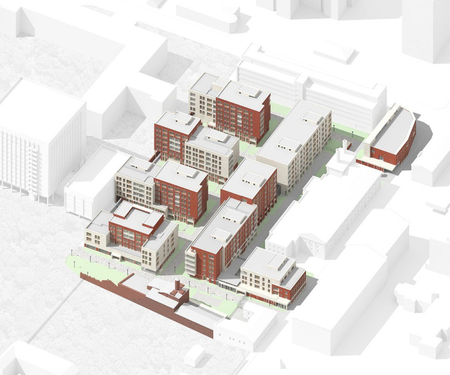
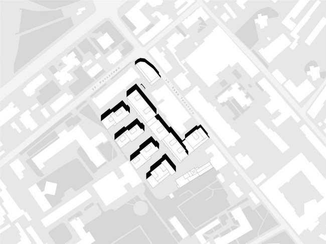
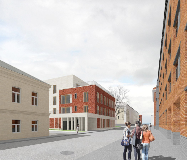
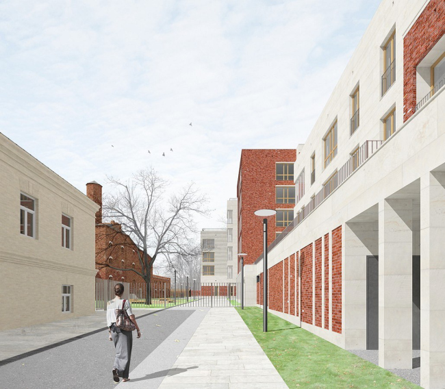
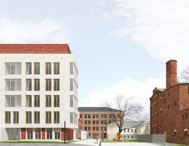
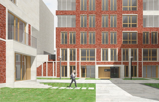
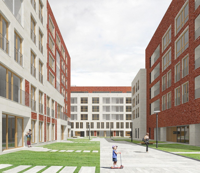
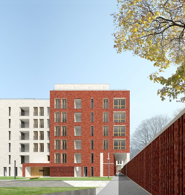
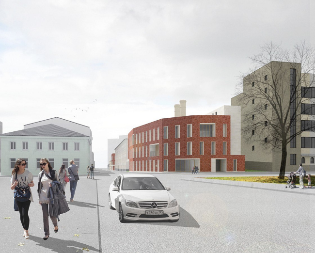
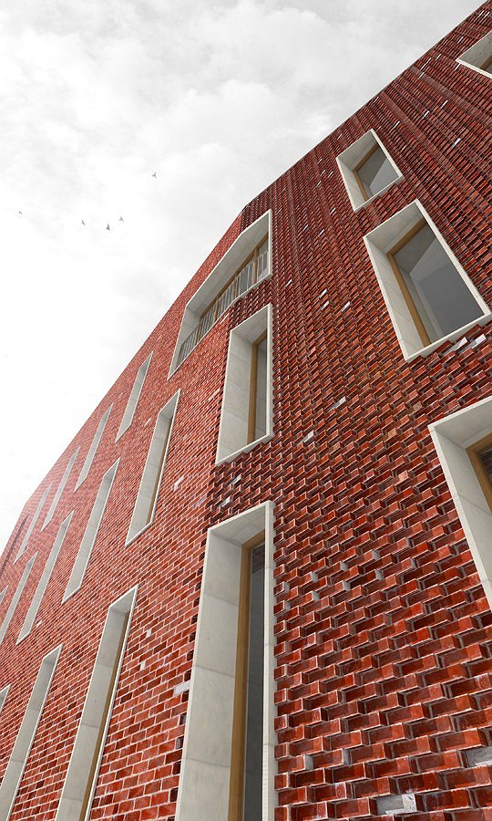
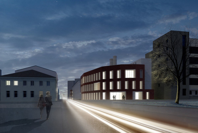
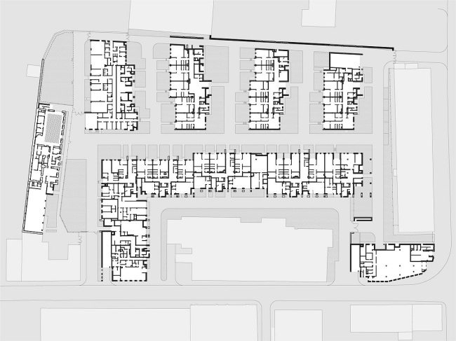
In Moscow’s district of Khamovniki, at Leo Tolstoy Street, the architectural studio “Sergey Kisselev and Partners” is designing a new mixed-use residential cluster. Located on the second line of development, it will leave the overall look of the street virtually unchanged, creating at the same time a few cozy courtyards inside the block. The cluster will ultimately consist of 7 buildings, including the already-mentioned brewery. At the same time, due to the fact that Rossolimo and Leo Tolstoy Streets still preserve the two extended buildings of the Experimental Drinks Factory and the former factory building, the presence of new volumes at the two streets is minimized. The new cluster will only be connected to Rossolimo Street by the arrival route, while Leo Tolstoy Street is faced by two low-rise buildings that “flank” the preserved structure. One of the two buildings is a corner one, and, because of its being located at the busy crossroads, it loses its residential function - the authors of the project design it to house retail stores and a gallery. A second volume that “breaks through” the original development is, on the other hand, a part of a residential building resembling the Cyrillic letter “Г” whose longer side is hidden in the depth of the block. Behind the multipart structure, there are four residential buildings. They all are positioned perpendicular to the volume that separates them from the factory structure, and thus are facing Leo Tolstoy's manor. Kind of boundary between the territory of this cultural monument and the new residential area is the red-brick brewery building – as one approaches the latter, the number of floors of the buildings decreases. The brewery building also predetermined, for the better part, the color palette of the future development. The authors design it so that each volume is made up of two “halves” – white and red – their order changing from house to house, thanks to which every courtyard gets its individual look. Considering the fact that the yards are but 20 meters wide (the housing density was originally set as the highest), one can easily understand how important it is for the spaces created. And so as to enrich their visual medium, the architects are giving each façade a pronounced texture: brick and stone laying pattern constantly varies, and these materials seem to melt into each other. The five-storey building that is closest to the brewery got a slightly different solution: here the central red-brick volume is kind of “embraced” by two white-stone wings. Such allusion to the classic architectural solution can be considered a tribute to the vicinity with the manor house; the “almost-corner” location of the house led the architects to the idea of placing a kindergarten here. The large space adjacent to the former brewery came in very handy – it will become the kindergarten’s playground. As far as the historical building itself, its function will also change – it will house a fitness club now. 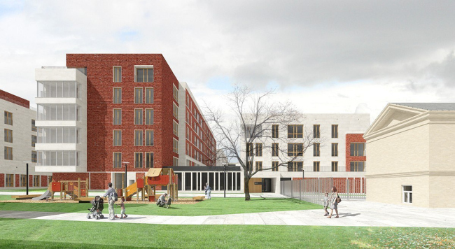 NoneNoneNoneNoneNoneNoneNoneNoneNoneNoneNoneNoneNone |
|
