|
Published on Archi.ru (https://archi.ru) |
|
| 19.12.2011 | |
|
A House with an Architectural Fable |
|
|
Maria Lyndina |
|
| Studio: | |
| ABV Group | |
|
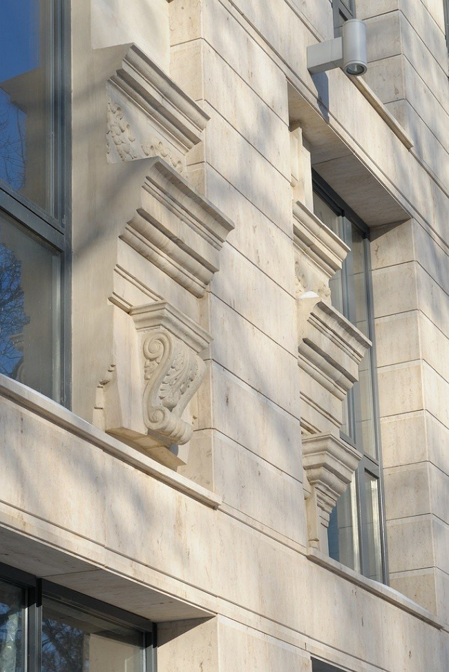
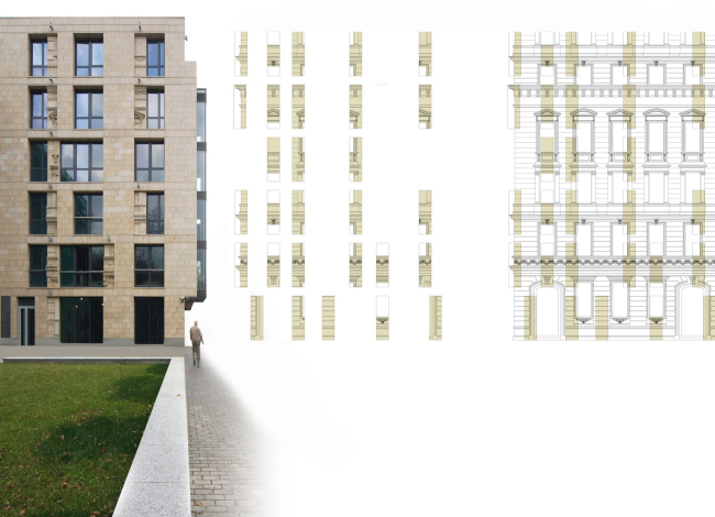
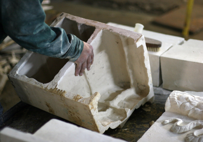
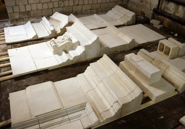
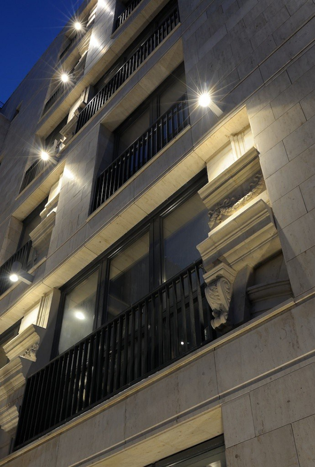
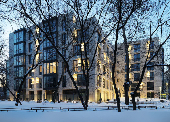
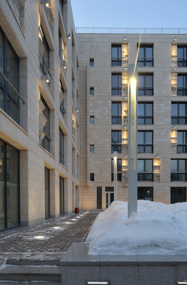
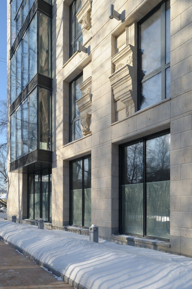
While implementing the project of a residential building in Khilkov side-street, the architects of “ABV Group” were faced with the necessity to relearn the all-but-forgotten skills of interworking with sculptors. Architecture, however, was to become the main subject matter of the reliefs: to the careful observer, the façades display theatrical scenes narrating of the twists and turns of the history of architecture. The commissioner – “Barkly” Corporation – owns a small landsite in the quiet Khilkov side-street that runs from Ostozhenka Street down to the Moskva river. The historical development of the neighborhood conditioned both the layout and the volume of the building: the visual and solar exposure regulations defined its low-rise and the unusual Z-shaped layout. This resulted in a small “corner” open space in front of the main entrance, and a quiet inner courtyard from the opposite side. The latter can be accessed via the entrance lobby. The building is “chamber” one: the first floor, apart from the entrance lobby, includes two offices, while the upper floors only house 27 apartments. The façade has a fairly modern look. The smooth planes of the so-called “Jurassic rock” are cut through with a regular network of large windows. The windows are arranged into vertical rows that alternate with neat, wall-high glass bay windows. These moderately light and moderately respectable façades could seem a little too much on the modest side, if it was not for the fireclay body reliefs (of the same pale color as the stones) that are inbuilt into the plane of the façade on either side from each window. The relief sections are “sunk in” relatively to the planes of the walls and they thus form a second, thinner “layer” of the façade. This layer is not so thin though – the relief sections are prominent, carefully molded and beautifully drawn, and their most prominent points even go beyond the plane of the stone façade. What is more important, however, is the fact that the narrative basis for all of the reliefs is neither human figures nor patterns (which is usually the case) but fragments of the façade of the classical building. If we step away from the house a little so as to see the whole of it, we will be able to see that this was not a random selection of beautiful architectural details. The elements of the outside ornament are arranged in a very logical manner – as if the house had initially been a Roman palace of the XVII century, then its façade was remodeled into a flat one, after which the height of the floors was changed and new windows were made but for all that some of the reliefs survived into the present and were even cleared up by the restorers. The architects initially planned to continue the façade play in the interior space of the public sections of the house: the entrance lobby, and the elevator lobbies on each floor. In the otherwise absolutely modern interior, the wall surfaces now and then display fragments of “ancient” paintings - as if they had been cleared under the restoration and placed in glassed frames. Regretfully, these design ideas never were implemented, while the project of night time illumination, mandatory for the city center buildings, was indeed completed: pillar-like light fixtures were installed in front of the facades, and lower backlighting was installed into the pavement. Apart from that, each sculptural fragment got a spotlight of its own which made the plastic solution much more interesting and sophisticated. NoneNoneNoneNoneNoneNone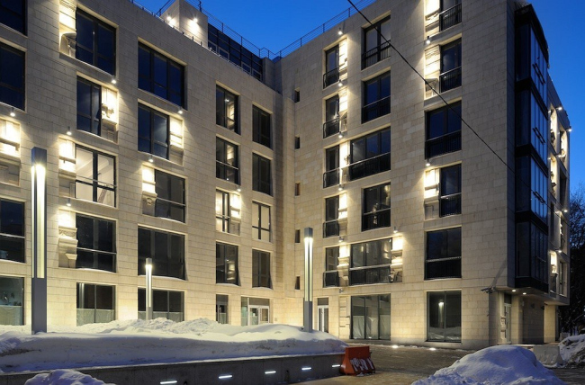 NoneNone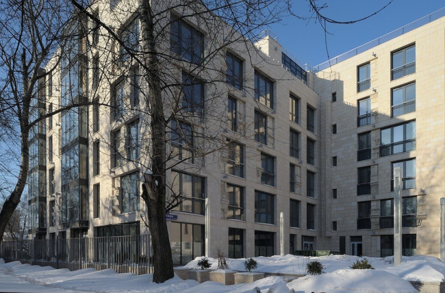 NoneNone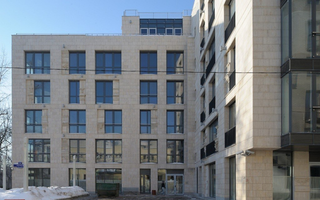 None |
|
