|
Published on Archi.ru (https://archi.ru) |
|
| 17.11.2011 | |
|
Golden Canyon City |
|
|
Anna Martovitskaya |
|
| Architect: | |
| Sergey Skuratov | |
| Studio: | |
| Sergey Skuratov architects | |
|
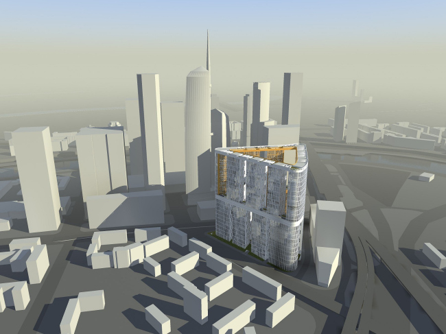
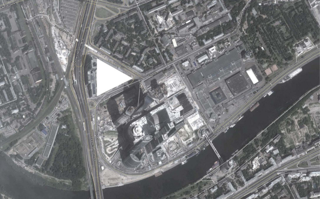
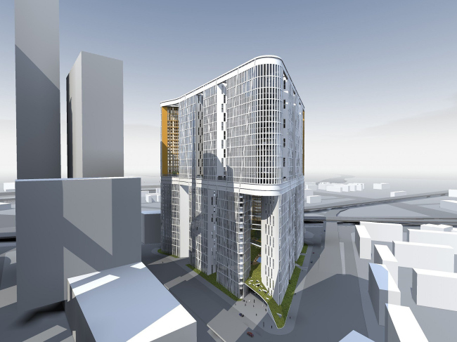
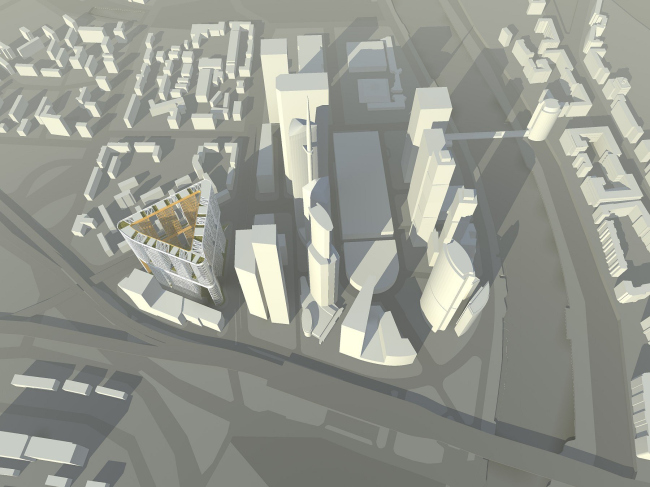
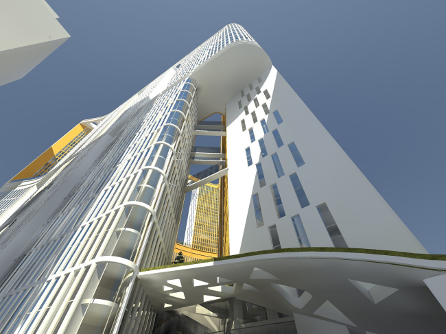
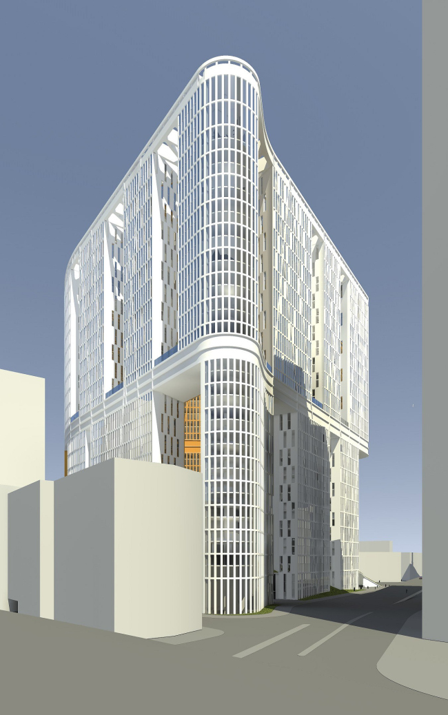
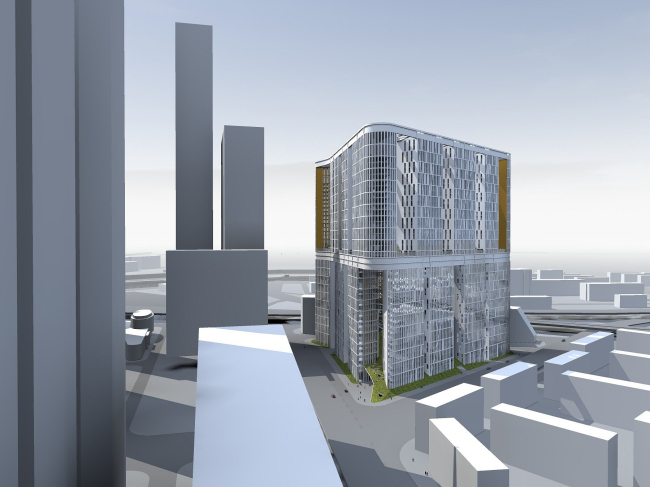
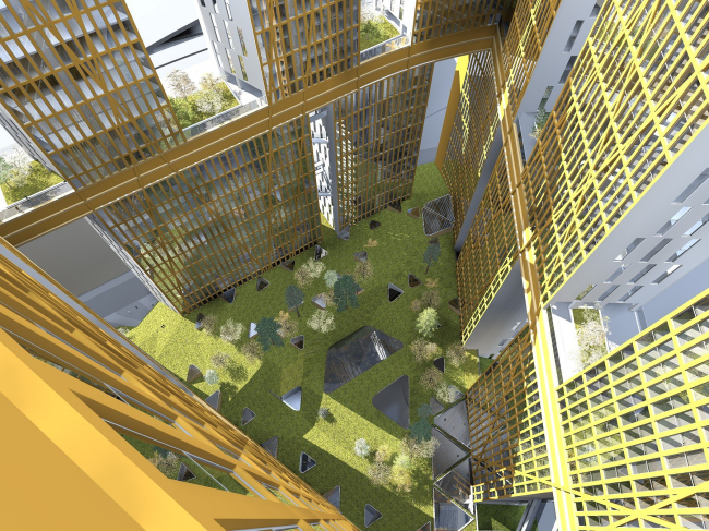
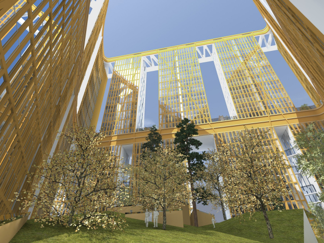
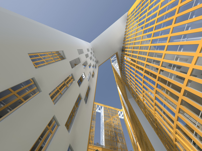
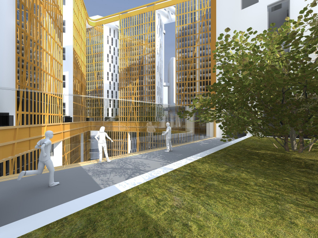
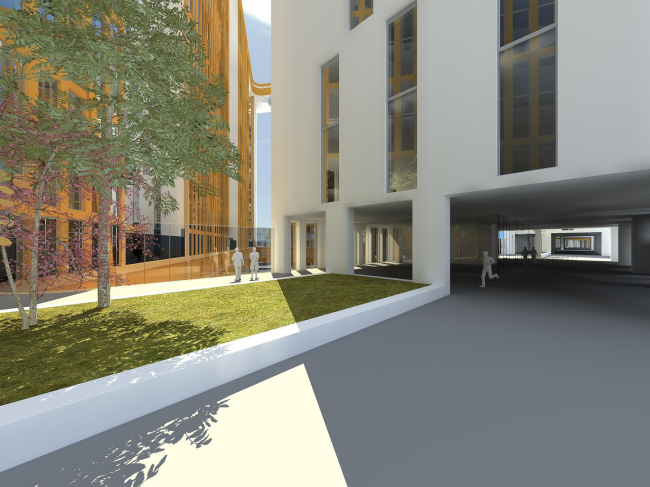
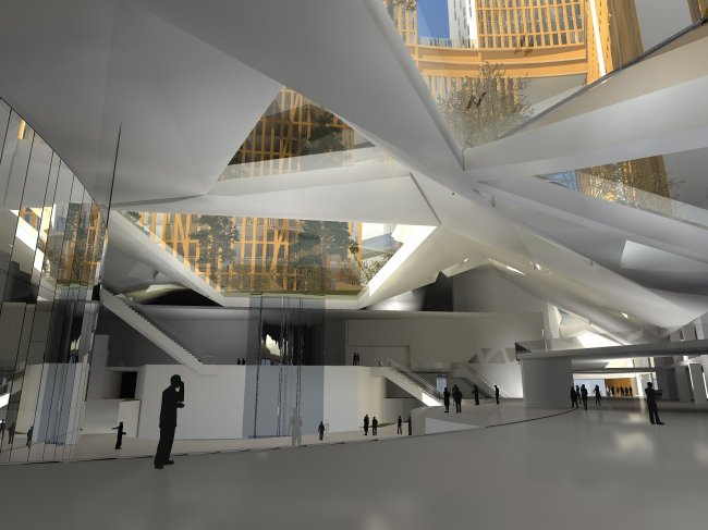
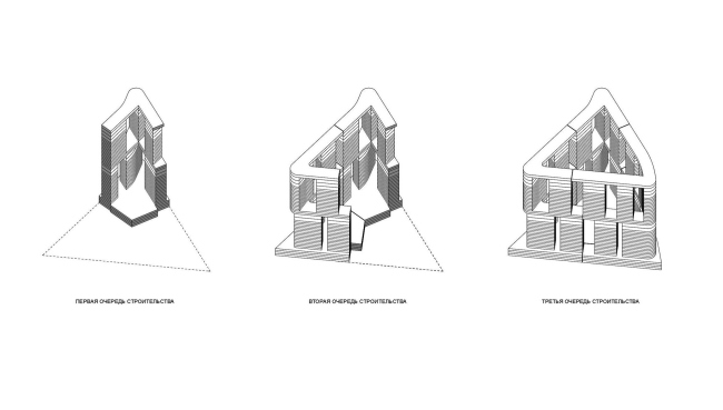
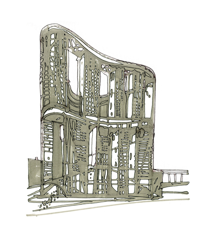
The only Russian participant of the international competitive bid for the development of the last vacant lot on the territory of “Moscow City” International Business Center was “Sergey Skuratov Architects” Studio. The height of the future development was restricted to 230 meters. However, upon careful examination of the silhouette and various views of the entire business center, Sergey Skuratov came to a conclusion that even this figure is “too much”, and went as far as to cut off yet another 40 meters off the top the projected volume. By doing this, the architect got a building that would be considerably taller than all the flyovers of the “Third Transport Ring” neighboring highway and would not look insignificant against the background of the center’s skyscrapers, without trying, at the same time, to “compete” with them. “In the beginning we would, of course, draw the tower - or towers – and try to move it over the construction site to see how it works with the other buildings – the architect explains - all this, however, did not seem to solve our main challenge, which was to come up with an object that would, on the one hand, look like it is flesh and blood Moscow City, and, on the other hand, look a completely independent architectural unit that would obviously look like it was designed ten years later than the skyscrapers. Finally, I got tired of all these manipulations and we decided to act ex adverso – build up the perimeter first”. The construction site has a triangular shape, and Skuratov follows this original configuration, rounding, however, the corners of his figure and thus giving it an evident plastic resemblance to the neighboring skyscrapers. The parking lot was predictably placed underground, while the stores, offices, and the apartments were arranged in layers: the retail stores took up the first few floors of the building and the space between the parking lot and the green courtyard, while the offices and the apartments form two equal volumes that the architect places on top of one another. Each of the triangles, in turn, consists of several mini-buildings, 3 to 4 on each “side”, the upper alternating with the bottom ones in “staggered” arrangement. On the one side, this provides the opportunity to run the communication lines of the residential floors through the offices, and, on the other side, keep away this feeling of a “fortification wall”. Visually, the borderline between the different functions is also marked by a wide belt of the technical floor, which can be used to walk along the perimeter of the center (or run along the perimeter, as the case may be, because the architects are planning to place here, among other things, a jogging track). Yet another such end-to-end corridor is placed directly beneath the roof that unites all the upper structures. The project also includes fully-fledged green houses not only on the ground level but also between the offices and the apartments as well as on the roof of the latter. As far as the green planting of the yard is concerned, it “spills over” the confines of the development – green rampants surround most of its perimeter, making it possible to enter the yard past all the salesrooms and office lobbies. NoneNoneNoneNoneNoneNoneNoneNoneNoneNoneNoneNoneNoneNoneNone |
|
