|
Published on Archi.ru (https://archi.ru) |
|
| 14.11.2011 | |
|
Transparent Hyperboloid |
|
|
Anna Martovitskaya |
|
| Architect: | |
| Sergei Tchoban | |
| Studio: | |
| Evgeniy Gerasimov & partners | |
| SPEECH | |
|
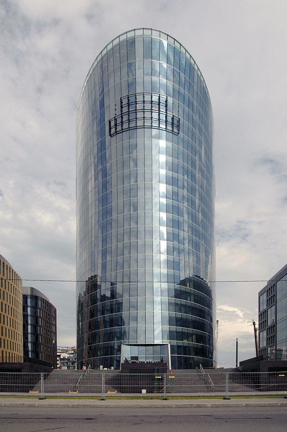
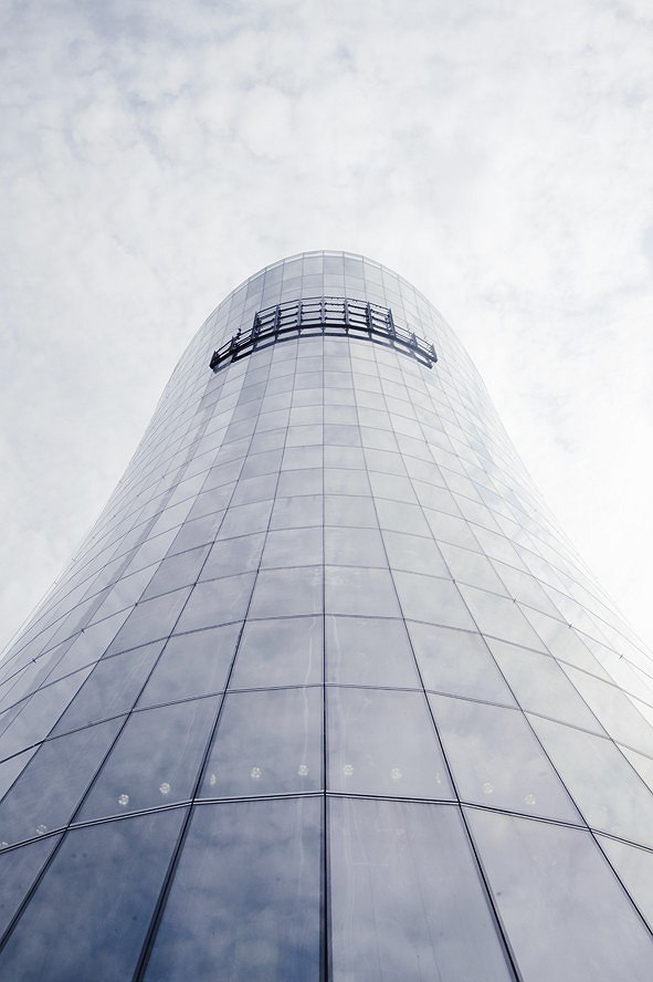
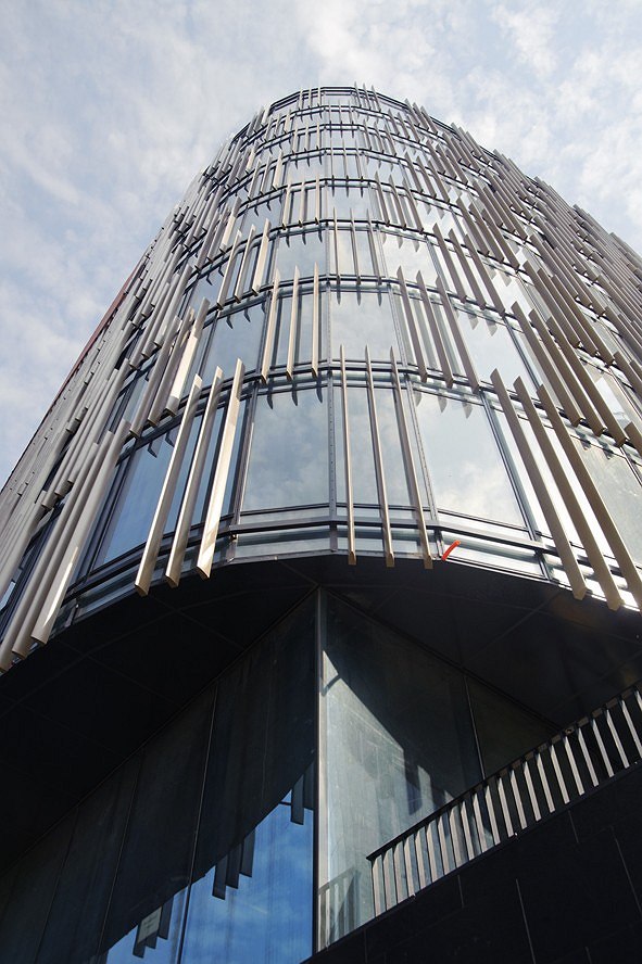
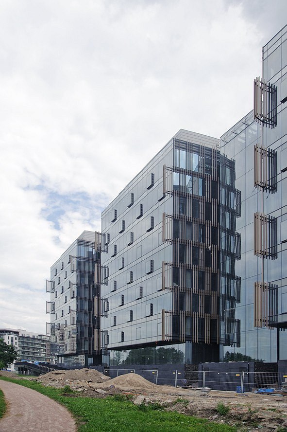
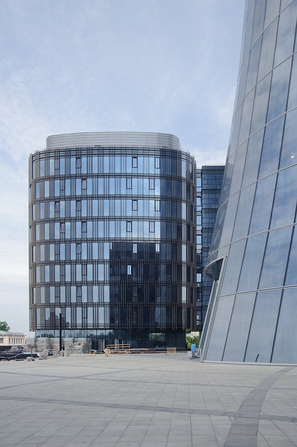
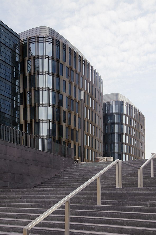
Late in September, the construction of “Saint Petersburg Plaza” business center was completed in Saint Petersburg. This building that has already won several prestigious industry awards became one of the landmark projects of 2011. The business center consists of two elongated rectangular 9-storey buildings and a 22-storey tower. While among its immediate neighbors there are both industrial and residential buildings, the future housing of this district, however, will predominantly consist of office buildings, so “Saint Petersburg Plaza” can be considered Malaya Okhta’s (name of the district – translator’s note) cornerstone of the future large mixed-use development. Designing the town-planning centerpiece, the architects took special care to make sure that the Malaya Okhta’s bulk and height restrictions were observed. The composition solution of the building was fully determined by its location and its surroundings: here, the avenue branches away from the embankment taking a sharp-angle turn, so the Neva River and the “Plaza” are separated by a considerable space that includes, among other things, two historical 4-storey buildings. Thus, the architects needed to visually enhance the fact that the office center was located on the “second line”, and, at the same time, make it reasonably visible from the embankment and Neva’s water area. And, while the historical buildings are positioned lengthwise along the river, the new buildings are positioned perpendicular to it. The river-commanding façades of the two buildings that flank the tower are about a third again as high as the old architectural monuments – which turns them into a sort of background for the latter. It is mostly because of this that the main facing material was chosen to be glass – while stressing the fact that the new building belongs to the modern architecture, it does not “force out” the buildings of the old years. The central tower is also fully glass-faced; its section is transparent irregular-shaped oval. The front side façade overlooking Neva, has a concave surface, while the rear side of the building is cut at an angle. The tower widens at the top, looming over the area in front of it like a massive “nose”. The architectural image of the development is generally based on the contrast between the plastic shape of the skyscraper having a completely glass-faced solution, and the more “material” volumes of the office buildings. The façades of the latter are formed by the stained-glass elements with stone inserts in the floor sections. In fact, on top of the translucent housing, the architects put a massive stone network, its pattern being different on each of the two buildings. 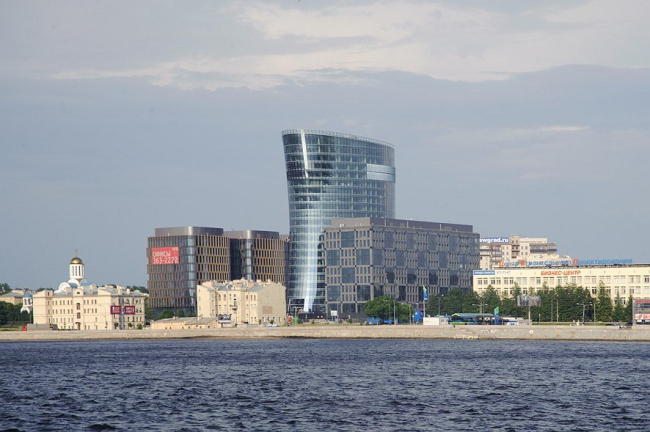 None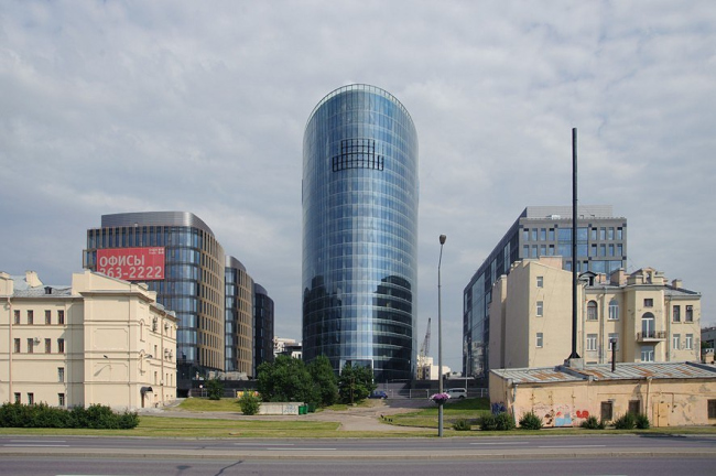 NoneNone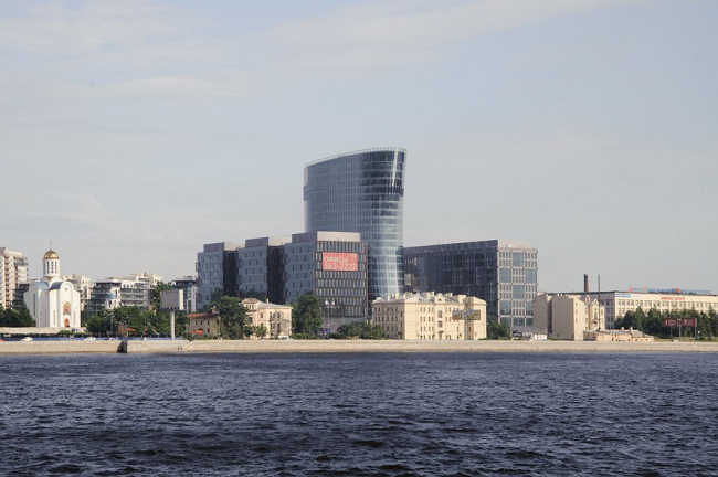 None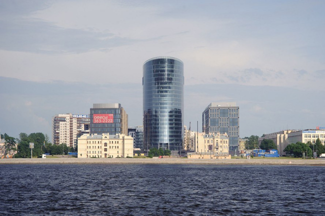 None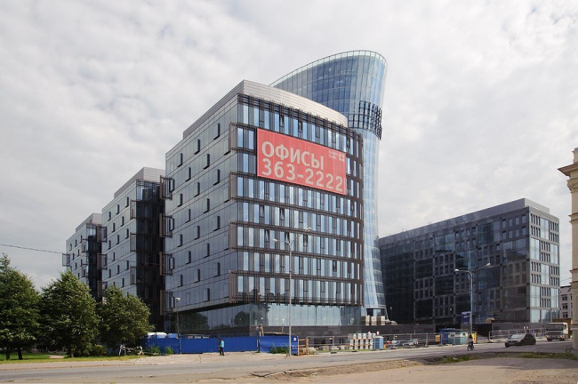 NoneNoneNoneNoneNoneNone |
|
