|
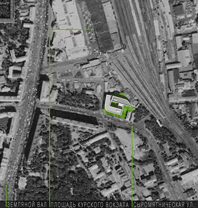
This building welcomes trains. Its place – to the left from the railways at the Kyrskaya station, is currently occupied by a compressors’ plant that is to be removed from downtown in order to give way to office- and shopping centre
The main context of the building is the railways; its audience – passengers who arrive to Moscow by train and look out of the windows. The building by Andrey Romanov and Ekaterina Kuznetsova is a present for them. .
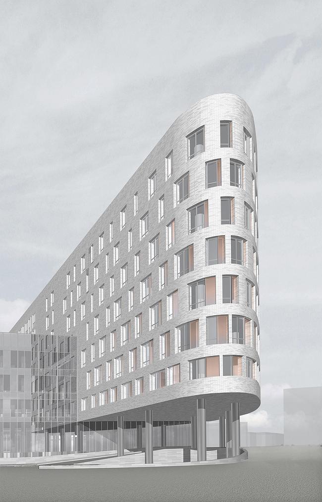
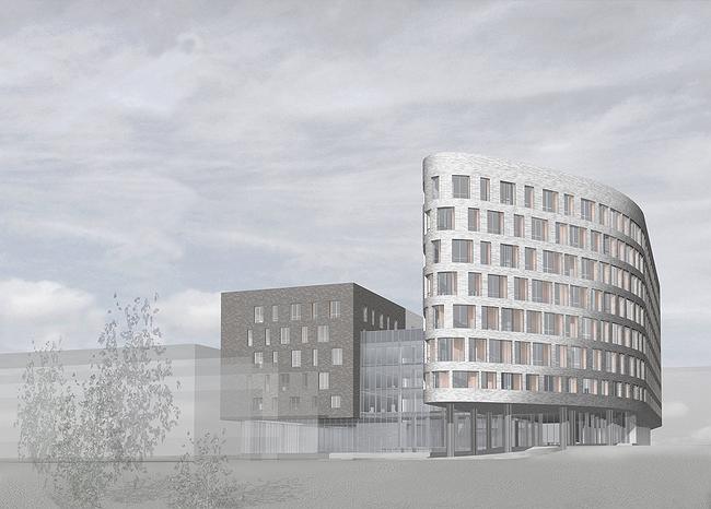
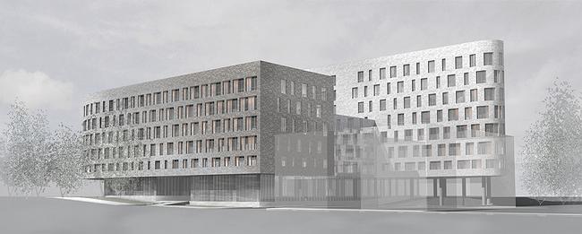
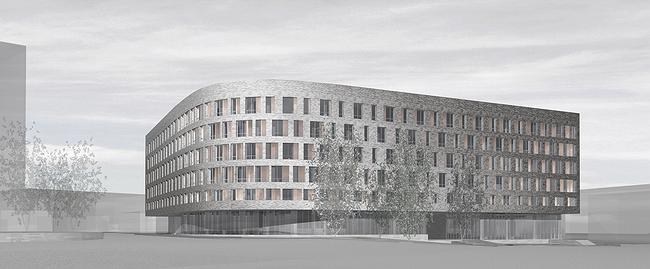
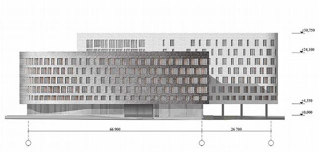
Its part, which is situated next to the rail ways, faces trains with its long ‘nose’; its smooth lines remind one of modern high-speed locomotive. Smooth lines are typical for cars and trains design. They help to diminish resistance to the air and create a visual image of flight. Thus the form is connected with speed.
The lower floor has glass walls, and the ‘nose’ is put onto thin circular legs. As a result the whole building seems to be suspended in the air, to fly above the earth; it reminds one of levitation, of the technologies of the future.
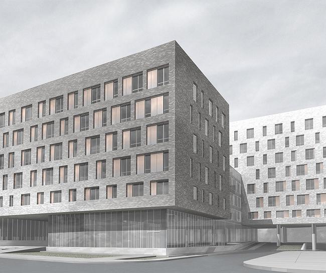
Authors’ intention was to refer to the theme of thinning and receding. It is one of their favourite topics. The building is supposed to look weather-worn. This effect is achieved through numerous techniques. Windows are of different sizes – some are larger, others are narrower, - and they are situated mostly in places where the façade is made pointed. Thus walls’ weight is diminished; the building has less matter. It is a reference to coastal cliffs subjected to erosion: soft rock disappears leaving intricate layered frame. In this project the role of frame is played by floors.
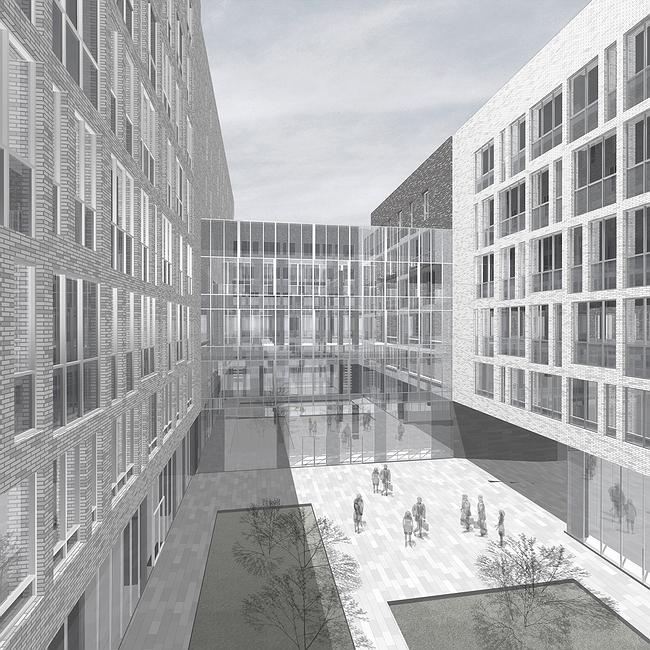
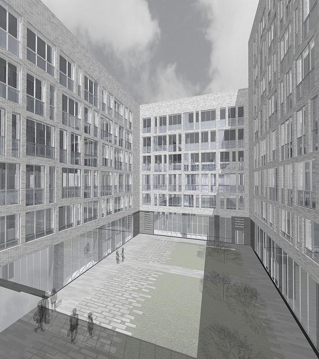
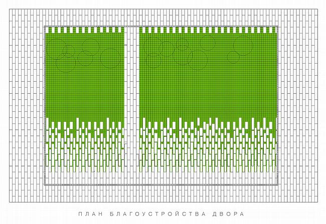
The second ways was to make layered walls. Windows has panels made of translucent glass textured by serigraphy; those are deeper than brick but more prominent than glass so that the third, intermediary, layer is created. This technique is as old as order itself. The third way is to use the colour of brick that is changing from dark brown of central facades to light ochre of ‘weathered’ parts. Imitation of weather-worn surface creates an effect of artificial ageing of a brand new building. The theme of ageing is referred to again in the courtyard where pavement is ‘dissolved’ in grass reminding of ruins. The above mentioned techniques lead one to think of time. The building is new but it a hint at that it could have been here for ages, just like a rock.
The building combines concepts of early modernism: the idea of form going through times, and the image of its inevitable ageing. Thus it looks as reflection on modernist archetypes
None
None
None
None
None
None
None
None
None
None
|
