|
Published on Archi.ru (https://archi.ru) |
|
| 13.10.2011 | |
|
Space Flagship |
|
|
Anna Martovitskaya |
|
| Studio: | |
| IPROMASHPROM | |
|
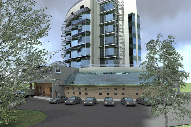
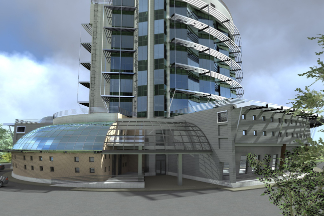
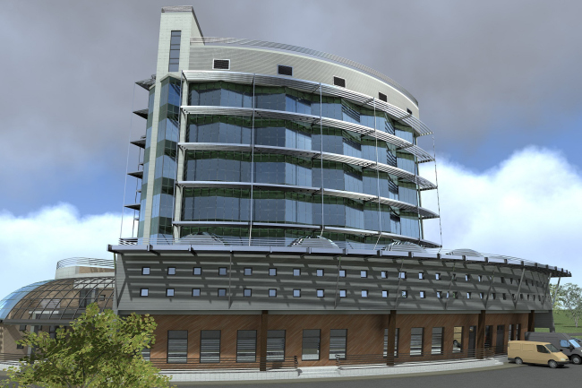
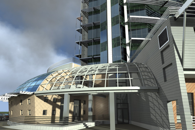
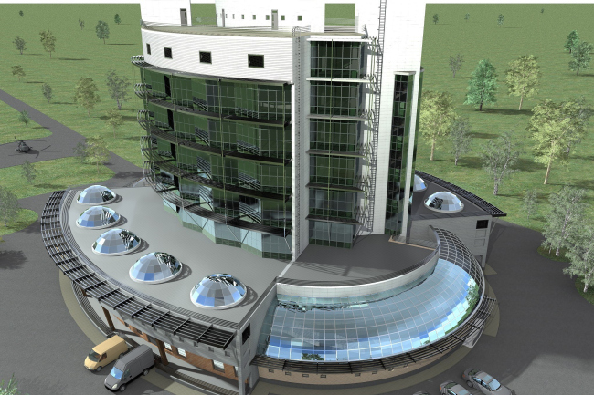
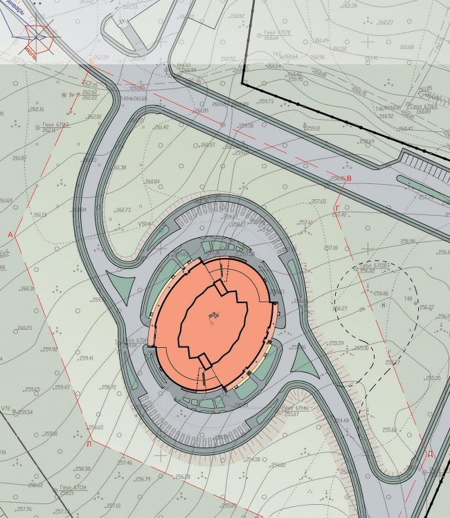
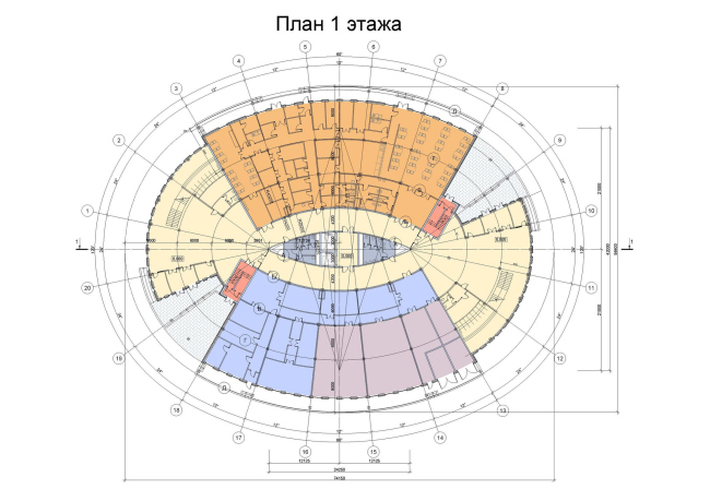
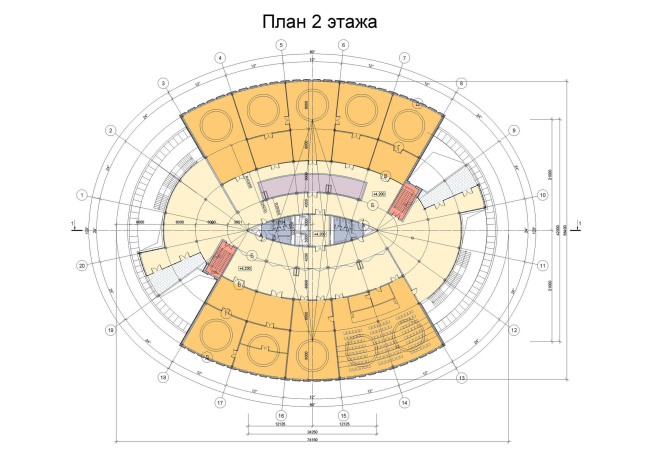
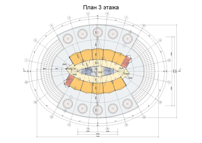
This year, on the territory of the future “Vostochny” (“East”) space port, OAO “IPROMASHPROM” begins to build the first administration and office building. The office building is being built in the vicinity of the city of Uglegorsk. By the standards of the entire spaceport’s territory (and it’s going to be over 600 hectares), the building will of course, take up a very modest area but its importance cannot be overestimated – it is here that the construction management of the future spaceport is going to reside. It is going to be located close to the spaceport’s entrance area and is meant to be the spaceport’s outpost that will meet the employees and the guests of the spaceport. “The architectural image of the new building came to our minds almost in an instant, - shares the main architect of “IPROMASHPROM” Andrew Airapetov - We proceeded from the idea that we were to place at the central area some “arrow” vertical centerpiece, and at the same time make it house over 13 square meters of office facilities. Building a really tall facility in a spaceport would have been inappropriate purely for safety reasons – meaning our centerpiece was ultimately doomed to be rather on the “fat” side. This is how we came up with the ship-like shape, sort of a battle cruiser, on the lower decks of which there would be the public and communication areas, and the central upper part would be the office area. It was mostly the very location of the structure that determined its dynamic and elliptic structure which is very noticeable and at the same time completely self-sufficient and really “space-looking”. On each of the long sides of the oval, there are conference blocks that have the shape of open fans. Smaller segments of the same shape, on the other hand, were removed to make the entrance lobbies with metallic pergolas. The latter were designed as the plastic continuation of the dome that partially covers the stylobate part of the building, which gives the entire composition some certain intrigue and dynamics - it just was tightly stretched canvas here, and now it’s only bare framework. Actually, the high-rise part of the building that “crops up” from the middle of the oval and is meant for the office facilities gets a more laconic solution.It also has an oval shape - consists of two semi-ovals, to be more exact – that are spaced apart out of the technical necessity of placing between them the communication blocks with elevators and staircases. The faceted facades, as well as the stair blocks, are lined with glass, while the upper limits of each of the stories (or rather, “decks”) are designated by the strict aluminum marquees that emphasize the business purpose of the central volume. NoneNoneNoneNoneNoneNoneNoneNoneNone |
|
