|
Published on Archi.ru (https://archi.ru) |
|
| 03.10.2011 | |
|
Illusions of Color |
|
|
Anna Martovitskaya |
|
| Studio: | |
| Sergey Kisselev & Partners | |
|
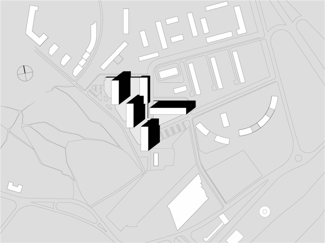
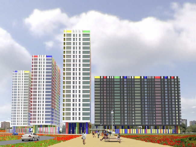
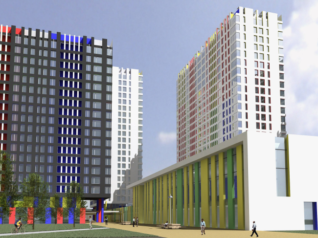
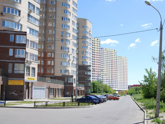
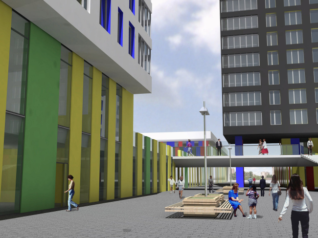
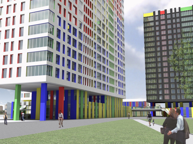
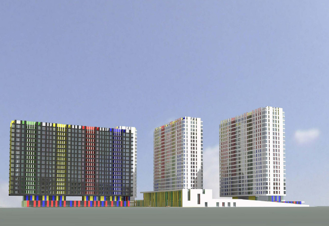
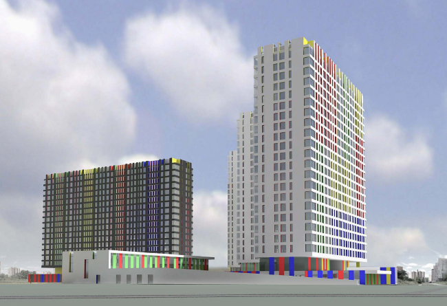
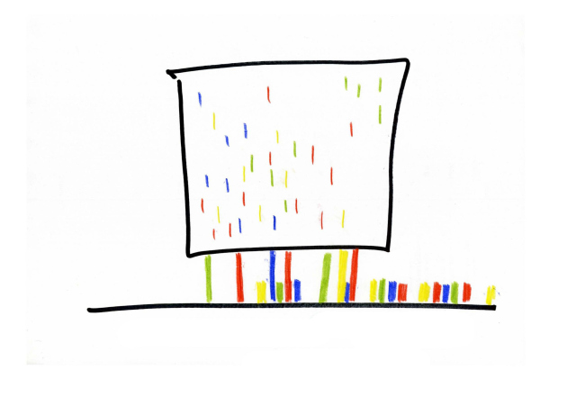
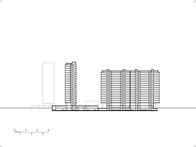
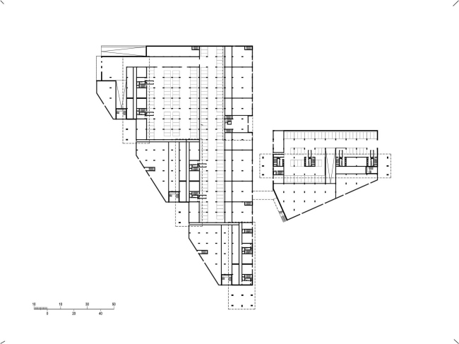
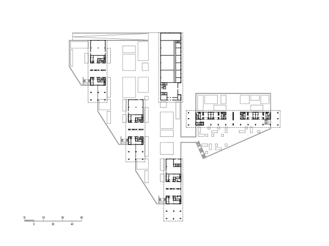
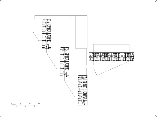
In Moscow suburbs town of Mytischi, a competitive bid for the residential building project has reached its final. The building is to be located in the very center of the town. The list of the participants of this bid included “Sergey Kiselev and Partners” Studio. The land site in question has indeed a very convenient location: its natural boundaries, Kirpichnaya and Vorovskogo Streets, are just a minute’s walk away from both from the bus and railway stations, and from the new “Krasny Kit” (“Red Whale”) shopping mall. It must have been this proximity that prompted the investor the idea to build here a development as large as reasonably possible: the architects were to design several buildings with a total area of some 130 thousand square meters. Right from the start, the architects discarded the idea of creating one single super-giant volume: the development was broken down into separate buildings. The architects also took special care to make sure that the already-existing pedestrian routes be kept intact; this is why the prolongation of Kirpichnaya Street became the central axis of the composition: on the layout, the site consists of two triangles, one large, and one small, looking like petals drifting apart in opposite directions. Along the long side of the larger triangle that adjoins the designed park area, the architects placed two 23-storey buildings, and on the smaller triangle they placed one 19-storey house consisting of four sections. The latter is “shorter” than its two elder brothers, and it was this difference in height that prompted the authors to position this building perpendicular to the others. On the ground floor level, along the outline of the stylobate part, the architects place the public and shopping premises. Adjacent to the future street, various shops are designed to be placed, while on the other side, where the stylobate is turned to the park side, cafes and restaurants are placed. One can access the sports and recreation center from the pedestrian street as well – it faces the latter with its façade made up of vertical multicolored stripes. The bright verticals become the key element in the stylobate decoration: the residential buildings are partially raised on pillars but the architects sought to disguise the massiveness of this structural unit, and by imitating a variegated “fence” they full achieved their purpose. As opposed to the active usage of color in decorating the stylobate, it makes its presence less obvious in the decoration of the residential buildings, even though it plays an important part in forming their image. The three 23-storey buildings are faced with white slabs, while the long perpendicular house is, on the other hand, painted a dark color, the slopes of the windows being multicolored in all the four cases. According to the architects, an apparent presence of bright colors on these large-scale planes would have made the residential volumes look heavier, while the barely perceptible spark of color, by contrast, attracts the eye and creates an interesting visual intrigue - both viewed from the inner courtyards of the residential compound, and in the context of the entire city’s housing logic. NoneNoneNoneNoneNoneNoneNoneNoneNoneNoneNoneNoneNoneNone |
|
