|
Published on Archi.ru (https://archi.ru) |
|
| 29.08.2011 | |
|
Skillful Plastics |
|
|
Anna Martovitskaya |
|
| Studio: | |
| Karlson & Co | |
|
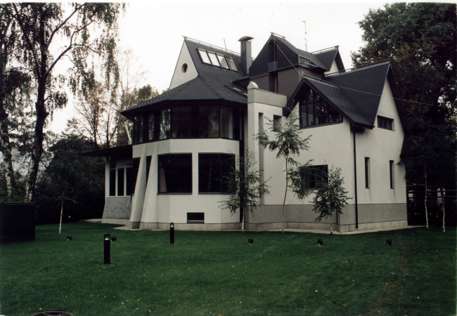
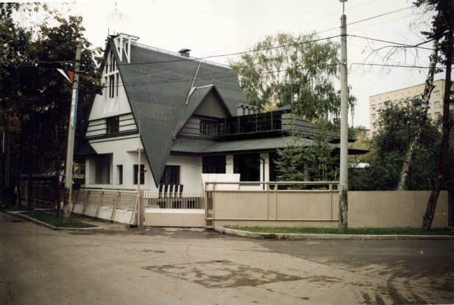
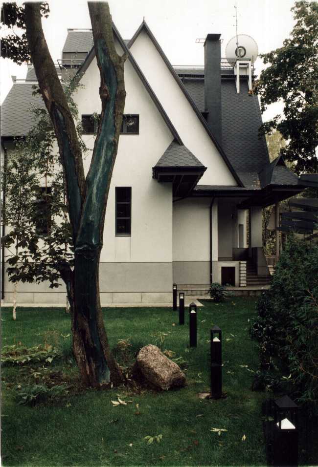
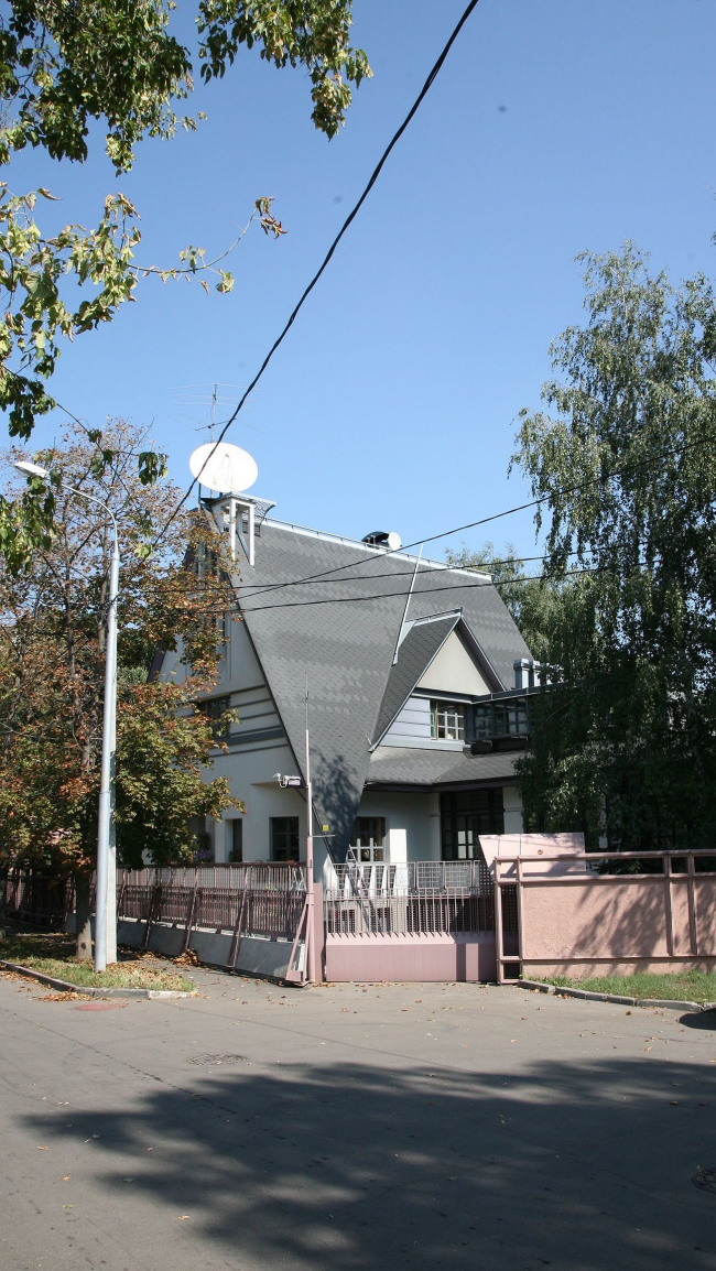
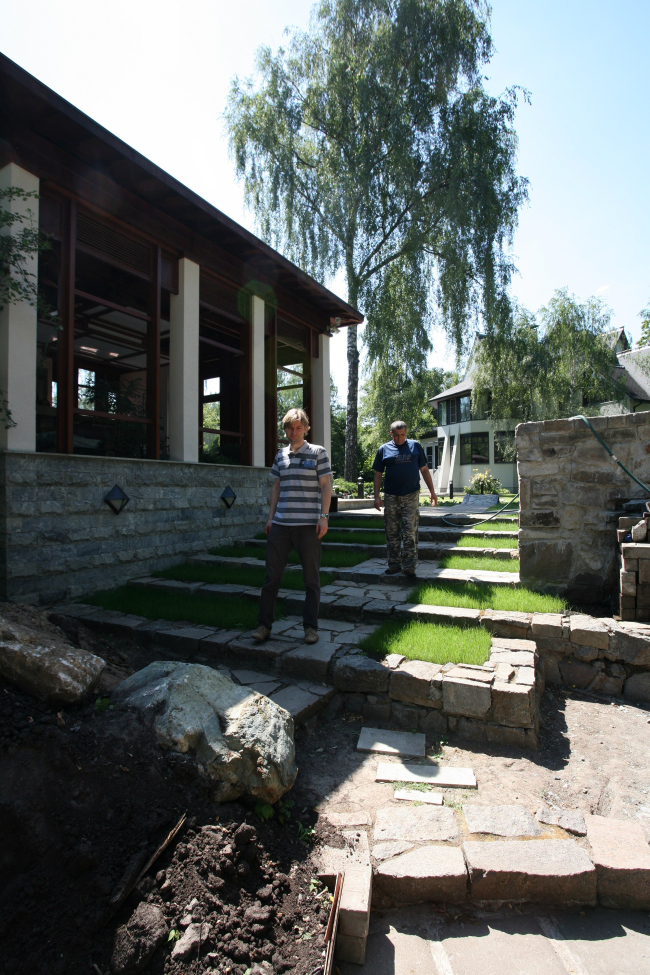
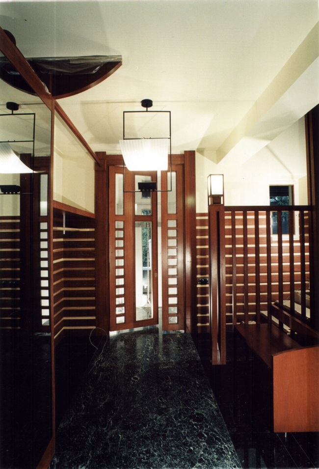
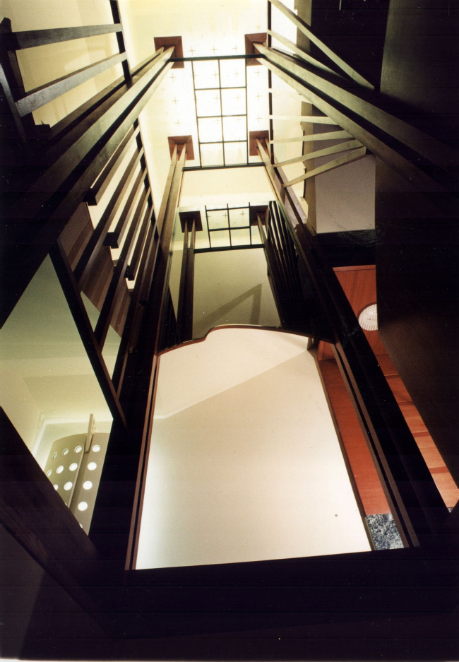
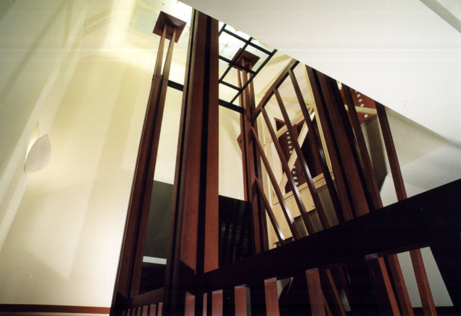
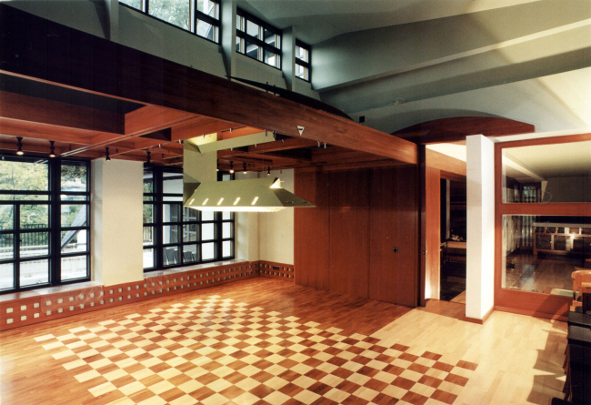
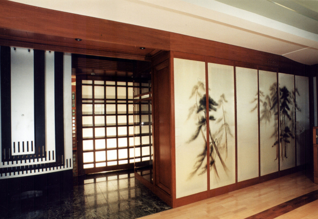
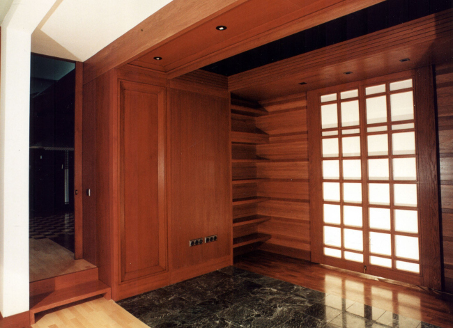
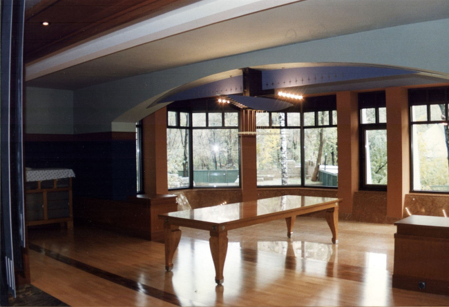
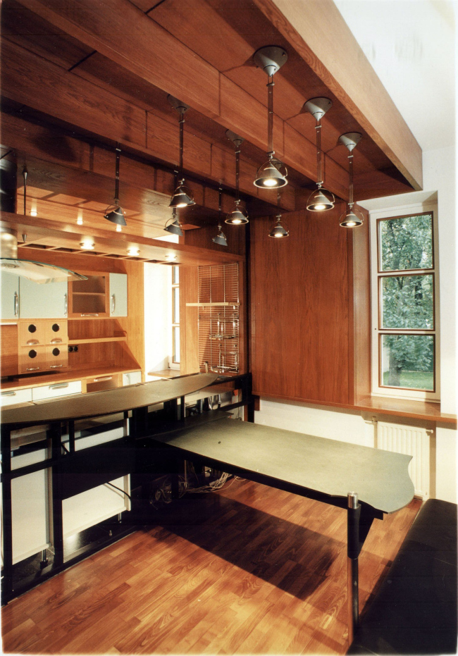
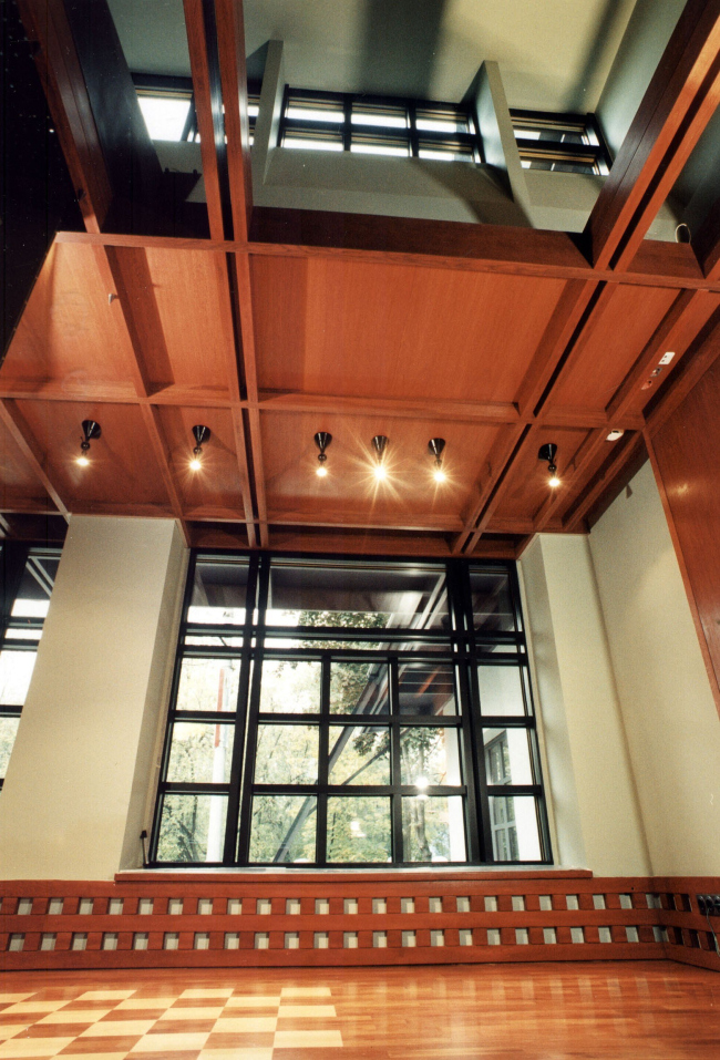
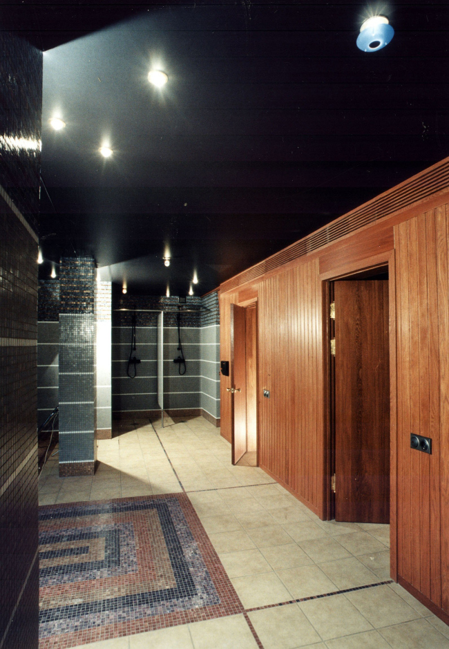
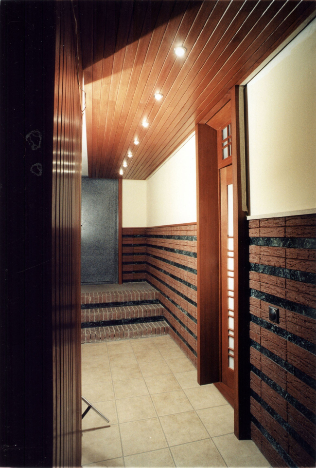
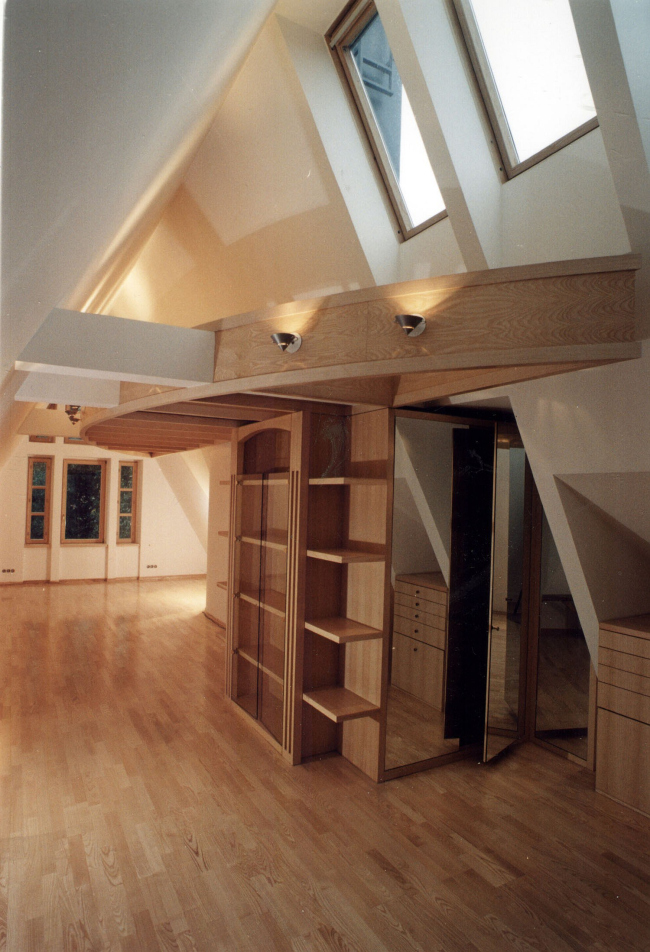
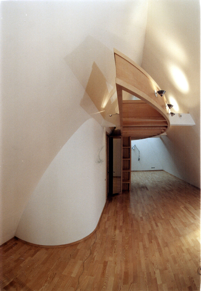
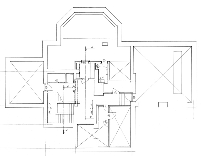
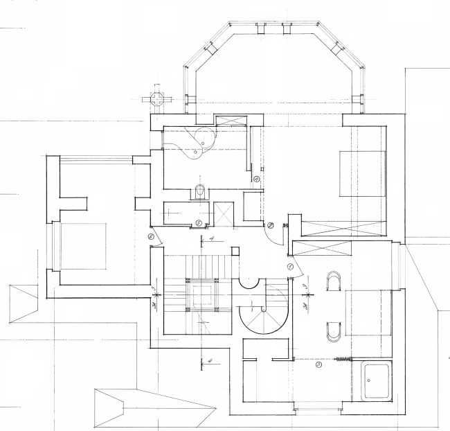
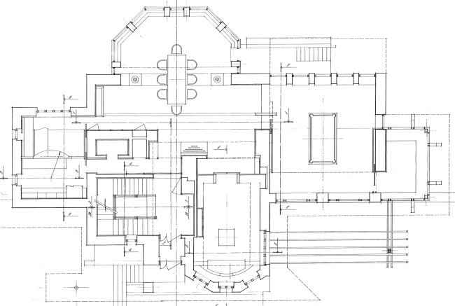
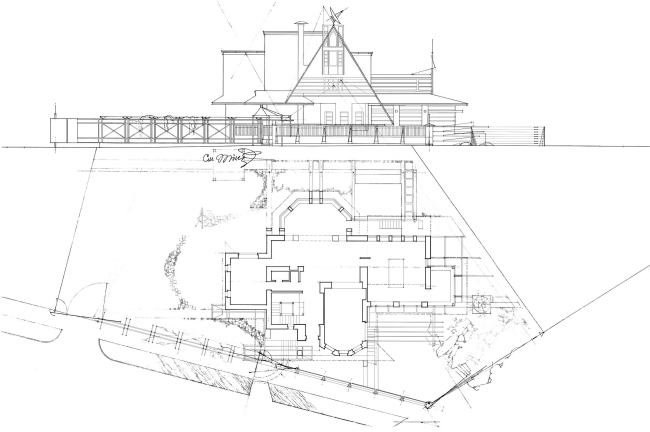
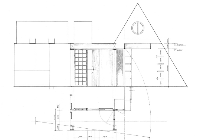
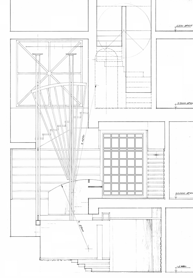
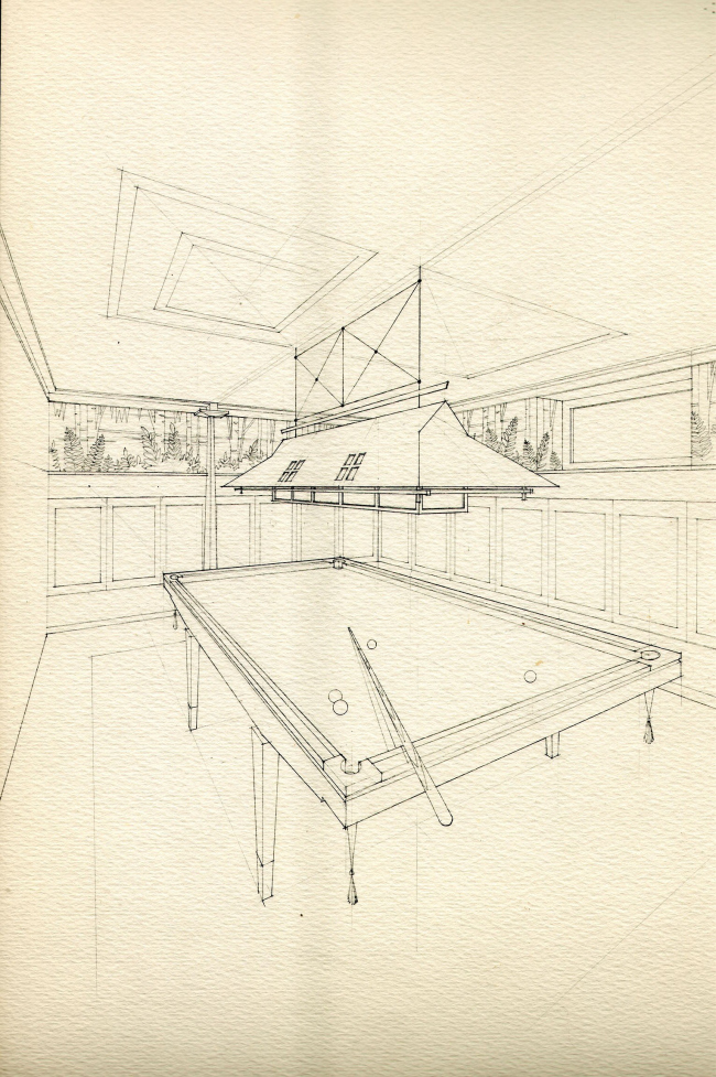
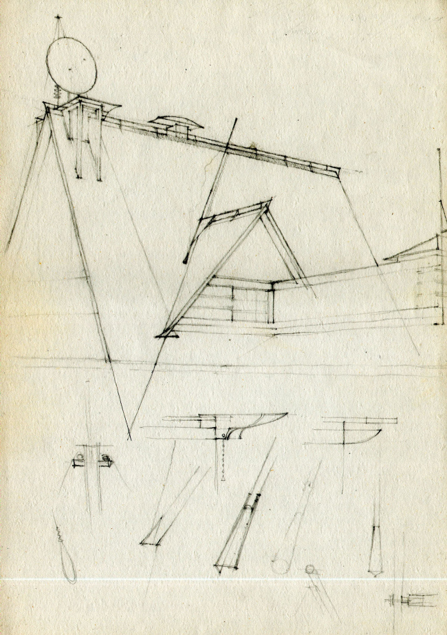
This house in Moscow’s “artist village” named “Sokol”, with its unusual-looking roof, was built a few years ago by Vladislav Platonov (“Carlson & Co” development and construction company). Initially, the architect got only the interior design commission – by that time construction of the house had already been in full swing by another architect’s project. Later on, however, while designing the interior look of the house, Vladislav realized the necessity of altering its outer look as well – and was able to get the lady commissioner round to his way of thinking. There were things to reconstruct, too: the comparatively small site was going to feature a massive, multi-part volume that was threatening to visually suppress the neighboring buildings. First of all, the architect decided to alter the scale of the facades that faced the crossroads. To make these “presentation” answer the size of their vis-a-vis, Vladislav pulled down the overhangs of the roof almost to the ground, and made the annexed garage and veranda as open as possible covering them with ostentatiously longish awnings. In fact, all these thick, almost fortress-like, walls, designed by Vladislav’s predecessor, were ultimately cut into separate, thinner fragments. This game of planes and surfaces that was thus introduced into the image of the house, visually fractured this large volume into several smaller ones – this theme is actively explored on the two other facades where the multi-faceted bay windows alternate with gables and windows of different shapes and sizes. The high gable on the main façade also looks quite striking: the crest of the roof is “cut through” by two white vertical rafts – apart from the main expressiveness of the silhouette, this element plays an important practical part as well: it supports the massive satellite dish. The interior design solution of this house that the author himself aptly calls “modernistic fantasy” (allusions to the northern modern are indeed apparent in the look of this mansion) is dominated by natural wood of various kinds and shades of color. And, while from the outside the mansion looks as if it were built out of a multitude of separate elements, its inner structure is ruled by the principle of the unified space. NoneNoneNoneNoneNoneNoneNoneNoneNoneNoneNoneNoneNoneNoneNoneNoneNoneNoneNoneNoneNoneNoneNoneNoneNoneNoneNoneNoneNoneNone |
|
