|
Published on Archi.ru (https://archi.ru) |
|
| 19.07.2011 | |
|
Red Brick Future |
|
|
Anna Martovitskaya |
|
| Studio: | |
| Sergey Kisselev & Partners | |
|
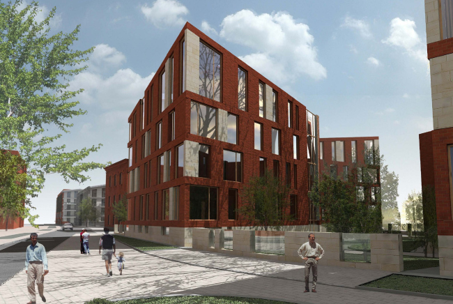
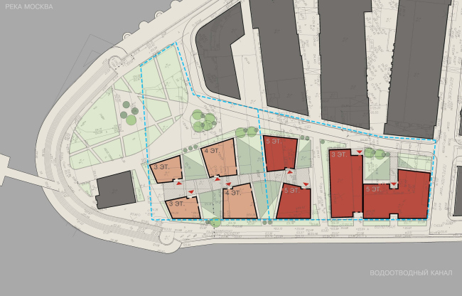
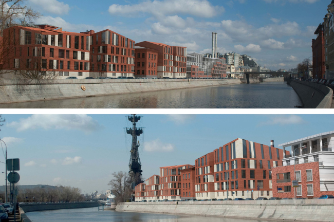
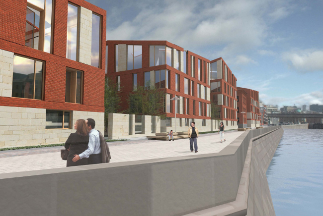
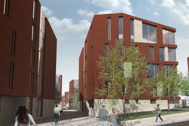
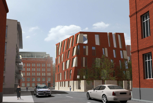
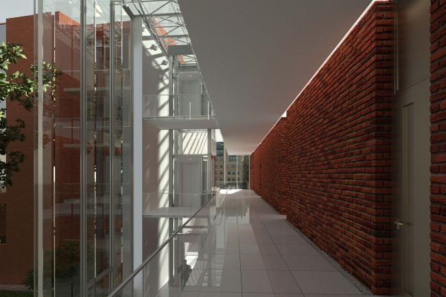
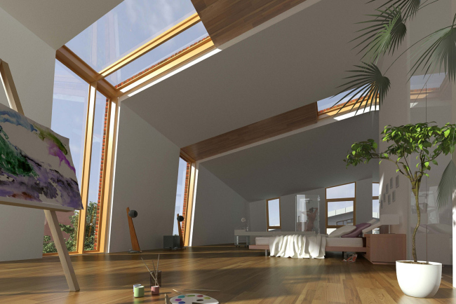
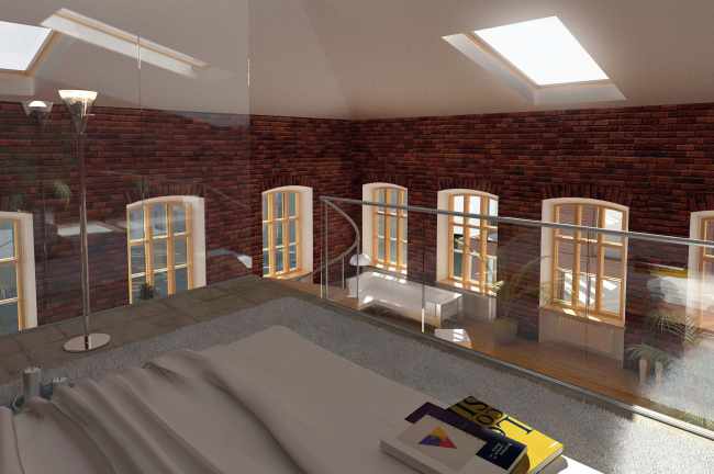
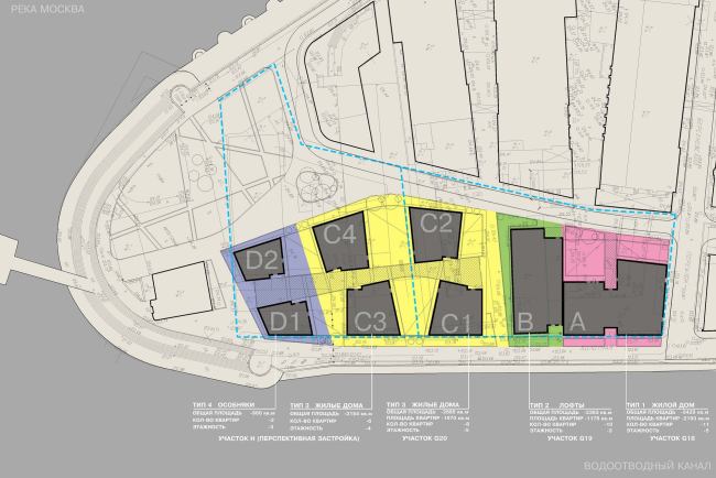
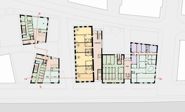
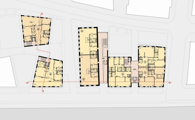
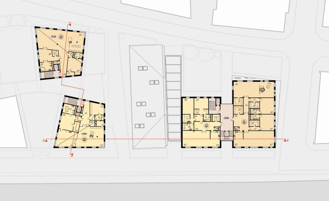
This spring, GUTA Development Company organized its second competitive bid for the project of a residential building at Bolotnaya embankment. This time around, it had to do with the site located exactly in the middle between the Patriarchy Bridge and the land spit that splits the Moskva River and the Drainage Canal. The list of the participants of this bid included “Sergey Kiselev and Partners” Studio. The concept of the urban development of this island that was worked out back in the early 2000’s, provided, among other things, for the residential houses to be positioned perpendicular to the embankment. The reason for this was quite simple: the already-existing brick house that was to be kept intact, stood exactly that way and the city planners thought it wise to position the two new volumes analogously. The developer, however, was not OK with this idea, and mostly because of his desire to change this “pre-determined” composition, this competitive bid was organized. “Sergey Kiselev and Partners” were also against the perpendicular solution, and made proposals that had to do not only with this given area but also with the adjacent territory. “Upon careful analysis of the general plan and the development prospects of the neighboring territory, we came to a conclusion that, if we build three perpendiculars on this site, then the building that is going to be built some day in their proximity, will abut against one of these houses – chief architect of the project Andrew Nikiforov explains - We were troubled, however, not only by this circumstance alone: the dividing line that was drawn between the two sites did not make any sense in terms of the town planning logic, and the already-existing historic building was more suitable to signify a pause in the construction rhythm. Thus, instead the three lengthy buildings turned to the Bolotnaya with their sides, “Sergey Kiselev and Partners” proposed a sophisticated composition of the development, likening it to a neighborhood whose density of development grows smaller as it gets closer to the land spit. In the space between the Bersenyevsky side-street and the preserved building, the architects place a sectional residential house that looks like the letter “H” on the layout. Its right “stroke” that goes along the red line of the side-street is a bit more elongated, thanks to which the house gets its own green yard, and the “horizontal stroke” of the letter H makes an open-ended passage way overlooking the river. The left side of the building is turned to the already-existing industrial volume that the architects are planning to remodel into a residential development a-la loft. The new volume is supposed to be faced with bricks. And here is the thing! In the contemporary architects’ hands, bricks are not “obliged” to replicate the laying and the patterns of the industrial volumes of the past, and this is why Nikiforov lines the red canvas with white limestone, and gives the building a prominently jagged shape: on the layout, the walls do not cross at right angles, the surfaces of the facades show visible “bending lines”, and the eaves are not always strictly horizontal. As was mentioned before, the preserved building was treated by the architects as the forerunner of a small break in the housing pattern of the embankment – the narrow brick sidewall marks the border line between the dense urban environment and the sparsely housed neighborhood of low-rise buildings.And, while the section house and the “loft” building, thanks to the adjacent gallery and the fully translucent “embedment” of the passage way, look, if not like one indivisible whole but at least one formed urban entity, the low-rise housing looks more on the country side. Here one can meet both townhouses and one-family cottages. The number of floors of the building decreases as one approaches the spit; the houses are separated by small yards and a pedestrian street that runs parallel to the embankment. None NoneNoneNoneNoneNoneNoneNoneNoneNoneNoneNoneNoneNoneNoneNone |
|
