|
Published on Archi.ru (https://archi.ru) |
|
| 06.07.2011 | |
|
Red and Gray |
|
|
Anna Martovitskaya |
|
| Studio: | |
| Sergey Kisselev & Partners | |
|
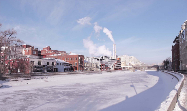
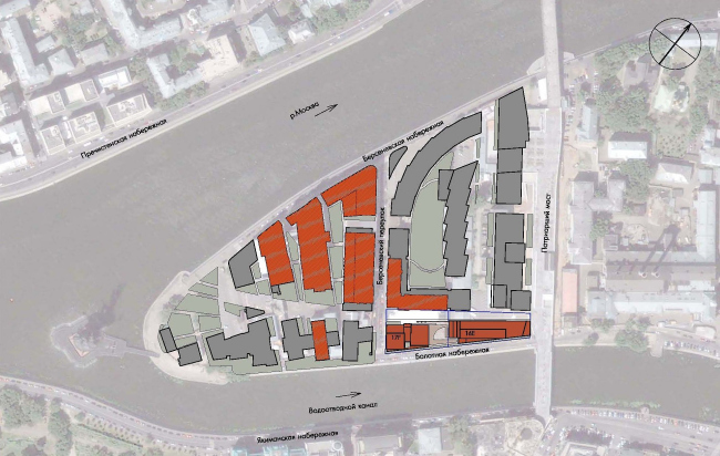
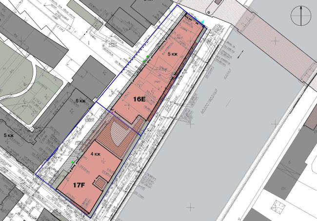
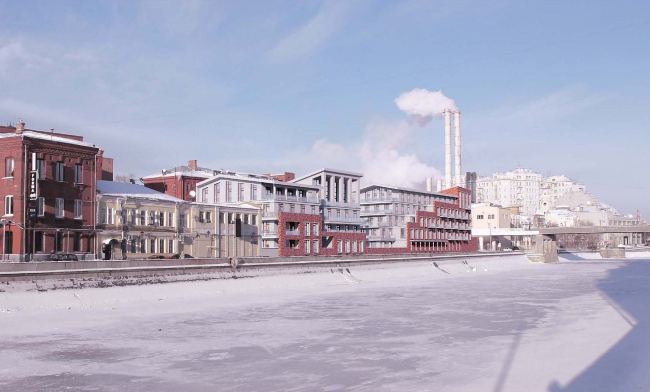
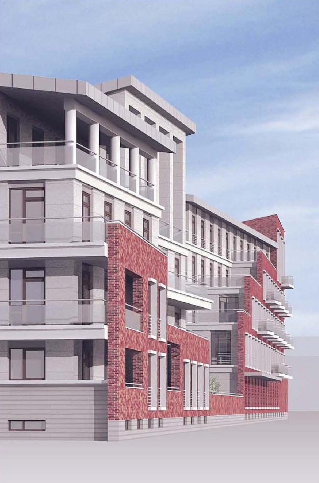
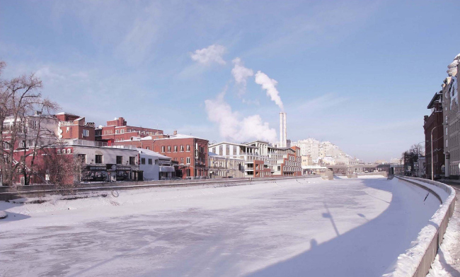
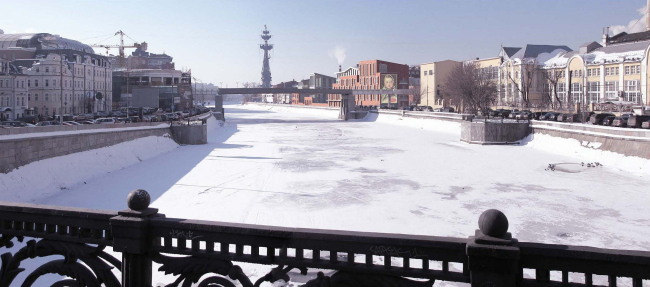
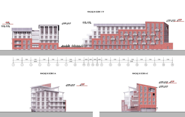
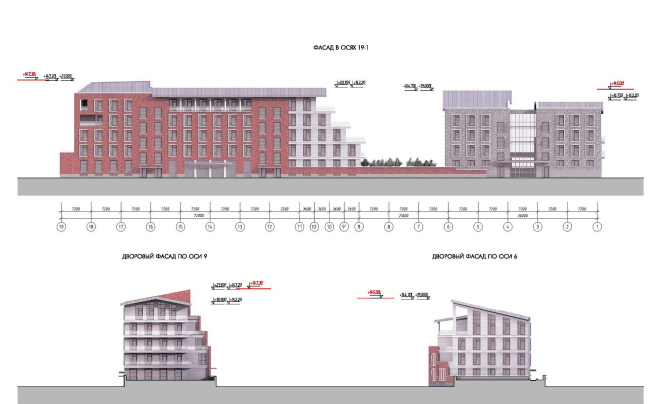
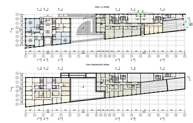
In the context of the contest on the project of a residential complex on Bolotnaya embankment OOO “Sergey Kiselyov and Partners” architectural bureau" designed two apartment buildings, artistic image of was inspired by the "Bathing of a Red Horse” painting. The main difficulty for the contestants was that the town-planning development concept of the entire territory of the factory developed in the early 2000s by "Mosproject-2" includes transformation of Bolotnaya embankment into a completely pedestrian area. Moreover, the entire island will have a joint underground parking with the entry right under the designed residential complex, or more precisely, under its side façade which fronts the Patriarchi bridge. Buildings also have hard limits concerning their class (notably, the larger distance from the bridge the higher is class), height, shape of their roofs and finishing materials. First of all, the authors had to "put together” composition of the two volumes - the long and the short, and they decided that for architecture of the Moscow centre such an antonymic pair is not very characteristic, so they must be visually divided into two parts. In the end it was this two-partness that eventually became the main idea of the space-planning solution of the residential complex: it consists of two different in status buildings and each of them also consists of two "halves". In addition, the smaller building seams to be composed of two stand-alone "small houses", while the longer one is cut into two pieces on the diagonal, and from the red-brick volume there "grows" a stone one. As to dialogue of materials it also was suggested by the technical enquiry: the long bulk is requested to be made of brick, and the more elite one is to be finished with the natural stone of light gray. Victor Barmin observes the requirement but he uses it to vary maximally the interaction of materials and make it more thrilling. For example, the building which starts by the pedestrian bridge fronts it with its two red brick walls (the end façade is slightly skewed in response to the close neighboring). It fronts the embankment not like a monument here: the brick cover is gradually falling down, the long river façade is cut by dynamic vertical and is decorated with light terraces hanging over the red wall. The opposite end façade is facing the courtyard and turns into a system of step (totally stone) terraces. The second building consists of two rectangular on the plan volumes, which are connected by the single hall. Interestingly, the outside "half" is covered with an ordinary gable roof, and the one that is adjacent to the courtyard has a lean-to roof supported by the massive grand portico. The stretched building is oriented on the island and the smaller one which accommodated the most expansive apartments of the complex is looking at Jakimanka and mirror like surface of the channel. "When we started working over the project, I recollected the painting by Petrov-Vodkin "Bathing of the Red Horse and I couldn’t stop thinking about it until I decided to base the composition on it - says Victor Barmin. – The long body is the body of the horse, and the two-part building is its head turned to the audience". None NoneNoneNoneNone None None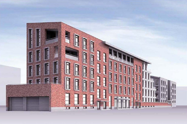 None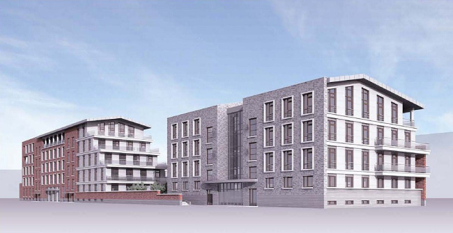 NoneNone NoneNoneNoneNoneNoneNone |
|
