|
Published on Archi.ru (https://archi.ru) |
|
| 13.09.2011 | |
|
Multiple Solutions |
|
|
Tatiana Timofeeva |
|
| Architect: | |
| Pavel Andreev | |
| Studio: | |
| Paul Andreev | |
|
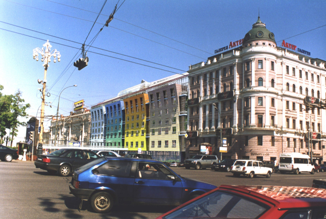
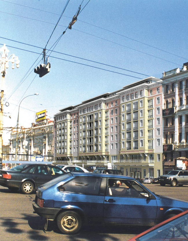
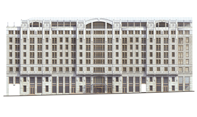
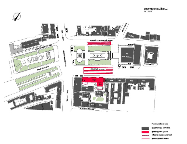
Designing the façade of the hotel on the Strastnoy Boulevard, right next to Pushkin monument, Pavel Andreev lay before his clients a whole set of solutions: from laconic colorful minimalism and “Stalin Empire” style to moderate variations of modern and postmodern. The hotel is to be built in the stead of the former house of XIX century that for years had been the chief editorial office of “Moscow News”. The house was several times rebuilt and topped out, burned twice, and, as a result, was ultimately found failing, which, in turn, allowed getting the permission for its deconstruction and subsequent building in its stead a hotel with sopping premises on the lower floors. This project can be called a “centenarian” for a whole number of reasons: its development, from the first concept to the beginning of getting the due approvals (with the original construction footprint limited to the confines of the old house, and the maximum height limited to that of the neighboring building named “Actors Galley”) went on for almost eight years and underwent numerous changes along the way. In particular, options were developed to reconstruct the building first with complete and then with partial preservation of the capital structure, but then it was decided that a completely new building would be constructed, for which the architects developed a number of vastly different façades. Incidentally, not only did the project of the future hotel change a few times but its name as well. Not long ago, this issue got its final solution: the building will belong to “Basic Element” hotel chain that already has hotels in Moscow, Sochi, and other Russian cities. All in all, as Pavel Andreev recalls, about a dozen façade projects were “run through” for the various potential operators. The most memorable was the proposal from Four Seasons Company: the lengthy (about 80 meters long) main façade of the building was divided into four equal squares meant to symbolize the four seasons, and each square was painted its own color -white, green, yellow, and orange. In the second version, the main façade got three wide bay windows, harmoniously fitting the town planning context of Tverskaya Street. The dark pink walls and the light beige stone, combined with the bronze elements of the sash frames and the balcony railings, as well as pairing the window areas and the “gallery” rhythm of the top floor of the attic, make this façade solution look like light and not-too-monumental architecture (well-known to us by the entrance lobby of the Mayakovskaya metro station only half a mile from this location). And finally, still later on, the investors asked the architects to add modernistic elements to the end solution. The architects did as they were told, refraining, however, from replicating the historical prototypes verbatim. The façade got coated with rough-hewn stone, arched windows, a row of sculptural “medallions” executed in the “Viennese” style, and a large glass marquee. None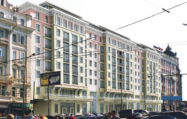 NoneNoneNoneNoneNoneNone |
|
