|
Published on Archi.ru (https://archi.ru) |
|
| 26.01.2007 | |
|
In honour of the sixtieth |
|
|
Julia Tarabarina |
|
| Studio: | |
| Alexandrov and partners | |
|
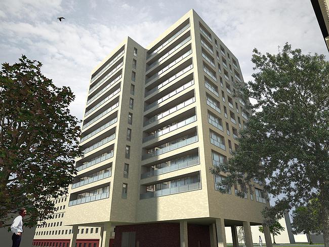
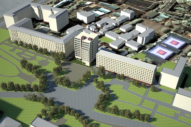
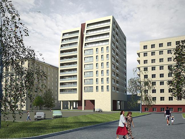
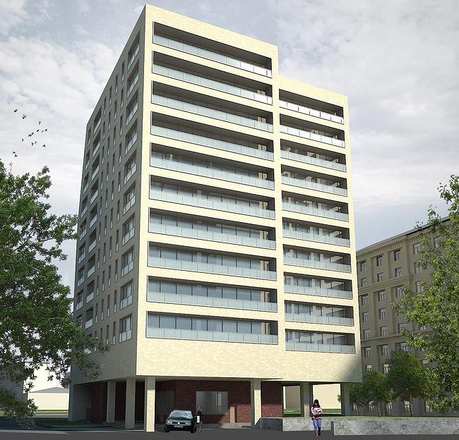
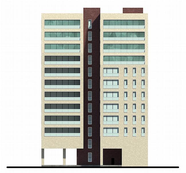
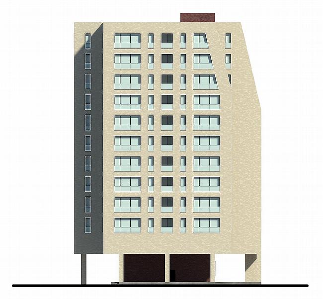
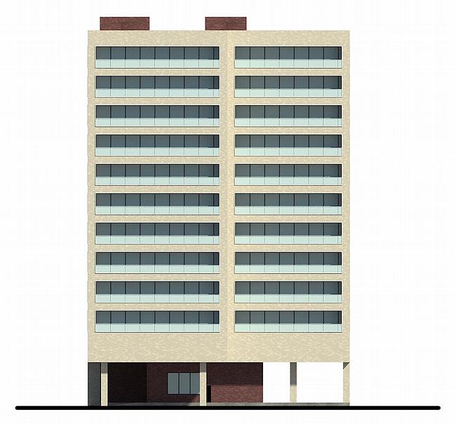
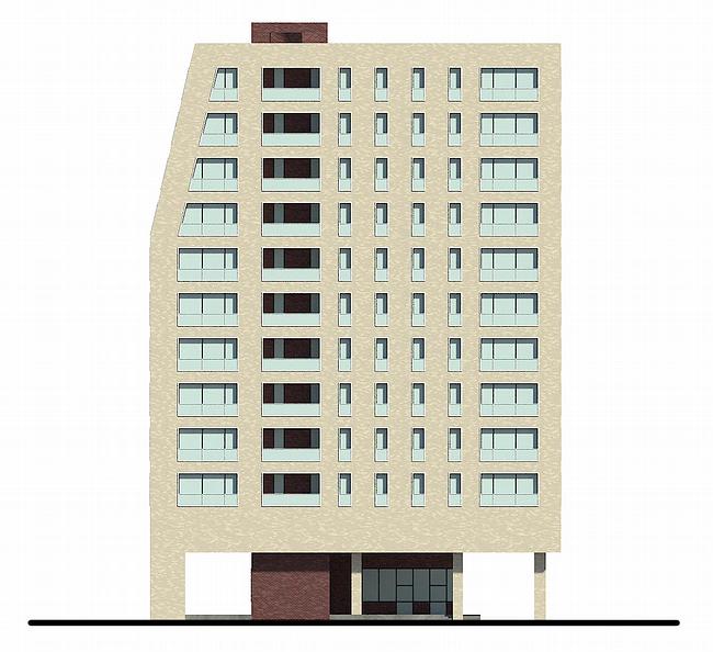
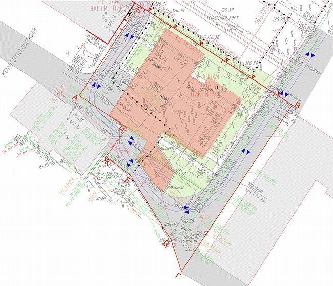
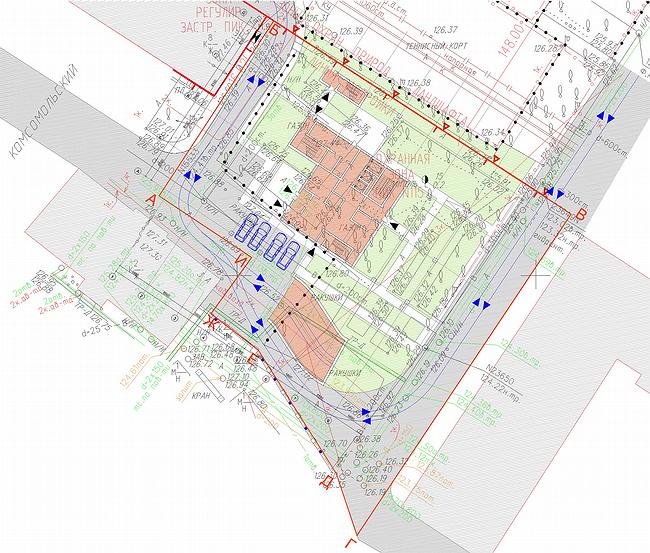
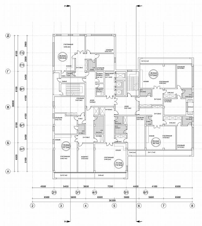
The small house combines simplicity of the architectural decision, called up by a modernism of 60th, and the technologies peculiar to inhabited skyscrapers. It will allow, having entered a building in a tiny site to keep almost untouched existing square, it is good to shine apartments and to give to tenants especial opportunities in connection with a free lay-out. Correspondent of ААН has set some questions to the authors. Tell, what problem faced to you at designing this house? A.Ivanov: To make qualitative, but simple house. The difficulty was to place inhabited volume of class Delux on the very small site between existing 9 and 12-storeyed houses. We searched for a very long time the plan of a building in which requirements of insolation would be considered, a space from the next houses, accommodation of communications. So there was a ten-storied volume which facade consists of two volumes-books leaving forward. The slopes on facades appeared as the answer to the next standing volume - up to the slop the surface of a building repeats a rhythm of windows of a building standing on the right, and after on an inclined plane go gallery balconies. The house has two main facades - aside square and in courtyards. The second is solved more homogeneously - by a uniform stroke of simple linear elements with protections from the tempered glass with application of metal and tape glassing. The house is very laconic. Is it a tribute to constructivism? D.Aleksandrov: Recently we have been called neo constructivists. Undoubtedly, constructivism is most recognized in domestic architecture. However, in my opinion, there was not less worthy period which has begun during Kchrushcev’s "thawing weather" and which 60th have transformed into architecture of Soviet neo modernism. It is presented this quarter - the area of building between quay Moscow-river and the Komsomol prospectus is generated by two types buildings – it is Stalin’s post-war construction and simple geometric architecture of 60th-beginning of 70th There are two known examples of such architecture - they are L.N.Pavlova's works and A.Meersona's early projects - the house on Begovoi and "Swan". Other interesting constructions - a hotel complex at "Airport" recently got thr new facade from modern materials, but absolutely repeats geometry of the building constructed in 60th years - architecture absolutely modernist though it directly follows from international style which has been adapted on our ground in 60th years. A similar example - so-called "Book" of senior Posohina on Arbat which without change of architectural shape is improved by a new ventilated facade - as a whole very dry modern house. We tried to find the certain compromise in our case between this architectural geometry. It is possible to tell this is our sight through a shoulder for one more worthy period of domestic architecture - the sixtieth. And how it was reflected in architecture? D.Aleksandrov: The plan of a building is executed in the form of the letter «Т» where an average sheaf is the staircase, and two volumes - bigger and smaller, remind a pair, the man and the woman. That is, one partner, a little bit larger, acts forward to a red line and slightly embraces by the ladder block his girlfriend thin and graceful, standing «on high heels». So the movement aside the park is created. Leaving by the last by four floors back about which Andrey has told, is caused by two reasons: on the one hand, we show a line of restriction of existing building and we leave back in depth of quarter and the second - the best apartments here are located, the most interesting view there from reveal. Practice of operation of modern apartment houses shows, that at the organization of balconies and any acting elements we should struggle that all this get into glass - sometimes under projects discussed with us, but more often, unfortunately, on their own. As a result the house turns out not absolutely such what was designed. Therefore face facades, that is the buildings turned aside, vanish under the French balconies or loggias with hollows inside which get in glass absolutely painless. Gallery balconies unite basically kitchens and drawing rooms, that is large public zones and are focused aside the most interesting points. Accordingly two structures of a material - a light stone under a brick and more dark which fastens certain correspondence with more chromatic white lady. Are legs on high heels on which the house leans only the nod aside coryphaeuses of 60th, or there is a practical substantiation to this decision? A.Ivanov: The site is not too big so we had problems with gardening around the house- there is no place enough, so such decision appeared: the bottom part of the house from a court yard is compressed as much as possible, leaving place only for lobby. We have lifted all rest on "legs" of a-column, that, having increased possible gardening almost twice, existing public garden will be kept, gardening will be even under columns. Under the ground the underground two-level parking which almost completely borrows a spot of building is located. Is the lay-out free as it usual nowadays? D.Aleksandrov: Free. The matter is that flexibility of a lay-out is incorporated in the design of the house. For a building in ten floors height stylobate, an intercepting technical floor - a thing uncharacteristic, not following the natural engineering image. But it, first of all, in many respects has defined architecture of a building: it entirely stands on a platform, and this platform is lifted upwards. Secondly, in this part of a building all engineering communications which then leave further to the central trunk and then under the ground are shown. It has provided flexibility of the plan. All "wet" zones, bathrooms and lavatories, are placed in a core of the house, and rooms are located as much as possible on perimeter of a building. Other moment which distinguishes this building from the similar houses of a high class of average amount of floors: here we have applied large enough grid of columns. Proceeding from that we here have « an intercepting table », on what the customer has agreed, though usually it is used at construction of high-altitude complexes, for example, our towers in « Amber city » where 100-meter buildings stand on a "table". In small volume of the 10-storeyed house on Komsomol "table" is combined with a technical floor, forming « a double shell » inside of which pass all communications. Owing to it we could apply a large grid of support with step « eight hundred ». Usually for habitation "steps" it is no more, than seven and a half. It has led to reduction of quantity of bearing elements, and the lay-out became enough flexible for possible transformations already after construction by proprietors of apartments. Same has allowed to transfer all premises on an external contour and to improve illumination. On face facades to the next houses we leave not apartments, but balconies and evacuation ladders. That is, public zones we focus all on free spaces and the most interesting specific points - Moscow-river, Park of culture and downwards under the Komsomol prospectus, and with the next houses, on the contrary, we avoid effect « a window in a window ». And how many apartments are there on a floor? Five apartments. On the average. There are variants - 6 apartments if the small apartment is added, studio. In the top floors if it is required, it is possible to make one greater apartment - a penthouse. The house has turned out on the size on one and a half section. The wide case dimensions 36 on 30 meters (the standard case - is no more 18). It and not a tower with one entrance, and at the same time not the section house. The narrow site has caused similar decisions. On the top floors five apartments can freely turn to three. NoneNoneNoneNoneNoneNoneNoneNoneNoneNoneNone |
|
