|
Published on Archi.ru (https://archi.ru) |
|
| 05.02.2007 | |
|
Three faces of an office building |
|
|
Julia Tarabarina |
|
| Architect: | |
| Sergey Kisselev | |
| Studio: | |
| Sergey Kisselev & Partners | |
|
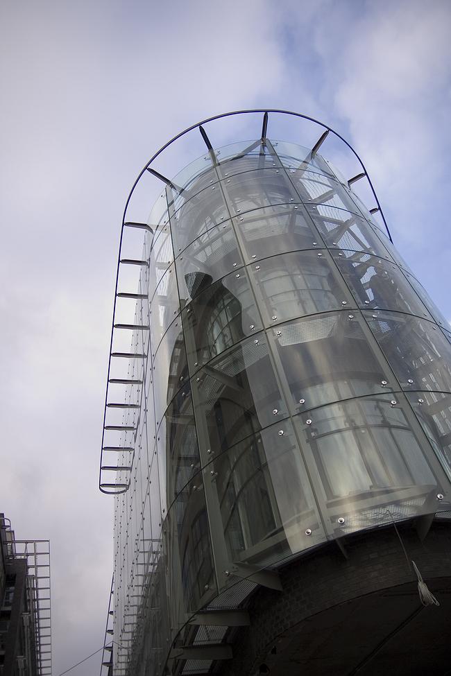
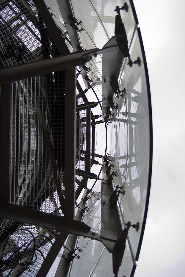
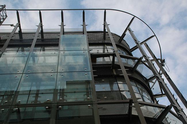
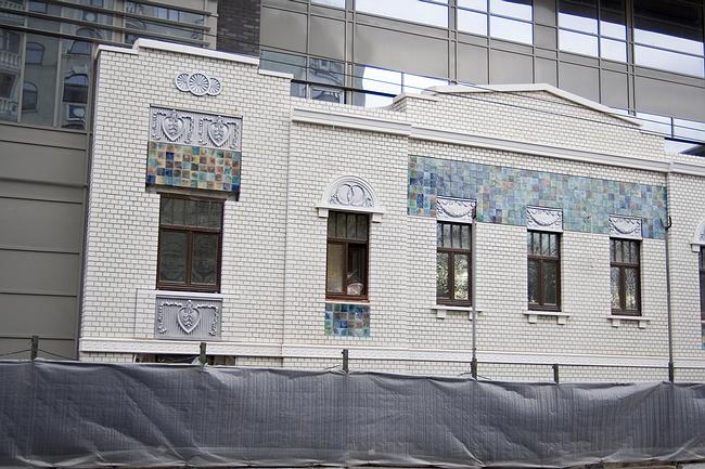
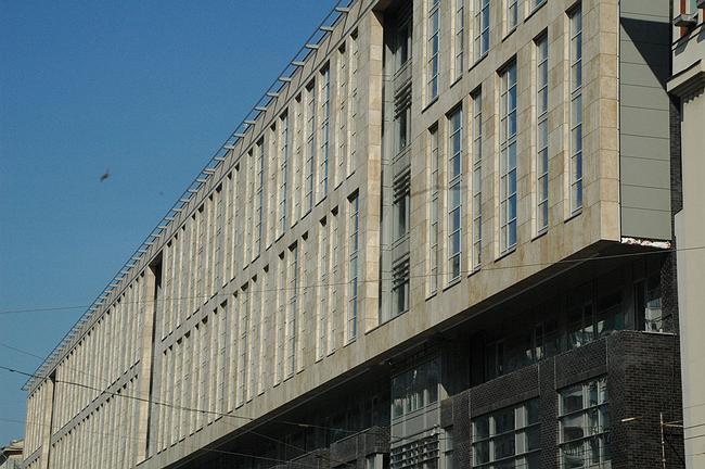
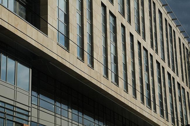
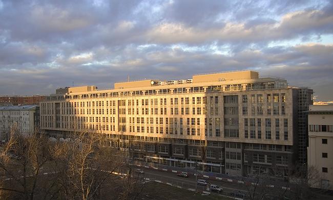
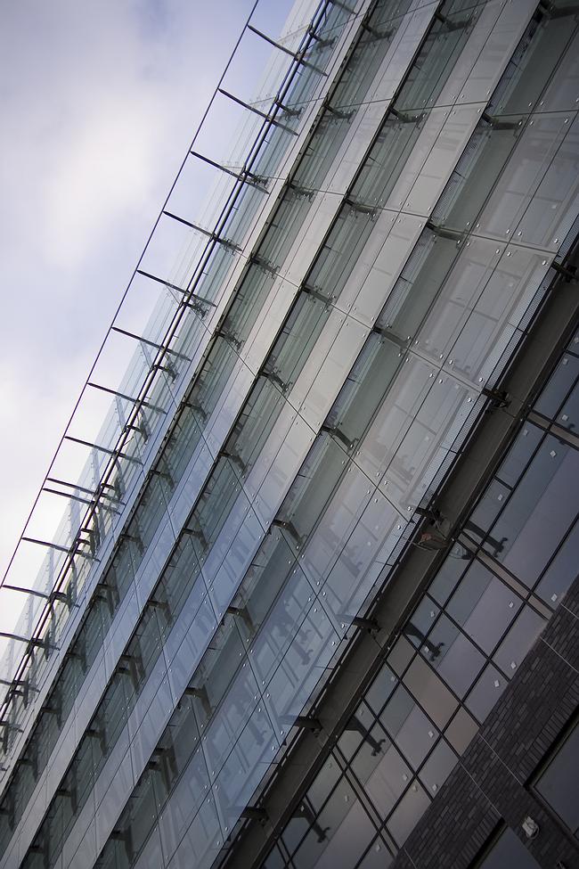
The new office centre, ‘Hermitage Plaza’, combines perfectly the careful approach to the context with a range of technological and recent façade design methods. A unique object has appeared on the Garden Ring, next to Marionette Theatre and the Museum of Arts and Crafts. Something kidney-shaped, shining with showy surface of its costly structural glazing. In close vicinity to the classical annex of the museum and the corner building, reconstructed six or seven years ago, the new building looks ultra-modern and certainly invites attention. Thereby performing the primary task – this is the facade of a new office center, the part that is to represent it on Sadovoe Kol’co. There are four floors of vacant space inside that can be ideal for presentations and grand events. Outside, there is a building extended into the yard fronted with good dark-brown lining brick, that from Sadovoe Kol’co spires like an asymmetrical ‘nose’, covered with the bendy glass screen. As if the building has ‘melted off’ from automobile rush on the main Moscow center highway. The glass screen really protects from noise. And also it provides the inner space with daylight and opens the views on the opposite side of Sadovoi-Karetnoi and the garden "Hermitage", which also has given its name to the new office centre. The shaped facade is nice and modern, it is a find for the Moscow centre. This is one of the best variants of installation a modern building into historical construction without loss for the both sides. When a construction does not lose its unity and a new building – actuality of forms. Sergey Kiselev has said that the volume has come out of the necessity to harmonize the office building that is being constructed and the neighboring manor Ostermanov-Tolstych (here is the Museum of Arts and Crafts ‘on Delegatskaya’). So the rising of this construction is the result of the reference to the method of ‘blurring’ a new construction that has become custom to Moscow centre; edges are slightly scaled down and ‘dissolved’ in historical surrounding. Surprisingly, the method, used to shade and hide a new building, in this case is turned into its reverse, accenting it. The manor hasn’t suffered from that however, but benefited - it has become better seen. Standing by the museum annex on Delegatskaya, the new «Plaza» represents a new façade type that is alien to the historical one from almost all points of view. First, comparing to the office complex, it is not a facade, but more like a courtyard house that has become a focus of attention being on an advantageous location, it becomes the center of attention. Secondly, instead of face area there is a rounded nose that doesn’t reach up the frontage line of the street; instead of a solemn portico there are glass spots, splintered reflection; instead of the architectonic of the classical order – the bent high-tech screen. This is a nice part of the center, even though it is the smallest. The rectangular volume of the second one – the primary building, has stretched alongside Krasnoproletarskaya (Pimenovskaya) Street, facing it with a long six-storey facade. The street facade of the building is designed for the two ways of vision – a passerby’s and a driver. So, the lower three levels has been moved away a little from the frontage line, enlarging the sidewalk; small rectangular bay windows are extended in a swing from their glass-metal surface at the second level. The lower part includes the two facades, remained from the houses of the beginning of the 20th century: their light tiling harmonizes with the smooth dark brick of the new surface, appearing as precious inclusions. These altogether create for a passerby an impression of sufficiently various and the city street space commeasurable to a man, as though the architects have especially careful read the texts by D.S.Lihacheva's. The top of the building "made" for watching cars, is fronted with noble jurassic stone, the light surface comes forward from the dark, brick-glass basis. It has a larger size, the four floors are considered as the two circles, rhythm of the window verticals (each covers 2 floors) is purposely disturbed, but just a little in order to enliven. The opposite yard facade is totally different. It’s main goal, according to Sergey Kiselev, is at maximum smooth the neighboring of the new office center with the historical building “Ostermanov-Tolstuch”, “to hide" the new construction. Again the custom context task has a got a good and original result. The five top circles are covered with the horizontal bands of glass, planes are turned up at a large angle - to reflect « … the sky, much of the sky» that becomes "background" for observation of the historical manor. Sergey Kiselev's office center has got an advantageous, but inconvenient location, the corner has already been occupied. The long facade on Krasnoproletarskaya Street and the minimal "output" to Sadovoe Kol’co, neighbouring of architectural monuments, and not so fine buildings of the past years - all these have created a number of obstacles and difficulties, but still a graceful and elegant ensemble has come out; and one of its main features is the variety of façade design ideas, but with no stylization at all. 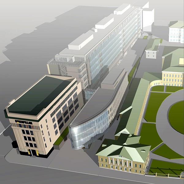 NoneNoneNoneThe structural glazing of the facade looking at Sadovoe Kol’co, during installation. The external surface of the glass facade and the internal panoramic window are separated with great spaceNoneNoneNoneNoneNone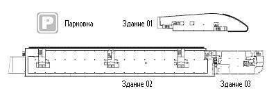 None |
|
