|
Published on Archi.ru (https://archi.ru) |
|
| 14.03.2011 | |
|
Masonry-Bound |
|
|
Anna Martovitskaya |
|
| Architect: | |
| Sergey Skuratov | |
| Studio: | |
| Sergey Skuratov architects | |
|
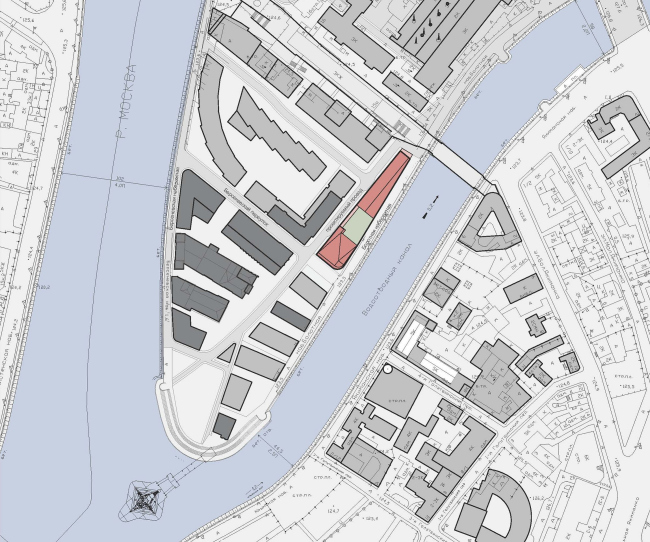
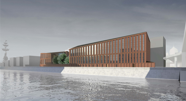
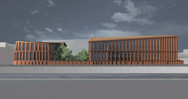
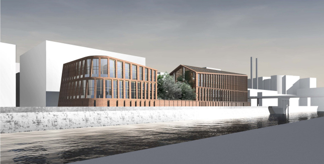
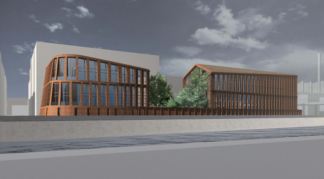
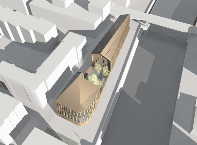
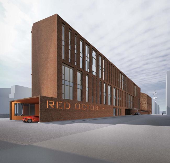
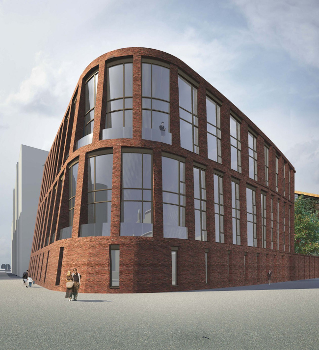
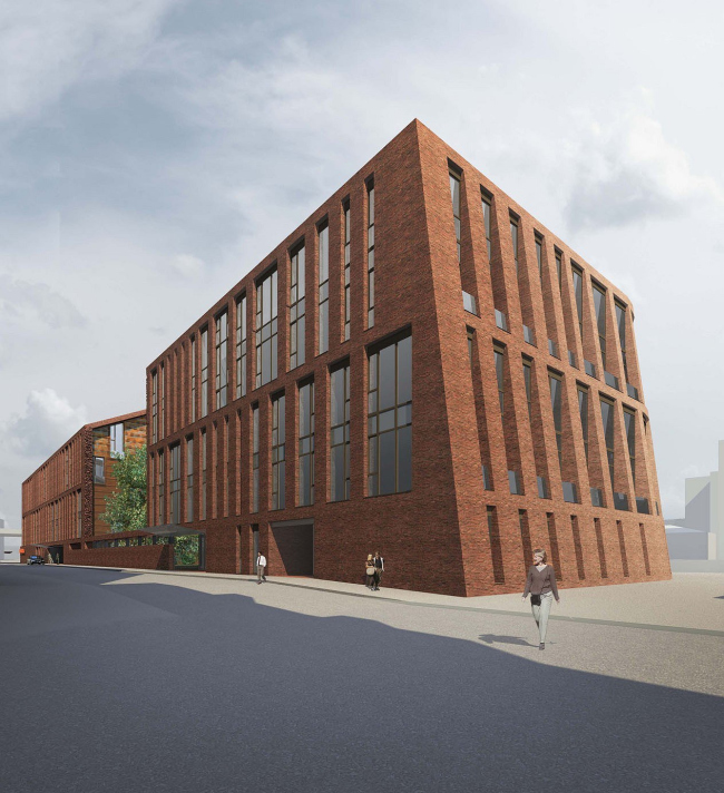
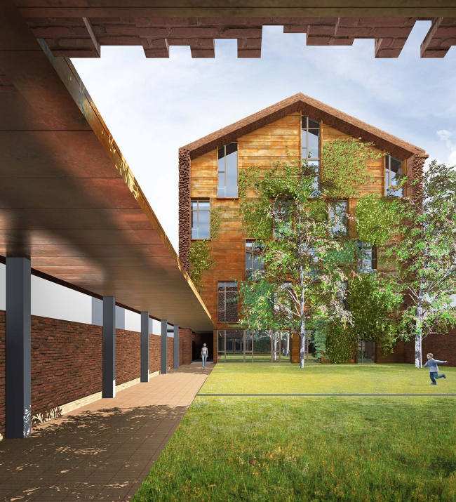
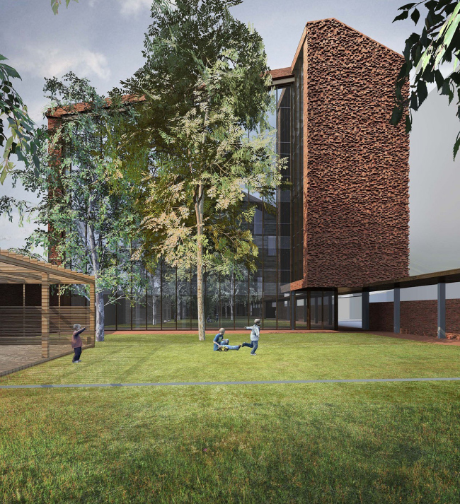
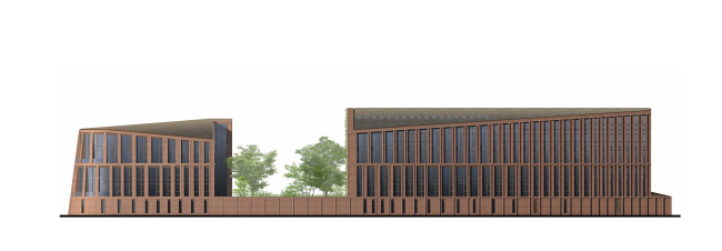
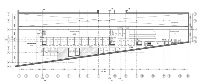
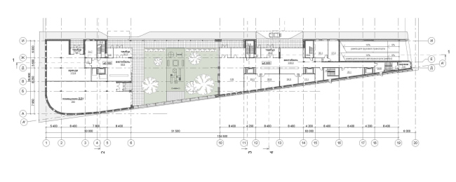
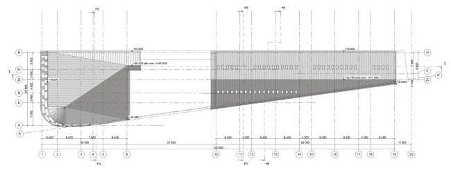
Early this year, GUTA Development Company organized a closed competitive tender for the project of a residential building on Bolotnaya embankment. The list of the participants included “Sergey Skuratov Architects”. “Today, this factory looks like a regular part of the city filled up with large residential buildings. And it was this particular circumstance that gave me the idea that the houses that would be built here instead of the industrial facilities should visually look like industrial objects and have the prominent aesthetics of lofts” – the architect explains. The architecture of this residential complex is indeed devoid of fine detail or any decorative elements - its image is created by the plastics and the texture of its very volumes, as well as by the virtuoso work with the material where Sergey Skuratov has no rivals. On the layout, the residential complex has a trapezoid shape, the narrow side of which is turned to Patriarchy bridge. In front of it, the motorway of the Bolotnaya Embankment turns into a pedestrian street, and this is why Sergey Skuratov proposed to place the driving entrance area from this particular side. The underground parking garage is accessed though a double-track ramp, and the entranced is decorated by a crimson portal. “Monkey’s ass” – says the architect jokingly about it but then cuts himself short and gives a less metaphorical yet more appropriate definition: “red entrance to the womb of “Red October”. Then he explains himself:being exposed to the heavy traffic, the narrow façade will inevitably be deformed – and the architecture of the building demonstrates this with a symbolic dent the height of the entire house. One of the requirements specified in the terms of reference was different form of the roofs of the future residential buildings. The long one was to be covered with an inclined roof, and the square one - with a flat roof. However, it would be very unlike Skuratov if he had not used this requirement to create complex and sophisticated plastics that now are giving the building its unique and recognizable character. The inclined roof of the long building (that looks as if it has “slid down” into the direction of Proektiruemy Proezd Street) likens this building to the famous house in Tessinsky side-street. However, while it was exactly where the architect stopped back in the day, here the shift of the roof of one of the buildings leads to radical changes in the shape of the roof of the other one. First of all, he keeps the incline of the roof set by the longer building but, due to the fact that the second building has more rigorous height restrictions, its roof is cut at quite a different angle: the slope of the roof goes down but then makes a sharp turn and continues the downside movement in reverse. This dynamic “downturn” had most direct effect on the architecture of the house: at the crossing of the embankment and Bersenevsky side-street, the rounded sloping facade of the complex looks a lot like the snout of a ship; the decks are made up of the extra balconies that became possible due to the inclination of the wall. NoneNoneNoneNoneNoneNoneNoneNoneNoneNoneNoneNone None None NoneNoneNoneNone |
|
