|
Published on Archi.ru (https://archi.ru) |
|
| 22.12.2006 | |
|
The site of Sergey Skuratov’s workshop has opened |
|
|
Julia Tarabarina |
|
| Architect: | |
| Sergey Skuratov | |
| Studio: | |
| Sergey Skuratov architects | |
|
<http: // skuratov-arch.ru> The site has two features - world outlook and structural. Structural feature occurs from the history of a workshop of Sergey Skuratov which, having appeared in 2002, has declared itself by two very appreciable constructions - the houses built nearby from each other in Butikovskii pereulok: one is « Butikovskij, 5 », the second - Cooper house. For such, sign projects - special section of a site, "selected works" which will gradually replenish. It stands the first in the list of a portfolio and is solved most vividly: photos take half of a screen, giving to a site similarity to the journal publication. All have got used to see Cooper house on covers and turns - here this impression is kept. You cam see the photo, however entirely - they slowly move, besides you can move them on your computer. The following subitem of a portfolio unites all projects of the workshop built on chronology, including works that are already in "selected works", and those, being constructed, are going to get there. It is the first part of a portfolio; its second half contains « personal archive » - projects and Sergey Skuratov's constructions made during his work in the workshop « Sergey Kiselyov and partners » and earlier. There are many known things here too: a complex on Seleznevskoj, a favorite of “Gold section” and "Architecture", the house in Zubovskij, Gagarinskij, in the street Burdenko, Bolshaia poliana … Here it is necessary to tell separately. The site is made «on flash», it is completely animated project, Europeans has a lot of such, and our architects have started to make them last years. The technology has one minus, usualy it is curiously to look on these sites, but it is difficult to receive something, take images and to unpack texts from them. Therefore journalists do not loke them. Here, however, the problem is solved - all pictures increase, if it is necessary, open in a separate window, texts are unpacked. In general it is possible to see enough, constructions are shown, and not just designate their presence by conditional «marks» - which means to get all the rest watch the paper catalogue. This site itself as the catalogue, it is made to admire good architecture and it is possible to do in net.
 None None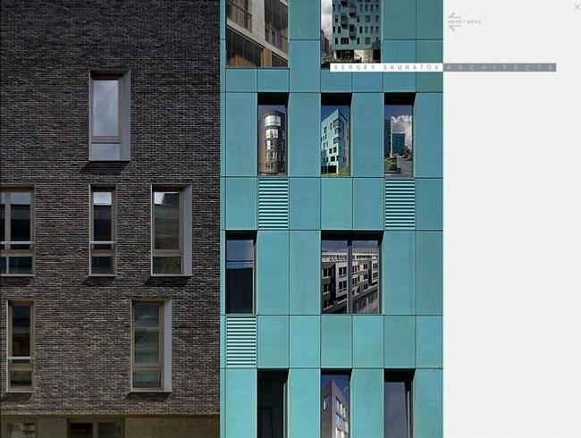 None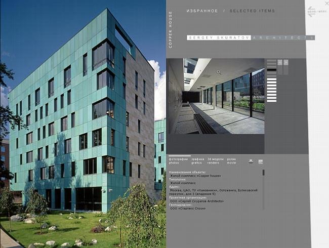 None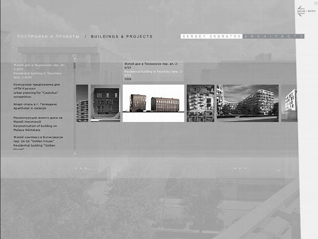 None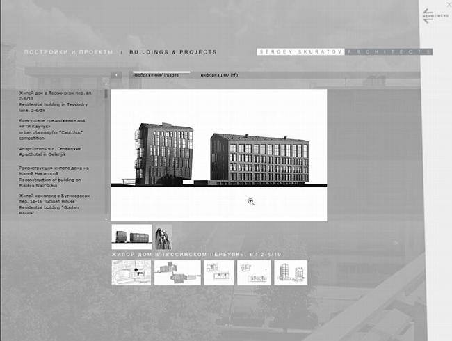 None |
|