|
Published on Archi.ru (https://archi.ru) |
|
| 16.03.2011 | |
|
Tetris… Vertical and Horizontal |
|
|
Anna Martovitskaya |
|
| Architect: | |
| Vera Butko | |
| Anton Nadtochiy | |
| Studio: | |
| ATRIUM | |
|
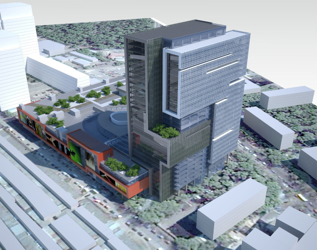
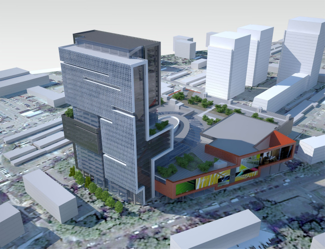
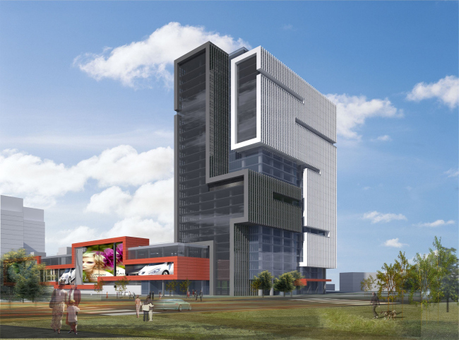
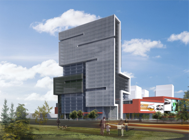
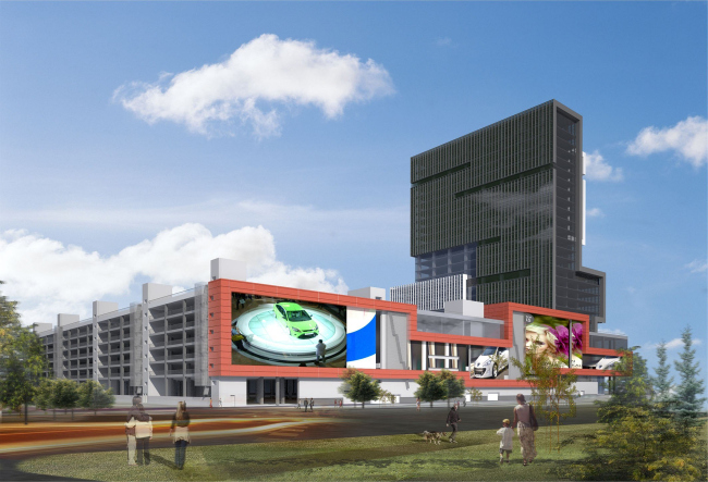
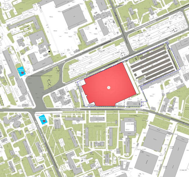
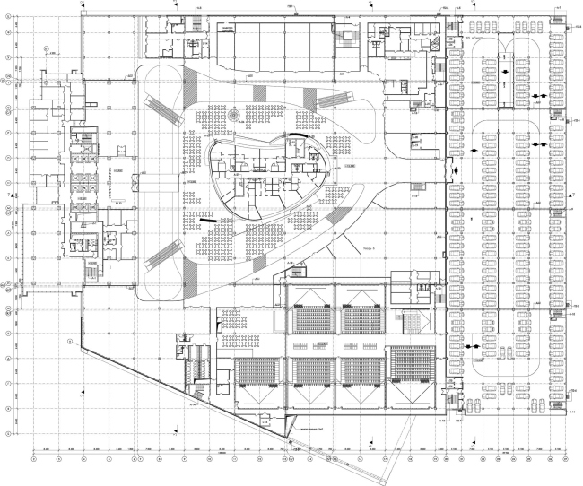
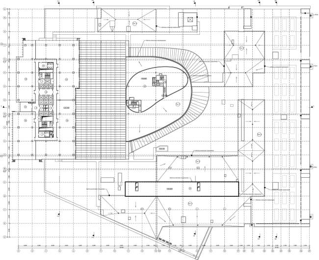
The list of Russian projects showcased at the recent Cannes international real estate show MIPIM-2011 included, among others, the multi-function development “Vodny” located on Golovinskoe Shosse. Its developer is MR Group; the architectural concept was worked out by “Atrium” architectural office. The architecture of the whole development is dominated by the high-rise centerpiece that is undoubtedly the right thing to build in such a faceless area. The tower houses the offices, while all the shops and restaurants are grouped in the 3-storey block that is “spread” over the site. At the same time, the space and volume solutions of the “office” and “shopping mall” are united by one common thing. Like true virtuosos should, the architects connected the two blocks, treating the abundance of functions of the development as interaction of different yet equally active plastic shapes. “Ultimately, we got a 3D Tetris of sorts, the one whose pieces are made to fit with one another so perfectly that they make up one indivisible whole, - architect Anton Nadtochiy shares, - in spite of the integrity of the overall shape, we sought to articulate the plastics of the interaction of its separate elements”. The high-rise part of the development is located closer to the metro station and the Leningradskoe Shosse highway that runs behind it. The fact that one of the facades of this 100 meter-high tower is seen from the highway leading up to “Sheremetyevo” international airport, conditioned the special attention that was paid to its design. Apart from that, being South-West oriented, it needed to be protected from the direct sunlight. The combination of these two factors – the necessity to give this huge surface an attractive and memorable look and make it sunlight-proof – conditioned the architectural image of this tower. First of all, the architects took the glass parallelepiped and “remolded” it in such a way that it looks as if it was made up of several complex rectangular shapes. Second of all, the translucent body of the office high-rise is protected with thin lamellae, one half of the tower being clad in white “vertical blinds” and the other half – in black ones, which gives the façade extra volume and adds to the dynamics of the interaction of its parts. Looking at the complex from the side, one can best see how its high-rise module interacts with its horizontal part. The tower literally “grows” into the lower plate – the office façade goes unchanged down the shopping mall façade becoming a part of it. “The interior of the shopping areas becomes quite an unusual element but at the same time the solemn office wall unambiguously marks the border between the two different areas - the shops and the amusement section” – architect Vera Butko explains. For the office employees’ convenience, the tower on the level of the third floor is connected with the shopping mall with a special passage way. It leads directly to the food court that is located in a nice semi-oval atrium. NoneNoneNoneNoneNoneNoneNoneNone |
|
