|
Published on Archi.ru (https://archi.ru) |
|
| 15.12.2006 | |
|
House-‘stels’ |
|
|
Julia Tarabarina |
|
| Architect: | |
| Vladimir Plotkin | |
| Studio: | |
| Creative Union ‘Reserve’ | |
|
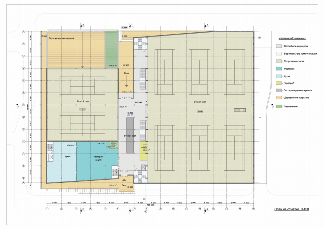
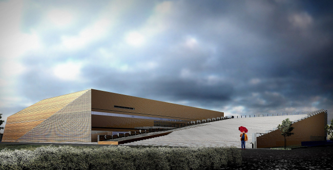
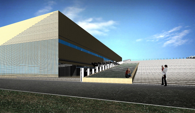
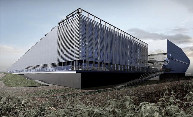
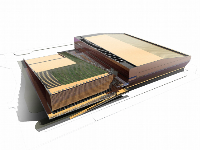
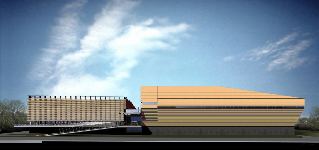
The new version of the ‘Tennis Club’ building by Vladimir Plotkin inherits the previous, but changes entirely its architectural image. Vladimir Plotkin elaborated the project of the Tennis Club on Leningradskoe Highway in the end of the 90’s, but the construction was never started. Today, the plan is being worked out largely – there will be two complexes under the share name The National Tennis Centre. We have already written about, so to say, the front part, which will unite the demonstration court and the hotel. The other component of the Centre is the sports complex for tennis trainings, the direct successor of the 8 years old project, and this makes it very interesting to see the changes have been made to it. The customer wished the demonstration court to be placed out of the project; this made the building look more pragmatic. The one part of it is almost a hangar, comprising the six training courts. Within there is a 56-meters flight covered with uniform metal farm without additional foot, this makes it possible to turn it into a large competition hall, putting temporary grandstand. There will also fit another two courts, fitness and a restaurant. The roof of this one is of less size – operational, slanting, covered with flat wide steps like in a park. From the highway the roof goes down to the ground, and easily goes up on the two-storey height towards the pond. So, it will look like a park on a small hill, for those driving by. Besides, they plan to use from time to time the open space as an auditorium for Tennis Federation’s activities. The idea to hide the building under the slanting roof was the main in the project of 90’s, where such kind of roof was to be made for the both buildings, covered with grass like a lid of a giant bunker, which had been just a little lifted to view the ‘lake’ scenery of the Khimkinskoye water basin. As Vladimir Plotkin has jokingly said, this ‘house-stels’ is as much unseen. There are a few points to view the landscape: the first is for driving by, who may even not notice it at all, so, it will not ruin the view to the grass. The second – is from within, the beautiful view to the water. The third is for those who couldn’t help to go to the bank and now is coming back – the only front façade of the complex. The combination of a few contrast effects, inevitably created a flaky, even contrast image of the building. The Tennis Centre in 1998, hiding from the highway under the grass slope, was very active from the opposite side – it seized the space with the metal constructions, spin with open winding stairs, reflected the water scenery in the huge panoramic windows. The building had the two faces – for passersby it was a park, for those invited to a competition or just visitors who had entered from the other side – represented the palace of sports. The new design works out the ‘idea of stels ’ in a different way. The composition of the two buildings remains almost unchanged, only the image has been modified entirely. It has become more complete, general, only on a closer review the nuances may be revealed. The broken outline can be easily explained – slanting is scaling down the obvious size of the construction where possible. ‘If you make up for the cut area’, the architect is telling– ‘the building will look much more massive’. However, even realizing the motifs, it’s hard to get rid of the felling that the house has been covered with wrap paper or a scrim of unknown manufacture. And as if it has fallen and just laid down with wide, slightly broken planes: beneath the cover reflects the ground and is getting darker, from the lake-basin it splits – just a little with thin stripes of jalousie, releasing the wonderful view to the restaurant’s window. Outside, the glass gloss is hidden, and this adds a bit of intrigue – the building doesn’t have routine windows, but it is always peeping through the jalousie or narrow ribbon windows. There are no traditional windows at all - no rectangles, no open stained glass – and this carries out the image of a nature object, a huge stone, indifferent to the surrounding, or a giant cocoon. The color of the cover will be either of wood – made of plastic wallboards, imitating it very well, or silver. The both colors have their own way to highlight the main emotion, occurring on the observing the ‘object’ outside – the irrationality, ‘secrecy’. As if a new Stels has landed there. None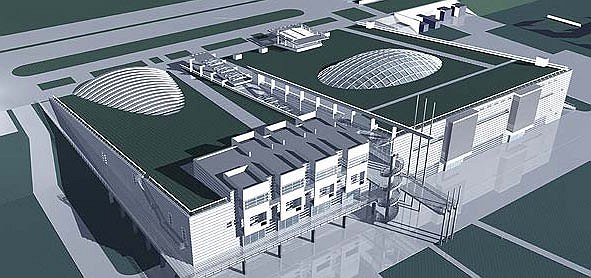 None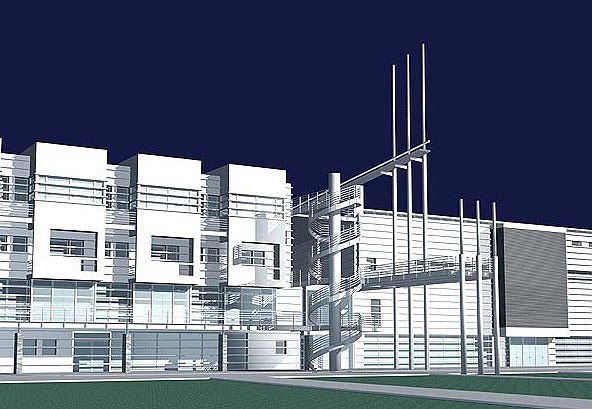 NoneNoneNoneNoneNoneNone |
|
