|
Published on Archi.ru (https://archi.ru) |
|
| 26.01.2011 | |
|
Quality of historism |
|
|
Julia Tarabarina |
|
| Architect: | |
| Oleg Karlson | |
| Studio: | |
| Karlson & Co | |
|
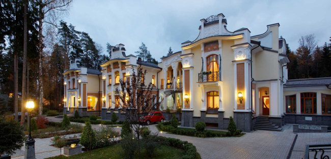
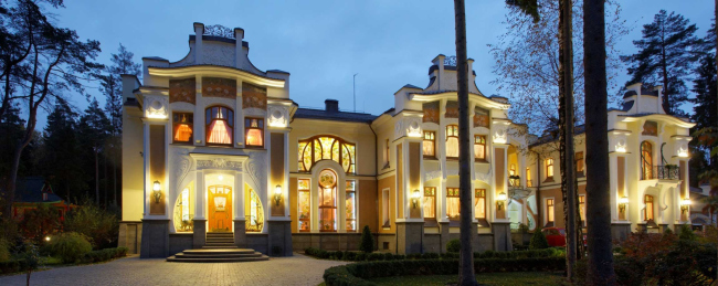
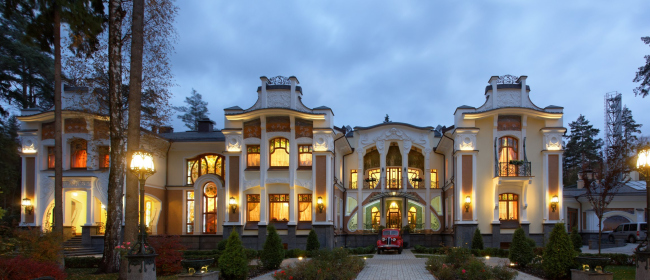
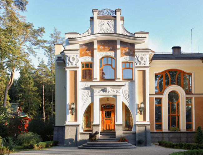
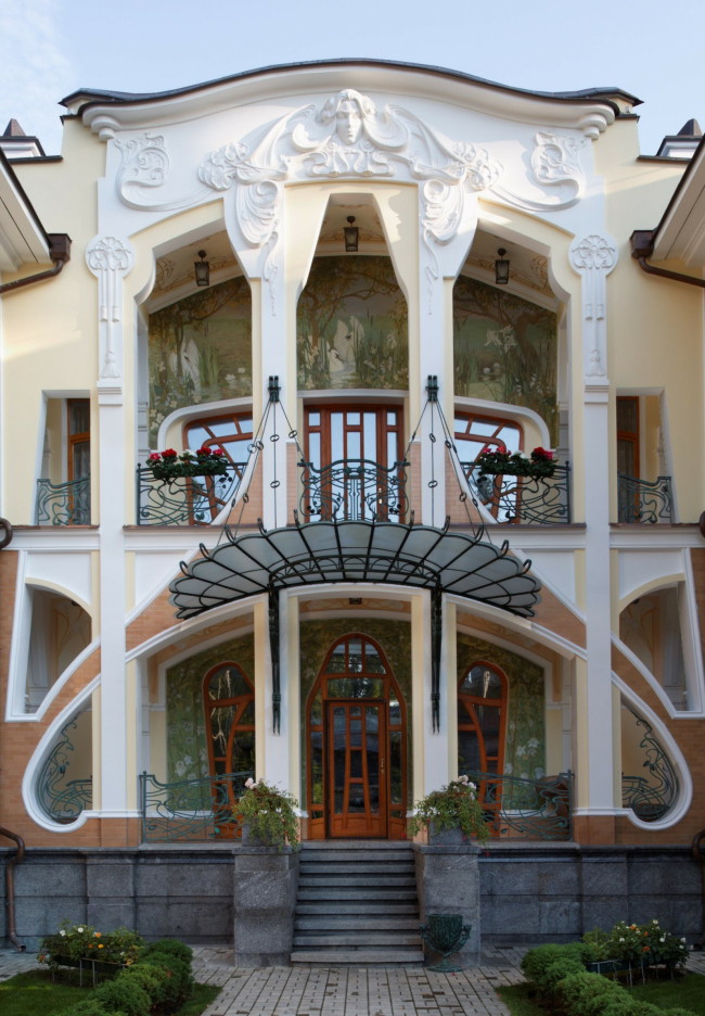
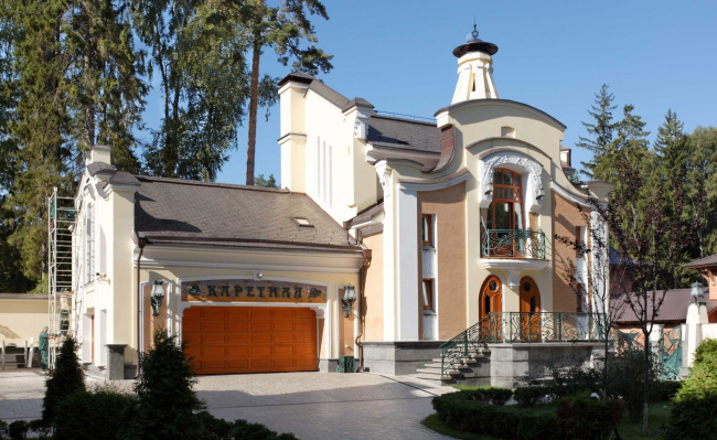
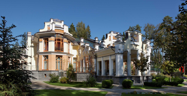
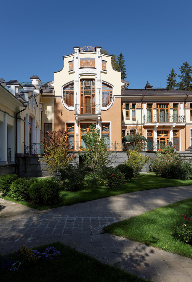
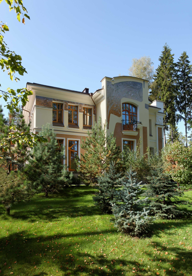
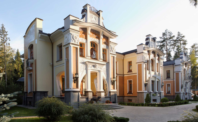
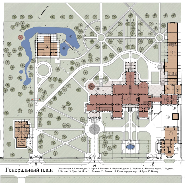
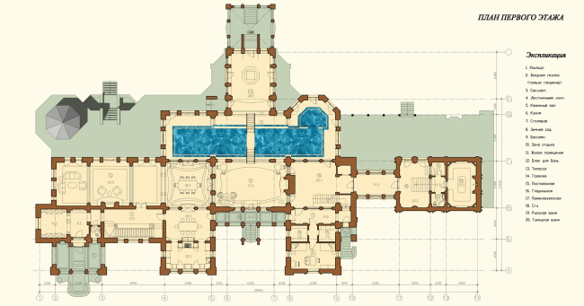
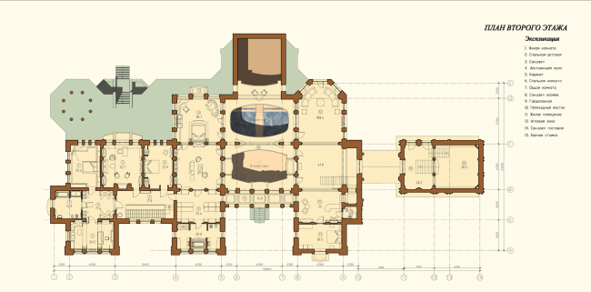
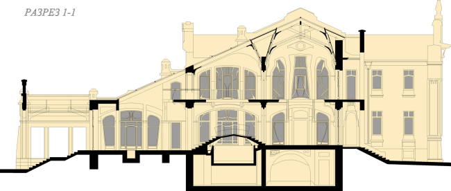
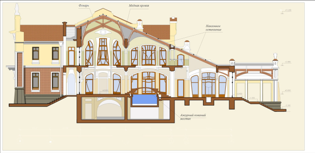
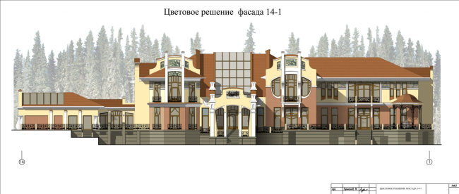
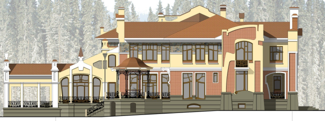
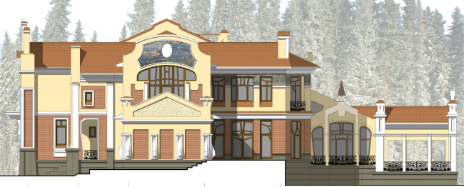
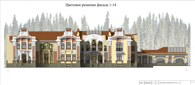
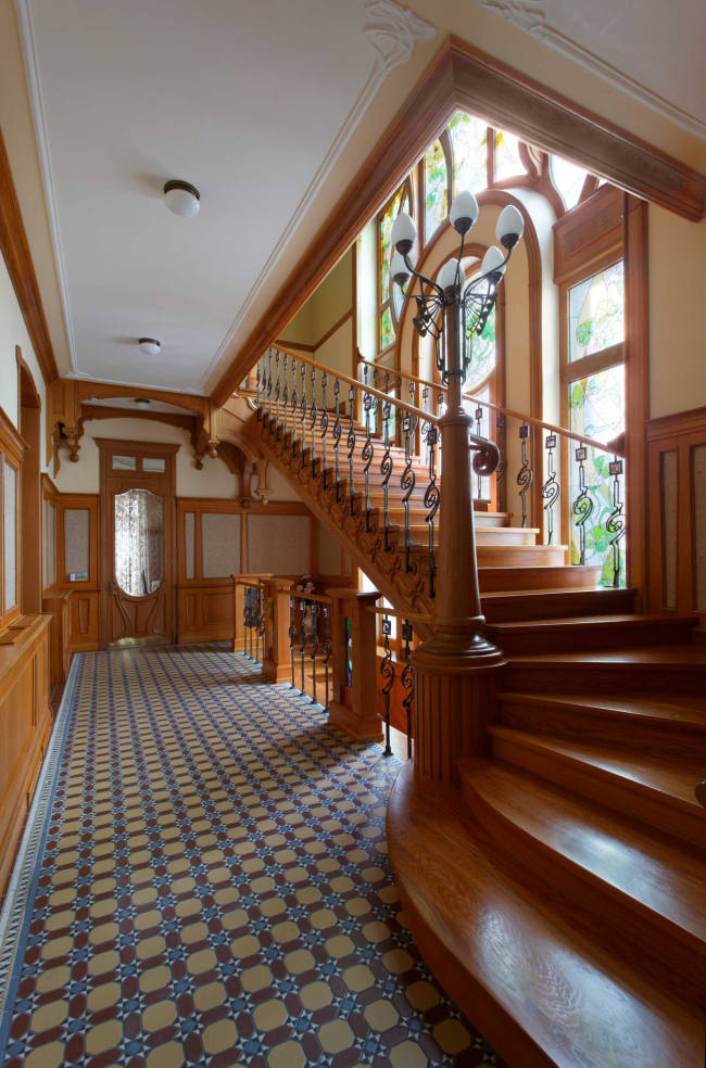
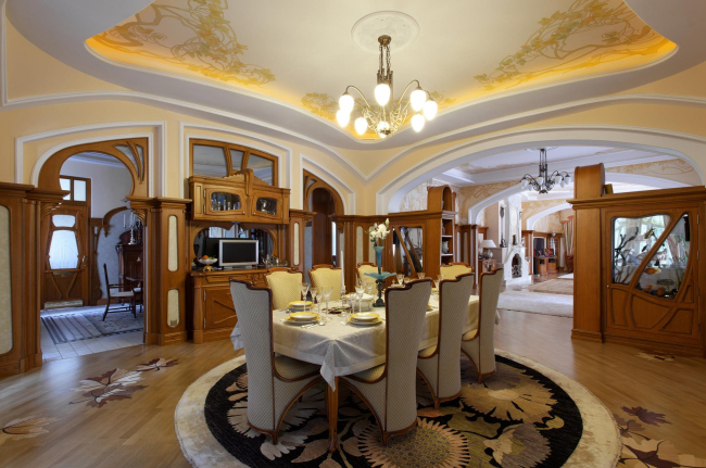
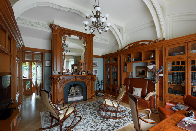
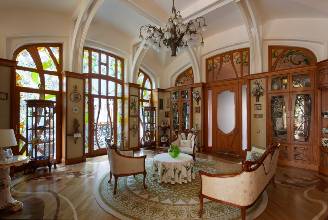
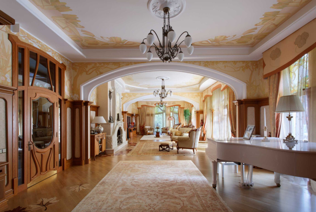
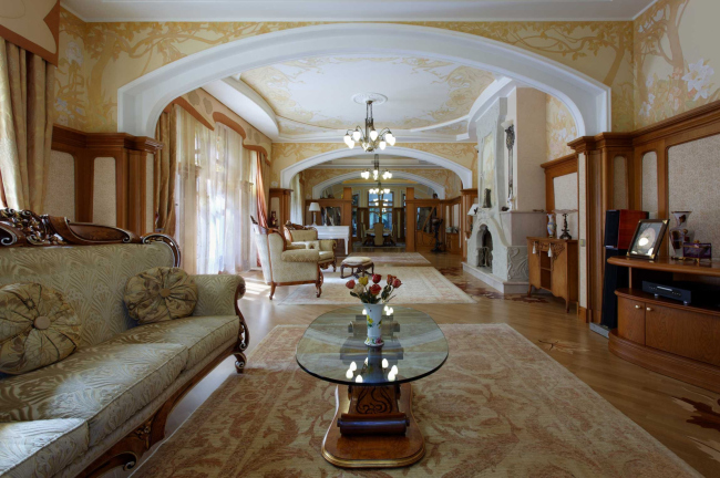
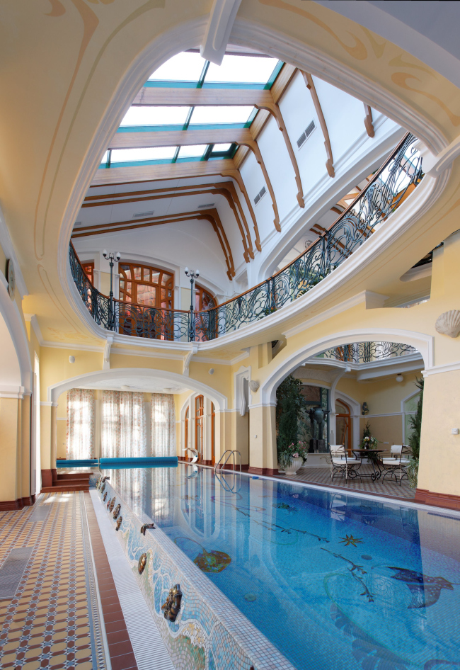
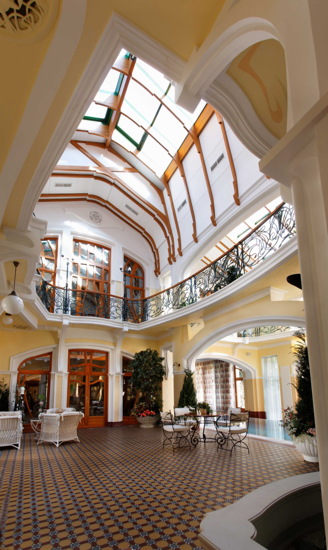
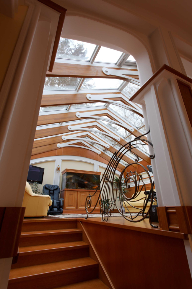
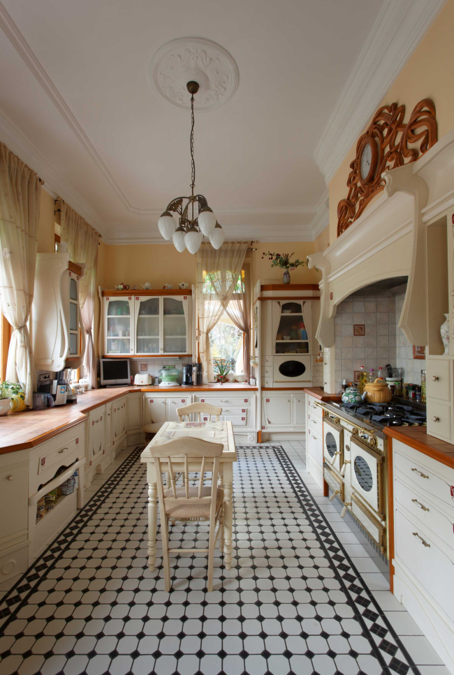
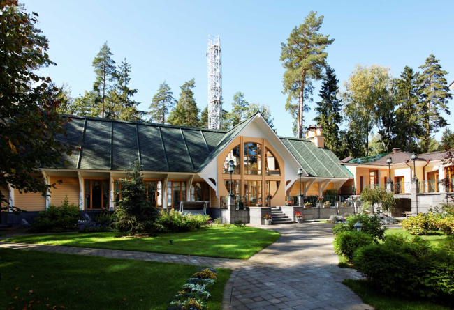
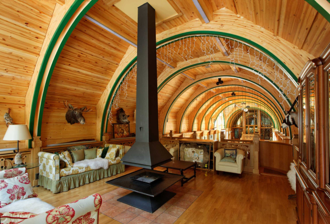
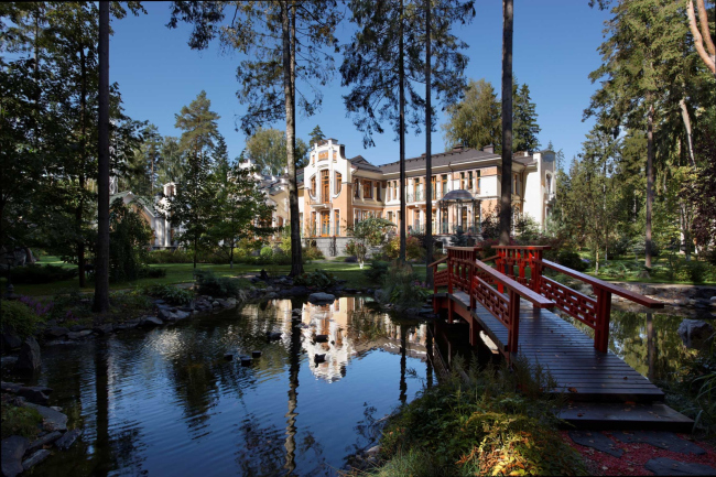
The recent history knows a lot of low-quality stylizations. This one, on the contrary is of high-quality, scrupulous at large and in details. Outside the house looks like a large palace, in fact it consists of three parts. To the left there is the main house of the owners planned as private place and is almost symmetrical. In its left risalit there is a front entrance – a deep (6x5 m) porch, leading to a relatively narrow lobby. There you should turn to the right, pass through a vestibule to get to the vast 2 storey room with a staircase to the second floor. It is leading upstairs to the bedroom, from the hall you can get to the dining room and kitchen (each 20 m), or to front part extending along at house from the garden side: there is another dining room (painted plafond, wooden cabinets, high back chair, the solemnity of a family dinner), a rose piano, a giant fireplace-sculpture, cushions, cabriole leg... Walls are replaced by broad arches which rather frame than border, and it looks more like a 'long hall', a gallery-sitting room of an English country palaces. To the right from the main residential building there are a few high 2storey room places: a green house (one can get there from the parade dining-room, a swimming-pool with curve bridge thrown over it, and a sauna - a typical modern spa, forming a perpendicular axis with a solemn exit to the garden parterre with a fountain. The entire "spa" is under the single glass roof, on the slope coming down to the park – such light makes this spectacular space look like a passage of the XIX century. To encourage the similarity, the architect himself calls it "internal street". On the opposite side there is another house smaller than the owner’s one adjusted to the "street". It is a guest house, originally designed for the parents. The three buildings: the house, the atrium and the guest house are thread on a single lengthwise (along the street) axis, resembling a palace. At least a stroll there promises a variety of impressions: spacious, high, open turns into private and modest, wooden, parquet, carpet, and cozy. The axis joins the three houses into a single complex, seem grown into a kind of "town". There is a reason for such comparison. Outside the house-palace really is like a row of Art Nouveau residences. They are different, and a visitor walking around won’t ever get bored: somewhere there are large sculptures, maiolica frieze, or giant windows. As to the last there was a story: nowadays windows are more suitable for large forms, than for small ones designed in modernist style; so the most popular to imitate historical windows is to stick a pseudo-frame onto a glass. The architect gave up the idea, and the windows were made over: the window frames have art nouveau curves. Although they are large than supposed to be, but they finely maintain the entire façade graphics. NoneNoneNoneNoneNoneNoneNoneNoneNoneNoneNoneNoneNoneNoneNoneNoneNoneNoneNoneNoneNoneNoneNoneNoneNoneNoneNoneNoneNoneNoneNoneNoneNoneNoneNoneNoneNoneNoneNoneNone |
|
