|
Published on Archi.ru (https://archi.ru) |
|
| 07.08.2009 | |
|
"Linkor", more "Linkor"! |
|
|
Anna Martovitskaya |
|
| Architect: | |
| Nikita Yavein | |
| Studio: | |
| Company: | |
|
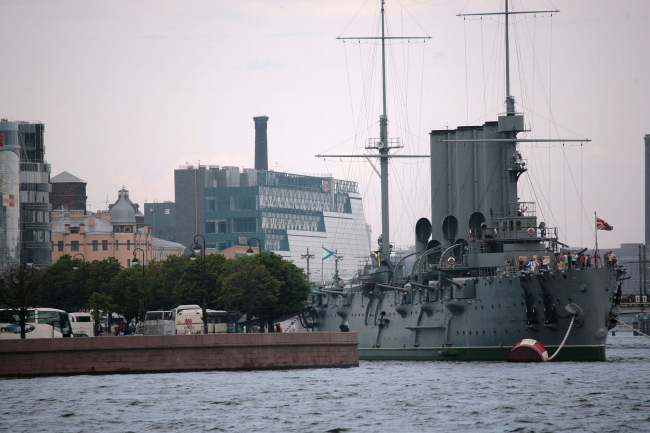
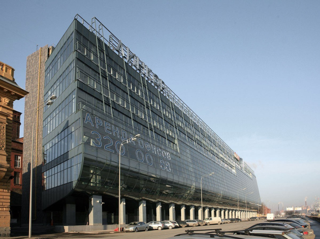
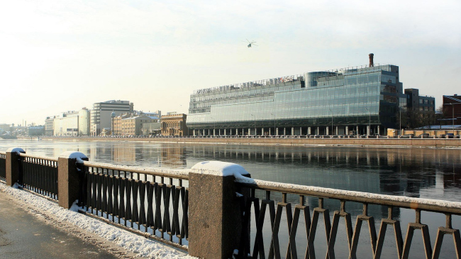
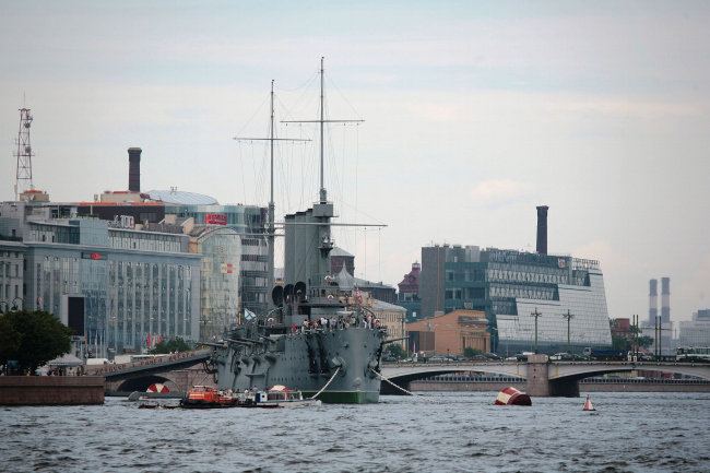
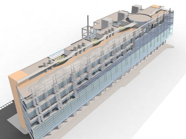
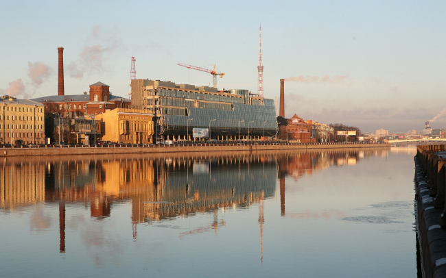
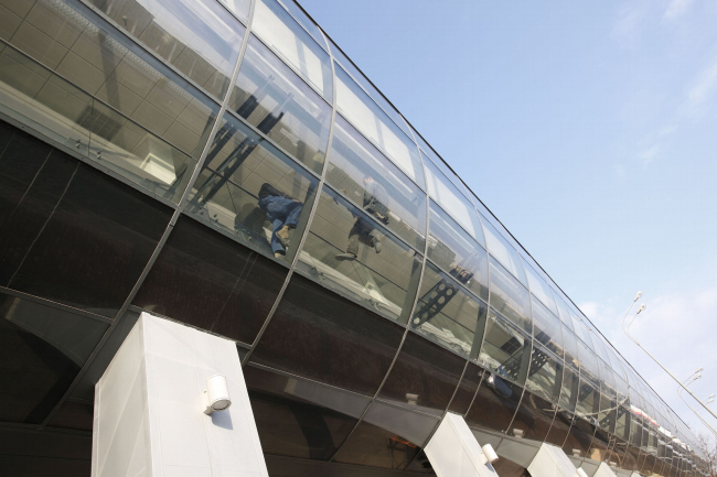
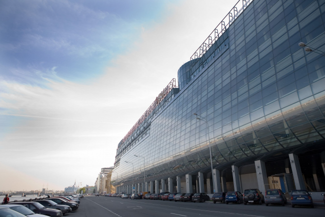
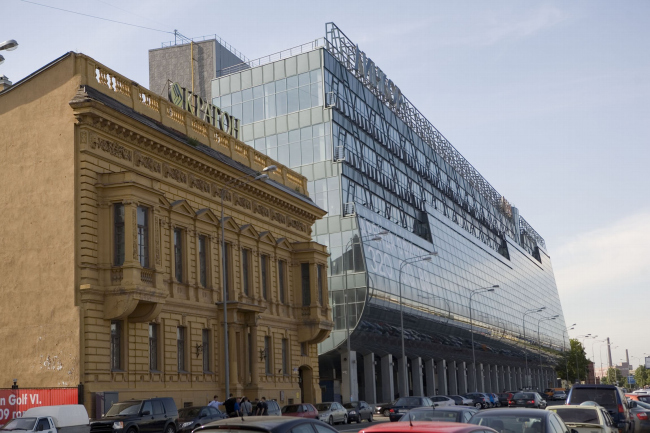
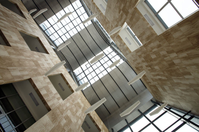
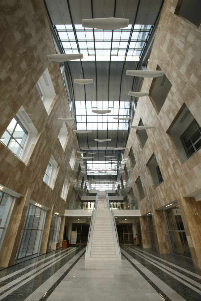
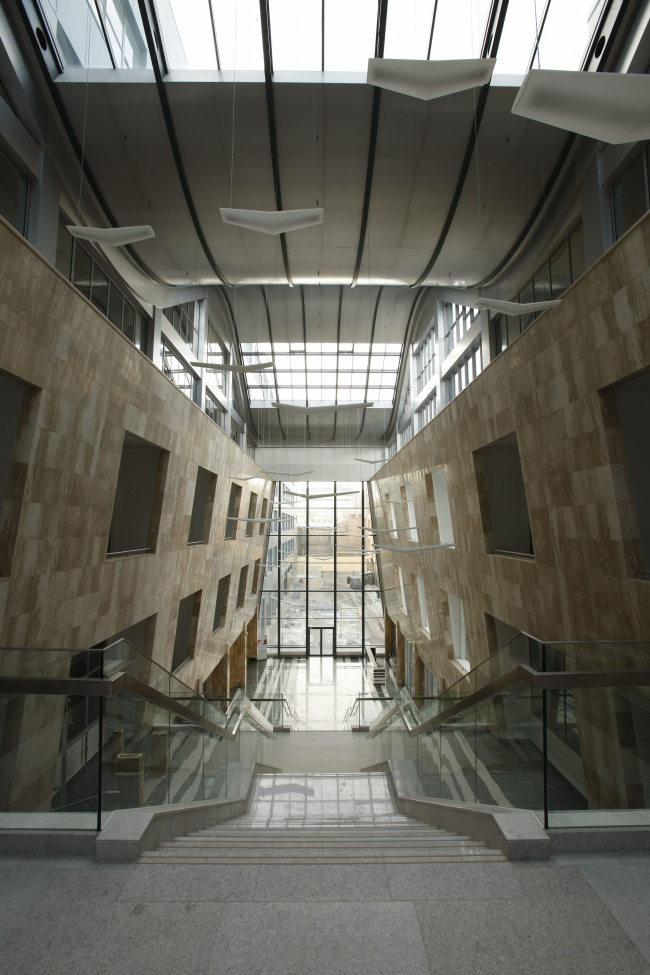
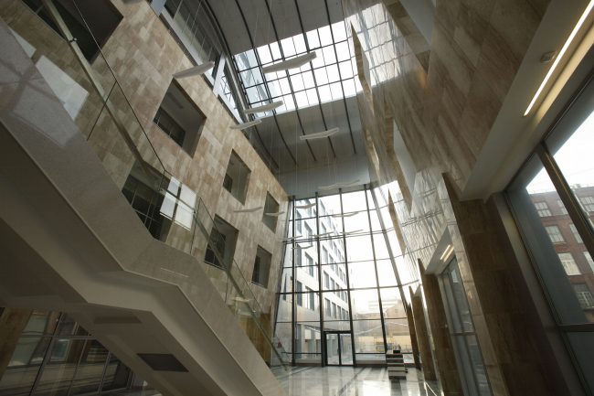
In the end of 2007 "Studio 44" architects built the A-class business center named " Linkor " nearby the most revolutionary symbol of St. Petersburg - "Aurora" cruiser. This complex is a lot like a ship and was built using the most innovative materials and technologies. It is reasonably seen together with "Aurora" – it is so unique and progressive, that it seems a revolution in office architecture of the city on the Neva is inevitable. According to the head "Studio 44" by Nikita Yaveyn, "Linkor" for sure has its naval character due to "Aurora" and to the located nearby Nakhimovsky naval collage, but it was the client who wanted to build a bank and compared it to a reliable ship, which “stability" can safe a business from any economic storm. The business center was supposed to be building upon the constructions of the two already exciting buildings on the territory, the architects considered themselves shipbuilders and imagined the building site to be a giant shipyard, where the skeleton of the future ship already was assembled, and there left works on jacketing and dividing into the deck. The naval theme in architecture and interiors of the business center is non-intrusively highlighted everywhere. The architects wanted to create a vivid and catchy image, but did not want to become prisoners of the brand. The face façade of "Linkor” fronting the river, turned out most speaking. It is pointed like a ship nose, in places the glass paneling does not touch board edges, metal frames are bare – it seems "Linkor” is not ready yet to be launched. Also the building resembles a ship due to nearly solid connection of steel color glass and certainly due to rounded bottom raised upon piers, so there is a parking area on the ground. Naval theme is interestingly and delicately presented interiors of the business center. The complex includes two buildings joined by the 25 m high atrium. To avoid trivial glazing of the space between the buildings, the architects pull them to each other and their walls slightly bend crating a ship outline (indeed the atrium is a ship's hold itself). Under the transparent ceiling there are “seagulls”-lumps hanging on long cables. And there is a quite narrow white way to the upper storey which lightness and elegance brings associations with an airstairs. NoneNoneNoneNoneNoneNoneNoneNoneNoneNoneNoneNoneNone |
|
